This document summarizes Schweitzer, a European shopfitting company based in Italy that is unique in also providing store design services. It employs 600 people across offices worldwide and expects £90 million in sales for 2012, a 25% increase over 2011. As both a shopfitter and designer, Schweitzer is able to fully design a store interior and carry out the construction, offering retailers a one-stop solution. The article notes some example stores Schweitzer has worked on and emphasizes its scale and international presence in the shopfitting industry.
How to Get Started in Social Media for Art League City
Rwi sept2012[1]
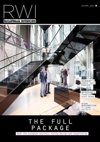
1. autumn 2012
RWI
Meet the European business fusing design and shopfitting
the full
package
sainsbury’s
enters Tesco
homeland
MoThErcarE’s
fledgling
store format
visual
MErchandising
in london
and Paris
2. Store construction
and shopfitting
for the world’s
leading brands
Offices worldwide including:
London, Paris, Milan, Madrid, Moscow, Dubai, Beijing, Shanghai, Hong Kong, Tokyo, Kuala Lumpur, Singapore, Sydney
T: +44 (0) 207 247 1717 | E: email@isgplc.com | Follow @ISGplc | www.isgplc.com
4. The arrival of Sainsbury’s in Hertford draws a line in the sand for
the supermarket that wants to be “number one locally”. By John Ryan
Sainsbury’s
in Tescoland
4 RWI | Autumn 2012 | retail-week.com/stores
ertford is a historic town. By the time
of the Domesday Book, it had three
mills, two markets and two churches
and was one of East Anglia’s (just) more impor-
tant locations. And until recently it has been
pretty much at the heart of Tesco country.
Cheshunt and the supermarket’s head office are
less than 10 miles away.
Now things have changed, however, and
instead of one large supermarket in Hertford,
there are two. Sainsbury’s has opened a store at
one end of the town centre – a suitable distance
H
from the Tesco shop, which was among the
first to be given the ‘warming up’ treatment of
lower units, wood and more graphics earlier
this year.
And given the amount of attention that has
been focused on Tesco’s activities in the town,
it might seem surprising that Sainsbury’s has
deemed it a good idea to break ground in this
part of the world.
But it’s easy to understand why Sainsbury’s
would have been tempted. On offer was a
19th-century building that had been derelict
since local brewer McMullen had moved and
created a “macro micro brewery”, as Sainsbury’s
director of store design Damian Culkin puts it.
“This is our first foray into Hertford,” he
says. “The aim was to put some of the work
we’ve been doing over the last year, starting
with Portswood (Southampton), and to do
something here.”
He adds that the store is part of the grocer’s
mission to be “number one locally” and
certainly, arriving in the car park, the vista is
almost bucolic.
5. retail-week.com/stores | Autumn 2012 | RWI 5
Sainsbury’s
has upped the
graphics count
and created a
market feel
This may be a modern supermarket,
but the view is of trees, a river,
a large park and a building with
the kind of fancy brickwork that
captains of industry liked to
create to remind them of places
such as Florence or Venice
STORES
6. STORES
6 RWI | Autumn 2012 | retail-week.com/stores
Brewing heritage
is remembered
In-store graphics have
a Hertford theme
The store reflects
local history
It’s a conservation
area and we weren’t
allowed to do
anything with the
building itself
Damian Culkin, Sainsbury’s
This may be a modern supermarket, but the
view is of trees, a river, a large green park and a
building with the kind of fancy brickwork that
captains of industry liked to create to remind
them of places such as Florence or Venice. To
the latter, Sainsbury’s has added a piece of what
is now known as ‘vernacular architecture’, in a
manner that fits with what was already there.
‘Welcome to Sainsbury’s Hertford’, which
would be the normal retail modus operandi
for those seeking to be ‘local’.
Indeed, step into this 28,000 sq ft store and
among the first things that are evident are
line-drawn overhead graphics of houses and
landmarks around the town. But it is not a
visually busy interior. Culkin says “taking the
clutter away and making it easier to navigate,
as well as communicating value” has been one
of the major pushes that Sainsbury’s has been
engaged in when creating this interior.
“This is first and foremost a fresh food store.
We’ve not just done a smaller version of what
we do everywhere else,” says Culkin. He adds
that the store has a “more authentic market feel”
and as progress is made past the fruit and veg
department, a series of shop-in-shop counters
are found along the back wall.
Culkin observes that a panorama of this kind
is not without its drawbacks. “It’s a conservation
area and we weren’t allowed to do anything with
the building itself,” he says. On a brisk trot round
the whole of this new Sainsbury’s, Culkin points
to the “hand-made” bricks, fashioned to comple-
ment what was already there. Externally, this is
an exercise in blending in.
Culkin says McMullen is “quite a big deal
locally – the brewer owns quite a lot of the town”.
This has meant that, in order to fit in, a degree of
fieldwork had to be undertaken. “We wandered
round the town and found things that tell the
story of Hertford,” he says.
Local flavour
The work has informed many of the graphics
that mark this store out as being part of
Hertford, instead of just putting a sign stating
7. www.fagerhult.co.uk/retail
We know that light makes the difference.
As one of Europe’s leading retail lighting manufacturers we know that
good lighting can assist with creating inspiring store interiors which
attract customers and drive sales. Equally we know that the focus
should be on your products, not ours and it is for this reason why
Fagerhult have become the trusted lighting partner for a growing
group of major UK retailers.
8. The shopper’s eye is
taken from one side to
the other, ensuring
both sides of each
aisle are viewed
STORES
8 RWI | Autumn 2012 | retail-week.com/stores
Good use is
made of the
large windows
Signage isn’t
overbearing
Graphics
and layout
catch the eye
This is what Sainsbury’s might
have looked like back in the day, well
the counters anyway. Except that while there
are still white-coated staff waiting to provide
service, the new low-level counters allow
customers to get up close and personal with the
produce, which really is a theme imported from
market retailing.
Down the aisles
This is a supermarket, however, and there still
have to be long aisles to ensure that the requi-
site number of SKUs can be given shelf space.
And as in other supermarkets, there is a long
central aisle that cuts across all of the others.
At its end there is the bakery and patisserie
counter, which has been given a white tile
and fancy font treatment lending something
of the feel you might get when entering a
Viennese konditorei.
The real purpose of this is to ensure that
Glance down the aisles in this store and there
is remarkably little point-of-sale material jutting
out from the gondolas but, where there is, it
almost alternates from side to side along their
length. The idea is that the shopper’s eye is taken
from one side to the other, ensuring both sides of
each aisle are viewed.
And so to the checkouts. Nothing terribly
remarkable about them, but as almost every-
where else in this store, there is a large amount
of natural daylight, making standing in line less
of a chore.
It is worth remarking that on the midweek day
of visiting, the car park was far from full. This
was a pretty sharp contrast with the Tesco store
where the constraint seemed to be how many
cars could actually get in and park – but this is a
much newer store and perhaps the good people
of Hertford need a little time to get used to the
idea that there is something other than a super-
market whose name begins with a ‘T’.
In terms of customer experience, and it is
sometimes hard to use that word in association
with visiting a supermarket, this really is quite
pleasant. And if you’re from Hertford, the efforts
that have been made to show something of the
town in-store will be apparent. Even if you’re
not, there is a lot to be said for taking a super-
market environment and giving it a lift in terms
of graphics and layout.
This is a sympathetic treatment of a fine struc-
ture and a good-looking supermarket to boot.
the gaze is taken across the whole of the space
and to maintain interest levels as the shopping
journey continues.
Culkin says research shows that any visitor
to a supermarket tends to look at only one
side of any aisle, meaning that “50% of the
offer is delisted”.
9. Online video demo on
www.fourmi-distribution.com
Telephone: 01908 522 166
FOURMI® is a Registered Trademark, Registered Design and Patented Product by IMGR Group.
Contact us now to know more about FOURMI®
IMGR Ltd
12 Fossey close – Milton Keynes – MK5 7FT
Tel: 01908 522 166 – Fax: 01908 506 533
Email: info@fourmi.co.uk
in record time
Skates
for moving loaded store fixtures
®
overnight!
Change
an entire store layout
ADVANTAGESMOVE
Easily and within minutes!
Member of
10. all things to
all retailers
Schweitzer employs 600
staff and will have
sales of £90m for the
year – up 25% on 2011
10 RWI | Autumn 2012 | retail-week.com/stores
The majority of shopfitters fit shops while the majority of
shop designers design them. Northern Italian shopfitting
giant Schweitzer does both. John Ryan reports
he store design business in the UK
is pretty straightforward if you’re a
retailer and have the funds to create
a new format. First, you’ll probably hold a beauty
parade of design consultancies, present the brief
and hope that at least one of them comes up with
something you like the look of.
Assuming that is the case, you’ll then work
with the consultancy and either get them to
choose a shopfitter or select one yourself and
hand over the drawings. Then it’s a matter of
standing back, exacting the requisite penalties
for late delivery (should this occur) and hoping
T
that what results bears more than a passing
resemblance to what first attracted you to the
design consultancy.
And that, give or take a few variations, is what
characterises the UK store design and build
sector. There are, however, a few exceptions
to this series of generalisations and among
them is Schweitzer. On the continent things are
often different.
Schweitzer is a shopfitter and also a design
outfit, but the two parts are not separable in any
meaningfulway.BasedinthepartoftheAlpswhere
thebordersaysyoushouldbeinItaly,buteveryone
around you speaks German, its headquarters are
just outside the spa resort of Merano, or Meran if
you are of a Teutonic disposition.
11. retail-week.com/stores | Autumn 2012 | RWI 11
Turning on the
style at Emporio
Armani in Manchester
Selgros in
Eschborn, Germany
Big fish –
Eschborn’s Selgros
The giant KaDeWe
store in Berlin
SHOPFITTING
Nike store in
Covent Garden
sible for a business that employs 600 people,
will have sales of about €110m (£90m) for the
current year and will show an increase of close
to 25% on 2011 when the final reckoning takes
place. This kind of turnover puts Schweitzer, the
company, in the big league as far as shopfitting
is concerned.
Argument for design
The design arm is, for the most part, not in
Naturns however, which is where most of the
prototypingandheadofficefunctionsarehoused.
Instead, it is located across the Alps in Zurich.
This may seem odd but, at first glance, odder still
is the fact that if you buy design services from the
house of Schweitzer, you generally do so from
Interstore. This is the name given to Schweitzer’s
design company and if you want a complete store
designed, or perhaps just a floor or two, look no
further. The latter can actually be bigger than it
sounds – currently the 16 people employed in the
Zurich office have almost finished work on the
third and fourth floors of KaDeWe, the massive
department store in Berlin.
The third floor has now opened and the fourth
is scheduled to welcome its first customers
With massive mountains all around the
village of Naturns (Naturno for Italian speakers
– the same rules apply), Schweitzer has an idyllic
setting. This is not by chance. Schweitzer is a
third-generation enterprise and is still run by the
founding family, who come from Naturns. There
is a reason for the company being where it is
therefore, but for retailers visiting it must be hard
not to feel as if they are on some form of working
vacation. And at the head of the whole thing is
the man whose surname hangs over the door:
Bernhard Schweitzer. Schweitzer took the reins
from his father in 1999 and today he is respon-
12. imminently. The point, however, is that KaDeWe
is not just buying a design from Interstore. An
integral part of the arrangement is that the
department store will also use Schweitzer to
provide fittings, fixtures and shopfitting.
Interstore existed before Bernhard Schweitzer
became boss, but it had languished and
not been an essential element of the
Schweitzer mix. Since 2000, however, one of
the first things that Schweitzer did upon taking
over control of the company was to ‘reawaken’
Interstore as an entity capable of opening doors
that might traditionally have remained closed
to a shopfitter.
Interstore in Zurich is managed by another
Bernhard, Heiden, and ‘Bennie’ comments:
“Interstore means that I can speak today with a
client at every level.” He is very clear about the
relationship between Interstore and Schweitzer:
“We sell Interstore first and then Schweitzer
is coming in. We are not a design agency – we
design and build.”
Heiden says that as far as design is concerned,
things are easier in the food business than in
fashion because there is “a lot of technical stuff
that we are well placed to deal with.” This may
account, in some measure, for the relationship
between Schweitzer and Waitrose, which has
been ongoing for more than half a decade.
Heiden says Interstore sits on the bespoke
side of Schweitzer’s operations – which is
broadly what has taken place with Waitrose.
When the supermarket opened its Marylebone
High Street store in 2008 it had a raft of new
elements, including a ‘time of day’ food-to-go
counter, circular wine fixtures and a market-
style entrance with fruit in wicker baskets. Much
of what was on view had been purpose-built for
SHOPFITTING
12 RWI | Autumn 2012 | retail-week.com/stores
The cavernous
Salzburg Spar
elements that make them different from what
has gone before and Schweitzer has been at the
heart of this too.
That relationship continues, but it is worth
noting that as well as working with retailers on
site-specific projects, Schweitzer also sits on the
more usual side of the fence that sees equip-
ment being manufactured and rolled out on a
mass scale. It performs this service for players
such as H&M and C&A, and the manufacturing
takes place predominantly in Hungary where
Schweitzer says operating costs are between 25%
to 30% cheaper than in western Europe.
As with Waitrose though, this kind of opera-
tion is built on relationship and reliability.
Schweitzer says at the start of a year, H&M will
come to Naturns and discuss how much of the
company’sroll-outmanufacturingcapacityitcan
book. “We do 45 to 50 new stores per season,” he
says. He adds that with mature relationships “we
are not discussing 80 pages of a contract. We’re
talking about what we can do next”.
And with a pan-European client list that
includes Nespresso, Burberry, Benetton, and
Woolworths in Germany, this is an organisa-
tion whose tendrils extend across a broad field.
It is also a business that understands that
success in shopfitting depends on rather more
than fitting shops. Helpful to have a place in
the Italian Alps to invite your clients to as well,
of course.
We are not a design
agency – we design
and build
Bernhard Schweitzer
A BROAD FIELD
Schweitzer clients include: H&M, Waitrose,
Spar, C&A, Nike, KaDeWe, Emporio Armani
and Eschborn
the location and the store proved an immediate
success with the well-to-do locals.
Roughly a year later, the food hall in John
Lewis followed. This was along similar lines
but was different and again, the Interstore and
Schweitzer combination was central. A roll-out
of stores has since taken place, but while many
of the stores may look the same, there are always
Meat display at
Spar in Salzburg
Checkouts at Salzburg Spar
17. Tesco may be backing ‘artisan’ coffee shop Harris & Hoole
but the cafe has a very distinct identity of its own
the art of the
perfect coffee
retail-week.com/stores | Autumn 2012 | RWI 17
coffee shops
obbies, F&F and Harris & Hoole
stand as examples of Tesco providing
backing for existing businesses, or
creating entirely new formats where it might not
be the first name that springs to mind. Coffee
shop Harris & Hoole is the newest and might be
described as an example of Tesco seed capital.
The grocer has taken a minority stake in
an enterprise that has ambitions to become a
modest chain. Uxbridge is now open and Ruislip
is next in line to welcome the Harris & Hoole
‘artisanal’ style of caffeine and cakes retailing.
D
It is Amersham on the Hill that has, since last
month, been the first town to have a Tesco-
backed coffee shop and, standing outside, there
is no clue about the grocer’s involvement.
This is probably just as well. Artisanal
coffee and big corporate retail could make
uncomfortable bedfellows but, even for those
in the know, this is much better than any of the
other coffee shops in the town. It is fair to remark
that there is a Caffè Nero and a Little Waitrose
not very far away –this is some way from being
an average locality.
Home-style chic
across the board
All the food is
cooked on-site
18. coffee shops
18 RWI | Autumn 2012 | retail-week.com/stores
The cafe is
deep and wide
Harris & Hoole is the
point where big retail
and a local form of
owner/manager-style
shopkeeping meet
Hidden spaces
offer privacy
Free wi-fi is
on the menu
That said, the majority of its neighbours are
outposts of national chains and while Harris
& Hoole has corporate backing, it has all the
hallmarks of a small, idiosyncratic operation.
All of the things you would expect of a
contemporary coffee chain are, of course,
in evidence with free wi-fi, calorific cakes
and a wide array of coffee styles all on
offer. But it is the curious mix of rustic
style and industrial chic (principally
in the shape of the long steel-topped counter)
that mark this one out as something different.
This is a deep and relatively wide shop – giving
the interior a sense of space that is unusual in
the highly formatted and cut-throat world of hot
beverage retailing, where every square foot tends
to be sweated. Then there is the mix of furniture.
There is a brown leather Chesterfield sofa, like
almost everywhere else, but this is mixed with
wooden benches and window seats, small tables
and aquamarine bentwood chairs, which banish
the feel of a corporate roll-out.
Bringing home the bacon
There is also the black and white tiled kitchen
at the back of the shop, reached by passing
through a raw timber arch. All of the pastries,
bacon muffins and suchlike are cooked here
from scratch and on the day of visiting most
customers seemed intent on tucking into
something rather more substantial than a
skinny latte or a single espresso.
Harris & Hoole is something of a curiosity,
therefore, being the point where big retail and
a highly individual and local form of owner/
manager-style shopkeeping meet. The staff were
enthusiastic and keen to offer the inevitable
loyalty card to anyone purchasing a drink in this
highly wrought interior.
Given that your correspondent’s normal
coffee drinking takes place some 27 miles south-
east of this cafe, the proffered card seems likely
to remain at the back of the wallet, but this is
almost good enough (as is the countryside
surrounding Amersham) to merit repeat visits,
in spite of the distance.
19.
20.
21. Mothercare’s revamped UK flagship in north London is a beacon of
sector best practice, but can it be replicated?
Mothercare is
born again
retail-week.com/stores | Autumn 2012 | RWI 21
stores
n mid-July, Mothercare provided a
trading update for the first quarter
that hardly made uplifting reading.
UK retail like-for-like sales had fallen 6.7% and
while there had been growth in the interna-
tional business, it was not of the scale that many
analysts had been expecting.
This was hardly news however. The retailer
has seen its fortunes dwindling for close to
30 months and the period had also brought
the high-profile departure of chief execu-
I
tive Ben Gordon and the appointment of his
successor Simon Calver.
Calver’s arrival has spawned an equally
newsworthy event, the revamping of the UK
flagship, just off the A406 in Edmonton, north
London. This store nestles among an armada
of out-of-town sheds including a Tesco Extra,
an Ikea and a Wickes Extra (what is it about the
word ‘Extra’?) among its near neighbours.
At 30,000 sq ft, this is a moderately sized shed,
but it is huge for a mother and baby retailer, and
A colourful
experience
The mezzanine offers
commanding views
22. stores
22 RWI | Autumn 2012 | retail-week.com/stores
Garments
as graphics
In spite of the area’s
substantial size, there
is no sense of being
in an oversized space,
or even a shed
A Costa Coffee implant
occupies one corner
standing outside the store, it is hard not to be
impressed by the size of the enterprise.
The interior, designed by London-based
consultancy CDW Partners, looks enormous,
with a large ground floor and, towards the back,
a floor-to-ceiling 2D rocket graphic surrounding
the lift up to the mezzanine level. But it was this
size prior to the makeover that was completed by
the end of July and therefore if scale is important,
then this has always been a leviathan.
Future clues
What matters about this branch is the fact that
it is home to new elements and store design
features that are intended to provide a clue about
the future of the beleaguered chain. Looking
to the right, it’s easy to spot the first of these as
there is a full-size Costa Coffee implant. It is full
can be used, according to a member of staff, for
anything from baby massages to breast-feeding
classes. Companies can hire the room and on
the day of visiting, it was being used by mums
(and dads) as a drop-in space and probably an
alternative to sitting down in Costa, although the
cafe was busy.
The decision to locate the pushchair and pram
department at the back of the store, underneath
the mezzanine, is an obvious consequence of the
category’s destination-like nature – you don’t
enter Mothercare or any of its rivals and walk
out with a pushchair by chance.
This is actually a very large department
and as well as using the rear wall to display
the merchandise in a manner that is reminis-
cent of a better-end bicycle shop, care has been
of mothers, fathers and pushchairs, as those who
have braved the North Circular take the weight
off their feet after the rigours of the journey.
But in truth, the cafe notwithstanding,
there is something worth inspecting at almost
every turn. The mid-shop of the ground floor
is an island with a walkway encircling it and it
contains nursery furniture. The overwhelming
impression is white – whether it’s the furniture
itself,orthesurroundsthatcreateminiroomsets.
Many of the walls have been given a very light
pastel wash to which graphics relating either
to childcare or something about childhood
have been applied. In total, in spite of the area’s
substantial size, there is no sense of being in an
oversized space, or even a shed, come to that.
Equally, although the freestanding walls that
give the central island its character are high, it is
still possible to navigate the interior easily as the
areas to the left and right of this are distinct and
the mezzanine’s open balustrade permits views
of the upper level.
There are several other ground floor features
that are likely to capture the gaze of visiting
shoppers. ‘Mumspace’, is a discrete, wood-clad
room at the rear right-hand side of the shop that
23. PRO ACTIVE SOLUTIONS
Delivering high quality interiors
– on time and on budget.
Handling both retail and commercial projects, our skilled personnel can develop schemes,
from concept through to completion, offering cost effective ideas and solutions.
Our project management team can provide all the elements necessary to give you
a total fit-out and refurbishment package.
Working closely with our clients – we listen to your needs and priorities.
OFFICE | COMMERCIAL | RETAIL
For more information:
Telephone: 024 7668 3727 | Email: info@activeinteriors.com | Website: www.activeinteriors.com
I N T E R I O R S
24. STORES
24 RWI | Autumn 2012 | retail-week.com/stores
A sense of light
and space predominates
This branch is home
to a series of design
features that gives a
clue about the future
of the chain
The family
photography studio
Lifts are framed
by rocket graphics
taken to allow sufficient walkway space to
permit test-drives.
Room for manoeuvre
And so to the mezzanine that consists of a large,
curving balcony with a deep space behind it.
This is predominantly used to house toys, soft
and otherwise, and is a complete remodelling of
what was in place before.
Large 3D graphics adorn the perimeter, acting
as wayfinders and adding to the feeling of a
kids’ kingdom for children accompanying their
parents. There is also a library of kids’ books at
one end of the floor and an outsize Wendy house
at the other. Between the two, a photo studio
means proud parents can have snaps taken of
their offspring having a good time. As on the
ground floor, the circulation space is generous
– essential for a retailer where the proposition
involves parents with pushchairs inspecting the
stock and entirely possible in a shop of this scale.
Which is perhaps the point. This is a very
big shop when set against sector rivals such as
Mamas & Papas, and has allowed Mothercare
roomformanoeuvreintermsofvisualmerchan-
dising and laying out the floor. Yet as broker
Panmure Gordon, which retains a sell position
A supplementary concern is therefore which
features of this new-look store are likely to find
their way into other branches? Putting a cafe into
a shop takes up space and is generally not a real
money-spinner for the host retailer, although it
does serve as a crowd-pleaser and may prolong
dwell times. Equally, the Mumspace room looks
like a luxury that can only be afforded in out-of-
town sheds where space is not an issue.
Finally, there is the little matter of online.
Shops that operate on this scale increasingly run
the risk of being treated as showrooms rather
than places in which to buy. This is a very good-
looking store and there is a real sense of occasion
on entering, but it is quite hard to see how many
of the initiatives that have been put in place will
be meaningfully exported to other locations.
Simon Calver still has his work cut out.
MOTHERCARE,
EDMONTON
Address Ravenside
Retail Park, Angel
Road, London N18
Size 30,000 sq ft
Store interior
design CDW
Partners
Store status UK
flagship
Reason for visiting
A true destination
shop
on Mothercare shares (although it admits, in
a note, to being very impressed by this store)
points out, there are only about eight stores of
sufficient magnitude in the retailer’s portfolio to
‘do an Edmonton’ on their interiors.
25. Next Home and Garden,
Shoreham, Sussex
-
National Association
of Shopfitters Design
Partnership Award
‘Overall Winner’
-
Oracle Retail Week Awards 2012
‘Store Design of the Year’
Through diligence, flexibility and
meticulous attention to detail, Patton has
enjoyed lengthy working relationships
with many of Europe’s largest blue chip
retailers including Debenhams, John Lewis,
Next, Primark, Selfridges and Tesco.
patton.co.uk
26. 100% recycled PVC
Interlocking tile
+44 (0)116 298 9578 sales@cobaeurope.com www.cobaeurope.com
Entrance Matting Systems
Premier Track
Available in 4 colour options
100% recycled PVC
Interlocking tile
Premier Track
Available in 4 colour options
High performance
entrance matting
Fire tested to EN13501
Euro Classification B(F2)S2
MAPIC gAthers thousAnds of InternAtIonAl CoMPAnIes, develoPers, Investors And PublIC
AuthorItIes under one roof. loCAte PrIMe retAIl sItes, PArtner wIth leAdIng reAl estAte PlAyers And
strIke deAls thAt oPen new terrItorIes And MArkets.
MAPIC MOVES RETAIL FORWARD
the international market for retail real estate - 18th edition
« In one word: networking. unique
opportunity, excellent location, one place,
and three days during which you can meet
everyone you want to meet »
rafal fabisiak,
Managing director,
diva (Poland)
register now
until october 11th : € 1 290
www.mapic.com
190-134 RETAIL EB3 EN.indd 1 24/07/12 11:55
27. Seasons to be
cheerful?
retail-week.com/stores | Autumn 2012 | RWI 27
visual merchandising
ain all summer long, sunshine the
moment the calendar ticks over to
autumn. The UK’s maddeningly
unpredictable weather has been little help to
fashion retailers trying to manage their merchan-
dising into the autumn/winter season and the
window displays in many of the West End’s
stores reflect that uncertainty. While Desigual
and Uniqlo decided to say it with flowers, even
they chose a different seasonal palette of flora and
fauna. Desigual encapsulated the dichotomy of
twin objectives further with one of its windows
dedicated to new fashion and the other to deep
discounts on summer stock.
R
Few retailers had thrown themselves fully into
the autumn season, no doubt reflecting the desire
to sell down summer stock at optimum prices
first and – in the case of some others – to hold on
to the last vestiges of a summer of sport that has
at least brought a feel-good factor to the country.
The common ground in visual merchandising
strategies comes from where the retailers have
gone back to communicating their messages in
words in their windows, whether that is a call to
arms, a brand statement, shouting about deals,
or story telling. On-window graphics dominated
around the West End and communication has
become direct, underlining the need to ensure the
customer gets it. Clearly, recession is not a time to
be too clever.
Many windows have also become advertise-
ments for the omnichannel nature of the retail
offer – a strategy dripping in irony but effec-
tively communicated by most, although few
as overtly as Urban Outfitters, which left no
channel unturned at its Oxford Street store. As
multichannel has migrated to omnichannel,
some analysts are speculating that for younger
consumers the whole idea of channels is rapidly
becoming arcane and that we might all be talking
about plain old retailing again before long. Maybe
someone should create a window about it.
As the sunshine finally shone in the early autumn, London’s visual
merchandisers were faced with the dilemma of whether windows should
shift seasons or stock. Mark Faithfull looks at how they managed
A tongue-in-cheek approach to its visual displays from Ben Sherman stood
out among the autumn windows. Well at least the idea did, with a window-
mounted control box inviting and apparently enabling shoppers to see one
of the six selected clothing items spin slowly around, vending machine-style.
It would have been even better if any of the buttons actually worked.
Spanish fashion retailer Desigual
clearly hedged its bets on
Regent Street, bookmarking its
rather tasteful floral doorway by
displaying huge discounts in one
window and its new season
collection in the other. The
messages may have covered all
the bases but it was a confusing
mix of new season confidence,
summer flowers and end-of-
season discounting.
Underlining the current desire to communicate directly and clearly, one
window of NikeTown, on the junction of Oxford Street and Regent Street,
was entirely dedicated to explaining the virtues of one of its sports shoes.
This is an interestingly technical and understated approach from a brand
better known for its swooshing Just Do It approach.
NikeTown, Oxford/Regent Street Ben Sherman, Carnaby Street
Desigual, Regent Street
28. 28 RWI | Autumn 2012 | retail-week.com/stores
visual merchandising
Warehouse was one of the few retailers to commit fully to
the autumn/winter season with a bit of bling, eschewing
autumnal colours for some bright and bold visual
merchandising props sat amid a selection from its new
range. Although this was a different visual approach from
most of its peers in the West End, the use of bold lettering
again underpinned the common approach of clearly telling
the story. Footwear retailer Dune also went for a confident
autumn window, flagging its website and using tasteful
on-window graphics to announce its new collection.
One common element in many windows was the promotion of other retail channels, from
mentions of the retailer’s own website to its presence on social networking platforms.
Urban Outfitters was the loudest, shouting about its other facets through its window
displays. In fairness, it would be tough to think of a retail chain better suited to Pinterest
et al, so the enthusiasm is understandable. Meanwhile, fashion retailer Reiss used its ‘spirit
of the city’ windows to start a story that it called on shoppers to investigate through its
social networking channels. It is all very clever, although some will doubtless not bother.
Gap also used window graphics to underpin its new collections and brand statements, but
like Desigual there was a muddying of the waters, with mixed messages through heavy
discounting promotions in some windows.
Retailers do not want
to risk sales by being
too clever with their
marketing and failing
to communicate
Baby and toddler equipment and clothing retailer Mamas
& Papas took its tone from the clear communications
delivered by many retailers, using one window to overtly
advertise some of its in-store services and another to
promote its latest deals. What is worth noting here is the
simplicity and clarity of these messages. This suggests
that retailers do not want to risk sales by being too
clever with their marketing and failing to communicate
their central messages to the customer.
Mamas & Papas, Regent Street
Reiss, Regent Street
Urban Outfitters, Oxford Street
Warehouse, Argyll Street
29. Inspiring Built
Environments
Monaghans are market leading multi-
disciplinary built asset consultants with
a 35 year pedigree serving the retail
sector nationally and internationally.
Working industry wide for both
long established and emerging
retailers we deliver innovative cost,
project, programme, supply chain
and asset management solutions
to a broad range of repeat retail
customers who appreciate our hands
on involvement and personalised
yet practical approach to delivery.
www.monaghans.co.uk
• Cost, Value & Risk Management
• Project & Programme Management
• Asset Management
• Equipment&SupplyChainManagement
30. 30 RWI | Autumn 2012 | retail-week.com/stores
visual merchandising
Anthropologie moved its windows gently into autumn with
a subtly leafy display. This was mirrored more overtly by
Japanese fast-fashion retailer Uniqlo, which was one of the
few retailers to pick up directly on autumn colours for its
window displays, beckoning in the new season collections.
Britain’s golden summer of sporting prowess was reflected in a number of displays with
hints of patriotism around the West End. Olympics backer John Lewis unsurprisingly
continued to wear the Union Jack on its sleeve, with updated graphics on some of Team
GB’s Olympians adorning its windows. Even T-Mobile had a little dabble at patriotism
with corporate-coloured bunting. Massimo Dutti added a tongue-in-cheek twist to
its celebration of the Games, while Armani Exchange said it all quite simply but still
managed to capture the patriotic spirit.
And for something completely different, here’s the
pop-up from Crocs, the plastic footwear brand, in the
heart of East London’s Spitalfields Market. Designed
by consultancy Triplar, this takes the brightly-coloured
merchandise and suspends much of it from strings
attached to the ceiling. It then adds a seasonal twist
with large 3D letters on the floor spelling out the words
rain and shine.
Crocs pop-up, Spitalfields MarketMassimo Dutti, Oxford Street
Anthropologie, Regent Street
Armani Exchange, Regent Street
31.
32. EMS 532688
EMS 14001:2004
moc.lmyelrib.www
Quality in Design
Quality in Build
Quality in Delivery
0114 280 3200
innovate | create | install
from design to delivery,
joinery & metalwork specialists
to the retail industry
In-house design
Prototyping facilities
Value engineering
Bespoke solutions
Quantity production
& stock holding
Nationwide delivery
& installation
Our specialist retail and banking experience
has provided manufactured solutions to some
of the UK's largest high street names
OHSAS 18001:2007 BS EN ISO 9001:2008
33. Since the first Hotel Chocolat opened in 2004, it’s become a thriving
chain of shops and cafes. We look at how design has aided its success
Cometh the chocolate,
cometh the man
retailer that chooses a designer and
then continues to work with that same
designer from 2004 until the present
day is surely unusual. Retailers usually tend to
try out a few elements from a consultancy and
then, when a change of direction or even format
‘evolution’ is perceived to be necessary, a new
consultancy is hired to create difference.
The outcome of this approach is that it is
frequently difficult to discern a design thread
that defines the brand. Indeed, the look of a store
may be completely different to what it was a few
years ago – thanks to a constant chopping and
changing of design consultancy.
Hotel Chocolat is an exception. Since its
foundation as a bricks-and-mortar entity eight
years ago not only has it stuck with designer
Terry Moore but it is easy to see how it has
evolved to its current store design format.
“Terry’s part of the team now,” says Angus
Thirlwell, Hotel Chocolat’s founder and chief
executive. “Eight years ago, we wanted to create
a store that would have the feel of a hotel lobby.
Before us, chocolate tended to be sold in small
shops in unmarked white boxes and you didn’t
really know what you were getting. It’s a bit like
treating customers as idiots. We knew we could
do a lot better than that.”
Successful strategy
If results are anything to go by, Hotel Chocolat
has done better. This sweet tooth empire now
trades from stores, online, and via mail order.
It even has its own cocoa estate and has opened
cafes where customers can see cocoa beans
being transformed into chocolate. Prices are
certainly at the top end of the mid-market
but, according to Thirlwell, as well as good
chocolate, a visit to Hotel Chocolat entails
being informed about product provenance
and immersed in clever storytelling. “We work
to bring chocolate alive in terms of look and
colours,” he says.
Underpinning much of the brand’s success
and its appeal for customers is the appearance
of its shops and the in-store environment. Hotel
Chocolatisthatmuchoverusedterm–anexperi-
ence. Whether you go into one of its branches
on a high street or in a shopping mall, or head
for the more elemental, rough-and-ready Rabot
Estate shop-cum-cafe at London Bridge, you
know where you are.
The brand stands for an idea that has been
developed over time. Sitting in the basement
of the latest Hotel Chocolat spin-off, Roast &
Conch – a cafe where cocoa-based hot drinks
and food are served and chocolate is manufac-
tured – Thirlwell is keen to show off his new
products. After a cup of chilli hot chocolate
and a tart with chocolate ganache (made on
the premises), it is not hard to understand this
organisation’s success.
Attention to detail – whether it’s the in-store
leaflets with beautiful photography, or the
packaging that gives any of the Mayfair and
Knightsbridge chocolate specialists a run for
their money – is what this retailer is about.
And the raffishly attired Thirlwell remains the
high-profile face of the brand. “I eat chocolate
every day,” he says. You have to guess, on the
evidence of his elegantly waisted frame, that he
just doesn’t eat too much of it.
A
Profile
Cafe spin-off
Roast + Conch
Angus Thirlwell
Eight years ago,
we wanted to create
a store that would
have the feel of a
hotel lobby
retail-week.com/stores | Autumn 2012 | RWI 33
34. Office/Factory Locations:
United Kingdom Sweden USA Norway Germany Russia Denmark Latvia Belgium Poland Lithuania Czech Republic Netherlands Ukraine Hungary Estonia China Ireland
Swallowdale Lane, Hemel Hempstead, Herts. Tel: 01442 419419 email: sales@itabuk.com www.itabuk.com
At ITAB we create exceptional space for leading retailers.
We add value by combining in-house production with quality shop-fitting.
ITAB deliver committed service and inspired design as standard.
Shop-fitting • Self scan • Display fixtures • Checkouts • Joinery • Pharmacy • Modular shelving • Principal Contractor
Improving the Shop Experience
35. Consolidation and sub-contracting are some of the main
themes in this year’s Top Shopfitters League table
Mergers reap rewards
he top 10 of this year’s Top Shopfitters
League table contains a few surprises.
In pole position is Overbury, a
shopfitter that has grown by acquisition since
merging Vivid Interiors into its portfolio over
the past 12 months. And like a number of other
companies in the table, consolidation is a recur-
ring theme that appears to be characterising the
shopfitting sector.
There are, however, plenty of hardy stalwarts
such as Styles & Wood, Wates and Morris
& Spottiswood that are continuing to make
their presence felt in the market. For some, their
position in the table can be ascribed to one client
and in a few instances almost to one project.
The Simons Group is a good example of
this. Appearing in fifth place in the table, the
shopfitter has been responsible for the construc-
tion of Marks & Spencer’s recently opened
151,000 sq ft Cheshire Oaks store. The scale and
intricacy of this project would be sufficient to
support several shopfitters in the lower reaches
of the table for a number of years, and this
will certainly have contributed to keeping the
shopfitter buoyant over the past 12 months.
There is also the phenomenon of big shopfit-
ters employing smaller ones – which a number
of the companies occupying the top places in the
table seem to be doing. This has been the modus
operandi at Styles & Wood and, to an extent,
ISG for some years and there has always been
discussion about whether the label shopfitter can
realistically be applied to this kind of operation.
This, however, is broadly a discussion confined
T
to those working within the sector, as retailers
will probably care little about the make-up of a
company that equips its stores as long as the job
is done for an appropriate price.
This is just a snapshot of both the Top
Shopfitters League table and the accompanying
analysis. There are more than 40 players in the
table this year. For more detailed information
from the league, please visit: www.retail-week.
com/interiors2012. On the website, you can
also see The Retail Week Interiors Report 2012
with articles covering store design, the retailers
that commission these projects and those who
turn these plans into tangible reality, plus closer
scrutiny of individual projects. This report will
now be produced annually and will provide
an overview of what happens when a retailer
decides it’s time to build a new store, or when an
existing store is ready to be refurbished.
The Shopfitters League table is, as ever, a
document that charts the fluidity of a sector that
continues to change. Next year will doubtless see
further shifts in this area.
Name YeareNd reveNue
–latest
fiNaNcial
Year
reveNue
2010
Profit
2011
Profit
2010
comPaNYcommeNts
overburY(vivid
iNteriorsmergediNto)
dec-11 £396m £336m £11.1m £11.3m turnoverisincreasing,thoughmarginsaredecreasing.
isg Jun-12 £300m £321m N/a N/a Whilemarginsremainchallenging,theindustryisinnovating
andprovidingopportunitiesforforward-thinkingproviders.
Watesretail dec-11 £141m £112m N/a N/a PartoflargerWatesgroup.
stYles&Wood dec-11 £101m £99.1m £1.9m £1.1m
simoNsgrouP mar-11 £99.88m £174.58m -£379,000 -£2.24m
sdudleY&soNs aug-11 £92.32m £65.3m £283,526 £914,496
viNcicoNstructioNuK dec-11 £90.2m £78m £1.2m £1.3m
morris&sPottisWood dec-11 £84.65m £84.68m £332,259 £309,523 retainedprofitabilitywithnildebtandastrongcashposition.
itabuK dec-11 £79.3m £64.9m £1.51m £600,000
simPsoNs(YorK) dec-11 £73.49m £59.75m £1.96m £1.44m achievedcontinuedgrowthanddevelopmentthrough
difficulttradingconditions.
for more information www.retail-week.com/interiors2012
ShopfitterS table
For some, their
position in the table
can be ascribed to
one client and almost
to one project
retail-week.com/stores | Autumn 2012 | RWI 35
36. 3
4
5
1
0
434510 4 3 2 0 0
4
3
2
0
0
You’re in capable hands
when you entrust your project to
bridgford interiors. With a
breadth and depth of experience
that enables us to tackle any
project, anywhere... we will be sure
to provide the complete fit-out
solution. Contact us to discuss the
successful delivery of your next
retail, leisure or hospitality project...
Are Bridgford
Interiors on your
radar? For your
next interior fit out
project find us at...
Interior fit out specialists
bridgford interiors limited
bridgford building, wellington crescent,
fradley park
lichfield, staffordshire
WS13 8RZ
tel: 01543 443200
email: alan.palmer@bridgford.co.uk
web: www.bridgford.co.uk
@BILfitout
37. The new season,
paris style
retail-week.com/stores | Autumn 2012 | RWI 37
paris
he advent of the autumn/winter season
at the start of this month was greeted
in Paris, as in London, by sustained
sunshine. Unlike the UK capital however, there
has been rather more sunshine than rain gener-
ally in Paris this year and so, to an extent this was
a continuation of what had gone before.
That said, on both sides of the Channel,
retailers have a perennial habit of hoping
T
against hope that they will shift outerwear in
September, which has to be the triumph of
hope over every kind of experience. At the
beginning of this month therefore, Parisian
shops were filled with mannequins wearing
fleeces and heavy wool coats and there were
even a few reindeer cut-outs in windows,
presumably to get people in the mood.
The bulk of those promenading the boulevards
were, of course, clad in shorts and T-shirts with
not an outer garment in sight. Unlike the UK,
however, the new season was not another oppor-
tunity to offer shoppers yet more promotions and
most of what was on view was at full price.
Perhaps UK retailers might take note – there
is more to an appealing store than windows that
shout that things which were one price are now at
a lower price...
While London’s retailers greet the new season with a wave
of discounting, in Paris the value message is much
more muted. John Ryan reports
Department store Printemps has devoted its
windows to Louis Vuitton’s collaboration with
Japanese artist Yayoi Kusama, in which white
dots on a red background (and vice versa) are
mirrored by featureless bob-haircut figures
clad in dresses of the same design.
Nonetheless, if you want to see something
dramatic, this is one of the most arresting
series of windows in the city and is quite unlike
anything that has been done before. Except that
in London (and one suspects in other major Louis
Vuitton outposts) Selfridges has devoted its
windows to an almost identical version of what’s
been done here.
Given that both department stores are
flagships and emblematic of the cities in which
they are located, this is a little disappointing
– particularly in view of the frequent traffic
between the two.
There are certain to be plenty of shoppers
who will notice the similarities.
Printemps, Boulevard Hausmann
38. 38 RWI | Autumn 2012 | retail-week.com/stores
PARIS
Long gone from these shores, but very much up and running across mainland Europe, the
windows fronting the C&A branch on the Rue de Rivoli have a stripped down, back-to-
basics feel about them. This is a marked change from the sometimes over-fussy schemes
that have characterised this retailer’s displays.
For this season, it’s a matter of white, boxed-in windows with a monochrome mood
photo as the backing, contrasting with the coloured autumnal stock that takes muted
tones and then uses a single highlight colour. This is hardly original, but it works and was
actually considerably better than many of the other mainstream players along this strip in
central Paris where mid-market retail comes out to play. And, like Gap, this will have been
rolled out to stores from Madrid to Moscow.
The design crowd’s homewares fix rarely fails to deliver in terms of visual merchandising and
Merci’s current display in the atrium, just inside the main entrance, is no exception. Dozens
of coloured headphones have been suspended from the ceiling. It is linked with other display
elements dotted around the store, including a mannequin sitting in a suspended bubble chair
and a row of the headphones against a white wall.
In fairness, while this looks interesting, it is not as original as might be supposed.
A fashion retailer in Berlin’s modish Mitte district was doing exactly this at the beginning
of 2011.
In spite of it being a very small chain, ballet flats and
shoe retailer Repetto manages to make this branch feel
as if it is a one-off (although there is an identical scheme
less than a mile away on the Rive Gauche). Think autumn
and thoughts might turn to dark woods, long nights
and wolves – well, maybe. And picking up on this
Brothers Grimm theme, Repetto has created a ‘chaperon
rouge’, aka Little Red Riding Hood, window in which the
hapless victim is leered at by a pretty hungry-looking
cartoon wolf.
The crude nature of the 2D monochrome wolf
contrasts with the 3D legless and headless bright red
caped figure. What this actually has to do with shoes
or selling them is probably anybody’s guess, yet it does
serve to draw onlookers’ eyes towards this window
rather than any of its neighbours.
Repetto, Opèra C&A, Rue de Rivoli
Merci, Boulevard Beaumarchais
39.
40. 40 RWI | Autumn 2012 | retail-week.com/stores
paris
When was the last time you noticed a store window in
London that features a slogan across the glassline in
French? There may be instances, but they are infrequent.
Yet in spite of the well-documented Gallic aversion to
creeping Anglo infringement on spoken French, there are
plenty of windows in Paris right now that use English to
promote a message.
Nowhere is this more obviously the case than in
Benetton, where shoppers are invited to inspect ‘the new
Fall collection’ – which does sound like US rather than UK
English and is odd coming from an Italian brand.
And perhaps to add insult to injury, the background
to this window features Big Ben, bathed in autumn
sunshine. Objectively, this window is not a crowd-puller,
but it does at least send a clearly unambiguous new
season message.
Benetton, Opera
US retailer Baby Gap is one of the exceptions that proves the non-discounting rule in
Paris at present. This window advertises the fact there is 30% off all jeans for very young
children. It does so with a display that will doubtless have been created for use across the
continent and which, owing to a simple backdrop and the use of balloons, will have been
simple to install and roll out across the estate.
The clothing on each of the small figures dangling from the inflatables is certainly
autumnal, but greeting the new season with a money-off promotion shows that in spite of
2012 so far having been more benign for the San Francisco-headquartered retailer than
the previous year, margins remain under pressure.
Simplicity does have its appeal and, as a means of showing off brightly coloured
garments, this is an effective vehicle. It is also worth noting that the 30% off denim
promotion extends to the adult Gap, in a connected shop just around the corner – at least
no discrimination is made on the grounds of age.
Habitat has not gone the way of C&A in the UK – its presence in France is now much
stronger than the three stores that remain in this country. In common with the UK organisa-
tion however, reductions do seem to be the order of the day, with alternating windows in this
long frontage showing full price and then reduced stock.
Unlike other retailers on the Rue de Rivoli, Habitat makes strong play of message rather
than merchandise to grab the gaze of passing shoppers, with large coloured pointers stating
“Ça, c’est un bureau” (this is an office) and “Ça, c’est un reduction” (no translation needed).
This is straightforward value-led stuff and was one of the most overtly promotional windows
in the whole of the city on the midweek day of visiting. It captured attention, however,
mainly because others were not overtly discounting.
Baby Gap, Rue de Rivoli
Habitat, off Rue de Rivoli
41. 2 Sloefield Drive
Trooperslane Industrial Est.
Carrickfergus BT38 8GX
T: 028 933 2900
F: 028 933 58150
E: info@mccuefit.com
53 Chandos Place
London
WC2N 4HS
T: 020 3402 2205
42. 42 RWI | Autumn 2012 | retail-week.com/stores
BADGEMASTER
Britain’s favourite
badge maker!
Contact Badgemaster for unparalleled service and
support, completely free and without obligation
including: Fast friendly helpful advice, an award-
winning design service, product information, samples,
site visits, a fast efficient service, fixed price per badge
quotations with no minimum order, no contract and
fully backed by Badgemaster’s no quibble best price
guarantee.
www.badgemaster.co.uk
Product
Directory
To take part in this directory please contact
daniel.cattini@emap.com on 020 7728 4470
HAVELLS-SYLVANIA
New led surpasses
halogen abilities
The launch of the new HI-SPOT® RefLED ES50
450lm from Sylvania sets a new standard in LED lamp
manufacturing. Unique in the current market, the new
lamp is the first ES50 to deliver 450 lumens in such a
compact size. Comparable in performance to a 65W
halogen lamp, this is the first LED lamp to surpass
the abilities of halogen and delivers more light than
previously possible.
www.havells-sylvania.com
WRIGHTS GPX
High quality plastic
solutions
Wrights gpx are one of UK’s leading manufacturer and
supplier of point of sale and retail displays in plastic,
wood, glass and metal in a wide variety of finishes.
As a leading provider of high-quality plastic solutions we
offer a complete service from design to delivery.
Call our sales line on 0121 580 3080
Lines open 9am-5pm Monday - Friday
www.wrightsplastics.co.uk
www.gpxgroup.com
ARTILLUS ILLUMINATING SOLUTIONS
‘Diamond’ LED light
boxes by Artillus
20mm deep, Diamond LED light boxes can be produced
any size up to 2500 x 1500mm with a 25mm snap front
for quick poster changes. Our standard sizes are A4 up
to A0. Custom LED boxes can be made with a choice of
Silver, White or Black frames. 8mm deep ‘Garnet’ LED
light panels are also available. LED offer low running
costs and the ultimate in brightness. Call 01604 678 410
for more information on our range.
www.artillus.com
PROMO PLASTICS
Acrylic point of
sale displays
Promo plastics provides bespoke acrylic displays for
retailers and shopfitters.small and flexible but with more
than 25 years experience,we can provide a full range
services from prototype to manufacture - with a fast
turnaround - to translate your merchandising concept
into attractive and cost effective point of sale and
product displays.
www.promoplastics.net
43. www.havells-sylvania.com
Show your true colours
Havells-Sylvania is delighted to announce
the introduction of two new products to
the Superia CMI range of ceramic metal
halide lamps. The NEW CMI-T mini 20W
offers best in class performance for
accent and display lighting, while the
NEW CMI-R BriteSpot 20W is the
smallest HID reflector lamp on the market.
These exquisitely, miniscule lamps have
been specially developed with today’s
contemporary luminaire designs in mind,
reducing background noise and ensuring
focus stays where it should be – on your
products, not ours.
NEW SUPERIA CMI GOES MINI
Tel: 0870 606 2030
CMI-T mini
Actual size
52mm x 13.3mm
CMI-R BriteSpot
■ Best in class Colour Rendering Index
■ Excellent lumen maintenance
■ Exceptional colour consistency
■ Very fast run-up
■ Stable, reliable one-piece arc tube
■ Less shadow, even light distribution
■ Long life
■ Smallest on the market