REIKA Credential 2017
•
1 gefällt mir•3,635 views

REIKA™ is a Vietnam-based full service digital agency specialized in interactive AR/VR solutions. Bringing together creative hard-working millennials grown up from both client & agency side, REIKA values creative and sales impact in every single project. We are a dedicated few contributing for the more beautiful world. Either you are a SME or a giant in your industry, we deliver our services on cutting edge technologies and take support seriously. We take care of all your needs regarding Digital Marketing, Branding, Creative Design, Production, Web/Mobile Development, Interactive AR/VR Solutions.

Empfohlen
Weitere ähnliche Inhalte
Was ist angesagt?
Ähnlich wie REIKA Credential 2017
Ähnlich wie REIKA Credential 2017 (20)
Kürzlich hochgeladen
Kürzlich hochgeladen (20)
REIKA Credential 2017
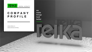
- 1. C O M P A N Y P R O F I L E DIGITAL AGENCY www.reika.co www.behance/reika we make things look better
- 2. REIKA™, Kanji: 麗化 Pronounce: /re:ka:/ in Japanese means Refinement, Making Beautiful. Everything is beautiful in its own way, from such common things to the most marvelous creations and human, in centuries, is trying to ex- press that beauty in Arts, Architecture, Poetry, Drama and even Science. Our team at REIKA commit to follow that journey using the power of modern technolo- gy and traditional craft art techniques to explore, define the beauty of your brand, make it bold and convert into great business improvement. REIKA™ establishes ourselves as one of the most diverse & enthusiastic Cre- ative Digital Agency. Our talents come from various fields: Art, Graphic design, Web development, Mobile app development, Architecture and Digital market- ing; from both Client (Brand) and Agency side; and from different nations which create our diversity and mutual understanding with our beloved clients. 02 R E I K A ’ s S T O R Y R E I K A ’ S S T O R Y 麗化 /’RE:KA:/ N. V I S I O N We are a community of young marketers, designers and devel- opers. Working hard and Playing max are what we do together. M I S S I O N
- 3. 03 R E I K A ’ s S T O R Y C O R E V A L U E S DIVERSITY We do not limit ourselves in specific criterias but welcome all differencies. TECH-SAVVY Born & raised in technolo- gy era, we tirelessly search & embrace new technolo- gy to improve efficiency and your business bene- fits. CRAFT- TECHNIQUES We respect the past and lasting experience from hand-drawing, pencil & paper sketches to market- ing, advertising principles CUSTOMER- ORIENTED Not only a beautiful art- works but also meet sales & financial purposes in every project. The octopus moves skillfully in a realm that is in constant motion. Ever changing, shifting, and wafting in accordance with the pull of the moon, the octopus' depth of mystery is enhanced by it own environmental aura. Although being vastly mobile and quite the traveler, the octopus is primarily a bottom dweller. In symbolic (totem) terms this is analogous of being grounded while still having the ability to exist in the watery world of the psyche. Those with the octopus as their totem would do well to recognize this analogy. It reminds us that we may be spiritual and intuitively gifted; nonetheless we are physical beings and must temper our psychic gifts with strong foundational grounding. – Wyland The world’s finest wilderness lies beneath the waves O C T O P U S V A L U E S 3.
- 4. TUẤN DƯƠNG MIKHAIL DUONG M A N A G I N G D I R E C T O R c e o 04 A B O U T U S A B O U T U S WHO WE ARE WHAT WE GOT A Digital Marketing Agency in Ho Chi Minh CIty, Vietnam 5++ years of experience in the Digital Marketing Digital makes this world flatter. REIKA chooses Digital Marketing to help clients to pour their brands over this flat world with peace and beauty. THANK YOU FOR CHOOSING US :) A community of marketers, designers, developers Our clients have come from Vietnam, US, UK, Australia, Japan and all over the world. Tell the story of brands with digital beauty
- 5. MỸ PHAN HOLLY A C C O U N T D I R E C T O R m e m b e r NA HOÀNG NANA A C C O U N T E X E C U T I V E m e m b e r 05 P E O P L E O F R E I K A VIÊN ĐỖ CANDY PARK W E B D E V E L O P E R m e m b e r O U R T E A M
- 6. O U R T E A M ẤN NGUYỄN KARRY NGUYEN G R A P H I C D E S I G N E R m e m b e r G R A P H I C D E S I G N E R m e m b e r QUYÊN DƯƠNG TACHEMA G R A P H I C D E S I G N E R m e m b e r VŨ PHƯỢNG JULI WU 06 P E O P L E O F R E I K A
- 7. 07 S E R V I C E DIGITAL STRATEGY Online communication strategy Content strategy Social media planning Digital campaign planning Community management Social media execution SEO/SEM O U R S E R V I C E Web design Web development Microsite Landing Page Ecommerce UX/UI Design Mobile Development Email marketing AR/VR Mobile INTERACTION Brand consulting Naming & Slogan Logos / Wordmarks Brand applications Visual identity Packaging & label design Brand environmental Brand content Brand style guide BRAND IDENTITY Concepts Copywriting Content Writing Interactive Technology Marketing collaterals Print advertising Key visual campaign Brochure / Catalogues Editorial design Annual reports Sale kit POSM CREATIVITY
- 8. O U R P R O C E S S 08 P R O C E S S PROJECTS BRIEF QUOTE RESEARCH /CONCEPT SKETCHES & DESIGN FEEDBACK /REVISION CORRECTIONS TO SELECTED CONCEPT FINAL ARTWORKS FILES DELIVERY & PAYMENT AFTER SALES - 30 DAYS - 365 DAYS FINAL ARTWORKS
- 9. 09 C L I E N T S O U R C L I E N T S
- 10. W O R K S
- 11. Tavie Cafe et Boulangerie's flagship store founded in 2016 with passion with genuine classy robusta from Dalat Highland and high-quality Cau Dat farm's tea dedicates to change people taste and mindset of viet- namese coffee. Customers enjoy marvelous pleasant smell coffee cups that're carefully processed by Thuy Vy, founder of Tavie following tradi- tional craftmanship in sweet classical music. Tavie Cafe et Boulangerie is designed to remind a long-lost French colo- nial Saigon mixed with some fresh air of modern days. Old typefaces from colonial era are used to create the wordmark of logo and all print promotion materials. Dozens vintage decoration floor tiles are studied to build the key visual that brings relaxing feeling and enhances mood. Other than that, we focus on the natural fresh origins of products using wide range color palette of green and brown. Tavie moves ahead and welcomes the minimalism which provides us plenty of open space to ex- plore new design concepts & creativities. The coffee journey of Tavie will be a long interesting adventure and we are proud to be a part of it. T A V I E CAFE ET BOULANERIE B R A N D I N G 11 W O R K S
- 12. 12 W O R K S TAVIE-CAFEETBOULANERIE
- 13. B R A N D I N G 13 W O R K S
- 14. Brandbassador is a freelance brand management agency. Red color is for the Heart enthusiasm. “B” is for the Best and Brandbassador is for the Ambassador of Brand supporting. When customer came and asked REIKA for a brand identity set designing, her inspiring brif has touched us immediately. What REIKA did is just shaping all her ideas with comprehend- ing and appreciating her passion of branding. B R A N D B A S S A D O R 14 W O R K S
- 15. BRANDBASSADOR
- 16. 16 W O R K S
- 17. Phu Van Tea is a brand of tea providing premium, authentic tea products located in the North of Vietnam, where the tea trees grow best thanks to the ideal weather and environment condition. The brand name idea comes from the image of the fluffy clouds floating among the mountains. REIKA helped to bring that nice idea into real package of branding and packaging. The clouds and tea leaves were mixed to create a Logo. With elegant and soft lines, this brand identity package will bring the delicate and light feeling to viewers. This effect also make customers comfortable, like when they enjoy a cup of tea: balance and peace. Drinking tea is like a spiritual adventure. The adventure of flavor, smell, and the memories of the origin of that flavor. Every things come from Phu Van Tea will invite drinker to re- member the place with layers and layers of mountains with the clouds floating up above. And this invitation is pictured in REIKA’s designs. P H Ù V Â N T E A SPECIALITY OF VIETNAM B R A N D & P A C K A G I N G 17 W O R K S
- 18. 16 W O R K S
- 19. B R A N D & P A C K A G I N G 17 W O R K S
- 22. RECEPTIONIST RE-BRANDING America’s most famous answering service, estab- lished in 1956 Belles provides your customers with the best pos- sible telephone experience BELLES has been caring about needs of con- sumers for a long time, since 1956. She is symbol of detail and enthusiasm. Everything has changed so much from the begin- ning, now she wants a new “face” to stand beside the modern Partners. REIKA did gave her full package of new brand identity to open new view of classic business. B E L L E S Receptionist Service 20 W O R K S
- 23. Receptionist Service 1b 1b 17b 8b Receptionist Service 1.5b 14b 14b1b 6b Receptionist Service A B C D E F G H I J K L M N O P Q R S T U V W X Y Z a b c d e f g h i j l m n o p q r s t u v w x y z 0 1 2 3 4 5 6 7 8 9 !@#$%^&? BEBAS NEUE A B C D E F G H I J K L M N O P Q R S T U V W X Y Z a b c d e f g h i j l m n o p q r s t u v w x y z 0 1 2 3 4 5 6 7 8 9 !@#$%^&? SOURCE SANS PRO B R A N D I N G 21 W O R K S
- 24. 22 W O R K S
- 25. B R A N D I N G 23 W O R K S
- 26. VIETNAM ACTIVATION St Louis-based car-rental company Enterprise Holdings will be soon be heading to Vietnam with a franchise agreement with MP Logistics. REIKA gives a hand to design & develop marketing mate- rials & landing page for Enterprise’s activation in APEC 2017 held in Danang from Nov 6, 2017 to Nov 11, 2017 E N T E R P R I S E ™ 24 W O R K S
- 27. W E B S I T E 25 W O R K S
- 28. 26 W O R K S
- 29. W E B S I T E 27 W O R K S
- 30. WEBSITE iSchool™, an online learning website which con- nects students and teachers through 1-on-1 tu- toring or online video course is going to be re- leased in 2018. Designed and developed by REIKA, iSchool™ will be available on Android, iOS & Desktop web-app. The idea behind iSchool™ is simple: a platform in which, students and (freelance) teachers connect with each other, communicate, teach & make payment via iSchool™. Teacher can sell video courses as other online learning websites as well as arrange schedule for 1-vs-1 lesson using inte- grated Google Calendar. iSchool™ is an out- sourcing product crowdfunded by warm-hearted dedicated teachers & tutors in Vung Tau city rep- resented by Mr. Ngo Ba Dat. I S C H O O L ™ 28 W O R K S
- 31. W E B S I T E 29 W O R K S
- 32. 30 W O R K S
- 33. W E B S I T E 31 W O R K S
- 34. WEBSITE EtonHouse At Thao Dien is an investment by E-Maison Education Company based out of Sin- gapore. The school is the first of three pre-schools to be built by the group for the next five years in Vietnam. Among plenty of schools for kids in Ho Chi Minh city, how REIKA can build a remarkable website for EtonHouse at Thao Dien? In order to have the answer for this question, our team researched a lot of schools in area and found out the solution. A place for kids is school, but the website of school is for parents who care about the place their kids playing and learning. REIKA has chosen the bright colors with clean and clear space to put into the website. This layout will show viewer the impression of comfort and free environment, that brings calm and peaceful feeling. E T O N H O U S E ™ 30 W O R K S
- 36. 32 R E I K A ’ s S T O R Y
- 37. 33 R E I K A ’ s S T O R YW E B S I T E
- 38. GAME MOBILE APP G O ‘ N ’ G E T I T 34 W O R K S
- 39. 35 A P P R E I K A ’ s S T O R Y
- 40. 36 W O R K S
- 41. THANK YOU FOR CHOOSING US! T H A N K F O R W A T C H I N G 37 C O N T A C T
- 42. THANK FOR CHOOSING US! REIKA Co, Ltd. 21 Nguyen Trung Ngan street, District 1, HCMC 01299475534 ask@reika.co A. P. E.