Powerful Google developer tools for immediate impact! (2023-24 C)
Media 8
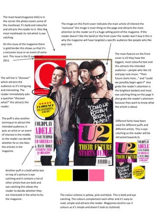
1. The mast head (magazine title) is in
the corner the photo covers some of
the masthead. It’s bold and colourful The image on this front cover indicates the main article of interest the
and attracts the reader to it. Also like “exclusive” the image is main thing on the page and attracts the most
most mastheads its red which is eye attention to the reader so it’s a huge selling point of the magazine. If the
catching reader doesn’t like the band on the front cover the reader won’t buy it this is
why the magazine will have targeted a specific audience like people who like
On this issue of the magazine there pop rock.
is gold border this shows us that it’s
a exclusive issue or an event of some
The main feature on the front
sort. This issue is the Q awards of
cover is U2 they have the
2011.
biggest, most colourful text and
this attracts the intended
audience – people who like U2
and pop rock music. “Their
The sell line is “discover” future starts here…” and “could
which attracts the we possibly begin again?” also
audience as it’s intriguing grabs the reader’s attention is
and interesting. The the brightest boldest and most
reader immediately asks eye catching thing on the page it
a question “discover also grabs the reader’s attention
what?” this attracts the because they want to know what
reader. the article is about.
The puff is also another
Different fonts have been
technique to attract the
used for different puffs and
intended audience; it
different artists. This is eye-
puts an artist or an event
catching so the reader will be
of interest in the middle
attracted towards Q.
so the reader can decide
whether he or she likes
the articles in the
magazine.
Another puff in a bold white box
on top of a picture is eye
catching and it contains a list of
other artists that are bold and
eye catching this allows the
reader to decide whether they
are interested in the artist to bu The colour scheme is yellow, pink and black. This is bold and eye
the magazine. catching. The colours complement each other and it’s easy to
read, simple and attracts the reader. Magazines tend to use 3
colours as it’s simple and doesn’t look to cluttered.