
Empfohlen
Weitere ähnliche Inhalte
Andere mochten auch
Mehr von rebecca-paterson
Mehr von rebecca-paterson (20)
Kürzlich hochgeladen
Kürzlich hochgeladen (20)
Media 13
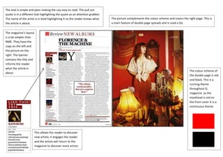
- 1. The text is simple and plain making the coy easy to read. The pull out quote is in a different text highlighting the quote as an attention grabber. The name of the artist is in bold highlighting it so the reader knows what The picture complements the colour scheme and covers the right page. This is the article is about. a main feature of double page spreads and is used a lot. The magazine’s layout is a lot simpler than NME. They have the copy on the left and the picture on the right. The banner contains the title and informs the reader what the article is The colour scheme of about. the double page is red and black. This is a running theme throughout Q magazine. as the masthead is red on the front cover it is a continuous theme. This allows the reader to discover new artists; it engages the reader and the artists will return to the magazine to discover more artists.