SlideShare ist ein Scribd-Unternehmen logo
1 von 27
 
Ranking 1: Mooncat Photo 1 Photo 2 Photo 3 Photo 4 Photo 5 Our political statement was "pro-choice" (supporting keeping abortions legal).
While your photos probably looked the most professional out of the bunch, I was turned off to them simply because they were all very cliche. You’ve got the professionalism down, but you need to work on task interpretation and creativity.  I’d really like to see something like what you did for the conceptual shoot.  They were professional, intriguing, and creative. Those looked like they deserved a spread in a magazine. You know the saying “great idea, poor execution”? Well you guys kind of have that backwards with great execution, poor idea. While your model is incredibly gorgeous and perhaps the most model like of the bunch, she really needs to work on conveying emotion. The photos themselves look heavy with emotion, but the model’s face is general the same and non-expressive. I’d like to see more passion and expression from the model. Overall the photography is excellent and I would start experimenting with zooming in and taking some close-ups. Especially when working with an emotional set of photos, facial close-ups can be really intriguing and get the point across. Overall, this is a pretty good set, I just think that you should be pushing the boundaries more and when I say pushing the boundaries I don’t mean by touching on more controversial topics or more provocative photos (you’ve got that down), but by coming up with more creative ways to express your message. Photo 1: My main problem with this photo is that it doesn’t actually fit with your message if you aren’t doing a storyline, which you mentioned in the thread that it wasn’t. If I hadn’t known that your issue was specifically abortion, my mind would simply have associated this photo with pregnancy and no further.  Maybe she’s sad she’s pregnant or maybe she’s sad because she isn’t pregnant. I’m not sure how you would do this artfully, but maybe some sort of indication that the test came out positive would have expressed the abortion side better? Although it could still be about unprotected sex or something of the like. I think you might’ve been able to get away with the photo being a bit vague, if it hadn’t been your first photo. I’m not sure that many teams recognize this, but it’s actually important what order you turn your photos in. The first photo should be one which makes it loud and clear what your issue/theme is. Aside from that, the modeling and photography isn’t bad. The set up isn’t that interesting and the photo is a bit plain. I would of played with the angle to capture her emotion better. Photo 2: This is by far my least favorite photo for several reasons. First off, words are a cop-out and ripping pieces of paper with one’s dreams written on them is even more of an easy way out as well as a cliche. Additionally, the model’s face is pretty much devoid of emotion.  She looks haughty, if anything. The angle is interesting, although I’m not sure it looks very professional. The biggest problem is simply the lack of emotion, meaning, and incredible cliches of this photo. Photo 3: This photo is most definitely striking and your model looks incredibly pretty, but again it’s not very provoking or interesting. While it’s definitely done more artfully in this photo, you’re still using words to get your point across. Additionally, while I do like the framing, the location doesn’t really add to the meaning of your photograph. My other biggest problem is that, other than the mascara running down her face, there is no emotion in the model’s face. She’s simply staring at the camera and it really doesn’t look like she’s been crying.  Her body language also fails to contribute any emotion to the photograph. I think it’s a nice photo, since it looks good, but the modeling and set up don’t really cater to the task or portray the message. HEAD JUDGE: Kris Ramos, 2
Photo 4: I like the contrast in this photo as well as the shadows. It’s also an example of using negative space to your advantage and overall it's a nice looking photograph. However, again, you used a cliche way of expressing your theme. Handcuffs can be used for pretty much any statement that involves some sort of oppression, which is quite a few. I also would have liked to seem some tension in the model’s hands. Nevertheless, it’s a nice photo, you just need to push your boundaries more.  Photo 5: This is quite...provocative, and I’m not sure it’s really necessary. I know it’s true that women really do try to abort their babies by themselves using hangers, and it often, and unsurprisingly, ends in a gory death, however, I don’t this photo is well-done enough to make up for the fact that it’s gory and controversial. It’s like on my school paper, if we’re going to publish an article that incites controversy, it better be amazingly written, not simply good. Same goes for photography, this photo isn’t nearly good enough to cover how explicit it is. There’s no real location, the angle is awkward, and the cropping is bad. Additionally, the model has absolutely no expression on her face. There’s actually no emotion here, rather, it’s simply some provocative gore.  Photography Judge: Nick Sullivan, 2 Your photos were all exceedingly well done and elegant, save the last, which could have been slightly less graphic, but I think you could have stretched your abilities a bit more. None of the photos really seem to break the status quo, exempting, again, the last photo, which was more than shocking enough. I really liked your fourth photo, even though some may say it is cliche. The first photo is quite well composed and the expressiveness of it is unmatched in the others.  Photography Judge: Kaitlyn, 1 You really took the plunge this week. You weren’t afraid to be bold, or offensive. Sometimes that’s what political art needs: offense. Frankly, I wrinkled my nose at many of my photos, and while they offended my senses, that in no way made the photos any less spectacular. You took my advice on pushing through and exploring your limits, and it really paid off. These photos tell a very coherent story, and it’s a tragic one at that, one that shows that dangers of making abortion illegal.  I really admired your use of black and white to highlight hopelessness, and especially liked the set up of the first photo. It looks like just a normal snapshot, but its clearly very excellently staged. Amazing work this week, I’m really in awe.  You varied angles and positions, as well as locations, making for a very interesting, but cohesive set.  Summary:  Excellent- Use of Black and White, Lighting, Costuming (the model really looks pregnant!), Variation, Storytelling  Needs Work- Can’t think of anything ;D  Photography Judge: Sandy, 1 Critiques unavailable this week
Modeling Judge: Cassandra, 1 Once again Mooncat has wowed us with wonderful pictures. In their first photo the model’s pose is great and we can feel the emotion that she is trying to communicate, really drawing us into her photo. The only issue that I can find with this one is how dark the model’s shirt is; while this usually isn’t an issue, with the way she has her left arm folded under her right and all the shadowing on it it makes everything between her right arm and legs seem to be a big blob of shadow. I found the second photo of their set to be the lowest quality picture they turned in. The model’s pose seems too “tight” and it looks like she’s faking tearing the papers. The emotion just wasn’t there as much as I know it could be and I would like to see her push herself a bit harder to make sure she always convinces us of her emotions. I also found this photo to be the least convincing in there being a child inside of her; it just seems awkwardly lumpy and lopsided. The third photo is very well played out as well; her pose is beautiful and we can really feel a good amount of emotion from her although I believe she could have tried a bit harder. This team’s fourth image is really great. The model is holding her stomach wonderfully and with what little she had to use as far as emotion she really did a great job at showing us how she feels, I love the prop you used as well - it’s not subtle but it’s not tacky. Out of their first four photos I found the last two to be the best at communicating the message they were trying to convey and the first two did a good job with communicating.  This team’s final photo was very blunt and in your face and I appreciate their boldness and willingness to shove their point in our face. They didn’t play it safe and that is a very good technique to have in a competition. I love the model’s pose although I wish that she had her left hand a tad further back as it seems a bit lost behind her leg. I love how her “blank” emotion isn’t simply not there but purposefully empty; it helps to draw us into the photo and it’s convincing. Unfortunately I do not think that this photo worked in their favor as far as communicating their point on abortions being legal. When people would look at the photo on an abortion standpoint they would see all the blood and would register it with torture and pain and it honestly helps to convince people to not have abortions instead of to have an abortion. This type of photo would be more suitable for a pro-life standpoint than a pro-choice standpoint. I honestly do love the attention to detail they put into this photo though and it is truly convincing and amazingly done. I must say that this team did an impressive job. Overall they have done a great job throughout the entire competition and we can see them getting better. The model has fantastic skills with posing and expressing emotion and they did a good job with following the line of being pro-choice. They just need to keep chugging along and getting better until they completely blow us away.  Three words: bold, haunting, brilliant. This photo set is my hands-down favorite this week. I love the story and how each picture adds something to it; I could easily see this being a several-page spread in a magazine. In every single photo I could feel the sense of anguish, even the ones that didn't show the model's face, which is pretty impressive. I applaud this team for really going out on a limb with this task and not being afraid to step on some toes, committing fully and entirely to creating amazing art. I loved every single picture from them!  Modeling Judge: Shawn Keeney, 1 Modeling Judge: Momo, 1
Photo One; I just want to start out by saying I feel this is the best set introduced to us so far. It's chilling and really, really portrays your theme well. Wonderful job. In this picture, I really get hopelessness. The stray hair through the fingers, the drab outfit choice (greys and blacks), the hunched over position are all wonderful indicators. My only concern is her back foot has disappeared in the wide-legged pants. And I like the splash of color of the box-- it really brings attention to it, and you can clearly see the cause of her misery.  Photo Two; My main concern here is the model's face. I see a sense of quiet acceptance that all her dreams have been torn apart. I'm not sure whether I really like this or not, when all the other pictures really scream 'misery'. It's a nice break, but it doesn't quite fit. Other than that, though, I like the faint hint of a pregnancy around her; you can clearly see the belly swollen. Her clutch on the paper seems strained.  Photo Three; I don't understand why she's in a forest, but it's pretty? You can clearly see the pregnancy and her misery. The "mistake" on her shirt is wonderful, and it's reflected in (and around) her eyes. The smeared mascara is always a nice touch when done subtly. She looks like she just got done with a huge crying session-- even the look on her face, I've seen it before, right when someone's done with crying and filled with anger at whatever made them cry. She's looking directly into the camera and that's a risky move, but very powerful in breaking the fourth wall (which is what you want to do for political things, make the viewer relate/understand/feel included). Her curled-up pose shows her trying to protect herself, almost, from something.  Photo Four; The shadows are really what made this an awesome photo, paired with the handcuffs. It really looks like she's been jailed by nature, almost-- the shadows the bars. The limpness in her hand shows a sort of defeat, and cradling the baby, I see no love, just perhaps to relieve some strain on herself. There are no strangely cut-off parts of floating limbs. The marks around her lower wrist show she's been struggling.  Photo Five; This is a crazy photo. It left me speechless when I first saw it. "Did she really go there?" Yes, you did, and with passion. It wasn't a half-arsed picture. The home-abortion is terrifying and you brought it to life in a picture. The washed out look to everything, the silky robe, they all add different aspects to the picture. It's hard to describe except striking. Especially her face-- she looks almost dead, yet there's a small sense of relief there.  Portrayal; Wonderful portrayal in all of the photos. You really got the meaning across.
Ranking 2: 1867 Photo 1 Photo 2 Photo 3 Photo 4 Photo 5 Proposition 8 was a constitutional amendment that was passed in November 2008, stating that, "only marriage between a man and a woman is valid or recognized in California." Although the amendment did not affect homosexual marriages performed before November 2008, it did affect the future rights of same-sex couples. On August 4th, 2010, Proposition 8 was overturned by a judge issuing an injunction against enforcing Proposition 8, for which the ruling will hold pending appeal.
My favorite part about your photos, is that I really felt you had a personal connection to them. It really seemed like you believed strongly in your statement, which is what this task was all about. I liked the variation in your photos, although I’d be careful about straying too far from your topic/concept like you did in one of your photos this week which I’ll explain later. For the most part, your model has expression and body language down and your photography has also gotten a lot better throughout the competition. I love how you guys continue to progress.  It’s obvious that you read the critiques every week and really pay attention to the advice that the judges give you. While your photos weren’t the most provocative, I think you did one of the better jobs of portraying your topic and what it means to you. I had trouble ranking first and second this week, but I ended up ranking you first because while Mooncat’s photos were quite provocative and moved me greatly, I think that your photos were actually slightly more expressive. And while your photos may not have the biggest “wow” factor to them, when I individually picked apart your photos for technical errors, I found a limited amount. It also helped that you had my favorite image of the week.  Kudos. Photo 1: The first photo is extremely clean and gets the point across easily. It’s kind of like how teachers tell you to write essays concisely and to the point, this is how it works for photography too sometimes. Although text is most often an easy way out, I feel like it’s done tastefully here. It doesn’t glare at you, rather it’s subtle, and it isn’t the main focus of the photograph at all. In terms of modeling, I think this photo falls a little flat. If the model is feeling ostracized, then her expression and body language should show either some ferocity or some sort of sadness. Here the model is sort’ve just staring off to the side, tugging at her bonds a bit. This photo needs more expression! The photography isn’t bad, although it is a pretty simple photo. The bottom crop should be slightly below the belt and the left side should shave the side of the elbow. The angle in general kind of makes the entire left arm awkward. Moving a couple steps to the left or right would have solved this. One thing to keep in mind, is just because you have a plain backdrop does not mean that the photo has to be taken straight on, you can still experiment with angles. I really love the shadow in the photo though, as it actually adds a lot of depth to this photograph. The color placement of red throughout the photo is very pleasing to the eye, great attention to detail here. Although this isn’t one of my favorite photos of the bunch, it’s still a pretty good photo. Photo 2: Normally I really dislike it when photos are monotone with one spark of color, but it actually really works in this photograph. Your photographer has a real talent of keeping the model’s face out of focus, but still bringing attention to it. I’ve also noticed that you seem to make hands the focal point of your photos a lot. While this has worked really well so far, I’d be careful about falling back on it too much.  Hands are expressive, yes, but they can also be interpreted as somewhat cliche. The lines in this photos are beautiful and I’m especially attracted to the movement in the photograph. The model’s expression is almost dead on, as she looks like she’s trying hard to stop the unaccepted part of her through, however, it actually looks like she has a hint of a smile which I don’t think is appropriate for the photo. Imagery in which the subject is trying to repress a part of themselves is generally provocative and interesting, and you definitely embodied those characteristics here, but I still think that the model needs to be a bit more expressive.  However, remember that expressive doesn’t necessarily mean comedic and make sure you don’t over exaggerate. My only other suggestion is that both the photographer and the model watch the angles more. The model’s right arm looks like it’s kind of bursting from her face. The colors are phenomenal though, and this entire photo really pops.  HEAD JUDGE: Kris Ramos, 1
Photo 3: This is by far your least interesting photograph, and the use of text here is boadering on a cop-out, although I do like the cleverness of the boxes and the fact that you didn’t go with straight or even gay, but freedom instead. It really framed the issue as one of freedom, not necessarily just being gay. The photo is plain though, and frankly kinda plainly boring, and I don’t understand what the model’s expression has to do with the photograph. Like your other photos though, it has a great depth of field. It’s just not a very interesting photograph even though it’s technically good (aside from the cropping of her left hand). Watch your cropping! Seriously, I know everyone probably thinks I’m crazy because I’m also pushing the cropping thing, but how you crop a photo can really make or break a photo, and it actually has a lot to do with tone and visual aesthetics. Photo 4: This is the photo that I think is a bit of a stretch. I think what you’re trying to say in this photo is that the person you actually like is a girl, but I think that message is too subtle here. Granted, it’s an awesome looking photograph with the clouds, lighting, and great framing with the trees, but it simply doesn’t make much sense. Additionally, the model, again, doesn’t have much expression. I really love the framing and the lighting though. I actually think your team may have the best photography and you’re definitely up there in the modeling standpoint. I think the main reason why your photos don’t stand out as much as other groups is that your set isn’t as sophisticated or powerful and you generally have a very limited use of crops and location. Although this photo is my least favorite in terms of concept/task interpretation, I absolutely love the backdrop.  Photo 5: I love love love love love love love love love love love this photo. The weird thing is that in terms of photography this may be your worst photo, but the modeling is so f------ brilliant, it just makes the photograph for me. A lot of the judges were talking in the guild about how they didn’t get this photo, but from what I can tell, it’s saying that the model feels forced into a straight relationship because she isn’t free to be with who she wants to. If I’m right, this photo is true brilliance. Both subjects of the photo are doing exactly what this concept asks of them (seriously, you should get that guy to join Season 2).  I like how the guy is looking at the camera while the model is looking downcast. Everything from her body language to her facial expression screams oppressed. Her expression is both wistful and sad and I like that, while she’s leaning against the man, her body language suggests reluctance and the desire to get away. Wonderful wonderful wonderful modeling here. This is exactly the kind of expression that you need to bring to your other photos; expressive, but not forced. The framing of the photo isnt’ that great and would be a lot better if the bench wasn’t cut off.  The windows and box like thing on the right hand side, look messy and a bit distracting. Otherwise, really amazing photograph.  Photography Judge: Nick Sullivan, 1 Overall, I liked how you expressed your theme, more than I did any other group. Everything you did was very novel and creative, a difficult achievement in a politically themed task. While the last two photos could have been more clear, in the overall context of your shoot they were entirely justified as they were. Wonderful job! The only things that I noticed to be improved would have to be the resolution and focus of some of the shots, and the apparent continuation of the theme throughout the set.
Photography Judge: Kaitlyn, 4 I was really let down by this set. The first photo was amazing! The Second photo was stunning! The third photo was precise! …and then the last two left me scratching my head. What happened?! I don’t get it! You communicated your theme so well in the first three photos and then you just…bottomed out.  Ignoring the last two photos, this set is amazing. Precisely focused with an amazing attention to detail and unique interpretations of the same theme. I loved those first three, especially the name-tag in the first: it’s a small detail, but it really makes the photo.  Summary:  Excellent: Photoshop, angles, visual interest  Needs work: Storytelling, sticking with the theme, pushing through  Photography Judge: Sandy, 3 Critiques unavailable this week Modeling Judge: Cassandra, 4 In the last round this team really kicked it up a notched and impressed me with a sudden burst of improvement; however this round they seemed to have dwindled back down a bit. While I am still pleased with their performance in comparison to the prior entries they really failed to wow me and I was left disappointed. The model’s posing is fairly good, however, it seemed like this week she was lacking in emotion and I couldn’t feel much of anything from her in the first four pictures. She has shown that she is very capable of expressing emotion in her pictures and I would like to see more emotion in each one so that we can feel what she wants us to feel when we look at the image instead of simply looking at an image unemotionally.  In their first image I found the model’s pose to be fair but there is some awkwardness to it that detracts a bit from the picture. The first thing to note is how the model’s left arm is positioned just looks weird – I honestly can’t tell what’s wrong with it but it just doesn’t seem to be a proper position. Another note is how flushed the model looks in the picture; it doesn’t look right and her face shouldn’t look so red like she just got done doing a lot of exercise. This is one of their images that showed the least amount of emotion and I can’t quite tell what she is trying to express; I appreciate the name tag as that really helps to state what you’re going for but she needs more than just a prop to express what she is feeling. With the help of the nametag I am able to understand what the message behind this photo is however I cannot fully relate the message to the theme of gay marriage being illegal though this could be due to me not associating rainbows with homosexuality and not be of any fault to the team. Overall I found their first image to be alright, it’s not interesting to look at but I’m not bored with it.  The second image I honestly didn’t understand until I let the image sink in for a few days. I didn’t hear any of the other judges talk about it so, once again, that’s most likely just me. Now that I understand I find that they did an alright job with delivering their message but it seems more like simply banning homosexuality in general instead of specifically marriage. Despite this, they still did a fairly decent job and I find this to be one of the better images out of the set. The pose is very nicely played and I can’t find anything specifically wrong with this image.
However I don’t see too much emotion in the model’s face but I can tell that there is something there so it’s not too bad. This image is nice to look at and is good at getting attention and making you want to keep staring. I found that this team’s third image was another one of the better pictures overall with posing as well as theme deliverance. The model’s pose is very nice though there is a bit of an issue with the cropping as her knuckles are cut off slightly. The model’s emotion is a lot better than the first two but still needs to be kicked up a notch. The point of the image is very clearly understood but there is still something missing from the image though I am not sure what it is.  As far as a modeling picture goes their best submission is their fourth image. The pose is beautiful, I can find nothing wrong and the mood that the background, pose and partial mouth opening is very surreal. Unfortunately this is also the image in which the model does the worst job at expressing the political statement they chose. I have found two ways to interpret the purpose of the balloon; firstly she could be saying she is having a child as she feels she must be in a heterosexual relationship. Secondly she could be saying that the person she chooses to love is a girl hence the “it’s a girl” statement. However both of these are not understood unless you know ahead of time that she is trying to express her desire to be in a homosexual relationship. When a team submits photos with a theme without captions they need to express their point to someone that has no idea what is going on and that simply was not done here.  Out of all their images, this team’s fifth image was the best at expressing emotion; the model really did a fantastic job at setting the mood. The model’s pose is very well executed and it is fairly clear to understand what is going on. There can however be a bit of a misunderstanding if we don’t know exactly why the model is upset; this image can be interpreted as either she is unhappily married (regardless of gender) or that she got into a fight with her husband and he doesn’t care. Perhaps it could have been made more clear if the model was perhaps holding a photo of a girl she likes or looking at a woman off in the distance. We can see that she is upset though and so at least they did get that across – great work. There were two awkward parts in this image; first the model’s left foot just seems to be in a weird position and takes some time to fully understand and also her left hand has completely disappeared in her sleeve. While this can be alright in some circumstances, it makes her forearm appear to be rather freakishly long and I would have liked to see a bit of her finger tips poking out. This image is interesting to look at but it still isn’t eye-catching enough and needs that extra push to really draw the viewer in.  All-in-all I felt that this team did a fairly decent job although, as I said earlier, they were not up to the level of skill that they have shown themselves to be. They need to remember to keep pushing themselves so they can come out on top and really continue to wow us with their work. The model has done exceptionally well with all her poses with just some tweaking here and there but she didn’t give us as much emotion as she should. She has shown us already that she is great at expressing herself and I would like to see more of that. They did a good job at communicating their theme to us although I feel that they can do better than they did in a few images; they want to make sure that we can understand what is going on even if we do not have prior knowledge to the circumstances. I am still very much pleased with their improvement from the first few entries but they need to keep pushing themselves and can’t afford to fall behind.  Again, I'm having a problem with this team submitting photos that don't really fit with the rest of them. It's like, they'll have two or three amazing pictures and then the rest are just completely out of place. In this set, the first, second, and third photos are really great, especially the first. Then, the last two are throwing me off. Modeling Judge: Shawn Keeney, 4
  I have no clue what that balloon has to do with same-sex marriage, and why wasn't the second model in the fifth another female? Like I said, I've noticed this kind of problem with this team on numerous occasions, but they have shown great improvement from where they began, so I think they deserve to stick around.  Photo One; YES! Someone knows how to use a cami in pictures! No unflattering pouches at all; the model has gorgeous curves accentuated by the tight garment. The left arm is extended wonderfully, I just wish the hand didn't disappear. I enjoy the little details in this picture, and how you made the colors 'pop!' against a black shirt and neutral background. The red comes out nicely in the accessories. The nametag really had a powerful effect. The look in her eyes is almost a sad look. The shadow looks chained, almost, it's hard to describe but I like it.  Photo Two; The splash of color here is AMAZING! My eye is brought directly to the hand. It has a cool, splayed-out shape I really love. I'm glad you chose to use a sepia-ish theme rather than black-and-white (which I tend to find a bit clichéd with color splashes). The model looks happy, and appears to be painting on the rainbow. The right arm is a bit cropped out of frame, but you included the crook of her elbow which successfully kept it from being a strange, floating arm.  Photo Three; The modeling here is OK, and while the message is strong, the posing needs a little bit more oomph to it. I'm not getting much feeling from the face, and her eyes seem a bit unfocused. It may have looked a bit better with her staring at the camera, showing you how confident she is in her choice. There is power in the hand holding the marker-- it's a fist, and drawn back.  Photo Four; While the message doesn't quite ring clear in this (though I think I get it-- "it's a girl" being her choice to be a lesbian), the modeling is gorgeous. Against the backdrop, you can see a really strong outline, nice, long legs, and even with the hat obscuring it a bit, you get a good jawline. The pink on the arms is a really clever touch-- it keeps them from fading into the rest of the model. Good choices here!  Photo Five; I feel this photo stands out the most to me. I really get a strong feeling from it. It's incredibly subtle, and without the theme I *may* not have gotten the right idea (though I also may have, I really don't know), but with it, it instantly clicked in my mind. I feel like this isn't something people focus on--the desire to fit in. And here, because society won't accept her, she's with a man and is obviously miserable. The posing itself is pretty good, but it's the details that get me. Though her hand appears to be missing, you can also figure out that it's tucked into her sleeves--for me, at least, a sign of trying to comfort yourself. A sign of hiding. The leaning away, yet into him, showing her discomfort. The tense-ness in her legs--ready to run away, yet the planting of the feet. Perhaps I'm seeing too far into it, but I really, really like this picture.  Portrayal; Portrayal here, I feel, was wonderful. LGBT rights was easily seen in the pictures, except perhaps the last two, but with the prompt, I was able to figure it out.  Modeling Judge: Momo, 2
Ranking 3: Uh Oh Spaghetti-Os Photo 1 “See no  evil” Photo 2 “Speak no evil” Photo 3  “Hear no evil” Photo 4 “Breathe  no evil” Photo 5 “Feel no evil” For this week's task of choosing a political statement, we picked Censorship. Many governments around the world monitor what it's citizens hear, say, see, and ultimately feel by keeping certain aspects of life a secret from them. It is our opinion that censorship in any country is wrong because citizens deserve a right to make judgements on topics by themselves instead of relying on a higher power to make a decision for them. Every person has a right to choose.  Censorship is defined as "suppression of speech or other communication which may be considered objectionable, harmful, sensitive, or inconvenient to the general body of people as determined by a government, media outlet, or other controlling body." Political censorship occurs "governments hold back information from their citizens. This is often done to exert control over the populace and prevent free expression that might foment rebellion. Another version of censorship is the phenomenon of disinformation which uses "red herrings" to distract people from some other controversial issue." We chose to make use of the color red in our photos as well to pinpoint the topics we were trying to convey.
As an aspiring journalist, I felt the strongest personal connection with your statement, however, I was not blown over by your photos, nor did I feel that I could relate to them much. I think my biggest problem with them, is how cliche they are. The see, speak, and hear no evil phrase is about as common and cliche as you can get, and the other two, breathe and feel no evil, seem kind of forced to fit the program. While I definitely appreciate the cleanliness of your photos as well as the color contrast, I don’t find them very interesting or entrancing. Also, while I do like the simplicity and elegance of your shoot, I don’t think it really fits in with your concept. I like that you used red for “red herrings,” but I think that maybe you should have only done that for the models outfit. A background made of a collage of newspapers might have made your photos more interesting. They’re pretty photos, they’re also just kind of bland. The second thing that really stood out to me, is that while I like the idea of red and black and white contrast, the photoshopping job isn’t done cleanly enough. As someone who gets paid to photoshop photos in various ways, the lining was obvious and messy. I know I’ve said this before, but it needs to be said again: if you’re going to edit photos in any way, it needs to be done cleanly and professionally. A messy job really stands out and detracts from the photos. Overall, I feel like you have really progressed throughout this entire contest, however, I think you need to push yourself even farther. Photo 1: This is definitely my favorite photo of your set, and it’s actually pretty good. Classy and elegant, I think the simplicity of the shoot worked here due to the angle and depth. The model’s lips look full and luscious, and the way her hands are lightly on the blind looks good. Even though her eyes are covered, I feel like she’s staring ferociously, almost burning the covering off. This is one of the better photoshopped photos, however, the outlining of the hair is still messy. First off, not all of the background is red like it should be and secondly, you can see hair underneath some red areas. Utilize the eraser tool to cut in as close as possible and when I do jobs like this, I redraw the hair over the background so that it looks realistic. My only other concern is the model’s wardrobe. I don’t think it’s appropriate to be wearing nothing other than a bra. It doesn’t match your theme and does nothing to better the photo. Photo 2: The lighting in this photos is great and I like how vibrant the red it. The black and white part (the model) is low in contrast though, so the model looks a bit dull. The model’s eyes are certainly compelling and she definitely draws the viewer in, but the angle as a whole is not very flattering. The shadows across her face are distracting and make her nose look larger than it is. Again, I’m not sure how necessary the lack of wardrobe is, especially since the closer to naked you get, the more free you seem. It would have been really cool if you created chains with body paint, or something that added to the overall theme of the photo. Photo 3: I like how you used both the ribbon and the chain as well as the variation of this photo, however, the photoshopping completely ruins this photo for me. It’s so obvious and messy; you even add extra ribbon where there isn’t any (the end where it shouldn’t be rounded). Sorry if this comes off as being picky, but in the professional world bad photoshopping just does not pass and really detracts from the quality of the photo. Photo 4: First off, I’d like to say that your model looks especially pretty here. In the past couple tasks, I have started to see the fierce model that I first saw in your application photo. I also really love the background in this photo and the way it’s falling evenly, however, the photoshopping around the hair isn’t done very well. While I love the way the model’s hands are gripping the HEAD JUDGE: Kris Ramos, 3
ribbon around her neck, the ribbon is photoshopped incredibly poorly and kind of looks like it was completely painted in.  While I love the slight squint of the model’s eyes, there isn’t much emotion in her face overall. There’s a hint of it, like she’s just starting to feel something, but if I were being choked up the way she is, I don’t think I’d be standing there calmly staring at the camera. There should be some sort of anger or desperation in this photo, or something to show how the model feels about censorship. She looks more confused than anything here. Photo 5: Your caption for this photo is “Feel No Evil,” however, the model looks like she’s consumed quite a bit of evil here. I don’t really understand what this photo is trying to tell me, especially when paired with the caption. Additionally the angle is unflattering to the lower half of the model’s body and the feet are cropped awkwardly. I’m also unsure as to why there is a random piece of ground left gray...? Like your other photos, the photoshipping is messy, especially around the bottom of her hair and the right arm. Please, if you’re going to photoshop so heavily, make it look professional!  Photography Judge: Nick Sullivan, 3 Nice theme, novel idea, poor execution. The idea is the most interesting of all these in my humble opinion, but the mediocre photoshopping and repetitive shots made the set less than amazing. I really think you guys could've made this a really amazing shoot, and I was kinda let down after looking through all of the photos. Nonetheless, I commend you on an interesting and thoughtful idea. Photography Judge: Kaitlyn, 3 Like many of the other teams, you went bold this week, and for once I really liked your heavy use of photoshop. You went for the “Black/White/Red” scheme, which is always powerful. Whats black and white and red all over? A Newspaper. What gets censored? Newspapers. Nice work. I was a little bummed that “Speak” and “Feel” were usch similar photos, I would have perhaps changed the angle just to keep up the variation.  Amazing work. You continue to improve and its VERY impressive!  Summary:  Excellent- Photoshop, Color Palette, Lighting, Theme expression, focus  Needs work- Variation (posing, angles, expression, and location)  Photography Judge: Sandy, 4 Critiques unavailable this week
This team has once again really shown us their “stuff” and I’m no longer left wondering what happened to that wonderful model in the application photos. The theme was very well communicated and the model’s posing and expressions really shown through. In the first image her pose is nicely executed and the way she is holding her hands and has her lips parted really helps to express emotion when the eyes can’t. There is a bit of awkwardness in the photo however; the model’s left hand is held weirdly and it makes her fingers look obscure as though two are relaxed and two are tensed which is contradictory to each other. The other issue is how tightly she is holding her arms into her body; it makes there be a rather large crease between her armpits and shoulders and it is just too tight. Aside from that however the picture is very nicely done and the theme of censorship is wonderfully executed. The image isn’t too interesting to look at though but it isn’t boring – I don’t know for sure what is missing from it but the picture just needs a little something extra to really bring it home.  Out of the set the team’s second image is the one I feel was executed the best. The model’s pose is practically perfect with the only issue being cropping and you can really feel a great sense of emotion coming from her. The message is very clearly displayed and it is overall a very lovely picture to look at. This team’s third image honestly didn’t give me too much to judge as it is solely the model’s ear. The message was communicated exceptionally well and it is an interesting picture to look at although, once again, there isn’t too much modeling involved so I cannot honestly judge it from that perspective. The fourth image is posed nicely although there is once again the bad cropping with the model’s hand. She has done a great job again at delivering emotion to the viewer and I am most pleased with this. While the message takes some time to understand they did a good job at communicating it to us and this is overall a picture that is pleasing to the eyes.  In their final image the model’s posing was still well done but there were some parts that needed tweaking. Firstly her left arm is awkwardly positioned in a way that while you can tell it’s bent it doesn’t quite register “bent” to the viewer and it leaves you a tad confused. Additionally, the positioning of her left hand is nicely played out however at that angle her hand should have been turned a bit more upwards to that we don’t see the inside of her hand as her current position is really designed for a front camera shot. Now the model’s right arm seems to be completely eaten by her hair and we cannot see where her arm starts and her body ends which can cause the illusion that they are connected. There is once again a cropping issue with the model’s feet as well as the side of her left arm; when we see most of something we want to see all of it. Unlike the other images the model really dwindled down in this one as far as expressing emotion goes, I can barely feel anything from her. I know that she is wonderful at expressing herself in images and I want her to push herself in this field and continue to wow us. In this image I also cannot see too much of their theme of censorship. While the model is censored on her body it doesn’t really communicate that and it looks more like she is simply standing there waiting for something to happen instead of feeling like there is something censoring what she can have. Perhaps this image should have been played out differently such as binding the model to herself so she literally can “feel no evil?” In this image I really felt lost on their theme.  All-in-all I am pleased that this team has continued to push themselves to get better. They keep stepping it up a notch and have really begun to show us just what they can do when they put their minds to it. The model is very good at posing and just has a few more things to look out for and she has truly shown us that she is excellent at showing emotion. They also did a really good job with following a theme and showing their statement on censorship. They just need to keep on chugging along and getting better as they have been.  Modeling Judge: Cassandra, 3
This team has really stepped it up for me this task. This photo set I could also see as a spread in a magazine. I like how each photo creates a sense of being restricted or confined in some way. My only critique would be that the third photo is a bit too focused on the ear, making it a bit difficult to discern what the picture is even about. I think the model did a really good job with her facial expressions, considering that's the main thing she had to work with in the shots, conveying emotions clearly and effectively. Good job, and most improved this week for me.  Modeling Judge: Shawn Keeney, 2 Photo One; Let me start out by saying I was impressed with the improvement of this team! They're much better than previous entries. Good job! This is my favorite out of this set, as well. The first thing I notice, other than the brilliant red, is how gorgeous the model's lips are. Very lush, I'm always so jealous when people can pull off the heavy stuff like that. It gives a nice focal point other than the red and a wonderful outline. I really like how the hands frame the face-- especially on the left, it almost seems as if she looks like she's trying to see (if you're like me, aka pretty much blind, and you have your glasses off, sometimes you find yourself rubbing your temples and squinting. At least, I do.). My only concern with these would be stray hairband around the wrist. It looks accidental!  Photo Two; I like this photo, but I feel the whole-body-taped bit should have been saved for the end. This would have benefited, in my opinion, from just being a headshot. Other than that, it's OK, the left arm looking completely removed at the shoulder (due to the hair), and the right arm cut off at the elbow (though there's a bit of the crook of her elbow there to save it from being a floating-arm).  Photo Three; As a modeling judge, there's not much for me to judge here. It's a cool idea, but I can't tell what the hands are supposed to be doing, and at first glance it's hard to tell what's going on. The chain was a nice touch, though.  Photo Four; I like the body language in this picture. She really seems to be clawing at her throat--at the binds. Her mouth is closed, showing the silence. I'm glad you highlighted the 'band', because I feel that I may have missed it at first though-- it's small, and the red saves it from disappearing. The face is a mixture of sadness and apathy; she looks a little sad, but the eyes just aren't selling it for me.  Picture Five; The loose hair adds a wonderfully wild effect, but be careful! It cut off her arm at the shoulder once again, on the left. It makes her arm look just like a part of her side, not a separate limb. The model looks a bit evil here, and I'm not 100% sure why. I get restriction from it-- she would be fully exposed if not for the tape-- and I feel this is what corresponds to the title, "Feel No Evil". In my mind, the evil here is the impure thoughts associated with nudity, and the red tape is covering it up. This may be way off track, though.  Portrayal; The portrayal was pretty good. I definitely got censorship out of most of the pictures.  Modeling Judge: Momo, 3
Ranking 3: the Lost Girls Photo 1 Photo 2 Photo 3 Photo 4 Photo 5 We went with religion in schools. While it's not directly something we've dealt with (we were both educated at home) we've had a taste of it and have had to deal with discrimination in many other areas of our lives.  We're pro 'free expression of religion' but chose to express it in a way that it wasn't. Such as the table being full of things obviously not allowed at school, and having the bible along with them.
Your performance this week, was a bit of a let down for me. Your team has the highest quality photo by far, and I’m starting to wonder if you’re relying too much on the fact that your photos naturally look sharper and therefore, of professional quality. Your photos are always crisp, and a definite relief to look at. This week, however, while your photos were crisp, your team didn’t really nail the task. The biggest problem is your concept portrayal. First off, without your explanation, I would be completely confused as to what your photos are about. The first three have something to do with religion and school, while the last two don’t suggest a connection to school whatsoever, other than the fact that the model is wearing something that could be considered a school uniform. Additionally, it’s confusing as to whether you are for or against religion in schools. In your explanation you say that you’re pro religion in schools, but some of your photos seem to portray the opposite. You also don’t have a single photo that really clearly represents your topic and your stance on it. This lack of clarification is what really hurt you this task. I think it’s safe to say that this week was merely a slip up for you.  I just hope you come back with some fire next week. Photo 1: This is a very pretty photo of your model, however, it’s also a little plain. Like I wrote in Mooncat’s critique, it’s really important that your first photo sets the stage. It should make it completely clear what your issue is and what your stance is on it. Aside from that, the photo is just kind of boring. I really don’t have that much to say about it. Photo 2: This is probably your best photo when it comes to interpreting the task. It clearly gets across that religion is banned in schools since it’s with a bunch of banned items in detention. It’s also clear that the book on the table is a bible since the cross is on top of it. I actually like the unique angle here, mainly because it works with the cropping which is done evenly as both sides of the table are equally put. This is an example of a well-cropped photo that is straight on and plain. The model doesn’t really do much for me here, and she doesn’t really add any meaning to the photo. She has a beautiful portrait, but her expression doesn’t bring any emotion to the photo. Photo 3: This photo is by far the best photography and if I were judging simply on nice photos, this would be my favorite of your set. The lighting and the shadow reflection is simply awesome. The photo is also really well balanced. Unfortunately, it doesn’t really match your concept. It seems like the model is being forced into prayer and oppressed by religion. Since your message is supposed to be the exact opposite of this, the photo is misleading. Additionally, the model is pretty expressionless. This task was pretty emotion/tone based, so the fact that the model hasn’t conveyed any mood isn’t good. Photo 4: This photo is probably the weakest of the bunch. Other than the uniform it shows no relation to school and if the viewer didn’t previously know that you were holding a bible, it wouldnt’ be evident. The cropping is weird, the model’s stance is really awkward, and, again, this photo shows no emotion whatsoever. Photo 5: While definitely a daring and compelling photograph, it also doesn’t match your topic closely. There isn’t a direct correlation to schools and if the viewer didn’t know that the pledge of allegiance was actually banned from some classrooms, I don’t think the relation is there at all. This is a creative use of words, but as I told many others this task, words are generally a cop-out.  HEAD JUDGE: Kris Ramos, 4
You also used words to get the point across in at least one other photo, which isn’t something you want to rely on. As with all your photos this week, this photo lacked in emotion. The model looks frightened and uncomfortable and I don’t quite understand why. Photography Judge: Nick Sullivan, 4 The first three photos are good, but then the last two don't really continue the theme. I wasn't really certain whether you were pro or con religion in school, and that’s a major issue when the set is based on a side. Also, there's nothing about the photos that particularly stands out, which is also an important factor in this competition. The photos were okay, but the expression of your theme could have used a lot of work.  Photography Judge: Kaitlyn, 2 I’m SO GLAD you took my advice. You moved around! You took amazing photos! Five amazingly different photos. All of them spoke to your theme (which was very unique, nice work), and I especially liked the last one. You took a step over the edge, and the soared marvelously. Burning the pledge of allegiance is a powerful statement, and I liked it a lot.  I was most happy to see you in five unique locations, but as usual your photos are wonderfully lit, posed, and angled, all to make a very pleasing set. I can find few flaws in these photos.  Summary:  Excellent- Lighting, Location, Variation  Needs Work- Can’t think of anything ;D  Photography Judge: Sandy, 2 Critiques unavailable this week Modeling Judge: Cassandra, 2 This team has once again turned in a very lovely set of photos. In their first photo the model’s pose is very nicely executed and you can see a good deal of emotion coming from the model though I would’ve liked to have seen more. The way the model’s skirt is folded up is a tad distracting though as it appears it is caught on something but there is nothing there. I felt as though this picture was the best they turned in as far as communicating their political statement. Just about everyone associates a library with school and the “shush” motion as a “please don’t tell;” great work. This team’s second photo really bugs me. The reason why? I can’t find anything wrong with it. Her pose is beautiful and just shows that annoyance that comes from getting sent to detention, especially if you didn’t do anything wrong in your eyes and her face exemplifies that emotion. The set is great and the subtle use of props really helps to tell a story as well as her placement on the bible showing the point of this shot. The second photo is just wonderful all-around.
In the third photo her pose is very good and you can get a real sense of emotion from her. Unfortunately the theme seems a bit lost in this photo. If they are going for a “religion shouldn’t be banned from school,” then why does she seem to be forced to pray? I can understand a bit how this can work the other way around but it really does seem like this is more of an against religion view. It is a very lovely picture none-the-less however. Out of the lot I found the fourth image to be the lowest quality although it is still a decent picture. Her pose is of average quality although it is nice in a sense. I found the jacket hanging halfway on her left arm to make her arm look really bulky and the bending of her left leg just seems awkwardly boneless; I think it would have been a bit better if her foot was hanging down instead of curved with the leg. All the flags help a little in putting you into a school zone although it is very subtle, additionally with the distance that we have it is hard to see that she is holding a bible and it looks more like a regular book. Because of this it’s hard to see a political statement in this photo.  I first want to point out that I appreciate the effort that the model put into this by being willing to hold a piece of flaming paper. Unfortunately it did not work for the political statement they were going with. Since the model is holding it and her face seems to be more possessed than anything it is almost as if she is saying she wants to destroy the Pledge of Allegiance where it says “under God” which is the opposite of what the team was trying to communicate. Her pose is very well done however and I love the look that she is giving us; I just don’t feel it worked for what they were doing. Overall this team did a very wonderful job, the model once again wowed us with her posing etiquette as well as emotional communication. She still has some more tweaking to do and they need to make sure that they stay on subject in the rounds to come. Make sure that every image submitted makes sense to the viewer and that they know what you’re going for.  Although the pictures themselves are nice, they really don't fit with the issue they chose to address. There's no clear story or sense of cohesiveness among the shots, making it a bit disjointed and confusing. I had to keep reminding myself of what they were portraying, which I'm remembering was a no-religion-in-schools argument. As I said, the pictures themselves were good, as always (I especially like the weird leg bend in the fourth photo), but they need to remember to stick to their theme. Not the best I've seen from them, but they've more then proven their ability to create great pictures, so they shouldn't be condemned for one off shoot.  Modeling Judge: Shawn Keeney, 3 Modeling Judge: Momo, 4 Let me clarify first that the reason this is ranked so low is because I was terribly confused from most of the pictures. I couldn't understand what you were trying to convey in most of them. The last picture was pretty much the only one where I got a semblance of an idea. The modeling was wonderful, however,  Photo One; I figured this was just a Christian librarian telling her students to hush up. The face looks a little distracted, which I can get a bit of a 'I'm on the lookout because I shouldn't be doing whatever I'm doing', but other than that I see nothing but a lady with a bible trying to shush others. The silhouette's a bit strange, as well; the way the skirt is bunched at the bottom left makes her look as if she's an amputee.
Photo Two; I get from this picture, "Rebel Christian" (I'm saying Christian in these because I see the bible and connect it to that religion right away, it's just what I think of). Her posing is kind of saying, "Yeah, I brought this stuff, so what?" It's a nice pose, but not what I think you were trying to bring across. She's looking away, making it seem as if she doesn't really care what you have to say. I like the picture, but I don't understand what it should mean (coming from an outsider's view-- I do get how the bible is among the stuff not allowed in school, but from the model, that's not what I understand at all).  Photo Three; I don't understand this one, either. It seems to me that she's a convict/delinquent praying before a meal. The silhouette is wonderful-- with the foresty background and bright light, she contrasts and has a nice outline. Her face is impassive.  Photo Four; The first thing I noticed, was, wow, her right leg looks REALLY bendy and unnatural. The second thing I noticed was that it seems we're at a graveyard, at least, I think. I don't get school grounds at all. I see a hidden cross in the background which leads me to think we're near a church or holy ground; once again, nothing to do with school. It's a nice photo of a girl standing with some flags. Perhaps she's showing us how religious America is?  Photo Five; First of all, major props to the model. This is a terrifying thing to imagine, holding burning paper of all things with a good face. I would have to say this is the best of the photos. I see "under God" is scribbled out, and I wish there wasn't a big hole in the middle so it wasn't so hidden as it seems to be. This seems more school-ish to me; I attach the pledge to school, and paired with the outfit, I understand, "Oh, the pledge of allegiance is bad because it has the words under God in it, and they don't want that..." However, I don't get your stance on it. It almost seems pro-religious oppression because the model almost seems a bit pleased that she's burning the paper.  Portrayal; See the above note. I feel portrayal here was poor at best. I was left in the dark for 4/5 pictures as to what was supposed to be the theme behind the pictures.
Ranking 5: Tegan and Sierra Photo 1 Photo 2 Photo 4 Photo 5 Photo 3 I chose to do pro-life as my political statement because I wanted the challenge of doing something polar opposite of my political views.
I've got to be honest here, I'm more than a little disappointed with your team's performance in not just this task, but throughout the entire competition as well.  I feel like every other team has really stepped it up and given their all for this competition.  We turned down a lot of people for this competition and it really doesn't seem like you're taking advantage of the opportunity.  It's not the camera quality, especially since the quality of your camera actually seems better than some of the competition, rather, your photos simply look unprofessional. While other teams are going all out with props, costuming, and location, your team tends to do the minimal.  It doesn't look like you have a "set."  It looks like you randomly decided to take photos in the comfort of your own home just for kicks. There's a big gap between you guys and the rest of the teams. I hate to be harsh, but I really think that it's warranted here. Photo 1: There is really nothing I like about this photo. Using any sort of sign is a cop-out for expressing your concept.  In fact, pretty much anything with words, unless done quite artfully, is just an easy way out. Additionally, your location doesn't have anything to do with anything. You're standing in the corner of a door and wall, with an annoying light-switch peeking in on one side.  The sweat pants make the model’s legs look weird and I don’t understand why she has such an angry expression on her face. It looks like a photo you took for a school project as evidence that you completed some step in the assignment or something. Photo 2: While I at least understand this photo, it still doesn’t do much for me. I see what idea you’re going for, and granted your model has really beautiful hands (seriously I’m jealous, my hands always look weird in photos), but I don’t think it was done artfully enough to make it unique. The photo is simply flat and kind of boring. Photo 3: This is by far my favorite shot of your set as the model really does look matronly and loving. Again, not to sound creepy, but the model does know how to use her hands gracefully. However, again, the location does nothing for the photo. The model does look nice here, though. Photo 4: Again, the sign really isn’t doing it for me. It’s a cop-out, the model’s expression doesn’t make sense, and the location is just another place in your house. There just appears to be no effort put into these photos. Photo 5: I get this photo, although it’s a little weird. Cradling a holy bible and a baby? You want to make sure that whatever you create as a photograph still makes sense as a whole and doesn’t seem like you’re pushing the issue too much. I also wish the model’s face was more visible, since as is, you can’t tell if the model is gazing adoringly at her baby or not.  HEAD JUDGE: Kris Ramos, 5 Photography Judge: Nick Sullivan, 5 Signs? Really? That's way too much like a cop-out. You guys haven't really done anything that great in a while, and with these last photos, it explains your last place. The best photo is the second, but even there the background is cluttered and the photo is rather mundane and uninteresting. I'm sorry, but you guys have got to go..
Photography Judge: Kaitlyn, 5 I was excited to see these photos, since not only did you do something contrary to your own political beliefs, but you picked something contrary to another team. It was nice to see both sides of the issue. Unfortunately your pictures came out very disappointing.  The signs are done quickly and the flash is harsh on them, washing them out and making them difficult to read. The backgrounds of your photos are cluttered portions of a home, and distract from the artistry of the photo. The lighting in general is incredibly harsh.  I was most disappointed with the fact that the progress you seemed to make last week all but disappeared. :/  Summary:  Excellent: statement choice and commitment  Needs work: Lighting, Location, position, angle, composition  Photography Judge: Sandy, 5 Critiques unavailable this week Modeling Judge: Cassandra, 5 This team didn’t do a terrible job but I wasn’t impressed with the images they submitted. Out of the lot, I found their first image to be the worst as far as posing and their way of communicating their stand on abortion. The way she is holding the sign makes it so we cannot see any of her body aside from some shoulders, hands and legs and, because of this, the legs seem weird in the picture and shouldn’t have been included. Another posing issue in the picture is the model’s hands; since the hands are doing the same thing they should go together in a sense, her right hand seems very relaxed on the paper while the other one seems to be having a death grip which just seems contradictory to each other and does not relate to the message of this picture. In this photo the model is doing a fair job with expressing emotion although it still needs more to it to really get our attention as it still feels rather empty. As far as capturing the theme of making abortions illegal this photo really didn’t hit the spot. It was a good statement to use a line from the bible since that is what most pro-life people do, however “thou shalt not kill” simply says “don’t kill,” not “don’t kill babies.” Unless the viewer has prior knowledge they wouldn’t know you were talking about abortions and you really have to keep that in mind when you are submitting photos for a theme. Overall, their first photo just isn’t fun to look at - I will say it could be worse but this just really isn’t up to par.  The second image is one of the better ones out of the set but it doesn’t give us much to go with. The way the model is holding her hands is beautiful and I can’t find anything particularly wrong with it. This one also did a very nice job on communicating the theme to us although it could get a bit lost to people that don’t notice the placement of her hands over the uterus though I would think if someone missed that then they aren’t paying enough attention. This photo has a nice feel to it but there isn’t much emotion in it, they did good with what they had though. Overall their second picture is interesting to look at and they did a good job with capturing the essence of making abortion illegal. Their third image is alright in an essence and I can see what they were going for; the pose is well done and you can understand the concept of her having a child.
Unfortunately the emotion isn’t really there and the picture just seems to be missing something. As far as being a pro-life statement it is fairly weak since the model does not have much emotion. All we see is a woman that is pregnant; there is no love for the baby thus no reason for us to not want to kill it. Overall the third image is fair but it isn’t too interesting.  Out of all the images in this set the fourth one is the best as far as communicating your argument however it is done rather bluntly with a sign and there is no help from the model expressing the viewpoint against abortions. The pose is fair although, just like the first image, the model’s hand grips are contradicting each other. The model isn’t giving us much emotion and this is overall a rather bland picture to look at. I found this team’s final image to be one of the best out of the set that they submitted. Her pose is wonderfully executed although, once again, there isn’t much emotion in the image and it does appear more like she is simply holding a child while waiting for it’s mother to come pick it up. Regardless of the lack of emotion the image does have a good feel to it and you can imagine a mother lovingly caressing her child and wanting to bring it up in a religious home; unfortunately that’s the path this picture leads the viewer down and that is not what this team was going for. All we see is a woman with her baby in a Godly family, we don’t see an argument against abortion.  Team really hasn’t made much improvement in this competition and that is a disappointment. The model has shown the ability to give us strong poses though sometimes she falters in one or two things and really needs some more tweaking. To improve on this she needs to learn what poses look good and what poses don’t; each person has their own set of what works and doesn’t work for their body. She still needs to push a bit harder as well to get emotion expressing down so we can feel what she wants us to when we look at her images. Emotion can be expressed with eyes, eyebrows, mouth, poses, clothing, props, and so much more. She needs to just try as hard as she can, perhaps evaluate other photos where a model makes her feel a certain way and try to learn what it is that the model is doing that causes it. With more practice I’m sure she can do this fantastically but she just isn’t there yet. As far as communicating their standpoint on being pro-life they didn’t do as good as they could have. They had some elements that really worked but they need to try to find all the different ways they can follow a theme to the tee so that there is no confusion as to what they are going for. All-in-all I appreciate their effort and they did a decent job but they do need to try harder to really impress.  I think it's finally time for this team to go. First and fourth photos...all I have to say is: really? The faces just do not work, and I think that holding signs with lots of wording is kind of like an easy way out. It's sort of like allowing the sign to do all the work that the model should be able to do with facial expression and body positioning. As for the other three pictures, I'm not getting the message they're trying to show us. Anyway, I applaud this team also for picking a side of probably the most controversial issue, but the pictures just are not great.  Modeling Judge: Shawn Keeney, 5 Modeling Judge: Momo, 5 Photo One; The model is covered up by the big board! I can see nothing of her except a floating head, some hands, and hips! There's nothing for me to judge here, really. Her facial expression seems to be anger, but there's a lack of clarity around the eyebrow area. It almost looks comical to me.
Photo Two; It's a bit clichéd, yes, but it gets the point across; especially because the heart is not directly over the stomach, rather, more the 'uterus' area, or so I get from the picture. The dress covers up the model and it's hard to tell. An OK picture. The heart was clearly defined, and I like the purple of the dress, but it blends in easily with the background. More light may have helped.  Photo Three; I definitely got the 'baby' vibe from this, but not so much abortion. I can see where you're coming from; I get a strong, 'loving' feel from the mother, thus "love your baby" could come from this. Without knowledge of the topic, though, I would just go, oh! A pregnant lady. That's nice. But the modeling was pretty good! You did a wonderful job of placing the hands to create the illusion of a pregnant mother. The dress hides the shape of the model, but that helped in this case with the illusion. The face is a bit blank, though. Pretty jawline, lost neck.  Photo Four; This is a shot where the dress does not compliment the model. It hangs loosely off of her frame and makes her look like a blob; she has nice curves, show them, don't hide them! I don't understand her facial expression. She looks like she's trying and failing to smile, or was caught while talking. It's hard to read the sign. The background does not fit; if she has a sign, it looks like she's protesting, thus I would have used an outdoorsy, suburban setting.  Photo Five; I love my baby and I love the bible. That's what I get out of this picture. Or, perhaps you're trying to bring up the child as a religious being. I don't get pro-life or pro-choice out of this. Her neck is completely gone-- not a very attractive pose. The clutter in the background is distracting me from the model.  Portrayal; OK portrayal overall, I felt. In some I was left scratching my head, but out of all of them I at least either got 'baby' or 'no killing' which correlate to your theme.

Weitere ähnliche Inhalte

Was ist angesagt?

Fashion work research sheet
Fashion work research sheetFashion work research sheet
Fashion work research sheetSarahMurrayy
 
As component 1 py_14_sample 12
As component 1 py_14_sample 12As component 1 py_14_sample 12
As component 1 py_14_sample 12Melanie Powell
 
Task 4 final images review portrait
Task 4 final images review portraitTask 4 final images review portrait
Task 4 final images review portraitSarahMurrayy
 
Photoshoot analysis henry
Photoshoot analysis henryPhotoshoot analysis henry
Photoshoot analysis henryAubert Cavallo
 
Top 5 photographs
Top 5 photographsTop 5 photographs
Top 5 photographsaczachor4
 
Portrait photography lee jeffries
Portrait photography lee jeffriesPortrait photography lee jeffries
Portrait photography lee jeffriesLouiseMaher18
 
Photos i didn’t use
Photos i didn’t usePhotos i didn’t use
Photos i didn’t useAmyhill94
 
Claire walsh evaluation
Claire walsh evaluationClaire walsh evaluation
Claire walsh evaluationclairewa
 
Claire walsh evaluation
Claire walsh evaluationClaire walsh evaluation
Claire walsh evaluationclairewa
 
Project Evaluation Unit 4
Project Evaluation Unit 4Project Evaluation Unit 4
Project Evaluation Unit 4Lauren Barrett
 
Evaluation question 2 powerpoint
Evaluation question 2 powerpoint Evaluation question 2 powerpoint
Evaluation question 2 powerpoint gabsgabsx
 
EVALUATION; Question 1
EVALUATION; Question 1EVALUATION; Question 1
EVALUATION; Question 1cathshanks
 
Portrait Photographers
Portrait PhotographersPortrait Photographers
Portrait PhotographersBigCheese1
 

Was ist angesagt? (20)

Photo choices
Photo choicesPhoto choices
Photo choices
 
My film pitch
My film pitchMy film pitch
My film pitch
 
Fashion work research sheet
Fashion work research sheetFashion work research sheet
Fashion work research sheet
 
As component 1 py_14_sample 12
As component 1 py_14_sample 12As component 1 py_14_sample 12
As component 1 py_14_sample 12
 
Task 4 final images review portrait
Task 4 final images review portraitTask 4 final images review portrait
Task 4 final images review portrait
 
Question 2
Question 2Question 2
Question 2
 
Photoshoot analysis henry
Photoshoot analysis henryPhotoshoot analysis henry
Photoshoot analysis henry
 
Top 5 photographs
Top 5 photographsTop 5 photographs
Top 5 photographs
 
Portrait photography lee jeffries
Portrait photography lee jeffriesPortrait photography lee jeffries
Portrait photography lee jeffries
 
Photographs
PhotographsPhotographs
Photographs
 
Evaluation q.1
Evaluation q.1Evaluation q.1
Evaluation q.1
 
Photos i didn’t use
Photos i didn’t usePhotos i didn’t use
Photos i didn’t use
 
Project evaluation
Project evaluationProject evaluation
Project evaluation
 
Claire walsh evaluation
Claire walsh evaluationClaire walsh evaluation
Claire walsh evaluation
 
Claire walsh evaluation
Claire walsh evaluationClaire walsh evaluation
Claire walsh evaluation
 
Project Evaluation Unit 4
Project Evaluation Unit 4Project Evaluation Unit 4
Project Evaluation Unit 4
 
FMP - Inspiration
FMP - Inspiration FMP - Inspiration
FMP - Inspiration
 
Evaluation question 2 powerpoint
Evaluation question 2 powerpoint Evaluation question 2 powerpoint
Evaluation question 2 powerpoint
 
EVALUATION; Question 1
EVALUATION; Question 1EVALUATION; Question 1
EVALUATION; Question 1
 
Portrait Photographers
Portrait PhotographersPortrait Photographers
Portrait Photographers
 

Ähnlich wie Task 4 Critiques

Experiments%20evidence%20template[1]
Experiments%20evidence%20template[1]Experiments%20evidence%20template[1]
Experiments%20evidence%20template[1]shannoncloee
 
Experiments%20evidence%20template[1]
Experiments%20evidence%20template[1]Experiments%20evidence%20template[1]
Experiments%20evidence%20template[1]shannoncloee
 
A2 MEDIA EVALUATION
A2 MEDIA EVALUATIONA2 MEDIA EVALUATION
A2 MEDIA EVALUATIONCaitlin_C
 
Photoshoot (Media Studies AS Level)
Photoshoot (Media Studies AS Level)Photoshoot (Media Studies AS Level)
Photoshoot (Media Studies AS Level)Teddy Smith
 
On going evaluations
On going evaluationsOn going evaluations
On going evaluationsshaniajane
 
Shoot 3 media
Shoot 3 mediaShoot 3 media
Shoot 3 mediaSash13
 
Re shoot of images
Re shoot of imagesRe shoot of images
Re shoot of imagesSeadaM97
 
Presentation1
Presentation1Presentation1
Presentation1broganl4
 
Experiments evidence template
Experiments evidence templateExperiments evidence template
Experiments evidence templateshaniajane
 
As photography entry project
As photography entry projectAs photography entry project
As photography entry projectJoel Griffiths
 
Portraiture photography analysis
Portraiture photography analysisPortraiture photography analysis
Portraiture photography analysisHaiiEmmaa
 
Photography powerpoint final edit
Photography powerpoint final editPhotography powerpoint final edit
Photography powerpoint final editdemibromfield
 
Editing process of my photos2
Editing process of my photos2Editing process of my photos2
Editing process of my photos2bethellison
 

Ähnlich wie Task 4 Critiques (20)

Experiments%20evidence%20template[1]
Experiments%20evidence%20template[1]Experiments%20evidence%20template[1]
Experiments%20evidence%20template[1]
 
Experiments%20evidence%20template[1]
Experiments%20evidence%20template[1]Experiments%20evidence%20template[1]
Experiments%20evidence%20template[1]
 
Photographs
PhotographsPhotographs
Photographs
 
A2 MEDIA EVALUATION
A2 MEDIA EVALUATIONA2 MEDIA EVALUATION
A2 MEDIA EVALUATION
 
Photoshoot (Media Studies AS Level)
Photoshoot (Media Studies AS Level)Photoshoot (Media Studies AS Level)
Photoshoot (Media Studies AS Level)
 
Model Planning 2
Model Planning 2Model Planning 2
Model Planning 2
 
Model Planning 2
Model Planning 2Model Planning 2
Model Planning 2
 
Image choices for my dps
Image choices for my dpsImage choices for my dps
Image choices for my dps
 
Chosen images
Chosen imagesChosen images
Chosen images
 
On going evaluations
On going evaluationsOn going evaluations
On going evaluations
 
Photographs
PhotographsPhotographs
Photographs
 
Shoot 3 media
Shoot 3 mediaShoot 3 media
Shoot 3 media
 
Re shoot of images
Re shoot of imagesRe shoot of images
Re shoot of images
 
Presentation1
Presentation1Presentation1
Presentation1
 
Experiments evidence template
Experiments evidence templateExperiments evidence template
Experiments evidence template
 
As photography entry project
As photography entry projectAs photography entry project
As photography entry project
 
W4 a2 thornburg_s
W4 a2 thornburg_sW4 a2 thornburg_s
W4 a2 thornburg_s
 
Portraiture photography analysis
Portraiture photography analysisPortraiture photography analysis
Portraiture photography analysis
 
Photography powerpoint final edit
Photography powerpoint final editPhotography powerpoint final edit
Photography powerpoint final edit
 
Editing process of my photos2
Editing process of my photos2Editing process of my photos2
Editing process of my photos2
 

Kürzlich hochgeladen

Lucknow 💋 Russian Call Girls Lucknow - Book 8923113531 Call Girls Available 2...
Lucknow 💋 Russian Call Girls Lucknow - Book 8923113531 Call Girls Available 2...Lucknow 💋 Russian Call Girls Lucknow - Book 8923113531 Call Girls Available 2...
Lucknow 💋 Russian Call Girls Lucknow - Book 8923113531 Call Girls Available 2...anilsa9823
 
Gomti Nagar & High Profile Call Girls in Lucknow (Adult Only) 8923113531 Esc...
Gomti Nagar & High Profile Call Girls in Lucknow  (Adult Only) 8923113531 Esc...Gomti Nagar & High Profile Call Girls in Lucknow  (Adult Only) 8923113531 Esc...
Gomti Nagar & High Profile Call Girls in Lucknow (Adult Only) 8923113531 Esc...gurkirankumar98700
 
Lucknow 💋 Call Girl in Lucknow | Whatsapp No 8923113531 VIP Escorts Service A...
Lucknow 💋 Call Girl in Lucknow | Whatsapp No 8923113531 VIP Escorts Service A...Lucknow 💋 Call Girl in Lucknow | Whatsapp No 8923113531 VIP Escorts Service A...
Lucknow 💋 Call Girl in Lucknow | Whatsapp No 8923113531 VIP Escorts Service A...anilsa9823
 
exhuma plot and synopsis from the exhuma movie.pptx
exhuma plot and synopsis from the exhuma movie.pptxexhuma plot and synopsis from the exhuma movie.pptx
exhuma plot and synopsis from the exhuma movie.pptxKurikulumPenilaian
 
Lucknow 💋 Call Girls in Lucknow ₹7.5k Pick Up & Drop With Cash Payment 892311...
Lucknow 💋 Call Girls in Lucknow ₹7.5k Pick Up & Drop With Cash Payment 892311...Lucknow 💋 Call Girls in Lucknow ₹7.5k Pick Up & Drop With Cash Payment 892311...
Lucknow 💋 Call Girls in Lucknow ₹7.5k Pick Up & Drop With Cash Payment 892311...anilsa9823
 
Patrakarpuram ) Cheap Call Girls In Lucknow (Adult Only) 🧈 8923113531 𓀓 Esco...
Patrakarpuram ) Cheap Call Girls In Lucknow  (Adult Only) 🧈 8923113531 𓀓 Esco...Patrakarpuram ) Cheap Call Girls In Lucknow  (Adult Only) 🧈 8923113531 𓀓 Esco...
Patrakarpuram ) Cheap Call Girls In Lucknow (Adult Only) 🧈 8923113531 𓀓 Esco...akbard9823
 
Bridge Fight Board by Daniel Johnson dtjohnsonart.com
Bridge Fight Board by Daniel Johnson dtjohnsonart.comBridge Fight Board by Daniel Johnson dtjohnsonart.com
Bridge Fight Board by Daniel Johnson dtjohnsonart.comthephillipta
 
Lucknow 💋 Call Girl in Lucknow Phone No 8923113531 Elite Escort Service Avail...
Lucknow 💋 Call Girl in Lucknow Phone No 8923113531 Elite Escort Service Avail...Lucknow 💋 Call Girl in Lucknow Phone No 8923113531 Elite Escort Service Avail...
Lucknow 💋 Call Girl in Lucknow Phone No 8923113531 Elite Escort Service Avail...anilsa9823
 
RAK Call Girls Service # 971559085003 # Call Girl Service In RAK
RAK Call Girls Service # 971559085003 # Call Girl Service In RAKRAK Call Girls Service # 971559085003 # Call Girl Service In RAK
RAK Call Girls Service # 971559085003 # Call Girl Service In RAKedwardsara83
 
Hazratganj / Call Girl in Lucknow - Phone 🫗 8923113531 ☛ Escorts Service at 6...
Hazratganj / Call Girl in Lucknow - Phone 🫗 8923113531 ☛ Escorts Service at 6...Hazratganj / Call Girl in Lucknow - Phone 🫗 8923113531 ☛ Escorts Service at 6...
Hazratganj / Call Girl in Lucknow - Phone 🫗 8923113531 ☛ Escorts Service at 6...akbard9823
 
Best Call girls in Lucknow - 9548086042 - with hotel room
Best Call girls in Lucknow - 9548086042 - with hotel roomBest Call girls in Lucknow - 9548086042 - with hotel room
Best Call girls in Lucknow - 9548086042 - with hotel roomdiscovermytutordmt
 
Lucknow 💋 Call Girl in Lucknow 10k @ I'm VIP Independent Escorts Girls 892311...
Lucknow 💋 Call Girl in Lucknow 10k @ I'm VIP Independent Escorts Girls 892311...Lucknow 💋 Call Girl in Lucknow 10k @ I'm VIP Independent Escorts Girls 892311...
Lucknow 💋 Call Girl in Lucknow 10k @ I'm VIP Independent Escorts Girls 892311...anilsa9823
 
Lucknow 💋 Escorts Service Lucknow Phone No 8923113531 Elite Escort Service Av...
Lucknow 💋 Escorts Service Lucknow Phone No 8923113531 Elite Escort Service Av...Lucknow 💋 Escorts Service Lucknow Phone No 8923113531 Elite Escort Service Av...
Lucknow 💋 Escorts Service Lucknow Phone No 8923113531 Elite Escort Service Av...anilsa9823
 
Young⚡Call Girls in Uttam Nagar Delhi >༒9667401043 Escort Service
Young⚡Call Girls in Uttam Nagar Delhi >༒9667401043 Escort ServiceYoung⚡Call Girls in Uttam Nagar Delhi >༒9667401043 Escort Service
Young⚡Call Girls in Uttam Nagar Delhi >༒9667401043 Escort Servicesonnydelhi1992
 
Charbagh / best call girls in Lucknow - Book 🥤 8923113531 🪗 Call Girls Availa...
Charbagh / best call girls in Lucknow - Book 🥤 8923113531 🪗 Call Girls Availa...Charbagh / best call girls in Lucknow - Book 🥤 8923113531 🪗 Call Girls Availa...
Charbagh / best call girls in Lucknow - Book 🥤 8923113531 🪗 Call Girls Availa...gurkirankumar98700
 
Jeremy Casson - How Painstaking Restoration Has Revealed the Beauty of an Imp...
Jeremy Casson - How Painstaking Restoration Has Revealed the Beauty of an Imp...Jeremy Casson - How Painstaking Restoration Has Revealed the Beauty of an Imp...
Jeremy Casson - How Painstaking Restoration Has Revealed the Beauty of an Imp...Jeremy Casson
 
Jeremy Casson - An Architectural and Historical Journey Around Europe
Jeremy Casson - An Architectural and Historical Journey Around EuropeJeremy Casson - An Architectural and Historical Journey Around Europe
Jeremy Casson - An Architectural and Historical Journey Around EuropeJeremy Casson
 
Lucknow 💋 Call Girls in Lucknow | Service-oriented sexy call girls 8923113531...
Lucknow 💋 Call Girls in Lucknow | Service-oriented sexy call girls 8923113531...Lucknow 💋 Call Girls in Lucknow | Service-oriented sexy call girls 8923113531...
Lucknow 💋 Call Girls in Lucknow | Service-oriented sexy call girls 8923113531...anilsa9823
 
Young⚡Call Girls in Lajpat Nagar Delhi >༒9667401043 Escort Service
Young⚡Call Girls in Lajpat Nagar Delhi >༒9667401043 Escort ServiceYoung⚡Call Girls in Lajpat Nagar Delhi >༒9667401043 Escort Service
Young⚡Call Girls in Lajpat Nagar Delhi >༒9667401043 Escort Servicesonnydelhi1992
 

Kürzlich hochgeladen (20)
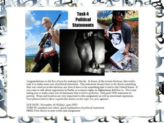
Lucknow 💋 Russian Call Girls Lucknow - Book 8923113531 Call Girls Available 2...
Lucknow 💋 Russian Call Girls Lucknow - Book 8923113531 Call Girls Available 2...Lucknow 💋 Russian Call Girls Lucknow - Book 8923113531 Call Girls Available 2...
Lucknow 💋 Russian Call Girls Lucknow - Book 8923113531 Call Girls Available 2...
 
Gomti Nagar & High Profile Call Girls in Lucknow (Adult Only) 8923113531 Esc...
Gomti Nagar & High Profile Call Girls in Lucknow  (Adult Only) 8923113531 Esc...Gomti Nagar & High Profile Call Girls in Lucknow  (Adult Only) 8923113531 Esc...
Gomti Nagar & High Profile Call Girls in Lucknow (Adult Only) 8923113531 Esc...
 
Lucknow 💋 Call Girl in Lucknow | Whatsapp No 8923113531 VIP Escorts Service A...
Lucknow 💋 Call Girl in Lucknow | Whatsapp No 8923113531 VIP Escorts Service A...Lucknow 💋 Call Girl in Lucknow | Whatsapp No 8923113531 VIP Escorts Service A...
Lucknow 💋 Call Girl in Lucknow | Whatsapp No 8923113531 VIP Escorts Service A...
 
exhuma plot and synopsis from the exhuma movie.pptx
exhuma plot and synopsis from the exhuma movie.pptxexhuma plot and synopsis from the exhuma movie.pptx
exhuma plot and synopsis from the exhuma movie.pptx
 
Lucknow 💋 Call Girls in Lucknow ₹7.5k Pick Up & Drop With Cash Payment 892311...
Lucknow 💋 Call Girls in Lucknow ₹7.5k Pick Up & Drop With Cash Payment 892311...Lucknow 💋 Call Girls in Lucknow ₹7.5k Pick Up & Drop With Cash Payment 892311...
Lucknow 💋 Call Girls in Lucknow ₹7.5k Pick Up & Drop With Cash Payment 892311...
 
Patrakarpuram ) Cheap Call Girls In Lucknow (Adult Only) 🧈 8923113531 𓀓 Esco...
Patrakarpuram ) Cheap Call Girls In Lucknow  (Adult Only) 🧈 8923113531 𓀓 Esco...Patrakarpuram ) Cheap Call Girls In Lucknow  (Adult Only) 🧈 8923113531 𓀓 Esco...
Patrakarpuram ) Cheap Call Girls In Lucknow (Adult Only) 🧈 8923113531 𓀓 Esco...
 
Bridge Fight Board by Daniel Johnson dtjohnsonart.com
Bridge Fight Board by Daniel Johnson dtjohnsonart.comBridge Fight Board by Daniel Johnson dtjohnsonart.com
Bridge Fight Board by Daniel Johnson dtjohnsonart.com
 
Lucknow 💋 Call Girl in Lucknow Phone No 8923113531 Elite Escort Service Avail...
Lucknow 💋 Call Girl in Lucknow Phone No 8923113531 Elite Escort Service Avail...Lucknow 💋 Call Girl in Lucknow Phone No 8923113531 Elite Escort Service Avail...
Lucknow 💋 Call Girl in Lucknow Phone No 8923113531 Elite Escort Service Avail...
 
RAK Call Girls Service # 971559085003 # Call Girl Service In RAK
RAK Call Girls Service # 971559085003 # Call Girl Service In RAKRAK Call Girls Service # 971559085003 # Call Girl Service In RAK
RAK Call Girls Service # 971559085003 # Call Girl Service In RAK
 
Hazratganj / Call Girl in Lucknow - Phone 🫗 8923113531 ☛ Escorts Service at 6...
Hazratganj / Call Girl in Lucknow - Phone 🫗 8923113531 ☛ Escorts Service at 6...Hazratganj / Call Girl in Lucknow - Phone 🫗 8923113531 ☛ Escorts Service at 6...
Hazratganj / Call Girl in Lucknow - Phone 🫗 8923113531 ☛ Escorts Service at 6...
 
Best Call girls in Lucknow - 9548086042 - with hotel room
Best Call girls in Lucknow - 9548086042 - with hotel roomBest Call girls in Lucknow - 9548086042 - with hotel room
Best Call girls in Lucknow - 9548086042 - with hotel room
 
Lucknow 💋 Call Girl in Lucknow 10k @ I'm VIP Independent Escorts Girls 892311...
Lucknow 💋 Call Girl in Lucknow 10k @ I'm VIP Independent Escorts Girls 892311...Lucknow 💋 Call Girl in Lucknow 10k @ I'm VIP Independent Escorts Girls 892311...
Lucknow 💋 Call Girl in Lucknow 10k @ I'm VIP Independent Escorts Girls 892311...
 
Lucknow 💋 Escorts Service Lucknow Phone No 8923113531 Elite Escort Service Av...
Lucknow 💋 Escorts Service Lucknow Phone No 8923113531 Elite Escort Service Av...Lucknow 💋 Escorts Service Lucknow Phone No 8923113531 Elite Escort Service Av...
Lucknow 💋 Escorts Service Lucknow Phone No 8923113531 Elite Escort Service Av...
 
Young⚡Call Girls in Uttam Nagar Delhi >༒9667401043 Escort Service
Young⚡Call Girls in Uttam Nagar Delhi >༒9667401043 Escort ServiceYoung⚡Call Girls in Uttam Nagar Delhi >༒9667401043 Escort Service
Young⚡Call Girls in Uttam Nagar Delhi >༒9667401043 Escort Service
 
Charbagh / best call girls in Lucknow - Book 🥤 8923113531 🪗 Call Girls Availa...
Charbagh / best call girls in Lucknow - Book 🥤 8923113531 🪗 Call Girls Availa...Charbagh / best call girls in Lucknow - Book 🥤 8923113531 🪗 Call Girls Availa...
Charbagh / best call girls in Lucknow - Book 🥤 8923113531 🪗 Call Girls Availa...
 
Jeremy Casson - How Painstaking Restoration Has Revealed the Beauty of an Imp...
Jeremy Casson - How Painstaking Restoration Has Revealed the Beauty of an Imp...Jeremy Casson - How Painstaking Restoration Has Revealed the Beauty of an Imp...
Jeremy Casson - How Painstaking Restoration Has Revealed the Beauty of an Imp...
 
Jeremy Casson - An Architectural and Historical Journey Around Europe
Jeremy Casson - An Architectural and Historical Journey Around EuropeJeremy Casson - An Architectural and Historical Journey Around Europe
Jeremy Casson - An Architectural and Historical Journey Around Europe
 
Dubai Call Girl Number # 00971588312479 # Call Girl Number In Dubai # (UAE)
Dubai Call Girl Number # 00971588312479 # Call Girl Number In Dubai # (UAE)Dubai Call Girl Number # 00971588312479 # Call Girl Number In Dubai # (UAE)
Dubai Call Girl Number # 00971588312479 # Call Girl Number In Dubai # (UAE)
 
Lucknow 💋 Call Girls in Lucknow | Service-oriented sexy call girls 8923113531...
Lucknow 💋 Call Girls in Lucknow | Service-oriented sexy call girls 8923113531...Lucknow 💋 Call Girls in Lucknow | Service-oriented sexy call girls 8923113531...
Lucknow 💋 Call Girls in Lucknow | Service-oriented sexy call girls 8923113531...
 
Young⚡Call Girls in Lajpat Nagar Delhi >༒9667401043 Escort Service
Young⚡Call Girls in Lajpat Nagar Delhi >༒9667401043 Escort ServiceYoung⚡Call Girls in Lajpat Nagar Delhi >༒9667401043 Escort Service
Young⚡Call Girls in Lajpat Nagar Delhi >༒9667401043 Escort Service
 

Task 4 Critiques

  • 1.  
  • 2. Ranking 1: Mooncat Photo 1 Photo 2 Photo 3 Photo 4 Photo 5 Our political statement was "pro-choice" (supporting keeping abortions legal).
  • 3. While your photos probably looked the most professional out of the bunch, I was turned off to them simply because they were all very cliche. You’ve got the professionalism down, but you need to work on task interpretation and creativity. I’d really like to see something like what you did for the conceptual shoot. They were professional, intriguing, and creative. Those looked like they deserved a spread in a magazine. You know the saying “great idea, poor execution”? Well you guys kind of have that backwards with great execution, poor idea. While your model is incredibly gorgeous and perhaps the most model like of the bunch, she really needs to work on conveying emotion. The photos themselves look heavy with emotion, but the model’s face is general the same and non-expressive. I’d like to see more passion and expression from the model. Overall the photography is excellent and I would start experimenting with zooming in and taking some close-ups. Especially when working with an emotional set of photos, facial close-ups can be really intriguing and get the point across. Overall, this is a pretty good set, I just think that you should be pushing the boundaries more and when I say pushing the boundaries I don’t mean by touching on more controversial topics or more provocative photos (you’ve got that down), but by coming up with more creative ways to express your message. Photo 1: My main problem with this photo is that it doesn’t actually fit with your message if you aren’t doing a storyline, which you mentioned in the thread that it wasn’t. If I hadn’t known that your issue was specifically abortion, my mind would simply have associated this photo with pregnancy and no further. Maybe she’s sad she’s pregnant or maybe she’s sad because she isn’t pregnant. I’m not sure how you would do this artfully, but maybe some sort of indication that the test came out positive would have expressed the abortion side better? Although it could still be about unprotected sex or something of the like. I think you might’ve been able to get away with the photo being a bit vague, if it hadn’t been your first photo. I’m not sure that many teams recognize this, but it’s actually important what order you turn your photos in. The first photo should be one which makes it loud and clear what your issue/theme is. Aside from that, the modeling and photography isn’t bad. The set up isn’t that interesting and the photo is a bit plain. I would of played with the angle to capture her emotion better. Photo 2: This is by far my least favorite photo for several reasons. First off, words are a cop-out and ripping pieces of paper with one’s dreams written on them is even more of an easy way out as well as a cliche. Additionally, the model’s face is pretty much devoid of emotion. She looks haughty, if anything. The angle is interesting, although I’m not sure it looks very professional. The biggest problem is simply the lack of emotion, meaning, and incredible cliches of this photo. Photo 3: This photo is most definitely striking and your model looks incredibly pretty, but again it’s not very provoking or interesting. While it’s definitely done more artfully in this photo, you’re still using words to get your point across. Additionally, while I do like the framing, the location doesn’t really add to the meaning of your photograph. My other biggest problem is that, other than the mascara running down her face, there is no emotion in the model’s face. She’s simply staring at the camera and it really doesn’t look like she’s been crying. Her body language also fails to contribute any emotion to the photograph. I think it’s a nice photo, since it looks good, but the modeling and set up don’t really cater to the task or portray the message. HEAD JUDGE: Kris Ramos, 2
  • 4. Photo 4: I like the contrast in this photo as well as the shadows. It’s also an example of using negative space to your advantage and overall it's a nice looking photograph. However, again, you used a cliche way of expressing your theme. Handcuffs can be used for pretty much any statement that involves some sort of oppression, which is quite a few. I also would have liked to seem some tension in the model’s hands. Nevertheless, it’s a nice photo, you just need to push your boundaries more. Photo 5: This is quite...provocative, and I’m not sure it’s really necessary. I know it’s true that women really do try to abort their babies by themselves using hangers, and it often, and unsurprisingly, ends in a gory death, however, I don’t this photo is well-done enough to make up for the fact that it’s gory and controversial. It’s like on my school paper, if we’re going to publish an article that incites controversy, it better be amazingly written, not simply good. Same goes for photography, this photo isn’t nearly good enough to cover how explicit it is. There’s no real location, the angle is awkward, and the cropping is bad. Additionally, the model has absolutely no expression on her face. There’s actually no emotion here, rather, it’s simply some provocative gore. Photography Judge: Nick Sullivan, 2 Your photos were all exceedingly well done and elegant, save the last, which could have been slightly less graphic, but I think you could have stretched your abilities a bit more. None of the photos really seem to break the status quo, exempting, again, the last photo, which was more than shocking enough. I really liked your fourth photo, even though some may say it is cliche. The first photo is quite well composed and the expressiveness of it is unmatched in the others. Photography Judge: Kaitlyn, 1 You really took the plunge this week. You weren’t afraid to be bold, or offensive. Sometimes that’s what political art needs: offense. Frankly, I wrinkled my nose at many of my photos, and while they offended my senses, that in no way made the photos any less spectacular. You took my advice on pushing through and exploring your limits, and it really paid off. These photos tell a very coherent story, and it’s a tragic one at that, one that shows that dangers of making abortion illegal. I really admired your use of black and white to highlight hopelessness, and especially liked the set up of the first photo. It looks like just a normal snapshot, but its clearly very excellently staged. Amazing work this week, I’m really in awe. You varied angles and positions, as well as locations, making for a very interesting, but cohesive set. Summary: Excellent- Use of Black and White, Lighting, Costuming (the model really looks pregnant!), Variation, Storytelling Needs Work- Can’t think of anything ;D Photography Judge: Sandy, 1 Critiques unavailable this week
  • 5. Modeling Judge: Cassandra, 1 Once again Mooncat has wowed us with wonderful pictures. In their first photo the model’s pose is great and we can feel the emotion that she is trying to communicate, really drawing us into her photo. The only issue that I can find with this one is how dark the model’s shirt is; while this usually isn’t an issue, with the way she has her left arm folded under her right and all the shadowing on it it makes everything between her right arm and legs seem to be a big blob of shadow. I found the second photo of their set to be the lowest quality picture they turned in. The model’s pose seems too “tight” and it looks like she’s faking tearing the papers. The emotion just wasn’t there as much as I know it could be and I would like to see her push herself a bit harder to make sure she always convinces us of her emotions. I also found this photo to be the least convincing in there being a child inside of her; it just seems awkwardly lumpy and lopsided. The third photo is very well played out as well; her pose is beautiful and we can really feel a good amount of emotion from her although I believe she could have tried a bit harder. This team’s fourth image is really great. The model is holding her stomach wonderfully and with what little she had to use as far as emotion she really did a great job at showing us how she feels, I love the prop you used as well - it’s not subtle but it’s not tacky. Out of their first four photos I found the last two to be the best at communicating the message they were trying to convey and the first two did a good job with communicating. This team’s final photo was very blunt and in your face and I appreciate their boldness and willingness to shove their point in our face. They didn’t play it safe and that is a very good technique to have in a competition. I love the model’s pose although I wish that she had her left hand a tad further back as it seems a bit lost behind her leg. I love how her “blank” emotion isn’t simply not there but purposefully empty; it helps to draw us into the photo and it’s convincing. Unfortunately I do not think that this photo worked in their favor as far as communicating their point on abortions being legal. When people would look at the photo on an abortion standpoint they would see all the blood and would register it with torture and pain and it honestly helps to convince people to not have abortions instead of to have an abortion. This type of photo would be more suitable for a pro-life standpoint than a pro-choice standpoint. I honestly do love the attention to detail they put into this photo though and it is truly convincing and amazingly done. I must say that this team did an impressive job. Overall they have done a great job throughout the entire competition and we can see them getting better. The model has fantastic skills with posing and expressing emotion and they did a good job with following the line of being pro-choice. They just need to keep chugging along and getting better until they completely blow us away. Three words: bold, haunting, brilliant. This photo set is my hands-down favorite this week. I love the story and how each picture adds something to it; I could easily see this being a several-page spread in a magazine. In every single photo I could feel the sense of anguish, even the ones that didn't show the model's face, which is pretty impressive. I applaud this team for really going out on a limb with this task and not being afraid to step on some toes, committing fully and entirely to creating amazing art. I loved every single picture from them! Modeling Judge: Shawn Keeney, 1 Modeling Judge: Momo, 1
  • 6. Photo One; I just want to start out by saying I feel this is the best set introduced to us so far. It's chilling and really, really portrays your theme well. Wonderful job. In this picture, I really get hopelessness. The stray hair through the fingers, the drab outfit choice (greys and blacks), the hunched over position are all wonderful indicators. My only concern is her back foot has disappeared in the wide-legged pants. And I like the splash of color of the box-- it really brings attention to it, and you can clearly see the cause of her misery. Photo Two; My main concern here is the model's face. I see a sense of quiet acceptance that all her dreams have been torn apart. I'm not sure whether I really like this or not, when all the other pictures really scream 'misery'. It's a nice break, but it doesn't quite fit. Other than that, though, I like the faint hint of a pregnancy around her; you can clearly see the belly swollen. Her clutch on the paper seems strained. Photo Three; I don't understand why she's in a forest, but it's pretty? You can clearly see the pregnancy and her misery. The "mistake" on her shirt is wonderful, and it's reflected in (and around) her eyes. The smeared mascara is always a nice touch when done subtly. She looks like she just got done with a huge crying session-- even the look on her face, I've seen it before, right when someone's done with crying and filled with anger at whatever made them cry. She's looking directly into the camera and that's a risky move, but very powerful in breaking the fourth wall (which is what you want to do for political things, make the viewer relate/understand/feel included). Her curled-up pose shows her trying to protect herself, almost, from something. Photo Four; The shadows are really what made this an awesome photo, paired with the handcuffs. It really looks like she's been jailed by nature, almost-- the shadows the bars. The limpness in her hand shows a sort of defeat, and cradling the baby, I see no love, just perhaps to relieve some strain on herself. There are no strangely cut-off parts of floating limbs. The marks around her lower wrist show she's been struggling. Photo Five; This is a crazy photo. It left me speechless when I first saw it. "Did she really go there?" Yes, you did, and with passion. It wasn't a half-arsed picture. The home-abortion is terrifying and you brought it to life in a picture. The washed out look to everything, the silky robe, they all add different aspects to the picture. It's hard to describe except striking. Especially her face-- she looks almost dead, yet there's a small sense of relief there. Portrayal; Wonderful portrayal in all of the photos. You really got the meaning across.
  • 7. Ranking 2: 1867 Photo 1 Photo 2 Photo 3 Photo 4 Photo 5 Proposition 8 was a constitutional amendment that was passed in November 2008, stating that, "only marriage between a man and a woman is valid or recognized in California." Although the amendment did not affect homosexual marriages performed before November 2008, it did affect the future rights of same-sex couples. On August 4th, 2010, Proposition 8 was overturned by a judge issuing an injunction against enforcing Proposition 8, for which the ruling will hold pending appeal.
  • 8. My favorite part about your photos, is that I really felt you had a personal connection to them. It really seemed like you believed strongly in your statement, which is what this task was all about. I liked the variation in your photos, although I’d be careful about straying too far from your topic/concept like you did in one of your photos this week which I’ll explain later. For the most part, your model has expression and body language down and your photography has also gotten a lot better throughout the competition. I love how you guys continue to progress. It’s obvious that you read the critiques every week and really pay attention to the advice that the judges give you. While your photos weren’t the most provocative, I think you did one of the better jobs of portraying your topic and what it means to you. I had trouble ranking first and second this week, but I ended up ranking you first because while Mooncat’s photos were quite provocative and moved me greatly, I think that your photos were actually slightly more expressive. And while your photos may not have the biggest “wow” factor to them, when I individually picked apart your photos for technical errors, I found a limited amount. It also helped that you had my favorite image of the week. Kudos. Photo 1: The first photo is extremely clean and gets the point across easily. It’s kind of like how teachers tell you to write essays concisely and to the point, this is how it works for photography too sometimes. Although text is most often an easy way out, I feel like it’s done tastefully here. It doesn’t glare at you, rather it’s subtle, and it isn’t the main focus of the photograph at all. In terms of modeling, I think this photo falls a little flat. If the model is feeling ostracized, then her expression and body language should show either some ferocity or some sort of sadness. Here the model is sort’ve just staring off to the side, tugging at her bonds a bit. This photo needs more expression! The photography isn’t bad, although it is a pretty simple photo. The bottom crop should be slightly below the belt and the left side should shave the side of the elbow. The angle in general kind of makes the entire left arm awkward. Moving a couple steps to the left or right would have solved this. One thing to keep in mind, is just because you have a plain backdrop does not mean that the photo has to be taken straight on, you can still experiment with angles. I really love the shadow in the photo though, as it actually adds a lot of depth to this photograph. The color placement of red throughout the photo is very pleasing to the eye, great attention to detail here. Although this isn’t one of my favorite photos of the bunch, it’s still a pretty good photo. Photo 2: Normally I really dislike it when photos are monotone with one spark of color, but it actually really works in this photograph. Your photographer has a real talent of keeping the model’s face out of focus, but still bringing attention to it. I’ve also noticed that you seem to make hands the focal point of your photos a lot. While this has worked really well so far, I’d be careful about falling back on it too much. Hands are expressive, yes, but they can also be interpreted as somewhat cliche. The lines in this photos are beautiful and I’m especially attracted to the movement in the photograph. The model’s expression is almost dead on, as she looks like she’s trying hard to stop the unaccepted part of her through, however, it actually looks like she has a hint of a smile which I don’t think is appropriate for the photo. Imagery in which the subject is trying to repress a part of themselves is generally provocative and interesting, and you definitely embodied those characteristics here, but I still think that the model needs to be a bit more expressive. However, remember that expressive doesn’t necessarily mean comedic and make sure you don’t over exaggerate. My only other suggestion is that both the photographer and the model watch the angles more. The model’s right arm looks like it’s kind of bursting from her face. The colors are phenomenal though, and this entire photo really pops. HEAD JUDGE: Kris Ramos, 1
  • 9. Photo 3: This is by far your least interesting photograph, and the use of text here is boadering on a cop-out, although I do like the cleverness of the boxes and the fact that you didn’t go with straight or even gay, but freedom instead. It really framed the issue as one of freedom, not necessarily just being gay. The photo is plain though, and frankly kinda plainly boring, and I don’t understand what the model’s expression has to do with the photograph. Like your other photos though, it has a great depth of field. It’s just not a very interesting photograph even though it’s technically good (aside from the cropping of her left hand). Watch your cropping! Seriously, I know everyone probably thinks I’m crazy because I’m also pushing the cropping thing, but how you crop a photo can really make or break a photo, and it actually has a lot to do with tone and visual aesthetics. Photo 4: This is the photo that I think is a bit of a stretch. I think what you’re trying to say in this photo is that the person you actually like is a girl, but I think that message is too subtle here. Granted, it’s an awesome looking photograph with the clouds, lighting, and great framing with the trees, but it simply doesn’t make much sense. Additionally, the model, again, doesn’t have much expression. I really love the framing and the lighting though. I actually think your team may have the best photography and you’re definitely up there in the modeling standpoint. I think the main reason why your photos don’t stand out as much as other groups is that your set isn’t as sophisticated or powerful and you generally have a very limited use of crops and location. Although this photo is my least favorite in terms of concept/task interpretation, I absolutely love the backdrop. Photo 5: I love love love love love love love love love love love this photo. The weird thing is that in terms of photography this may be your worst photo, but the modeling is so f------ brilliant, it just makes the photograph for me. A lot of the judges were talking in the guild about how they didn’t get this photo, but from what I can tell, it’s saying that the model feels forced into a straight relationship because she isn’t free to be with who she wants to. If I’m right, this photo is true brilliance. Both subjects of the photo are doing exactly what this concept asks of them (seriously, you should get that guy to join Season 2). I like how the guy is looking at the camera while the model is looking downcast. Everything from her body language to her facial expression screams oppressed. Her expression is both wistful and sad and I like that, while she’s leaning against the man, her body language suggests reluctance and the desire to get away. Wonderful wonderful wonderful modeling here. This is exactly the kind of expression that you need to bring to your other photos; expressive, but not forced. The framing of the photo isnt’ that great and would be a lot better if the bench wasn’t cut off. The windows and box like thing on the right hand side, look messy and a bit distracting. Otherwise, really amazing photograph. Photography Judge: Nick Sullivan, 1 Overall, I liked how you expressed your theme, more than I did any other group. Everything you did was very novel and creative, a difficult achievement in a politically themed task. While the last two photos could have been more clear, in the overall context of your shoot they were entirely justified as they were. Wonderful job! The only things that I noticed to be improved would have to be the resolution and focus of some of the shots, and the apparent continuation of the theme throughout the set.
  • 10. Photography Judge: Kaitlyn, 4 I was really let down by this set. The first photo was amazing! The Second photo was stunning! The third photo was precise! …and then the last two left me scratching my head. What happened?! I don’t get it! You communicated your theme so well in the first three photos and then you just…bottomed out. Ignoring the last two photos, this set is amazing. Precisely focused with an amazing attention to detail and unique interpretations of the same theme. I loved those first three, especially the name-tag in the first: it’s a small detail, but it really makes the photo. Summary: Excellent: Photoshop, angles, visual interest Needs work: Storytelling, sticking with the theme, pushing through Photography Judge: Sandy, 3 Critiques unavailable this week Modeling Judge: Cassandra, 4 In the last round this team really kicked it up a notched and impressed me with a sudden burst of improvement; however this round they seemed to have dwindled back down a bit. While I am still pleased with their performance in comparison to the prior entries they really failed to wow me and I was left disappointed. The model’s posing is fairly good, however, it seemed like this week she was lacking in emotion and I couldn’t feel much of anything from her in the first four pictures. She has shown that she is very capable of expressing emotion in her pictures and I would like to see more emotion in each one so that we can feel what she wants us to feel when we look at the image instead of simply looking at an image unemotionally. In their first image I found the model’s pose to be fair but there is some awkwardness to it that detracts a bit from the picture. The first thing to note is how the model’s left arm is positioned just looks weird – I honestly can’t tell what’s wrong with it but it just doesn’t seem to be a proper position. Another note is how flushed the model looks in the picture; it doesn’t look right and her face shouldn’t look so red like she just got done doing a lot of exercise. This is one of their images that showed the least amount of emotion and I can’t quite tell what she is trying to express; I appreciate the name tag as that really helps to state what you’re going for but she needs more than just a prop to express what she is feeling. With the help of the nametag I am able to understand what the message behind this photo is however I cannot fully relate the message to the theme of gay marriage being illegal though this could be due to me not associating rainbows with homosexuality and not be of any fault to the team. Overall I found their first image to be alright, it’s not interesting to look at but I’m not bored with it. The second image I honestly didn’t understand until I let the image sink in for a few days. I didn’t hear any of the other judges talk about it so, once again, that’s most likely just me. Now that I understand I find that they did an alright job with delivering their message but it seems more like simply banning homosexuality in general instead of specifically marriage. Despite this, they still did a fairly decent job and I find this to be one of the better images out of the set. The pose is very nicely played and I can’t find anything specifically wrong with this image.
  • 11. However I don’t see too much emotion in the model’s face but I can tell that there is something there so it’s not too bad. This image is nice to look at and is good at getting attention and making you want to keep staring. I found that this team’s third image was another one of the better pictures overall with posing as well as theme deliverance. The model’s pose is very nice though there is a bit of an issue with the cropping as her knuckles are cut off slightly. The model’s emotion is a lot better than the first two but still needs to be kicked up a notch. The point of the image is very clearly understood but there is still something missing from the image though I am not sure what it is. As far as a modeling picture goes their best submission is their fourth image. The pose is beautiful, I can find nothing wrong and the mood that the background, pose and partial mouth opening is very surreal. Unfortunately this is also the image in which the model does the worst job at expressing the political statement they chose. I have found two ways to interpret the purpose of the balloon; firstly she could be saying she is having a child as she feels she must be in a heterosexual relationship. Secondly she could be saying that the person she chooses to love is a girl hence the “it’s a girl” statement. However both of these are not understood unless you know ahead of time that she is trying to express her desire to be in a homosexual relationship. When a team submits photos with a theme without captions they need to express their point to someone that has no idea what is going on and that simply was not done here. Out of all their images, this team’s fifth image was the best at expressing emotion; the model really did a fantastic job at setting the mood. The model’s pose is very well executed and it is fairly clear to understand what is going on. There can however be a bit of a misunderstanding if we don’t know exactly why the model is upset; this image can be interpreted as either she is unhappily married (regardless of gender) or that she got into a fight with her husband and he doesn’t care. Perhaps it could have been made more clear if the model was perhaps holding a photo of a girl she likes or looking at a woman off in the distance. We can see that she is upset though and so at least they did get that across – great work. There were two awkward parts in this image; first the model’s left foot just seems to be in a weird position and takes some time to fully understand and also her left hand has completely disappeared in her sleeve. While this can be alright in some circumstances, it makes her forearm appear to be rather freakishly long and I would have liked to see a bit of her finger tips poking out. This image is interesting to look at but it still isn’t eye-catching enough and needs that extra push to really draw the viewer in. All-in-all I felt that this team did a fairly decent job although, as I said earlier, they were not up to the level of skill that they have shown themselves to be. They need to remember to keep pushing themselves so they can come out on top and really continue to wow us with their work. The model has done exceptionally well with all her poses with just some tweaking here and there but she didn’t give us as much emotion as she should. She has shown us already that she is great at expressing herself and I would like to see more of that. They did a good job at communicating their theme to us although I feel that they can do better than they did in a few images; they want to make sure that we can understand what is going on even if we do not have prior knowledge to the circumstances. I am still very much pleased with their improvement from the first few entries but they need to keep pushing themselves and can’t afford to fall behind. Again, I'm having a problem with this team submitting photos that don't really fit with the rest of them. It's like, they'll have two or three amazing pictures and then the rest are just completely out of place. In this set, the first, second, and third photos are really great, especially the first. Then, the last two are throwing me off. Modeling Judge: Shawn Keeney, 4
  • 12. I have no clue what that balloon has to do with same-sex marriage, and why wasn't the second model in the fifth another female? Like I said, I've noticed this kind of problem with this team on numerous occasions, but they have shown great improvement from where they began, so I think they deserve to stick around. Photo One; YES! Someone knows how to use a cami in pictures! No unflattering pouches at all; the model has gorgeous curves accentuated by the tight garment. The left arm is extended wonderfully, I just wish the hand didn't disappear. I enjoy the little details in this picture, and how you made the colors 'pop!' against a black shirt and neutral background. The red comes out nicely in the accessories. The nametag really had a powerful effect. The look in her eyes is almost a sad look. The shadow looks chained, almost, it's hard to describe but I like it. Photo Two; The splash of color here is AMAZING! My eye is brought directly to the hand. It has a cool, splayed-out shape I really love. I'm glad you chose to use a sepia-ish theme rather than black-and-white (which I tend to find a bit clichéd with color splashes). The model looks happy, and appears to be painting on the rainbow. The right arm is a bit cropped out of frame, but you included the crook of her elbow which successfully kept it from being a strange, floating arm. Photo Three; The modeling here is OK, and while the message is strong, the posing needs a little bit more oomph to it. I'm not getting much feeling from the face, and her eyes seem a bit unfocused. It may have looked a bit better with her staring at the camera, showing you how confident she is in her choice. There is power in the hand holding the marker-- it's a fist, and drawn back. Photo Four; While the message doesn't quite ring clear in this (though I think I get it-- "it's a girl" being her choice to be a lesbian), the modeling is gorgeous. Against the backdrop, you can see a really strong outline, nice, long legs, and even with the hat obscuring it a bit, you get a good jawline. The pink on the arms is a really clever touch-- it keeps them from fading into the rest of the model. Good choices here! Photo Five; I feel this photo stands out the most to me. I really get a strong feeling from it. It's incredibly subtle, and without the theme I *may* not have gotten the right idea (though I also may have, I really don't know), but with it, it instantly clicked in my mind. I feel like this isn't something people focus on--the desire to fit in. And here, because society won't accept her, she's with a man and is obviously miserable. The posing itself is pretty good, but it's the details that get me. Though her hand appears to be missing, you can also figure out that it's tucked into her sleeves--for me, at least, a sign of trying to comfort yourself. A sign of hiding. The leaning away, yet into him, showing her discomfort. The tense-ness in her legs--ready to run away, yet the planting of the feet. Perhaps I'm seeing too far into it, but I really, really like this picture. Portrayal; Portrayal here, I feel, was wonderful. LGBT rights was easily seen in the pictures, except perhaps the last two, but with the prompt, I was able to figure it out. Modeling Judge: Momo, 2
  • 13. Ranking 3: Uh Oh Spaghetti-Os Photo 1 “See no evil” Photo 2 “Speak no evil” Photo 3 “Hear no evil” Photo 4 “Breathe no evil” Photo 5 “Feel no evil” For this week's task of choosing a political statement, we picked Censorship. Many governments around the world monitor what it's citizens hear, say, see, and ultimately feel by keeping certain aspects of life a secret from them. It is our opinion that censorship in any country is wrong because citizens deserve a right to make judgements on topics by themselves instead of relying on a higher power to make a decision for them. Every person has a right to choose. Censorship is defined as "suppression of speech or other communication which may be considered objectionable, harmful, sensitive, or inconvenient to the general body of people as determined by a government, media outlet, or other controlling body." Political censorship occurs "governments hold back information from their citizens. This is often done to exert control over the populace and prevent free expression that might foment rebellion. Another version of censorship is the phenomenon of disinformation which uses "red herrings" to distract people from some other controversial issue." We chose to make use of the color red in our photos as well to pinpoint the topics we were trying to convey.
  • 14. As an aspiring journalist, I felt the strongest personal connection with your statement, however, I was not blown over by your photos, nor did I feel that I could relate to them much. I think my biggest problem with them, is how cliche they are. The see, speak, and hear no evil phrase is about as common and cliche as you can get, and the other two, breathe and feel no evil, seem kind of forced to fit the program. While I definitely appreciate the cleanliness of your photos as well as the color contrast, I don’t find them very interesting or entrancing. Also, while I do like the simplicity and elegance of your shoot, I don’t think it really fits in with your concept. I like that you used red for “red herrings,” but I think that maybe you should have only done that for the models outfit. A background made of a collage of newspapers might have made your photos more interesting. They’re pretty photos, they’re also just kind of bland. The second thing that really stood out to me, is that while I like the idea of red and black and white contrast, the photoshopping job isn’t done cleanly enough. As someone who gets paid to photoshop photos in various ways, the lining was obvious and messy. I know I’ve said this before, but it needs to be said again: if you’re going to edit photos in any way, it needs to be done cleanly and professionally. A messy job really stands out and detracts from the photos. Overall, I feel like you have really progressed throughout this entire contest, however, I think you need to push yourself even farther. Photo 1: This is definitely my favorite photo of your set, and it’s actually pretty good. Classy and elegant, I think the simplicity of the shoot worked here due to the angle and depth. The model’s lips look full and luscious, and the way her hands are lightly on the blind looks good. Even though her eyes are covered, I feel like she’s staring ferociously, almost burning the covering off. This is one of the better photoshopped photos, however, the outlining of the hair is still messy. First off, not all of the background is red like it should be and secondly, you can see hair underneath some red areas. Utilize the eraser tool to cut in as close as possible and when I do jobs like this, I redraw the hair over the background so that it looks realistic. My only other concern is the model’s wardrobe. I don’t think it’s appropriate to be wearing nothing other than a bra. It doesn’t match your theme and does nothing to better the photo. Photo 2: The lighting in this photos is great and I like how vibrant the red it. The black and white part (the model) is low in contrast though, so the model looks a bit dull. The model’s eyes are certainly compelling and she definitely draws the viewer in, but the angle as a whole is not very flattering. The shadows across her face are distracting and make her nose look larger than it is. Again, I’m not sure how necessary the lack of wardrobe is, especially since the closer to naked you get, the more free you seem. It would have been really cool if you created chains with body paint, or something that added to the overall theme of the photo. Photo 3: I like how you used both the ribbon and the chain as well as the variation of this photo, however, the photoshopping completely ruins this photo for me. It’s so obvious and messy; you even add extra ribbon where there isn’t any (the end where it shouldn’t be rounded). Sorry if this comes off as being picky, but in the professional world bad photoshopping just does not pass and really detracts from the quality of the photo. Photo 4: First off, I’d like to say that your model looks especially pretty here. In the past couple tasks, I have started to see the fierce model that I first saw in your application photo. I also really love the background in this photo and the way it’s falling evenly, however, the photoshopping around the hair isn’t done very well. While I love the way the model’s hands are gripping the HEAD JUDGE: Kris Ramos, 3
  • 15. ribbon around her neck, the ribbon is photoshopped incredibly poorly and kind of looks like it was completely painted in. While I love the slight squint of the model’s eyes, there isn’t much emotion in her face overall. There’s a hint of it, like she’s just starting to feel something, but if I were being choked up the way she is, I don’t think I’d be standing there calmly staring at the camera. There should be some sort of anger or desperation in this photo, or something to show how the model feels about censorship. She looks more confused than anything here. Photo 5: Your caption for this photo is “Feel No Evil,” however, the model looks like she’s consumed quite a bit of evil here. I don’t really understand what this photo is trying to tell me, especially when paired with the caption. Additionally the angle is unflattering to the lower half of the model’s body and the feet are cropped awkwardly. I’m also unsure as to why there is a random piece of ground left gray...? Like your other photos, the photoshipping is messy, especially around the bottom of her hair and the right arm. Please, if you’re going to photoshop so heavily, make it look professional! Photography Judge: Nick Sullivan, 3 Nice theme, novel idea, poor execution. The idea is the most interesting of all these in my humble opinion, but the mediocre photoshopping and repetitive shots made the set less than amazing. I really think you guys could've made this a really amazing shoot, and I was kinda let down after looking through all of the photos. Nonetheless, I commend you on an interesting and thoughtful idea. Photography Judge: Kaitlyn, 3 Like many of the other teams, you went bold this week, and for once I really liked your heavy use of photoshop. You went for the “Black/White/Red” scheme, which is always powerful. Whats black and white and red all over? A Newspaper. What gets censored? Newspapers. Nice work. I was a little bummed that “Speak” and “Feel” were usch similar photos, I would have perhaps changed the angle just to keep up the variation. Amazing work. You continue to improve and its VERY impressive! Summary: Excellent- Photoshop, Color Palette, Lighting, Theme expression, focus Needs work- Variation (posing, angles, expression, and location) Photography Judge: Sandy, 4 Critiques unavailable this week
  • 16. This team has once again really shown us their “stuff” and I’m no longer left wondering what happened to that wonderful model in the application photos. The theme was very well communicated and the model’s posing and expressions really shown through. In the first image her pose is nicely executed and the way she is holding her hands and has her lips parted really helps to express emotion when the eyes can’t. There is a bit of awkwardness in the photo however; the model’s left hand is held weirdly and it makes her fingers look obscure as though two are relaxed and two are tensed which is contradictory to each other. The other issue is how tightly she is holding her arms into her body; it makes there be a rather large crease between her armpits and shoulders and it is just too tight. Aside from that however the picture is very nicely done and the theme of censorship is wonderfully executed. The image isn’t too interesting to look at though but it isn’t boring – I don’t know for sure what is missing from it but the picture just needs a little something extra to really bring it home. Out of the set the team’s second image is the one I feel was executed the best. The model’s pose is practically perfect with the only issue being cropping and you can really feel a great sense of emotion coming from her. The message is very clearly displayed and it is overall a very lovely picture to look at. This team’s third image honestly didn’t give me too much to judge as it is solely the model’s ear. The message was communicated exceptionally well and it is an interesting picture to look at although, once again, there isn’t too much modeling involved so I cannot honestly judge it from that perspective. The fourth image is posed nicely although there is once again the bad cropping with the model’s hand. She has done a great job again at delivering emotion to the viewer and I am most pleased with this. While the message takes some time to understand they did a good job at communicating it to us and this is overall a picture that is pleasing to the eyes. In their final image the model’s posing was still well done but there were some parts that needed tweaking. Firstly her left arm is awkwardly positioned in a way that while you can tell it’s bent it doesn’t quite register “bent” to the viewer and it leaves you a tad confused. Additionally, the positioning of her left hand is nicely played out however at that angle her hand should have been turned a bit more upwards to that we don’t see the inside of her hand as her current position is really designed for a front camera shot. Now the model’s right arm seems to be completely eaten by her hair and we cannot see where her arm starts and her body ends which can cause the illusion that they are connected. There is once again a cropping issue with the model’s feet as well as the side of her left arm; when we see most of something we want to see all of it. Unlike the other images the model really dwindled down in this one as far as expressing emotion goes, I can barely feel anything from her. I know that she is wonderful at expressing herself in images and I want her to push herself in this field and continue to wow us. In this image I also cannot see too much of their theme of censorship. While the model is censored on her body it doesn’t really communicate that and it looks more like she is simply standing there waiting for something to happen instead of feeling like there is something censoring what she can have. Perhaps this image should have been played out differently such as binding the model to herself so she literally can “feel no evil?” In this image I really felt lost on their theme. All-in-all I am pleased that this team has continued to push themselves to get better. They keep stepping it up a notch and have really begun to show us just what they can do when they put their minds to it. The model is very good at posing and just has a few more things to look out for and she has truly shown us that she is excellent at showing emotion. They also did a really good job with following a theme and showing their statement on censorship. They just need to keep on chugging along and getting better as they have been. Modeling Judge: Cassandra, 3
  • 17. This team has really stepped it up for me this task. This photo set I could also see as a spread in a magazine. I like how each photo creates a sense of being restricted or confined in some way. My only critique would be that the third photo is a bit too focused on the ear, making it a bit difficult to discern what the picture is even about. I think the model did a really good job with her facial expressions, considering that's the main thing she had to work with in the shots, conveying emotions clearly and effectively. Good job, and most improved this week for me. Modeling Judge: Shawn Keeney, 2 Photo One; Let me start out by saying I was impressed with the improvement of this team! They're much better than previous entries. Good job! This is my favorite out of this set, as well. The first thing I notice, other than the brilliant red, is how gorgeous the model's lips are. Very lush, I'm always so jealous when people can pull off the heavy stuff like that. It gives a nice focal point other than the red and a wonderful outline. I really like how the hands frame the face-- especially on the left, it almost seems as if she looks like she's trying to see (if you're like me, aka pretty much blind, and you have your glasses off, sometimes you find yourself rubbing your temples and squinting. At least, I do.). My only concern with these would be stray hairband around the wrist. It looks accidental! Photo Two; I like this photo, but I feel the whole-body-taped bit should have been saved for the end. This would have benefited, in my opinion, from just being a headshot. Other than that, it's OK, the left arm looking completely removed at the shoulder (due to the hair), and the right arm cut off at the elbow (though there's a bit of the crook of her elbow there to save it from being a floating-arm). Photo Three; As a modeling judge, there's not much for me to judge here. It's a cool idea, but I can't tell what the hands are supposed to be doing, and at first glance it's hard to tell what's going on. The chain was a nice touch, though. Photo Four; I like the body language in this picture. She really seems to be clawing at her throat--at the binds. Her mouth is closed, showing the silence. I'm glad you highlighted the 'band', because I feel that I may have missed it at first though-- it's small, and the red saves it from disappearing. The face is a mixture of sadness and apathy; she looks a little sad, but the eyes just aren't selling it for me. Picture Five; The loose hair adds a wonderfully wild effect, but be careful! It cut off her arm at the shoulder once again, on the left. It makes her arm look just like a part of her side, not a separate limb. The model looks a bit evil here, and I'm not 100% sure why. I get restriction from it-- she would be fully exposed if not for the tape-- and I feel this is what corresponds to the title, "Feel No Evil". In my mind, the evil here is the impure thoughts associated with nudity, and the red tape is covering it up. This may be way off track, though. Portrayal; The portrayal was pretty good. I definitely got censorship out of most of the pictures. Modeling Judge: Momo, 3
  • 18. Ranking 3: the Lost Girls Photo 1 Photo 2 Photo 3 Photo 4 Photo 5 We went with religion in schools. While it's not directly something we've dealt with (we were both educated at home) we've had a taste of it and have had to deal with discrimination in many other areas of our lives. We're pro 'free expression of religion' but chose to express it in a way that it wasn't. Such as the table being full of things obviously not allowed at school, and having the bible along with them.
  • 19. Your performance this week, was a bit of a let down for me. Your team has the highest quality photo by far, and I’m starting to wonder if you’re relying too much on the fact that your photos naturally look sharper and therefore, of professional quality. Your photos are always crisp, and a definite relief to look at. This week, however, while your photos were crisp, your team didn’t really nail the task. The biggest problem is your concept portrayal. First off, without your explanation, I would be completely confused as to what your photos are about. The first three have something to do with religion and school, while the last two don’t suggest a connection to school whatsoever, other than the fact that the model is wearing something that could be considered a school uniform. Additionally, it’s confusing as to whether you are for or against religion in schools. In your explanation you say that you’re pro religion in schools, but some of your photos seem to portray the opposite. You also don’t have a single photo that really clearly represents your topic and your stance on it. This lack of clarification is what really hurt you this task. I think it’s safe to say that this week was merely a slip up for you. I just hope you come back with some fire next week. Photo 1: This is a very pretty photo of your model, however, it’s also a little plain. Like I wrote in Mooncat’s critique, it’s really important that your first photo sets the stage. It should make it completely clear what your issue is and what your stance is on it. Aside from that, the photo is just kind of boring. I really don’t have that much to say about it. Photo 2: This is probably your best photo when it comes to interpreting the task. It clearly gets across that religion is banned in schools since it’s with a bunch of banned items in detention. It’s also clear that the book on the table is a bible since the cross is on top of it. I actually like the unique angle here, mainly because it works with the cropping which is done evenly as both sides of the table are equally put. This is an example of a well-cropped photo that is straight on and plain. The model doesn’t really do much for me here, and she doesn’t really add any meaning to the photo. She has a beautiful portrait, but her expression doesn’t bring any emotion to the photo. Photo 3: This photo is by far the best photography and if I were judging simply on nice photos, this would be my favorite of your set. The lighting and the shadow reflection is simply awesome. The photo is also really well balanced. Unfortunately, it doesn’t really match your concept. It seems like the model is being forced into prayer and oppressed by religion. Since your message is supposed to be the exact opposite of this, the photo is misleading. Additionally, the model is pretty expressionless. This task was pretty emotion/tone based, so the fact that the model hasn’t conveyed any mood isn’t good. Photo 4: This photo is probably the weakest of the bunch. Other than the uniform it shows no relation to school and if the viewer didn’t previously know that you were holding a bible, it wouldnt’ be evident. The cropping is weird, the model’s stance is really awkward, and, again, this photo shows no emotion whatsoever. Photo 5: While definitely a daring and compelling photograph, it also doesn’t match your topic closely. There isn’t a direct correlation to schools and if the viewer didn’t know that the pledge of allegiance was actually banned from some classrooms, I don’t think the relation is there at all. This is a creative use of words, but as I told many others this task, words are generally a cop-out. HEAD JUDGE: Kris Ramos, 4
  • 20. You also used words to get the point across in at least one other photo, which isn’t something you want to rely on. As with all your photos this week, this photo lacked in emotion. The model looks frightened and uncomfortable and I don’t quite understand why. Photography Judge: Nick Sullivan, 4 The first three photos are good, but then the last two don't really continue the theme. I wasn't really certain whether you were pro or con religion in school, and that’s a major issue when the set is based on a side. Also, there's nothing about the photos that particularly stands out, which is also an important factor in this competition. The photos were okay, but the expression of your theme could have used a lot of work. Photography Judge: Kaitlyn, 2 I’m SO GLAD you took my advice. You moved around! You took amazing photos! Five amazingly different photos. All of them spoke to your theme (which was very unique, nice work), and I especially liked the last one. You took a step over the edge, and the soared marvelously. Burning the pledge of allegiance is a powerful statement, and I liked it a lot. I was most happy to see you in five unique locations, but as usual your photos are wonderfully lit, posed, and angled, all to make a very pleasing set. I can find few flaws in these photos. Summary: Excellent- Lighting, Location, Variation Needs Work- Can’t think of anything ;D Photography Judge: Sandy, 2 Critiques unavailable this week Modeling Judge: Cassandra, 2 This team has once again turned in a very lovely set of photos. In their first photo the model’s pose is very nicely executed and you can see a good deal of emotion coming from the model though I would’ve liked to have seen more. The way the model’s skirt is folded up is a tad distracting though as it appears it is caught on something but there is nothing there. I felt as though this picture was the best they turned in as far as communicating their political statement. Just about everyone associates a library with school and the “shush” motion as a “please don’t tell;” great work. This team’s second photo really bugs me. The reason why? I can’t find anything wrong with it. Her pose is beautiful and just shows that annoyance that comes from getting sent to detention, especially if you didn’t do anything wrong in your eyes and her face exemplifies that emotion. The set is great and the subtle use of props really helps to tell a story as well as her placement on the bible showing the point of this shot. The second photo is just wonderful all-around.
  • 21. In the third photo her pose is very good and you can get a real sense of emotion from her. Unfortunately the theme seems a bit lost in this photo. If they are going for a “religion shouldn’t be banned from school,” then why does she seem to be forced to pray? I can understand a bit how this can work the other way around but it really does seem like this is more of an against religion view. It is a very lovely picture none-the-less however. Out of the lot I found the fourth image to be the lowest quality although it is still a decent picture. Her pose is of average quality although it is nice in a sense. I found the jacket hanging halfway on her left arm to make her arm look really bulky and the bending of her left leg just seems awkwardly boneless; I think it would have been a bit better if her foot was hanging down instead of curved with the leg. All the flags help a little in putting you into a school zone although it is very subtle, additionally with the distance that we have it is hard to see that she is holding a bible and it looks more like a regular book. Because of this it’s hard to see a political statement in this photo. I first want to point out that I appreciate the effort that the model put into this by being willing to hold a piece of flaming paper. Unfortunately it did not work for the political statement they were going with. Since the model is holding it and her face seems to be more possessed than anything it is almost as if she is saying she wants to destroy the Pledge of Allegiance where it says “under God” which is the opposite of what the team was trying to communicate. Her pose is very well done however and I love the look that she is giving us; I just don’t feel it worked for what they were doing. Overall this team did a very wonderful job, the model once again wowed us with her posing etiquette as well as emotional communication. She still has some more tweaking to do and they need to make sure that they stay on subject in the rounds to come. Make sure that every image submitted makes sense to the viewer and that they know what you’re going for. Although the pictures themselves are nice, they really don't fit with the issue they chose to address. There's no clear story or sense of cohesiveness among the shots, making it a bit disjointed and confusing. I had to keep reminding myself of what they were portraying, which I'm remembering was a no-religion-in-schools argument. As I said, the pictures themselves were good, as always (I especially like the weird leg bend in the fourth photo), but they need to remember to stick to their theme. Not the best I've seen from them, but they've more then proven their ability to create great pictures, so they shouldn't be condemned for one off shoot. Modeling Judge: Shawn Keeney, 3 Modeling Judge: Momo, 4 Let me clarify first that the reason this is ranked so low is because I was terribly confused from most of the pictures. I couldn't understand what you were trying to convey in most of them. The last picture was pretty much the only one where I got a semblance of an idea. The modeling was wonderful, however, Photo One; I figured this was just a Christian librarian telling her students to hush up. The face looks a little distracted, which I can get a bit of a 'I'm on the lookout because I shouldn't be doing whatever I'm doing', but other than that I see nothing but a lady with a bible trying to shush others. The silhouette's a bit strange, as well; the way the skirt is bunched at the bottom left makes her look as if she's an amputee.
  • 22. Photo Two; I get from this picture, "Rebel Christian" (I'm saying Christian in these because I see the bible and connect it to that religion right away, it's just what I think of). Her posing is kind of saying, "Yeah, I brought this stuff, so what?" It's a nice pose, but not what I think you were trying to bring across. She's looking away, making it seem as if she doesn't really care what you have to say. I like the picture, but I don't understand what it should mean (coming from an outsider's view-- I do get how the bible is among the stuff not allowed in school, but from the model, that's not what I understand at all). Photo Three; I don't understand this one, either. It seems to me that she's a convict/delinquent praying before a meal. The silhouette is wonderful-- with the foresty background and bright light, she contrasts and has a nice outline. Her face is impassive. Photo Four; The first thing I noticed, was, wow, her right leg looks REALLY bendy and unnatural. The second thing I noticed was that it seems we're at a graveyard, at least, I think. I don't get school grounds at all. I see a hidden cross in the background which leads me to think we're near a church or holy ground; once again, nothing to do with school. It's a nice photo of a girl standing with some flags. Perhaps she's showing us how religious America is? Photo Five; First of all, major props to the model. This is a terrifying thing to imagine, holding burning paper of all things with a good face. I would have to say this is the best of the photos. I see "under God" is scribbled out, and I wish there wasn't a big hole in the middle so it wasn't so hidden as it seems to be. This seems more school-ish to me; I attach the pledge to school, and paired with the outfit, I understand, "Oh, the pledge of allegiance is bad because it has the words under God in it, and they don't want that..." However, I don't get your stance on it. It almost seems pro-religious oppression because the model almost seems a bit pleased that she's burning the paper. Portrayal; See the above note. I feel portrayal here was poor at best. I was left in the dark for 4/5 pictures as to what was supposed to be the theme behind the pictures.
  • 23. Ranking 5: Tegan and Sierra Photo 1 Photo 2 Photo 4 Photo 5 Photo 3 I chose to do pro-life as my political statement because I wanted the challenge of doing something polar opposite of my political views.
  • 24. I've got to be honest here, I'm more than a little disappointed with your team's performance in not just this task, but throughout the entire competition as well. I feel like every other team has really stepped it up and given their all for this competition. We turned down a lot of people for this competition and it really doesn't seem like you're taking advantage of the opportunity. It's not the camera quality, especially since the quality of your camera actually seems better than some of the competition, rather, your photos simply look unprofessional. While other teams are going all out with props, costuming, and location, your team tends to do the minimal. It doesn't look like you have a "set." It looks like you randomly decided to take photos in the comfort of your own home just for kicks. There's a big gap between you guys and the rest of the teams. I hate to be harsh, but I really think that it's warranted here. Photo 1: There is really nothing I like about this photo. Using any sort of sign is a cop-out for expressing your concept. In fact, pretty much anything with words, unless done quite artfully, is just an easy way out. Additionally, your location doesn't have anything to do with anything. You're standing in the corner of a door and wall, with an annoying light-switch peeking in on one side. The sweat pants make the model’s legs look weird and I don’t understand why she has such an angry expression on her face. It looks like a photo you took for a school project as evidence that you completed some step in the assignment or something. Photo 2: While I at least understand this photo, it still doesn’t do much for me. I see what idea you’re going for, and granted your model has really beautiful hands (seriously I’m jealous, my hands always look weird in photos), but I don’t think it was done artfully enough to make it unique. The photo is simply flat and kind of boring. Photo 3: This is by far my favorite shot of your set as the model really does look matronly and loving. Again, not to sound creepy, but the model does know how to use her hands gracefully. However, again, the location does nothing for the photo. The model does look nice here, though. Photo 4: Again, the sign really isn’t doing it for me. It’s a cop-out, the model’s expression doesn’t make sense, and the location is just another place in your house. There just appears to be no effort put into these photos. Photo 5: I get this photo, although it’s a little weird. Cradling a holy bible and a baby? You want to make sure that whatever you create as a photograph still makes sense as a whole and doesn’t seem like you’re pushing the issue too much. I also wish the model’s face was more visible, since as is, you can’t tell if the model is gazing adoringly at her baby or not. HEAD JUDGE: Kris Ramos, 5 Photography Judge: Nick Sullivan, 5 Signs? Really? That's way too much like a cop-out. You guys haven't really done anything that great in a while, and with these last photos, it explains your last place. The best photo is the second, but even there the background is cluttered and the photo is rather mundane and uninteresting. I'm sorry, but you guys have got to go..
  • 25. Photography Judge: Kaitlyn, 5 I was excited to see these photos, since not only did you do something contrary to your own political beliefs, but you picked something contrary to another team. It was nice to see both sides of the issue. Unfortunately your pictures came out very disappointing. The signs are done quickly and the flash is harsh on them, washing them out and making them difficult to read. The backgrounds of your photos are cluttered portions of a home, and distract from the artistry of the photo. The lighting in general is incredibly harsh. I was most disappointed with the fact that the progress you seemed to make last week all but disappeared. :/ Summary: Excellent: statement choice and commitment Needs work: Lighting, Location, position, angle, composition Photography Judge: Sandy, 5 Critiques unavailable this week Modeling Judge: Cassandra, 5 This team didn’t do a terrible job but I wasn’t impressed with the images they submitted. Out of the lot, I found their first image to be the worst as far as posing and their way of communicating their stand on abortion. The way she is holding the sign makes it so we cannot see any of her body aside from some shoulders, hands and legs and, because of this, the legs seem weird in the picture and shouldn’t have been included. Another posing issue in the picture is the model’s hands; since the hands are doing the same thing they should go together in a sense, her right hand seems very relaxed on the paper while the other one seems to be having a death grip which just seems contradictory to each other and does not relate to the message of this picture. In this photo the model is doing a fair job with expressing emotion although it still needs more to it to really get our attention as it still feels rather empty. As far as capturing the theme of making abortions illegal this photo really didn’t hit the spot. It was a good statement to use a line from the bible since that is what most pro-life people do, however “thou shalt not kill” simply says “don’t kill,” not “don’t kill babies.” Unless the viewer has prior knowledge they wouldn’t know you were talking about abortions and you really have to keep that in mind when you are submitting photos for a theme. Overall, their first photo just isn’t fun to look at - I will say it could be worse but this just really isn’t up to par. The second image is one of the better ones out of the set but it doesn’t give us much to go with. The way the model is holding her hands is beautiful and I can’t find anything particularly wrong with it. This one also did a very nice job on communicating the theme to us although it could get a bit lost to people that don’t notice the placement of her hands over the uterus though I would think if someone missed that then they aren’t paying enough attention. This photo has a nice feel to it but there isn’t much emotion in it, they did good with what they had though. Overall their second picture is interesting to look at and they did a good job with capturing the essence of making abortion illegal. Their third image is alright in an essence and I can see what they were going for; the pose is well done and you can understand the concept of her having a child.
  • 26. Unfortunately the emotion isn’t really there and the picture just seems to be missing something. As far as being a pro-life statement it is fairly weak since the model does not have much emotion. All we see is a woman that is pregnant; there is no love for the baby thus no reason for us to not want to kill it. Overall the third image is fair but it isn’t too interesting. Out of all the images in this set the fourth one is the best as far as communicating your argument however it is done rather bluntly with a sign and there is no help from the model expressing the viewpoint against abortions. The pose is fair although, just like the first image, the model’s hand grips are contradicting each other. The model isn’t giving us much emotion and this is overall a rather bland picture to look at. I found this team’s final image to be one of the best out of the set that they submitted. Her pose is wonderfully executed although, once again, there isn’t much emotion in the image and it does appear more like she is simply holding a child while waiting for it’s mother to come pick it up. Regardless of the lack of emotion the image does have a good feel to it and you can imagine a mother lovingly caressing her child and wanting to bring it up in a religious home; unfortunately that’s the path this picture leads the viewer down and that is not what this team was going for. All we see is a woman with her baby in a Godly family, we don’t see an argument against abortion. Team really hasn’t made much improvement in this competition and that is a disappointment. The model has shown the ability to give us strong poses though sometimes she falters in one or two things and really needs some more tweaking. To improve on this she needs to learn what poses look good and what poses don’t; each person has their own set of what works and doesn’t work for their body. She still needs to push a bit harder as well to get emotion expressing down so we can feel what she wants us to when we look at her images. Emotion can be expressed with eyes, eyebrows, mouth, poses, clothing, props, and so much more. She needs to just try as hard as she can, perhaps evaluate other photos where a model makes her feel a certain way and try to learn what it is that the model is doing that causes it. With more practice I’m sure she can do this fantastically but she just isn’t there yet. As far as communicating their standpoint on being pro-life they didn’t do as good as they could have. They had some elements that really worked but they need to try to find all the different ways they can follow a theme to the tee so that there is no confusion as to what they are going for. All-in-all I appreciate their effort and they did a decent job but they do need to try harder to really impress. I think it's finally time for this team to go. First and fourth photos...all I have to say is: really? The faces just do not work, and I think that holding signs with lots of wording is kind of like an easy way out. It's sort of like allowing the sign to do all the work that the model should be able to do with facial expression and body positioning. As for the other three pictures, I'm not getting the message they're trying to show us. Anyway, I applaud this team also for picking a side of probably the most controversial issue, but the pictures just are not great. Modeling Judge: Shawn Keeney, 5 Modeling Judge: Momo, 5 Photo One; The model is covered up by the big board! I can see nothing of her except a floating head, some hands, and hips! There's nothing for me to judge here, really. Her facial expression seems to be anger, but there's a lack of clarity around the eyebrow area. It almost looks comical to me.
  • 27. Photo Two; It's a bit clichéd, yes, but it gets the point across; especially because the heart is not directly over the stomach, rather, more the 'uterus' area, or so I get from the picture. The dress covers up the model and it's hard to tell. An OK picture. The heart was clearly defined, and I like the purple of the dress, but it blends in easily with the background. More light may have helped. Photo Three; I definitely got the 'baby' vibe from this, but not so much abortion. I can see where you're coming from; I get a strong, 'loving' feel from the mother, thus "love your baby" could come from this. Without knowledge of the topic, though, I would just go, oh! A pregnant lady. That's nice. But the modeling was pretty good! You did a wonderful job of placing the hands to create the illusion of a pregnant mother. The dress hides the shape of the model, but that helped in this case with the illusion. The face is a bit blank, though. Pretty jawline, lost neck. Photo Four; This is a shot where the dress does not compliment the model. It hangs loosely off of her frame and makes her look like a blob; she has nice curves, show them, don't hide them! I don't understand her facial expression. She looks like she's trying and failing to smile, or was caught while talking. It's hard to read the sign. The background does not fit; if she has a sign, it looks like she's protesting, thus I would have used an outdoorsy, suburban setting. Photo Five; I love my baby and I love the bible. That's what I get out of this picture. Or, perhaps you're trying to bring up the child as a religious being. I don't get pro-life or pro-choice out of this. Her neck is completely gone-- not a very attractive pose. The clutter in the background is distracting me from the model. Portrayal; OK portrayal overall, I felt. In some I was left scratching my head, but out of all of them I at least either got 'baby' or 'no killing' which correlate to your theme.