
Empfohlen
Weitere ähnliche Inhalte
Was ist angesagt?
Was ist angesagt? (20)
Andere mochten auch
Andere mochten auch (6)
Ähnlich wie Suitable or not suitable
Ähnlich wie Suitable or not suitable (20)
Kürzlich hochgeladen
Kürzlich hochgeladen (20)
Suitable or not suitable
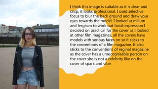
- 1. I think this image is suitable as it is clear and crisp, it looks professional. I used selective focus to blur the back ground and draw your eyes towards the model. I looked at millum and fergison to work out facial expression I decided on practical for the cover as I looked at other film magazines, all the covers have models with serious faces on so it sticks to the conventions of a film magazine. It also sticks to the conventions of reginal magazine as the cover has a unrecognisable person on the cover she is not a celebrity like on the cover of spark and vibe.
- 2. This image wouldn’t be suitable as its too blurry I used selective focus however, I don’t like how my other male model in focus is not looking at the camera it looks all most pointless to use selective focus in this picture as the audience don’t have much to look at and take from it.
- 3. This is an over the shoulder shot, I like this image as it shows our models interacting like it was taken out of a film and it looks interesting and realistic not like its being forced. I chose over the shoulder so it looks like our models are having a conversation and how the male is taller it looks better to be over his shoulder, almost as if he is looking over her to protect her and not in an intimidation way.
- 4. I like this image and I think its suitable as it shows our model interacting with the background, she isn’t looking at the camera and is walking along a path. I don’t think her smile looks forced so I like this. The lighting is good we can see her face clearly, I asked her to be happy and smile this facial expression is carefree. I think the angle is creative, looking down on her but in a good way as if something is watching over her I can say this as the lighting is bright and has no evil connotations.
- 5. This is image is not suitable as its all unforced, There are bottles in the way of the camera and not for any reason. The whole shot looks messy. I wouldn’t use this in my magazine or website as it doesn’t look professional.
- 6. I think this shot would work in my magazine as it looks creative and quirky something you would find in a independent film, unlike Hollywood films which are all action shots, the scenery is doing all the talking the bright sun light is connoting positivity. I took this photo in Winter gardens park which is exclusive to this region so the location is relating to the features of a regional magazine, let the scenery or location sell the magazine.
- 7. I took this picture at a metro station when the metro was pulling in, there is movement in this picture and looks like real life something is happening. I choose for my model not to look at the camera as this would take the natural look away from the scene. I think this image would work as the lighting is clear, nothing is out of place, blurry or messy.
- 8. I don’t like this picture as it is not on the right angle and is all too dark, I could use it as a cover but unlike slide number one this one is too dark, it looks lifeless and doesn’t have much to take from it. I couldn’t use it as a sub image as its not on the right angle or size.