Sony Ericsson T610 Campaign Guidelines
•
3 gefällt mir•591 views

The campaign guidelines for the full Sony Ericsson T610 Global Marketing Campaign. This was the first true JV product launched under the new brand, from concept through to launch. An extremely comprehensive campaign that was executed across all regions of the world and had variations of a TVC that ran at the same time.

Empfohlen
Weitere ähnliche Inhalte
Andere mochten auch
Andere mochten auch (14)
Ähnlich wie Sony Ericsson T610 Campaign Guidelines
Ähnlich wie Sony Ericsson T610 Campaign Guidelines (20)
Mehr von Mathew C.P Hayward
Kürzlich hochgeladen
Kürzlich hochgeladen (20)
Sony Ericsson T610 Campaign Guidelines
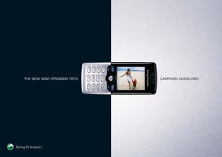
- 1. THE NEW SONY ERICSSON T610 CAMPAIGN GUIDELINES
- 2. CONTENTS Introduction 3 Design overview 7 “QuickShare” overview 10 “QuickShare” creative guidelines 12 Above-the-line television overview 16 Above-the-line print overview 18 Above-the-line creative guidelines 22 Online overview 34 Below-the-line overview 38 Below-the-line creative guidelines 41 Below-the-line - teasers 45 Below-the-line - postcards 47 Below-the-line - large point-of-sale 52 Below-the-line - small point-of-sale 61 Below-the-line - consumer literature 68 Below-the-line - product display / dispensers 89 Below-the-line - staff support materials 94 Below-the-line - launch materials / PR & retailer kits 98 Approval process 103 Disks & disk contents 105
- 3. 3 SIMPLICITY Simplicity in Form. Simplicity in Function. This has been the basis from which all development of the new Sony Ericsson T610 Marketing Campaign took place. It is an understated idea that is clearly defined once you see and hold the T610. Understated yet bold, a definitive statement about the style and direction of Sony Ericsson's design language, the T610 campaign has been designed based on the 'language' of the product. The T610 / T616 / T618 is Sony Ericsson's first phone to be designed with Sony Ericsson's new design language and form factor. It also brings with it a new MMI (Man Machine Interface) and revolutionary new “QuickShare” functionality. It is these two messages that this through-the-line campaign is built on, with the design being visually portrayed and “QuickShare” supporting the message.
- 4. 4 SIMPLICITY To illustrate the unique character and the benefits of this breakthrough product, we have used a very strong visual style based on the core characteristics of the product. In print, we have led with the product itself, using contrasting moods of 'darkness and light' to reinforce a new language in product design. This has been consistently executed in all printed materials, including the POS and PR items, as well as in Digital. Additionally, in the TVC we increase the “QuickShare” benefits with a consumer takeout of "Pass It On" to illustrate the picture messaging and built in camera functionality. In all elements, the product is the centre of attention. The T610 campaign has numerous elements, all built from the same brief demanding consistency in tone and manner. The strength of this campaign will be in the unified execution in market, that we can strive to achieve. Consistency must be paramount throughout the various consumer contact points.
- 5. 5 SIMPLICITY Though our advertising message is clear, we have assembled this manual in order to make sure our brand and product image remain strong and consistent throughout the world, from region to region. Here you'll find all the information you need to introduce the T610 in your market. The complete campaign includes TVC spots, print images with two routes (Style or Technical), Digital, POS and PR materials. Key to this campaign is the consistency and clarity of one united message. After all, the power of truly great advertising lies not only in the concept, but also in the executional details. Remember, Simplicity in Form, Simplicity in Function, that creates an extremely visually powerful offering.
- 6. 6
- 7. 7 BEAUTY The T610, conceived by industrial designer Erik Ahlgren, contrasts aluminium panels with a deep, lustrous black finish. The customer can choose from three colour themes that resemble the elements of nature, caught between darkness and light.
- 8. 8
- 9. 9 PERFORMANCE The T610 with “QuickShare” is a powerfully efficient, innovative and easy to use phone that’s perfect for the modern user. It boasts a built-in digital point-and-shoot camera, extra-large 65,536 colour LCD display and cutting edge picture sharing and connectivity applications.
- 10. TM THE FASTEST AND EASIEST WAY TO SHARE IMAGES
- 11. 11 The market is filled with high-performance camera phones that claim to fulfil your customers’ every need. What sets the T610 apart from the rest is “QuickShare”. “QuickShare” is a combination of cutting-edge imaging features and applications that are extremely easy to use. With “QuickShare” you can take a picture and share multimedia information locally or globally in just a few clicks. One click activates the camera, just one more and the picture is taken and saved. Now you’re ready to send the picture anywhere in the world, or share it locally from one device to another. QUICKSHARE
- 12. 12 QUICKSHARE LOGO SPECIFICATIONS The following is the “QuickShare” logo. The “QuickShare” logo must be reproduced in accordance with the logo reproduction sheets incorporated in these guidelines. The “QuickShare” logo can be used in both positive and negative imprinting. The “QuickShare” logo should never be used in combination with other letters, designs, symbols or logos. It must be used independently. The isolation zone should conform to the specifications shown below. QUICKSHARE h h h h
- 13. 13 The size of the “QuickShare” logo is indicated by height (h) as shown below. The colouring of the “QuickShare” logo is not specified. However it is recommended to use the neutral colour (black/white/grey /silver). The “QuickShare” logo should be used in a single colour. LOCATION The “QuickShare” logo is recommended to be displayed in at least one place of the “QuickShare” logo products/services. The “QuickShare” logo is recommended to be imprinted in package, cover page of the operation instructions, catalogue, and advertising material of “QuickShare” products/services. QUICKSHARE h
- 14. 14 TYPE STYLE When referring to “QuickShare” products / services in printed materials, the word “QuickShare” or “QUICKSHARE” can be used in a plain letter form (without a space between the letter ‘k’ and ‘s’). Example of incorrect manner: Quick Share, quick share, Quick share, etc. For the purpose of protection of the “QuickShare” trademark, use quotation marks or write in bold style or in Italic style. The “QuickShare” trademark must be handled with proper attention and should never be used as a generic term. Moreover, when describing “QuickShare” products/services in printed materials, the generic term is recommended to be mentioned also in at least one place of the materials. If “QuickShare” or the “QuickShare” logo is used in printed materials, the following note should appear at least once. And the “TM” mark is recommended to be placed on the bottom right of the “QuickShare” logo. e.g.“QuickShare”and are trademarks of Sony Ericsson Mobile Communications. QUICKSHARE TM T
- 16. 16 The above-the-line campaign is based on the product truth that the Sony Ericsson T610 is a distinctively designed phone that optimises style and function. TELEVISION CAMPAIGN The television campaign introduces consumers to the world of the T610. This incredibly stylish and choreographed world revolves around the T610 - the way it looks, the way you use it, the way you want to share it. ABOVE-THE-LINE
- 18. 18 PRINT CAMPAIGN The print campaign focuses on both the look and the functionality of the T610. This very clear dual message of style and substance is based on the following: • The inspiration behind the design of the phone is ‘night & day’. This contrast of light and dark is strongly reinforced by the reversed black and aluminium background. • The beauty of the phone’s materials is reinforced by the high quality photography that makes the most of the highly polished black and aluminium finish. • The functional simplicity of the phone - it has “QuickShare”. ABOVE-THE-LINE
- 19. 19 PRINT CAMPAIGN CREATIVE ROUTES There are two creative routes as follows: 1. A simple beauty shot of the phone which is designed to work in large format media and style publications. It leaves you with the clear impression of the launch of a highly desirable design and fashion icon. 2. A more informative creative designed to work in intimate media environments such as newspapers and industry focussed magazines. This format allows for close-up shots of the integrated camera, the snap-on flash and other angles of the phone. The copy explains the simple “QuickShare” functionality. ABOVE-THE-LINE
- 22. 22 FONTS Headline font: The main headlines are all in Square721 BT, +10 tracking, in white. The size depends on the type of ad to be produced - see page 28 - Construction. Body Copy: All body copy should be set in 8.3pt Square721 BT, with 17pt leading, +10 tracking, ranged left and in 100% Black. The web address which appears at the end of the body copy is set in the same size. If you do not have the font available in your territory it must be purchased from the nearest vendor. SONY ERICSSON LOGO Whilst the positioning of the logo should remain proportionate to the examples included, the rules governing the position of the logo state that it should sit at least half the diameter of the ball away from any trim edge or safe area. ABOVE-THE-LINE
- 23. 23 IMAGES The main image is made of two elements, the background and the handset Background: The metallic backgrounds should be scaled to just deeper than the depth of the advertisement (allowing for bleed) so that the full graduation is displayed. It should then sit on a rich CMYK black background. e.g. for magazine use (i.e. 320 UCR), the black breakdown is: – Cyan: 80% – Magenta: 70% – Yellow: 70% – Black: 100% This is to emulate the depth of colour on the handset itself when reproduced. If for a given specification the amount of UCR has to be increased on the phone image, the black panel should be changed to match. NB the black should always be the maximum allowed by the specification. ABOVE-THE-LINE
- 24. 24 HANDSET On a DPS, the proportion of “Metal” to black should be in the same ratio as on the handset itself (as much as possible), whilst making sure the handset does not go through the gutter. See page 28 for more details. To find an approximate size for the handset, the black portion of the handset should occupy roughly half of the silver area. Care must be taken to ensure that the split between the colours on the handset goes EXACTLY through the split between the colours on the background. It sits on the vertical centre of the page. ABOVE-THE-LINE
- 25. 25 SCREENSHOT GUIDELINES There are a total of 6 screenshots that can be used in the screen of the phone, 5 can be used in landscape format, all 6 in portrait. These shots have global usage for one year in all media from the date that they are first used in a territory. Below is our recommendation for which landscape screenshot works best with certain colours of phones. However this is only a recommendation as we have supplied all images in all colours of phone. ABOVE-THE-LINE
- 26. 26 PORTRAIT FORMATS None of our executions require portrait format screen images, but we have supplied all screenshots in portrait formats if you have a need to. ABOVE-THE-LINE
- 27. 27 HANDSET IMAGES These images can be used in any material used to promote the T610. They are all cleared for global usage in all media for one year. ABOVE-THE-LINE
- 28. 28 STYLE PRESS DOUBLE PAGE SPREAD CONSTRUCTION Try to maintain the same proportion of black and silver on the background as on the handset itself. Ensure the left hand edge of the handset is AT LEAST 4mm from the gutter. Enlarge the “with QuickShare” item until it is AT LEAST 10mm away from the edge. Ensure the text on the right of the handset is at least 4mm away from it. This dictates the size of the rest of the headline type on the left. The left portion of the headline should then be ranged right, again AT LEAST 4mm from the gutter. The split between the colours of the background must fall EXACTLY down the colour split on the handset. Position the web address on the same baseline as the logo and the same distance away from the right edge as the “QuickShare” item. Ensure that there is at least a 4mm space either side of the gutter. Check with your publication to see if more space is needed. ABOVE-THE-LINE
- 29. 29 STYLE PRESS SINGLE PAGE CONSTRUCTION Try to maintain the same proportion of black to silver on the background as on the handset. The right edge of the word “QuickShare” should range with the right edge of the handset. This then dictates the size of the rest of the headline text. Make sure the wordspace between “T610” and “WITH” is double that of the rest of the words. The headline should sit the height of the “QuickShare” logo above the handset. The web address should sit on the same baseline as the text part of the logo and the same distance from the right as the ball is from the left. ABOVE-THE-LINE
- 30. 30 TECHNICAL PRESS DOUBLE PAGE SPREAD CONSTRUCTION Create the ad as for a normal DPS. Except the “WITH QuickShare” line should be placed away from the handset and away from the colour split, at a distance equal to the capheight of the headline. The block of type should sit exactly in between the right of the handset and the right hand edge. The “QuickShare” logo, the handset (or the handset with Flash) and the three views of the handset should all be the same width as the block of copy. The three handset views should sit on the vertical centre of the main handset. At the top of the column, there should be a gap the size of the height of the “QuickShare” logo above and below the handset. The web address should range right with the right of the copy block. ABOVE-THE-LINE
- 31. 31 TECHNICAL PRESS SINGLE PAGE CONSTRUCTION Construct the ad as for a Style version, but this time the silver/black ratio is ignored. To get the type size for the headline, range the text right with the right edge of the handset, then enlarge the text until the colour split falls in a word space. The “WITH QuickShare” line should be placed away from the handset and away from the colour split, at a distance equal to the cap-height of the headline. Use exactly the same treatment for the right hand side elements as on a DPS (see previous page). ABOVE-THE-LINE
- 32. 32 CONSECUTIVE SINGLE PAGE CONSTRUCTION As shown below, achieve a balance between phone size and text size, as this determines the width of the silver panel, which in turn will determine the measure of the column of type on the next page. ABOVE-THE-LINE
- 33. 33 CONSECUTIVE SINGLE PAGE CONSTRUCTION Make the panel width, phone size, and headline type size the same as on the previous page. Make the “QuickShare” logo the same width as your text measure. Start the text the height of the “QuickShare” logo away from the logo itself. Wrap the copy around the phone, then at the end of the copy, the height of the “QuickShare” logo away, position the three handset images. This total panel should then centre within the depth of the ad, as far as possible. The web address then sits on the same baseline as the SE logo, and ranged right from the edge of the body copy. ABOVE-THE-LINE
- 34. 34 t-six-ten is a monthly online magazine showcasing the best in mobile photography. It is initially planned to run from May to September to cover the build up to the above-the-line launch in September. The site is flexible and may be continued after September. HOW DOES IT WORK? Users (known as ‘image scouts’) register online to compete in monthly photographic challenges. They can upload one entry per month which is displayed on their t-six-ten personal home page. The image scouts will be able to vote on the images displayed on the site and in this way the winners and runners up are selected. The monthly winner will have their image displayed on the t-six-ten homepage and will also win a new Sony Ericsson T610. A new photographic challenge is set each month. The ten most popular images from each issue will be displayed in the gallery section of t-six-ten. These images will be made available as wallpapers and e-cards that can be downloaded and passed on to friends. ONLINE
- 35. 35 WHAT ELSE DOES IT CONTAIN? Within t-six-ten is a section that showcases the Sony Ericsson T610. It covers the form and function of the T610 as well as giving an explanation of “QuickShare”. This section of the site also contains tips from famous photographers and Sony Ericsson designers on how to get the most out of the T610’s built-in camera. Each issue of t-six-ten will also feature artists reporting on aspects of their life and showing off their skills with the T610. GUIDELINES For any regional adaptations, please contact: – martin.lundin@sonyericsson.com ONLINE
- 36. 36
- 37. 37
- 38. 38 To assist you in promoting the new Sony Ericsson T610 we have taken the above-the-line campaign and developed it for below-the-line point-of-sale use. The beauty and simplicity of the above-the-line campaign has been retained for the below-the-line campaign and also makes use of many of the same images. A wide range of point-of-sale items has been developed for retail outlets which include training and sales material for staff. BELOW-THE-LINE
- 39. 39 The point-of-sale fulfils a range of objectives: • Show the beauty of the phone and give the clear impression of the launch of a highly desirable design and fashion icon. • Demonstrate the importance of “QuickShare”. • Show and explain the features of the phone in a very simple way. • Retain a high level of simplicity, clarity and elegance of design across every item. • Ensure high levels of visibility and standout in comparison to competitive point-of-sale. BELOW-THE-LINE
- 40. 40 SELLING THE T610 When siting point-of-sale items for the T610, attention must always be given to achieving maximum impact with minimum fuss and clutter. The T610 is elegant in its form and technological simplicity and by giving promotional materials space and prominence these features will shine through. BELOW-THE-LINE
- 41. 41 SONY ERICSSON LOGO The symbol and stylised name logo. The stylised name is reproduced in grey in four colour CMYK. The symbol, the stylised name and the Sony Ericsson logotype should be surrounded by ample clear space. At the very least, other elements must be kept out of the isolation zone indicated here: Height - At least half the height of the symbol Width - At least half the width of the symbol Wherever possible please position the logo on a black background. N.B. No attempt should be made at any time to redraw any element of the Sony Ericsson identity. BELOW-THE-LINE
- 42. 42 OPERATOR LOGOS These will be determined by which ever local market operator is working with Sony Ericsson. Operator logos should be visually aligned to the centre of the Sony Ericsson logo. The operator logos should never appear larger than the Sony Ericsson logo. HEADLINE Headline is set in Eurostile regular and should appear in one of the following ways: - White on black - Black on silver - Black on white Please set headline to the scale illustrated. BODY COPY Body copy is set in Helvetica Neue Roman and should appear in one of the following ways: - Black on silver - Black on white - 40% black (CMYK) or PMS Cool Grey 6 on white Please set body copy to the scale illustrated. BELOW-THE-LINE
- 43. 43 BACKGROUND The background is created in black (100K) and a high-resolution silver image (supplied). When the T610 is placed on the silver background the flare/glow on the background must always appear from behind the T610. The texture of the background should run horizontally wherever possible. In some cases where it is not possible to run the texture horizontally e.g. portrait banner, the texture may run vertically. Red and blue backgrounds are also supplied for use with the red and blue versions of the T610. The red and blue versions of the T610 should always appear with their respective background colour. BELOW-THE-LINE
- 44. 44 SCREEN IMAGES There are six supplied images that may be used on the screen of the T610. No other images may be used without prior approval*. SIZES When producing the following items please ensure the T610 is printed actual size: - Shelf wobblers - “QuickShare” booklet - Staff sales prompt booklet *Additional images will be supplied from the TVC based on key approved frames BELOW-THE-LINE
- 45. TEASERS
- 46. FILENAME Teasers SIZE 210 (W) x 420 (H) (Can be scaled to size required) MATERIAL 150gsm / GLOSS COLOUR CMYK 46
- 47. POSTCARDS
- 48. FILENAME Postcards_Set1 SIZE 148 (W) x 105 (H) MATERIAL 350gsm / GLOSS COLOUR Front - CMYK. Back - Pantone Cool Grey 6 CV 48
- 49. POST CARD2 WHY WAIT WHEN THERE’S QUICKSHARE QuickShare is the fastest and easiest way to share images. One click activates the built-in digital camera. Just one more and the picture’s yours. Now you’re ready to send it around the world in seconds. www.t-six-ten.com POST CARD3 The new Sony Ericsson T610 The T610 with QuickShare is a powerfully efficient, innovative and easy to use phone that’s perfect for the modern user. It boasts a built-in digital point-and-shoot camera, extra-large 65,536 colour LCD display and cutting edge picture sharing and connectivity applications. Elegantly conceived and stylishly simple, the T610 contrasts aluminium panels with a deep, lustrous black finish. WHY WAIT WHEN THERE’S QUICKSHARE POST CARD4 Elegantly conceived and stylishly simple, the T610 contrasts aluminium panels with a deep, lustrous black finish. And with its large screen, digital camera and easy-to-use imaging features, the T610 is visually powerful however you look at it. www.t-six-ten.com POST CARD5 WHY WAIT WHEN THERE’S QUICKSHARE Elegantly conceived and stylishly simple, the T610 contrasts aluminium panels with a deep, lustrous black finish. And with its large screen, digital camera and easy-to-use imaging features, the T610 is visually powerful however you look at it. www.t-six-ten.com POST CARD6 WHY WAIT WHEN THERE’S QUICKSHARE The built-in digital point-and-shoot camera takes crystal-clear pictures in true-to-life colour. Activate the camera and take a picture in just two clicks, then send it around the world in seconds. www.t-six-ten.com POSTCARDS_SET1 APPROVED COPY 49 POST CARD1 WHY WAIT WHEN THERE’S QUICKSHARE Aluminium panels, contrasted with a deep, lustrous black finish. The T610 is elegantly conceived and stylishly simple. And with its large screen, digital camera and easy-to-use imaging features, the T610 is visually powerful however you look at it. www.t-six-ten.com
- 50. FILENAME Postcards_Set2 SIZE 148 (W) x 105 (H) MATERIAL 350gsm / GLOSS COLOUR Front - CMYK. Back - Pantone Cool Grey 6 CV 50
- 51. POST CARD1 The new Sony Ericsson T610 The T610 with QuickShare is a powerfully efficient phone that’s perfect for the modern user. With built-in digital camera, large 65,536 colour display and cutting edge picture sharing applications, you can take and share images fast. www.t-six-ten.com POST CARD2 The new Sony Ericsson T610 The built-in digital point-and-shoot camera takes crystal-clear pictures in true-to-life colour. Activate the camera and take a picture in just two clicks, then send it around the world in seconds. www.t-six-ten.com POST CARD3 Elegantly conceived and stylishly simple, the T610 contrasts aluminium panels with a deep, lustrous black finish. And with its large screen, digital camera and easy-to-use imaging features, the T610 is visually powerful however you look at it. www.t-six-ten.com POST CARD4 Elegantly conceived and stylishly simple, the T610 contrasts aluminium panels with a deep, lustrous black finish. And with its large screen, digital camera and easy-to-use imaging features, the T610 is visually powerful however you look at it. www.t-six-ten.com POST CARD5 Elegantly conceived and stylishly simple, the T610 contrasts aluminium panels with a deep, lustrous black finish. And with its large screen, digital camera and easy-to-use imaging features, the T610 is visually powerful however you look at it. www.t-six-ten.com POST CARD6 QuickShare is a combination of cutting-edge imaging features and applications that are extremely easy to use. With QuickShare you can take a picture and share multimedia information locally or globally in just a few clicks. One click activates the camera, just one more and the picture’s yours. Now you’re ready to send your picture anywhere in the world, or share it locally from one device to another. QuickShare starts with the camera that’s built-in to your phone. Where it ends is up to you. www.t-six-ten.com POSTCARDS_SET2 APPROVED COPY 51
- 53. FILENAME Corner Poster SIZE 594 (W) x 420 (H) (Can be scaled to size required) MATERIAL 150gsm / GLOSS COLOUR CMYK 53
- 54. FILENAME Horizontal Banner SIZE 630 (W) x 148 (H) (Can be scaled to size required) MATERIAL 150gsm / GLOSS COLOUR CMYK FILENAME Vertical Banner SIZE 148 (W) x 630 (H) (Can be scaled to size required) MATERIAL 150gsm / GLOSS COLOUR CMYK 54
- 55. FILENAME Point_Shoot_Share_Poster SIZE 297 (W) 210 (H) (Can be scaled to size required) MATERIAL 150gsm / GLOSS COLOUR CMYK FILENAME Point_Shoot_See_Poster SIZE 297 (W) x 210 (H) (Can be scaled to size required) MATERIAL 150gsm / GLOSS COLOUR CMYK 55
- 56. FILENAME Quickshare_Poster_PDA SIZE 210 (W) x 297 (H) (Can be scaled to size required) MATERIAL 150gsm / GLOSS COLOUR CMYK FILENAME Quickshare_Poster_Combo SIZE 210 (W) x 297 (H) (Can be scaled to size required) MATERIAL 150gsm / GLOSS COLOUR CMYK 56
- 57. FILENAME Quickshare_Poster_Printer SIZE 210 (W) x 297 (H) (Can be scaled to size required) MATERIAL 150gsm / GLOSS COLOUR CMYK FILENAME Quickshare_Poster_PC SIZE 210 (W) x 297 (H) (Can be scaled to size required) MATERIAL 150gsm / GLOSS COLOUR CMYK 57
- 58. FILENAME Modular_Bunting_CubeSides SIZE 120 (W) x 120 (H) (Can be scaled to size required) MATERIAL 150gsm / GLOSS COLOUR CMYK FILENAME Quickshare_Poster_Bluetooth SIZE 210 (W) x 297 (H) (Can be scaled to size required) MATERIAL 150gsm / GLOSS COLOUR CMYK 58
- 59. FILENAME Modular_Bunting_CubeSides SIZE 120 (W) x 120 (H) (Can be scaled to size required) MATERIAL 150gsm / GLOSS COLOUR CMYK SUGGESTED CUBE COMBINATIONS 59
- 60. FILENAME Modular_Bunting_CubeSides SIZE 120 (W) x 120 (H) (Can be scaled to size required) MATERIAL 150gsm / GLOSS COLOUR CMYK SUGGESTED CUBE COMBINATIONS 60
- 62. FILENAME Point_Shoot_Share_Wobbler_1 SIZE Produce with phone scaled to actual size MATERIAL 200gsm / Plastic Coated COLOUR CMYK 62
- 63. FILENAME Point_Shoot_Share_Wobbler_2 SIZE Produce with phone scaled to actual size MATERIAL 200gsm / Plastic Coated COLOUR CMYK 63
- 64. FILENAME Linked_Wobbler SIZE Produce with phone scaled to actual size MATERIAL 200gsm / Plastic Coated COLOUR CMYK 64
- 65. FILENAME Flash_Wobbler SIZE Produce with phone scaled to actual size MATERIAL 200gsm / Plastic Coated COLOUR CMYK FILENAME Smile_Wobbler SIZE Produce with phone scaled to actual size MATERIAL 200gsm / Plastic Coated COLOUR CMYK 65
- 66. FILENAME Side_Wobbler SIZE Produce with phone scaled to actual size MATERIAL 200gsm / Plastic Coated COLOUR CMYK FILENAME Side_Barker SIZE 420 (W) x 40 (H) MATERIAL 200gsm / Plastic Coated COLOUR CMYK FILENAME Button Barker SIZE 420 (W) x 40 (H) MATERIAL 200gsm / Plastic Coated COLOUR CMYK 66
- 67. FILENAME Door_Sign_2 SIZE 315 (W) x 40 (H) MATERIAL 350gsm / Plastic Coated COLOUR CMYK FILENAME Door_Sign_1 SIZE 315 (W) x 100 (H) MATERIAL 350gsm / Plastic Coated COLOUR CMYK 67
- 69. Circular Leaflet FILENAME Circular Leaflet SIZE 112 (W) x 120 (H) MATERIAL 200gsm / GLOSS COLOUR CMYK 69
- 70. 70
- 71. 71
- 72. 72
- 73. 73
- 74. 74
- 75. 75
- 76. 76
- 77. 77
- 78. 78
- 79. 79
- 80. 80
- 81. FILENAME Quickshare_Leaflet SIZE 44 (W) x 102 (H) MATERIAL 200gsm / GLOSS COLOUR CMYK 81
- 82. FILENAME Retail_Flipchart SIZE 297 (W) x 210 (H) MATERIAL 200gsm / GLOSS COLOUR CMYK 82
- 83. 83
- 84. 84
- 85. 85
- 86. 86
- 87. 87
- 88. 88
- 89. PRODUCT DISPLAY / DISPENSERS
- 90. FILENAME Leaflet_Dispenser/Product_Stand SIZE 120 (W) 460 (H) MATERIAL 2000 Micron Display Board / 440 Micron Folding Box Board / 440 Micron Clear PVC COLOUR CMYK / Special Silver 90
- 91. DISPLAY BOARD ACRYLIC LID PVC / ACRYLIC COVER BATTERY POWERED ROTATING MOTOR POSTAL PORT PHONE STAND LEAFLET DISPENSER PRINTED PVC LEAFLET CAP ROTATING MOTOR BATTERY ROTATING MOTOR CABLE FILENAME Leaflet_Dispenser/Tech_Drawing SIZE 120 (W) 460mm (H) MATERIAL 2000 Micron Display Board / 440 Micron Folding Box Board / 440 Micron Clear PVC COLOUR CMYK / Special Silver 91
- 92. FILENAME Mirrored_Product_Stand SIZE 297 (W) x 210 (H) MATERIAL 2000 Micron Display Board / 440 Micron Folding Box Board / 3mm Plastic Mirror Board COLOUR CMYK CAN BE USED FOR: - Real Product - Dummy Phone - Quickshare Leaflet 92
- 93. 130mm 135mm 297mm 70mm 297mm 140mm Plastic Mirror Display Board Structure Litho Printed Folding Box Board Cover Phone Holder (Cut into box) FILENAME Mirrored_Product_Tech_Drawing SIZE 297 (W) x 210 (H) MATERIAL 2000 Micron Display Board / 440 Micron Folding Box Board / 3mm Plastic Mirror Board COLOUR CMYK 93
- 95. FILENAME Badges SIZE Large - 50 (W) 35 (H) Small - 60 (W) 14 (H) MATERIAL Aluminium / Stainless Steel COLOUR CMYK / Black on Silver FILENAME Pendant SIZE 8.8 (W) 20.4 (H) (to same scale/shape as phone) MATERIAL Aluminium / Stainless Steel COLOUR Black on Silver 95
- 96. FILENAME Staff_Sales_Prompt SIZE 44 (W) x 120 (H) MATERIAL 300gsm / GLOSS COLOUR CMYK 96
- 97. 97
- 98. LAUNCH MATERIALS - PR & RETAILER KITS
- 99. FILENAME Launch_Box SIZE 427 (W) x 374 (H) MATERIAL 2000 Micron Display Board / 440 Micron Folding Box Board COLOUR CMYK / Special Silver 99
- 101. CIRCULAR BROCHURE DESIGN BOOKLET CAMPAIGN OVERVIEW 101
- 102. LidLid BoxBox Litho Printed. Display board. Total Dimensions: Depth: 304 mm Width: 427 mm Height: 40 mm Dimensions: Box insert 300mm h, 352mm w and 423mm d. Fitting for phone 5mm insert, 140 mm wide and 40mm deep. Fitting for pen 5mm depth, 140mm long and 12mm wide. Sony Product Box FBB covering. FBB Fitting for phone. FBB Fitting for pen. Display board inner White centered. Layer of display board at the top. Empty space. FILENAME Launch_Box_Tech_Drawing SIZE 427 (W) x 374 (H) MATERIAL 2000 Micron Display Board / 440 Micron Folding Box Board COLOUR CMYK / Special Silver 102
- 103. APPROVAL PROCESS
- 104. 104 Sony Ericsson has secured approval for the look, layout and graphics that you have received with all the partners involved. We will work closely with you to facilitate local adaptations whilst ensuring global consistency is retained. For more information please contact: – Mat Hayward Creative Director, Global Marketing E-mail: mathew.hayward@sonyericsson.com Telephone: +44 208 762 5857 – Takuya Kawagoi Art Director, Global Marketing E-mail: takuya.kawagoi@sonyericsson.com Telephone: +44 208 762 5856 CONTACTS