CHEAP Call Girls in Malviya Nagar, (-DELHI )🔝 9953056974🔝(=)/CALL GIRLS SERVICE
Digipacks
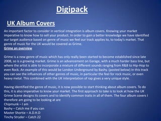
1. Digipack UK Album Covers An important factor to consider in vertical integration is album covers. Knowing your market imperative to know how to sell your product. In order to gain a better knowledge we have identified our target audience based on genre of music we feel our track applies to, to today's market. That genre of music for the UK would be covered as Grime. Grime an overview Grime is a new genre of music which has only really been started to become established since late 2008, so is a growing market. Grime is an advancement on Garage, with a much harder bass line, but where the artist is able to incorporate a mixture of different sounds ranging from R&B to Hip-Hop to even Rock. An example of this would be London Underground by Bashy. (posted below) In this track you can see the influences of other genres of music, in particular the feel for rock music, or even heavy metal. This combined with the UK interpretation of rap gives a very unique style. Having identified the genre of music, it is now possible to start thinking about album covers. To do this, it is also imperative to know your market. The first approach to take is to look at how the UK Grime Scene designs its covers and to identify common traits in all of them. The four album covers I therefore am going to be looking at are Chipmunk – I am Bashy – Catch me if you can Master Shortie – A.D.H.D Tinchy Stryder – Catch 22
2. Chipmunk – I Am The first thing that stands out in this album is clearly the bold writing. It speaks out to you, and almost grabs your attention. This is a clever way too attract buyers attention. The use of Yellow as a background could represent something about the Persona of Chipmunk himself. Yellow as a colour represents Vanity. A closer look at the photo reveals that this could be true. Behind the wording is an effect that makes it seem as if the sun is rising behind him. This could connote that he is a rising star. The sun is the biggest of stars and by including it in the layout of the page suggests that Chipmunk is becoming a star. The title its self I Am Chipmunk, could be seen as Chipmunk attempting to establish himself as an artist, although he is well known amongst the grime scene, he is less commercially accepted and this album could be him now trying to become a bigger selling artist.
3. Bashy – Catch Me If You Can The first thing to note about this album cover is the dominant frame of Bashy, the artist, looking directly at you. This plays in with the album title Catch Me If You Can. This carries a double entendre. First of all it plays on the words of Catch Me If You Can, as if he is talking to us the buyer. The Way of catching him is through buying the album. The second meaning it could be argued, serves as a warning to other artists, that Bashy is on such a high level in terms of is music, that he can not be compared to, can not be caught up by anyone. In terms of layout, it is important to acknowledge the background. It is a number of CCTV shots around the country. The background again relating back to the album title. Also present is Bashy’s trademark logo of his name. Bashy. This is present on every Album cover, and mix tape he has created, using the same font as the lollipops Chupa Chups. This font has followed Bashy around since his first mixtape the Chupa Chups mixtape. It is how Bashy as an artist is now recognised.
4. Master Shortie – A.D.H.D The title of A.D.H.D is an interesting title to pick. Attention-deficit hyperactivity disorder. This fits into Master Shortie’s personality, as a bit hyper, and a bit crazy at times. This is reflected into his music. The album cover its self is basic, but clever. Having a Neutral background and just a black and white photo does not speak volumes about the artist. However, the sudden streaks of colour's, red, purple, pink and blue help in directing your attention to the artist name and album title, making it effective in standing out to the buyer. The Central image is Master Shortie himself.
5. Tinchy Stryder – Catch 22 This album cover is a little more creative in terms of the technology used. The main central focus is directed towards Tinchy Stryder, through the use of an effect, which has distorted the other images, to make it appear as if there is a motion blur because he is moving so fast. Also central in focus is the artist name and album title, used in a white font to make it stand out more. The title itself, does not appear to be related to unlike the other three albums chosen. Catch 22 is “a situation in which a desired outcome or solution is impossible to attain because of a set of inherently illogical rules or conditions”. A quick look at the track listings shows that it is a track on the album, perhaps Tinchy’s favourite track.