Evolution of Research by Joanne Mechling, Market Strategies
•
2 gefällt mir•318 views

Joanne Mechling of Market Strategies International describes the results of an experiment she conducted to test the impact of integrative graphics and gamification on online surveys, with surprising results.

Empfohlen
Weitere ähnliche Inhalte
Mehr von NorthWest MRA
Mehr von NorthWest MRA (11)
Kürzlich hochgeladen
Kürzlich hochgeladen (20)
Evolution of Research by Joanne Mechling, Market Strategies
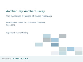
- 1. Another Day, Another Survey The Continued Evolution of Online Research MRA Northwest Chapter 2012 Educational Conference May 8, 2012 Reg Baker & Joanne Mechling
- 2. Overview 1. The respondent engagement problem 2. The experiment 3. Implications of findings 4. A restrained approach to interactivity 5. Meeting the increasing demand for online respondents 6. Summary 7. Q&A 2
- 3. The respondent engagement problem 3
- 4. Online MR has been extraordinarily successful US Online Spend ($000s) $2,492 $2,308 $2,061 $1,960 $2,015 $1,933 $1,662 $1,375 $1,163 $881 $709 $435 $273 $111 $12 $33 1997 1998 1999 2000 2001 2002 2003 2004 2005 2006 2007 2008 2009 2010 2011 2012F Source: Inside Research, 2012 4
- 5. But online MR has a problem Speeding Straightlining Demand Random responding Parsimonious verbatims Participation 5
- 6. Engagement from a Survey Research Perspective “Respondent motivation declines as the interview continues beyond an optimal point.” --Cannell & Kahn (1968) “Respondent burden . . . (1) the length of the interview; (2) the amount of effort required of the respondent; (3) the amount of stress on the respondent; and (4) the frequency with which the respondent is interviewed.” ---Bradburn (1977) “Respondents answering items that are included in large sets toward the later parts of a long questionnaire are more likely to give identical answers to most or all of the items, compared to those responding to items in smaller sets or in shorter questionnaires.” ---Herzong & Bachman (1981) “Instead of seeking optimal solutions to problems, people usually seek solutions that are simply satisfactory or acceptable in order to minimize psychological costs.” ---Krosnick & Alwin (1987) 6
- 7. Engagement from a Technology Perspective “ A quality of user experience that emphasizes the positive aspects of interaction, an in particular the phenomena associated with being captivated by technology (and so being motivated to use it). Successful technologies are not just used, they are engaged with; users invest time, attention, and emotion into the equation.” --- Attfield, Kazai, Laimas & Piwowarski (2011) “The more engaged users are, the more features an application can sustain. But most users have low commitment -- especially to websites, which must focus on simplicity, rather than features.” ---Nielsen (2007) “Leverage knowledge in the head…Performance can be faster and more efficient.” ---Norman (1988) 7
- 8. Current Schools of Thought 1. Use of interactive features such as slider bars, drag and drops, and other Flash-like objects increase respondent enjoyment, yield better quality data and improve survey participation (Reid, Morden & Reid, 2007). 2. Respondents prefer standard HTML formats (Miller, 2009) and extensive use of interactive features can have unpredictable impacts on response, denigrating data quality (Malinoff, 2010). 3. Use of game-like features in online surveys increase engagement, encourage more thoughtful responding and better quality data (Puleston and Sleep, 2011). 8
- 9. The experiment 9
- 10. 4 Survey Types Text only Decoratively visual Male Male Functionally visual Gamified 10
- 11. Method Replicate Edison Electric Institute study. US adults 18+ from ResearchNow panel. Random assignment to design treatments: Text only Decoratively visual n=251 n=251 Functionally visual Gamified n=252 n=253 Fieldwork: June 28–July 5, 2011. Participation rate 8%. 11
- 12. Text only 12
- 13. Decoratively visual 13
- 14. Functionally visual 14
- 15. What’s a game? Back story Game-like aesthetic A challenge Rules for play Gamified Rules for advancement Rewards for accomplishment 15
- 16. Gamified 16
- 17. Hypotheses Text only Decoratively visual H0 Lowest H1 No benefits vs. satisfaction other treatments Functionally visual Gamified H2 Satisfaction, H3 Polarized appeal, engagement and risking self- data quality equal selection to or greater than H4 Adds to survey gamified costs (for us) 17
- 18. Productivity Decoratively Functionally Total Text only visual visual Gamified Completion rate 80% Completion length 15 mins. Labor vs. “text only” 1.1x 1.5x 2.0x 18
- 19. Respondent characteristics Decoratively Functionally Total Text only visual visual Gamified Male 48% Age <35 24% College graduate 57% Income <$25K 18% Play games daily/weekly 62% Play games seldom/never 24% Hours online/week 24 19
- 20. Response behaviors Decoratively Functionally Total Text only visual visual Gamified Inconsistent responses 20% Didn’t follow instruction 12% Grid straightline 10% 20
- 21. Response distributions Scale items Categorical items 1 difference Functionally visual (chance) 7 out of 42 different 21
- 22. Response distributions Text only Functionally visual 22
- 23. Response distributions Decoratively visual Functionally visual 23
- 24. Respondent evaluations Decoratively Functionally Total Text only visual visual Gamified Interesting 5.6 Easy to read 6.2 Easy to answer 6.1 Fast 5.3 Enjoyed 5.4 Estimated minutes 14 24
- 25. Findings Text only Decoratively visual H0 Lowest H1 No benefits vs. satisfaction other treatments Functionally visual Gamified H2 Satisfaction, H3 Polarized appeal, engagement and risking self- data quality equal selection to or greater than H4 Adds to survey gamified costs (for us) 25
- 26. Visually functional and gamified treatments provided... • A more enjoyable respondent experience • No increase in sampling error or changes to response distributions • No decrease in satisficing • Increase in production costs (for us) 26
- 27. Implications of findings 27
- 28. What our experiment tells us • Key to survey engagement is...the same as it ever was: − Survey length − Topic salience − Cognitive burden − Frequency of survey requests • Creating a more enjoyable survey experience still a worthy goal. • Surveys will become more graphical (functionally visual). • Challenge: develop and execute research focused on defining best practices for visually enhanced surveys to replace those that evolved (over decades) for text only surveys. Rigorous & Evangelism systematic evaluation 28
- 29. A restrained approach to online survey embellishment & interactivity 29
- 30. The impact of images • Web surveys make it relatively easy for surveys to incorporate photographs, graphics, and other images. • Use of images in web surveys can be: − decoration to provide a more attractive interface for the respondents, − an integral part of the question, helping respondents to identify the particular object they are being asked about • Even when images are intended merely as embellishment, they are likely to be powerful, contextual stimuli and can have effects on responses: −Best case, they distract respondents from the task of answering questions; −Worst case, they change the meaning of questions. • Images incorporated into a survey need to be chosen very carefully and deliberately. 30
- 31. Images can move answers in the direction of the image • Couper, Tourangeau, and Kenyon (2004) varied the content of photographs that accompanied each of 6 survey items that asked respondents how often they’d done something. • A photograph that depicted some instance of the category of interest accompanied each item; images chosen to represent low or high frequency exemplars of the target category: Low High frequency frequency • One group of respondents saw only the high frequency exemplars and a second group saw only low frequency exemplars −Images seen had statistically significant effects on answers to all 6 items. −Those who saw high frequency exemplars reported higher frequencies than those who got the low frequency exemplars. 31
- 32. Images can narrow the interpretation of the category of interest • Tourangeau et al., (2011) compared responses to: Visual examples vs. Verbal examples Fruit (including bananas, watermelon, apples, oranges, pineapple, etc.) • Respondents reported eating more servings of foods in a target category when the categories were represented by words than by a picture −Even though verbal and pictorial examples on the same level of generality were chosen. 32
- 33. Images can serve as a standard of comparison affecting the judgments made • Couper, Conrad, and Tourangeau (2007) displayed photographs either of a woman in a hospital bed or a young woman jogging to web survey respondents. • Respondents received one or the other picture in a web survey. Images appeared near a question asking a respondent to rate the quality of his/her own health. • Respondents rated their own health as worse when they got the picture of the jogger and as better they got the picture of the sick women 33
- 34. Background choices matter • Color is not a neutral choice; Baker & Couper (2007) tested 3 colors as backgrounds: Breakoff rates 15.0% 10.8% 13.7% No effect on perceived/actual completion time or on subjective evaluation items asked at the end. • Nielsen (2006) argues: “Use either plain-color backgrounds or extremely subtle background patterns. Background graphic interfere with the eye’s capability to resolve the lines in the characters and recognize word shapes.” 34
- 35. Respondents use color to assign meanings to scale points • Tourangeau, Couper and Conrad (2004, 2007) argue that respondents apply 5 heuristics that help them interpret the response scales in visual surveys, one being: “Like in appearance means close in meaning” • Tourangeau, Couper, and Conrad (2007) compared two scales experimentally: Two colors One color 35
- 36. Colors can move scale use to the extreme Responses shift toward the more positive end of the scale when the top scale was used as compared to the bottom scale. 50 45 Same Color 40 Two Color 36.8 34.9 35 30 Percent 25.6 26.2 25 22.4 20 17.8 15 9.7 10 6.0 7.2 6.3 5 1.7 3.1 1.9 0.6 0 1 2 3 4 5 6 7 36
- 37. Progress bars: Friend or foe? • Assumptions about progress bars: −Respondents want to be informed about their position in the questionnaire. −Providing this information will increase the likelihood they will finish it. • Callegaro, Villar, and Yang (2011) carried out a meta-analysis of studies done on progress bars and break-off rates. Their conclusions: −Progress indicators by themselves do not appear to lower breakoffs, they may increase breakoffs when they offer discouraging news. −They only clearly reduce breakoffs when they offer unusually positive feedback. 37
- 38. Meeting the increasing demand for online respondents 38
- 39. Are online panels an anachronism? • High demand • High turnover • Increased focus on low incidence populations • Concerns about panel biases, diversity and representivity 39
- 40. The immediate future is multisourcing 1. Extend the reach of online sampling beyond a single panel. 2. Find people who want to do a survey now. 3. Screen and match them to a waiting survey. 40
- 41. Pros and cons of routers Pro Con • Increases diversity • Black box • Reduces reliance on professional • Respondent validation is more respondents difficult • Supports blending • Respondent reuse may be problematic • Reduces screen outs • Router bias • Standardizes online sample selection • No standards 41
- 42. Summary 42
- 43. Summary 43
- 44. Thank you! reg.baker@marketstrategies.com joanne.mechling@marketstrategies.com