
Empfohlen
Empfohlen
Weitere ähnliche Inhalte
Andere mochten auch
Andere mochten auch (20)
Ähnlich wie R&p
Ähnlich wie R&p (20)
Mehr von nctcmedia12
Mehr von nctcmedia12 (20)
Kürzlich hochgeladen
Kürzlich hochgeladen (20)
R&p
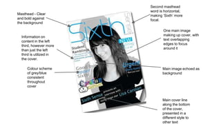
- 1. Masthead - Clear and bold against the background Colour scheme of grey/blue consistent throughout cover One main image making up cover, with text overlapping edges to focus around it Main image echoed as background Main cover line along the bottom of the cover, presented in a different style to other text Information on content in the left third, however more than just the left third is utilized in the cover. Second masthead word is horizontal, making ‘Sixth’ more focal.
- 2. All information displayed in the left third Masthead - ‘shield’ is bolded to make it the primary focus of the masthead First cover line relates to main image Main image fills the right hand side of the page and matches the colour scheme of the cover. One font used for cover info, looks clean and consistent
- 3. Target Audience Sixth form students will be the main target of the magazine, so will be tailored to them by having content relevant to them and images that will be of familiar sights, for example the Sixth form building. I will make the layout clear and consistent so that it is appealing to the eye with coherent colour scheme that relates to the colours already used commonly by the school. The design will be kept very general as it must appeal to the wide audience within the 6th form, so I will not overly focus the magazine towards on particular demographic of the 16-18 range. Appealing to particular interests could be done in the magazines contents rather than the cover and then shown through the contents page, for example a feature on sixth form Art work for the students interested in Art.