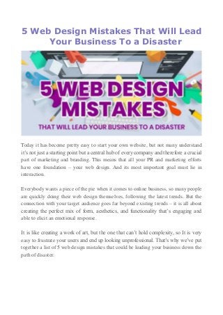
5 Web Design Mistakes That Will Lead Your Business To a Disaster
•
0 gefällt mir•12 views

Today it has become pretty easy to start your own website, but not many understand it’s not just a starting point but a central hub of every company and therefore a crucial part of marketing and branding. This means that all your PR and marketing efforts have one foundation – your web design. And its most important goal must lie in interaction.

Empfohlen
Empfohlen
Weitere ähnliche Inhalte
Kürzlich hochgeladen
Kürzlich hochgeladen (20)
Empfohlen
Empfohlen (20)
5 Web Design Mistakes That Will Lead Your Business To a Disaster
- 1. 5 Web Design Mistakes That Will Lead Your Business To a Disaster Today it has become pretty easy to start your own website, but not many understand it’s not just a starting point but a central hub of every company and therefore a crucial part of marketing and branding. This means that all your PR and marketing efforts have one foundation – your web design. And its most important goal must lie in interaction. Everybody wants a piece of the pie when it comes to online business, so many people are quickly doing their web design themselves, following the latest trends. But the connection with your target audience goes far beyond existing trends – it is all about creating the perfect mix of form, aesthetics, and functionality that’s engaging and able to elicit an emotional response. It is like creating a work of art, but the one that can’t hold complexity, so It is very easy to frustrate your users and end up looking unprofessional. That’s why we’ve put together a list of 5 web design mistakes that could be leading your business down the path of disaster.
- 2. 1. It’s Not a Literary Contest While written content is undoubtedly a powerful tool, the very words are less so. The rapid decrease in our attention span makes it obvious that it’s pointless to write like Shakespeare. You may think that your words are creative, funny and engaging, and they as well might be, but forcing them too much you’ll only build a wall of text that will blind your audience. People don’t go online to read, but to scan the text and find relevant information. That’s why you need to establish a strong visual hierarchy of the written content by creating smaller digestible blocks of text ornamented with blockquotes, bullets, sub-headings, and headings, staying below 60 characters per line, and making the most of your white space. If you want an exercise in style, where you’ll squeeze a bunch of keywords and brag about your products and services, take it to your blog. The quality lies in the emotional impact produced with fewer words. 2. It’s Not a Sticker Album There is a constant need for attractive photos, so the most common design mistake lies in the use of boring stock ones. You don’t need an artistic eye to see how fake they are. It is true that you need photos of happy customers smiling in order to attract the attention of your visitors – that creates a mood and sets a tone. But if you turn your website into a sticker album of fake stock smiles the only mood you’ll create is one of disbelief. In other words, using stock photos is like greeting your customers with an obvious lie while they’re looking for someone who they can trust in their search for a solution. That’s why you need to put an effort into creating inspiring and authentic imagery that’ll be able to win buyer’s confidence. Choose the models who clearly represent your ideal buyer persona – that will make your visitors know they’ve come to the right place instantly. And the last step is to optimize your images. We don’t need to mention that you need to stay away from blurry or pixelated ones, but many people don’t pay attention to resolution. You should always start with the highest possible and down-scale it latter if needed. If you can’t evade enlargening an image choose raster or vector ones to make sure they’ll stay crisp.
- 3. 3. It’s Not a Coloring Book You might be tempted to use lots of strong and flashy colors, but before you make your web pages look as if a paint factory just exploded, just picture your potential customers rolling around and foaming at their mouth because your crazy color scheme has inducted their epileptic seizures. If you think this is a bit extreme example, we’ll point out to a different group you probably haven’t considered, either – the color blind. Your design needs to cater to everyone, so tools such as Colorblindness Stimulator are a must. But the inappropriate use of color can also chase away the ʽless sensitiveʼ visitors if your color choices make the text difficult to read. So find a complementary color palette you’ll stick to, and use contrast wisely, with a help from Colour Contrast Check. 4. It’s Not an Escape Room In the midst of playing with words, photos, and colors, many designers forget about the importance of quality navigation. If you don’t have proper navigation in place your site will quickly turn into the Bermuda Triangle so it’s recommendable to have your navigational elements outlined before you start designing. 5. The Dead End Even the most precise navigation could lead your users through blind alleys if your call to action (CTA) buttons are not clear and in place. Everything we mentioned so far is the part of the process of leading your visitors to buy, subscribe or contact you, and falling at your CTA’s is the best way to shatter that effort. It’s basically a condensation of all your conversion power in a single button, but that doesn’t mean you should overdo it with multiple competing ones on every page. If you want to create successful CTA’s you need to invest consideration and time into the process. Your users are not here to think, so you’ll have to do the thinking for them by picking the right design, shape, size, color, location, length, and language.