
Empfohlen
Weitere ähnliche Inhalte
Was ist angesagt?
Was ist angesagt? (19)
Andere mochten auch
Andere mochten auch (20)
Ähnlich wie Development diary-1
Ähnlich wie Development diary-1 (20)
Mehr von natashanewton
Kürzlich hochgeladen
Kürzlich hochgeladen (20)
Development diary-1
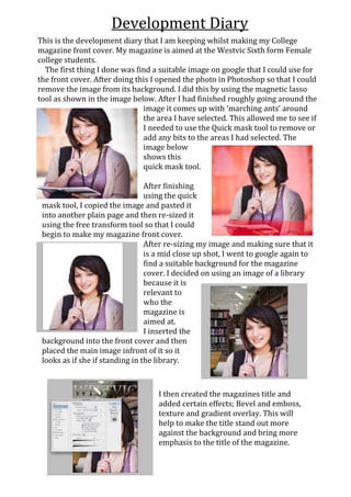
- 1. Development Diary This is the development diary that I am keeping whilst making my College magazine front cover. My magazine is aimed at the Westvic Sixth form Female college students. The first thing I done was find a suitable image on google that I could use for the front cover. After doing this I opened the photo in Photoshop so that I could remove the image from its background. I did this by using the magnetic lasso tool as shown in the image below. After I had finished roughly going around the image it comes up with ‘marching ants’ around the area I have selected. This allowed me to see if I needed to use the Quick mask tool to remove or add any bits to the areas I had selected. The image below shows this quick mask tool. After finishing using the quick mask tool, I copied the image and pasted it into another plain page and then re-sized it using the free transform tool so that I could begin to make my magazine front cover. After re-sizing my image and making sure that it is a mid close up shot, I went to google again to find a suitable background for the magazine cover. I decided on using an image of a library because it is relevant to who the magazine is aimed at. I inserted the background into the front cover and then placed the main image infront of it so it looks as if she if standing in the library. I then created the magazines title and added certain effects; Bevel and emboss, texture and gradient overlay. This will help to make the title stand out more against the background and bring more emphasis to the title of the magazine.
- 2. I then added the strap line and insert to my magazine cover; I made these a similar colour to the girl’s top in the photo so that it brings the colours on the magazine cover together. As the background of my college magazine is mainly bold colours, I added effects to the coverlines text to make it stand out from the background more than before. I changed the font of part of the title to match the font of the coverlines; I believe that this will make the finished product look more professional. I added the ‘Film Grain’ effect to the background to decrease the brightness of the image, I also changed the opacity to allow the coverlines to be more noticeable to the audience.
- 3. Before After I decreased the contrast of the main image so that it blends into the background better and doesn’t stand out as much. Insert Strapline I added drop shadow and bevel and emboss to the insert and I added drop shadow to the strapline of the magazine cover, these add effects to the magazine cover that would be found on professional magazine covers. This is the final product for my college magazine front cover, I included all the features needed to make a successful magazine front cover. I like how the background has been made to blend in with the image and not stand out too much against the coverline text.