Bangalore Call Girl Just Call♥️ 8084732287 ♥️Top Class Call Girl Service Avai...
Preliminary task analysis
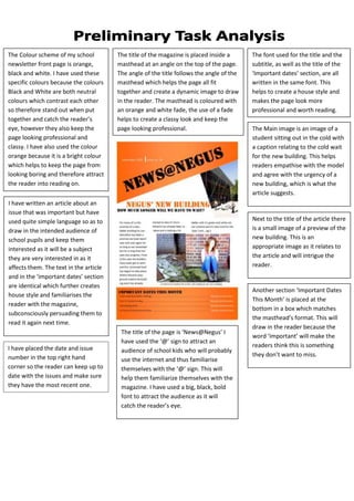
1. The Colour scheme of my school The title of the magazine is placed inside a The font used for the title and the
newsletter front page is orange, masthead at an angle on the top of the page. subtitle, as well as the title of the
black and white. I have used these The angle of the title follows the angle of the ‘Important dates’ section, are all
specific colours because the colours masthead which helps the page all fit written in the same font. This
Black and White are both neutral together and create a dynamic image to draw helps to create a house style and
colours which contrast each other in the reader. The masthead is coloured with makes the page look more
so therefore stand out when put an orange and white fade, the use of a fade professional and worth reading.
together and catch the reader’s helps to create a classy look and keep the
eye, however they also keep the page looking professional. The Main image is an image of a
page looking professional and student sitting out in the cold with
classy. I have also used the colour a caption relating to the cold wait
orange because it is a bright colour for the new building. This helps
which helps to keep the page from readers empathise with the model
looking boring and therefore attract and agree with the urgency of a
the reader into reading on. new building, which is what the
article suggests.
I have written an article about an
issue that was important but have
used quite simple language so as to Next to the title of the article there
draw in the intended audience of is a small image of a preview of the
school pupils and keep them new building. This is an
interested as it will be a subject appropriate image as it relates to
they are very interested in as it the article and will intrigue the
affects them. The text in the article reader.
and in the ‘important dates’ section
are identical which further creates
Another section ‘Important Dates
house style and familiarises the
This Month’ is placed at the
reader with the magazine,
bottom in a box which matches
subconsciously persuading them to
the masthead’s format. This will
read it again next time.
draw in the reader because the
The title of the page is ‘News@Negus’ I
word ‘important’ will make the
have used the ‘@’ sign to attract an
I have placed the date and issue readers think this is something
audience of school kids who will probably
number in the top right hand they don’t want to miss.
use the internet and thus familiarise
corner so the reader can keep up to themselves with the ‘@’ sign. This will
date with the issues and make sure help them familiarize themselves with the
they have the most recent one. magazine. I have used a big, black, bold
font to attract the audience as it will
catch the reader’s eye.