Re-branding Access-Damond Bank
•
0 gefällt mir•50 views
![Chuks Ogene [Sunesis]](https://cdn.slidesharecdn.com/profile-photo-mynameischuks-48x48.jpg?cb=1559841762)
A look at what could have been, re-branding Access-Diamond Bank by Chuks Ogene Sunesis

Empfohlen
Weitere ähnliche Inhalte
Kürzlich hochgeladen
Kürzlich hochgeladen (20)
Empfohlen
Empfohlen (20)
Re-branding Access-Damond Bank
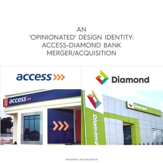
- 1. AN ‘OPINIONATED’ DESIGN IDENTITY: ACCESS-DIAMOND BANK MERGER/ACQUISITION INSTAGRAM: @OCHACREATIVE
- 2. Diamond bank has a stronger and more memorable visual identity due to its well selected colour palette thus giving off a vibrant and hard-to-ignore visual identity fit for its target audience. Access bank’s ‘forward motion’ of font and logomark portray a more subconscious forward minded meaning its target market has also taken in as well. Lastly, Diamond bank’s buildings are much more identifiable than those of those of Access due to the fact it effectively integrated its brand-architecture into each. Both brands should have played to these advantages mentioned above. Create a new identity by extracting visual elements from both brands without alienating stakeholders perception yet taking into strong consideration the corporate nature of the merger/acquisition. SUPPOSED BRIEF (AS EXTRACTED FROM THE MEDIA REPORTS) SOLUTION INSTAGRAM: @OCHACREATIVE
- 3. Both logos possess the V-shape of the chevron symbols. This naturally makes a visual-fusion between then is conceivable. Well combined colours that work but shape is abstract without much meaning other than somewhere between a crescent and diamond (as it inherited from its initial identity). This shape has clear meaning: ‘forward-motion’ or ‘moving ahead’ VISUAL-BRAND ARCHITECTURE ANALYSIS INSTAGRAM: @OCHACREATIVE
- 4. Between these two brand elements, Access bank’s prevails due of the corporate events that surrounded the merger/acquistion. Thus access is retained. INSTAGRAM: @OCHACREATIVE VISUAL-BRAND ARCHITECTURE ANALYSIS
- 5. Adopting the vibrant colours for Diamond’s logo while still retaining the chevron marks of Access bank’s logo can communicate better. This produces a well conceived marriage that does not alienate stakeholders and still takes into consideration the corporate issues involved in the merger/acquisition. =+ THE RESULT INSTAGRAM: @OCHACREATIVE
- 6. OTHER POSSIBLE VARIANTS This option being the most appropriate...in my opinion. INSTAGRAM: @OCHACREATIVE
- 7. NOW, FOR A BIT MORE IMPROVEMENT... knock off these ‘tips’ from the chevron marks to create a perception of better visual-motion/foward emphasis, resulting from the merger/acquisition. INSTAGRAM: @OCHACREATIVE
- 8. Motion emphasised. Forward-thinking philosophy for the resulting brand/bank. Motion further emphasised by ‘skewing’ the chevron marks sightly to the right. Motion further emphasised by ‘skewing’ the chevron marks sightly to the right. INSTAGRAM: @OCHACREATIVE
- 12. ...more than banking. INSTAGRAM: @OCHACREATIVE
- 13. ...more than banking. INSTAGRAM: @OCHACREATIVE
- 14. ...more than banking. INSTAGRAM: @OCHACREATIVE