SlideShare ist ein Scribd-Unternehmen logo
1 von 70
Responding to the challenge
of the mobile web
Graham Bird
Contents
• Before we start
• A quick history lesson
• Fast forward to today
• What about our site?
• Looking forwards
Before we start
Why mobile?
Engagement through mobile is one of
the guiding principles defined in
Operation Partridge (Online Capabilities)
Before we start
By 2013 mobile phones will overtake
PCs as the most common web access
device worldwide
Gartner, Key Predictions for IT Organizations and Users in 2010 and Beyond
http://www.gartner.com/it/page.jsp?id=1278413
Before we start
Why now?
A quick history lesson
The mobile cliché
• Poor connection speed
• Tiny audience
• Lots of distractions
• Tiny screen size
• Requires dedicated mobile site
• On the go (short attention span)
• One handed interaction
• Tedious to type on numeric
keypads
Photo by Oimax
A quick history lesson
The cliché applied in 1999...
• Very slow connection speed
• Extortionate data plans
• Hardly any compatible sites
• Mobile sites very stripped down
• Tiny screens
• Typing URLs on numeric keypad
• Difficult to use wheel/joystick
= geeks/masochists only
A quick history lesson
29 June 2007...iPhone arrives
• Very slow connection speed
• Extortionate data plans
• Hardly any compatible sites
• Mobile sites very stripped down
• Tiny screens
• Typing URLs on numeric keypad
• Difficult to use wheel/joystick
A quick history lesson
29 June 2007...iPhone arrives
• Very slow connection speed
• Extortionate data plans
• Hardly any compatible sites
• Mobile sites very stripped down
• Tiny screens
• Typing URLs on numeric keypad
• Difficult to use wheel/joystick
A quick history lesson
29 June 2007...iPhone arrives
• Very slow connection speed
• Extortionate data plans
• Hardly any compatible sites
• Mobile sites very stripped down
• Tiny screens
• Typing URLs on numeric keypad
• Difficult to use wheel/joystick
+ Apple marketing
+ widespread PR coverage
A quick history lesson
= overnight sensation
Fast forward to today
It’s not all Apple
Fast forward to today
Figures from statcounter.com for August 2011
Many screen sizes
Even the Kindle
has a browser
Fast forward to today
89% of smartphone owners use their
mobile device at home
Nielsen/Yahoo
http://advertising.yahoo.com/industry-knowledge/mobile-shopping-insight.html
Variable connection speed
Fast forward to today
Variable connection speed
Mobile devices
have overtaken
laptops for Wi-Fi
hotspot usage
GigaOM
http://gigaom.com/2011/06/21/mobile-devices-overtake-computers-on-wi-fi-networks/
0.00%
10.00%
20.00%
30.00%
40.00%
50.00%
60.00%
70.00%
80.00%
90.00%
100.00%
2010 2011
Fast forward to today
Portable, but not always moving
86% use their mobile device while at
home watching the TV
Nielsen/Yahoo
http://advertising.yahoo.com/industry-knowledge/mobile-shopping-insight.html
Fast forward to today
But most importantly...
People expect mobile support
Nearly half of mobile web users are
unlikely to return to a website that they
had trouble accessing from their phone,
and 57% are unlikely to recommend the
site
Compuware, New Study Reveals the Mobile Web Disappoints Global Consumers
http://investor.compuware.com/releasedetail.cfm?ReleaseID=592528
Fast forward to today
People expect mobile support
34% visit a site on their PC and then
follow up on mobile
Nielsen/Yahoo
http://advertising.yahoo.com/industry-knowledge/mobile-shopping-insight.html
Fast forward to today
People expect mobile support
70% of smartphone owners choose to
find information via the browser instead
of apps
Orange
http://www.unanimis.co.uk/orange-mobile-exposure-2010/
Fast forward to today
And they’re active users
People that use Facebook on their
mobile devices are twice as active on
Facebook than non-mobile users.
http://www.facebook.com/press/info.php?statistics
Fast forward to today
Mobile web design today
• Don’t assume bandwidth
Fast forward to today
Mobile web design today
• Don’t assume bandwidth
• Don’t assume user intent
Fast forward to today
Mobile web design today
• Don’t assume bandwidth
• Don’t assume user intent
• Don’t design for specific screen sizes
Fast forward to today
Mobile web design today
• Don’t assume bandwidth
• Don’t assume user intent
• Don’t design for specific screen sizes
• Do provide large touch targets
Fast forward to today
Mobile web design today
• Don’t assume bandwidth
• Don’t assume user intent
• Don’t design for specific screen sizes
• Do provide large touch targets
• Do take advantage of new capabilities
Fast forward to today
Mobile web design today
• Don’t assume bandwidth
• Don’t assume user intent
• Don’t design for specific screen sizes
• Do provide large touch targets
• Do take advantage of new capabilities
• Don’t use Flash (or other plugins)
Fast forward to today
What about our site?
The 1% rule
The Big Garden Birdwatch survey form
(and by implication, the rest of the website)
should support any browser that
exceeds 1% of traffic to our website
What about our site?
0
1
2
3
4
5
6
7
8
9
10
11
12
13
14
15
Jan 2008 Jan 2009 Jan 2010 Jan 2011 Jan 2012
Graph shows combined iPhone, iPad, iPod Touch, Android, Blackberry and Nokia traffic to the RSPB website
RSPB website
% of
all traffic
What about our site?
0
1
2
3
4
5
6
7
8
9
10
11
12
13
14
15
Jan 2008 Jan 2009 Jan 2010 Jan 2011 Jan 2012
Graph shows combined iPhone, iPad, iPod Touch, Android, Blackberry and Nokia traffic to the RSPB website
RSPB website
% of
all traffic
What about our site?
0
1
2
3
4
5
6
7
8
9
10
11
12
13
14
15
Jan 2008 Jan 2009 Jan 2010 Jan 2011 Dec 2011
Graph shows combined iPhone, iPad, iPod Touch, Android, Blackberry and Nokia traffic to the RSPB website
RSPB website
% of
all traffic
What about our site?
What’s popular on mobile?
• 11% of Bird identifier traffic
• 11% of Bird guide traffic
• 9% of Community traffic
• 9% of Feed the Birds day traffic
• 6.5% of Join traffic
• 6% of Reserves traffic (8.5% on find page)
• 0.3% of landing page traffic (2,500 people)
What about our site?
Figures from October 2011
Looking forwards
To provide the complete RSPB website
to the widest range of mobile devices with
little or no additional maintenance effort
What is our ambition?
Looking forwards
Help us achieve it
Looking forwards
• Bring mobile into the web strategy
• Support standardisation of the website
• Give us time to redesign the site
• Give us devices to test on
• A mobile-friendly site
Looking forwards
What are the benefits?
• A mobile-friendly site
• Better user experience
Looking forwards
What are the benefits?
• A mobile-friendly site
• Better user experience
• Better search rankings
Looking forwards
What are the benefits?
• A mobile-friendly site
• Better user experience
• Better search rankings
• Web Team more agile
Looking forwards
What are the benefits?
• A mobile-friendly site
• Better user experience
• Better search rankings
• Web Team more agile
• Increased robustness across desktop browsers as
well as mobile
Looking forwards
What are the benefits?
• A mobile-friendly site
• Better user experience
• Better search rankings
• Web Team more agile
• Increased robustness across desktop browsers as
well as mobile
• Continuous improvement across the site
Looking forwards
What are the benefits?
Including mobile in the strategy
Looking forwards
We need to recognise that mobile is here to
stay and ensure that the needs of the mobile
audience are part and parcel of our web
strategy
Standardising the site
Looking forwards
• Identify gaps in functionality
• Create a toolkit of reusable modular elements
• Tested on desktop and mobile
• Consistent behaviour across site
• Less code to maintain
• Quicker to build new sections
• Quicker to roll out updates
• No page left behind
Perceived downsides
of standardisation
Looking forwards
• Templates are seen as restrictive, limiting, dull
• Limited scope to reproduce print materials is
seen as a bad thing
• There is a desire from customers to make their
mark (“I want my thing to be different from
everything else”)
• Novelty is seen as inherently good (“change for
change’s sake”)
• Personal opinions are given too much weight
A brief interlude
Don’t fear the template
A brief interlude
• Templates can still be
beautiful & flexible
• We have one website, not
many
• Consistency is very
important
• If we weren’t doing bespoke
work all the time, we could
improve the core template
for everyone
Who else uses templates?
A brief interlude
BBC Online is heavily templated and strictly
controlled by visual guidelines
Let’s compare web budgets
A brief interlude
0
10,000,000
20,000,000
30,000,000
40,000,000
50,000,000
60,000,000
70,000,000
80,000,000
90,000,000
100,000,000
BBC RSPB
Optimistic
Let’s compare web budgets
A brief interlude
0
10,000,000
20,000,000
30,000,000
40,000,000
50,000,000
60,000,000
70,000,000
80,000,000
90,000,000
100,000,000
BBC RSPB
Using templates well Trying not to
Back to the point...
Standardisation is good
Looking forwards
• Consistency is a “first principle” of interaction
design – it breeds familiarity, confidence and
trust
• Feels professional and thought through
• User is more able to focus on task at hand
• Website is faster
• Reduced time to build and to maintain
• New functionality is created once and can be
used anywhere
Redesign
Looking forwards
• A new site that adapts to the device being used,
providing optimum design & usability for all
• Future-proof
• Best practice
• Optimised for poor connection speeds
• Consistent user experience
Redesign
Looking forwards
• A new site that adapts to the device being used,
providing optimum design & usability for all
• Future-proof Future-friendly
• Best practice
• Optimised for poor connection speeds
• Consistent user experience
Testing
Looking forwards
• Wi-Fi in the Web Team area
• Access to internal test servers and internet
• 1 x iPad 2
• 1 x iPhone 4
• 1 x Android phone
• 1 x Blackberry 6 phone
• 1 x Blackberry 5 phone
Thank you
Remember...not every mobile device will have an
RSPB app on it but every mobile device can access
the RSPB website

Weitere ähnliche Inhalte

Andere mochten auch

Belém do presente - Bernardo Biagioni
Belém do presente - Bernardo BiagioniBelém do presente - Bernardo Biagioni
Belém do presente - Bernardo Biagioni
Paratur
 
Lee hammond
Lee hammondLee hammond
Lee hammond
105904
 
Edição especial Belém do Pará - Patrícia Brito
Edição especial Belém do Pará - Patrícia BritoEdição especial Belém do Pará - Patrícia Brito
Edição especial Belém do Pará - Patrícia Brito
Paratur
 
Um plano sustentável para Algodoal - Moisés Sarraf
Um plano sustentável para Algodoal - Moisés SarrafUm plano sustentável para Algodoal - Moisés Sarraf
Um plano sustentável para Algodoal - Moisés Sarraf
Paratur
 
Viva o Pará - Carolina Cotta
Viva o Pará - Carolina CottaViva o Pará - Carolina Cotta
Viva o Pará - Carolina Cotta
Paratur
 
католог итог
католог итогкатолог итог
католог итог
Vadim Semenov
 
Presentacion power point tipos de paisaje
Presentacion power point tipos de paisajePresentacion power point tipos de paisaje
Presentacion power point tipos de paisaje
Tatis Ramirez
 

Andere mochten auch (18)

Competitive review
Competitive reviewCompetitive review
Competitive review
 
Belém do presente - Bernardo Biagioni
Belém do presente - Bernardo BiagioniBelém do presente - Bernardo Biagioni
Belém do presente - Bernardo Biagioni
 
Amanda pare week1
Amanda pare week1Amanda pare week1
Amanda pare week1
 
Lee hammond
Lee hammondLee hammond
Lee hammond
 
Webpages
WebpagesWebpages
Webpages
 
A pare redo3
A pare redo3A pare redo3
A pare redo3
 
Edição especial Belém do Pará - Patrícia Brito
Edição especial Belém do Pará - Patrícia BritoEdição especial Belém do Pará - Patrícia Brito
Edição especial Belém do Pará - Patrícia Brito
 
Um plano sustentável para Algodoal - Moisés Sarraf
Um plano sustentável para Algodoal - Moisés SarrafUm plano sustentável para Algodoal - Moisés Sarraf
Um plano sustentável para Algodoal - Moisés Sarraf
 
Viva o Pará - Carolina Cotta
Viva o Pará - Carolina CottaViva o Pará - Carolina Cotta
Viva o Pará - Carolina Cotta
 
католог итог
католог итогкатолог итог
католог итог
 
Business cards
Business cardsBusiness cards
Business cards
 
SDL Tridion at the RSPB (2010)
SDL Tridion at the RSPB (2010)SDL Tridion at the RSPB (2010)
SDL Tridion at the RSPB (2010)
 
Tridion Content Broker - how and why we are using it at the RSPB (2007)
Tridion Content Broker - how and why we are using it at the RSPB (2007)Tridion Content Broker - how and why we are using it at the RSPB (2007)
Tridion Content Broker - how and why we are using it at the RSPB (2007)
 
Apresentação1
Apresentação1Apresentação1
Apresentação1
 
A pare designrational
A pare designrationalA pare designrational
A pare designrational
 
Practical progressive enhancement
Practical progressive enhancementPractical progressive enhancement
Practical progressive enhancement
 
Optimising the RSPB website (2011)
Optimising the RSPB website (2011)Optimising the RSPB website (2011)
Optimising the RSPB website (2011)
 
Presentacion power point tipos de paisaje
Presentacion power point tipos de paisajePresentacion power point tipos de paisaje
Presentacion power point tipos de paisaje
 

Ähnlich wie Responding to the challenge of the mobile web (2012)

Striking gold! How Mobile Marketing Pioneers are Winning the Hearts & Minds o...
Striking gold! How Mobile Marketing Pioneers are Winning the Hearts & Minds o...Striking gold! How Mobile Marketing Pioneers are Winning the Hearts & Minds o...
Striking gold! How Mobile Marketing Pioneers are Winning the Hearts & Minds o...
auexpo Conference
 
Responsive Design: Where, Why and How | Imagine 2013 Strategic Marketing
Responsive Design: Where, Why and How | Imagine 2013 Strategic MarketingResponsive Design: Where, Why and How | Imagine 2013 Strategic Marketing
Responsive Design: Where, Why and How | Imagine 2013 Strategic Marketing
Atwix
 

Ähnlich wie Responding to the challenge of the mobile web (2012) (20)

Responsive Web Design Primer - NAGW 2014
Responsive Web Design Primer - NAGW 2014Responsive Web Design Primer - NAGW 2014
Responsive Web Design Primer - NAGW 2014
 
How to create a mobile version of your website
How to create a mobile version of your websiteHow to create a mobile version of your website
How to create a mobile version of your website
 
Mobile SEO (English Version)
Mobile SEO (English Version)Mobile SEO (English Version)
Mobile SEO (English Version)
 
Designing for mobile devices
Designing for mobile devicesDesigning for mobile devices
Designing for mobile devices
 
Digital Marketing in a Mobile First World
Digital Marketing in a Mobile First World Digital Marketing in a Mobile First World
Digital Marketing in a Mobile First World
 
Striking gold! How Mobile Marketing Pioneers are Winning the Hearts & Minds o...
Striking gold! How Mobile Marketing Pioneers are Winning the Hearts & Minds o...Striking gold! How Mobile Marketing Pioneers are Winning the Hearts & Minds o...
Striking gold! How Mobile Marketing Pioneers are Winning the Hearts & Minds o...
 
Why Are Mobile Websites Important?
Why Are Mobile Websites Important?Why Are Mobile Websites Important?
Why Are Mobile Websites Important?
 
Conversion Conference - Schuh's journey to RWD
Conversion Conference - Schuh's journey to RWDConversion Conference - Schuh's journey to RWD
Conversion Conference - Schuh's journey to RWD
 
Responsive Design: Where, Why and How | Imagine 2013 Strategic Marketing
Responsive Design: Where, Why and How | Imagine 2013 Strategic MarketingResponsive Design: Where, Why and How | Imagine 2013 Strategic Marketing
Responsive Design: Where, Why and How | Imagine 2013 Strategic Marketing
 
Modern Digital Design: The power of Responsive Design
Modern Digital Design: The power of Responsive DesignModern Digital Design: The power of Responsive Design
Modern Digital Design: The power of Responsive Design
 
Mobile Optimization that Actually Works
Mobile Optimization that Actually WorksMobile Optimization that Actually Works
Mobile Optimization that Actually Works
 
Responsive Web Design - Why and How
Responsive Web Design - Why and HowResponsive Web Design - Why and How
Responsive Web Design - Why and How
 
Who's winning the mobile web?
Who's winning the mobile web?Who's winning the mobile web?
Who's winning the mobile web?
 
Webinar: Web Design Trends
Webinar: Web Design TrendsWebinar: Web Design Trends
Webinar: Web Design Trends
 
SEO - What is it?
SEO - What is it?SEO - What is it?
SEO - What is it?
 
Mobile first - one key important aspect in digitalisation
Mobile first - one key important aspect in digitalisationMobile first - one key important aspect in digitalisation
Mobile first - one key important aspect in digitalisation
 
Responsive Web Design_2013
Responsive Web Design_2013Responsive Web Design_2013
Responsive Web Design_2013
 
Schuh Responsive Website
Schuh Responsive WebsiteSchuh Responsive Website
Schuh Responsive Website
 
Mobile Marketing
Mobile MarketingMobile Marketing
Mobile Marketing
 
Are Websites Optimized for Mobile Devices and Smart TVs ?
Are Websites Optimized for Mobile Devices and Smart TVs ?Are Websites Optimized for Mobile Devices and Smart TVs ?
Are Websites Optimized for Mobile Devices and Smart TVs ?
 

Responding to the challenge of the mobile web (2012)

  • 1. Responding to the challenge of the mobile web Graham Bird
  • 2. Contents • Before we start • A quick history lesson • Fast forward to today • What about our site? • Looking forwards
  • 4. Why mobile? Engagement through mobile is one of the guiding principles defined in Operation Partridge (Online Capabilities) Before we start
  • 5. By 2013 mobile phones will overtake PCs as the most common web access device worldwide Gartner, Key Predictions for IT Organizations and Users in 2010 and Beyond http://www.gartner.com/it/page.jsp?id=1278413 Before we start Why now?
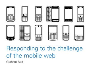
  • 7. The mobile cliché • Poor connection speed • Tiny audience • Lots of distractions • Tiny screen size • Requires dedicated mobile site • On the go (short attention span) • One handed interaction • Tedious to type on numeric keypads Photo by Oimax A quick history lesson
  • 8. The cliché applied in 1999... • Very slow connection speed • Extortionate data plans • Hardly any compatible sites • Mobile sites very stripped down • Tiny screens • Typing URLs on numeric keypad • Difficult to use wheel/joystick = geeks/masochists only A quick history lesson
  • 9.
  • 10.
  • 11.
  • 12.
  • 13.
  • 14. 29 June 2007...iPhone arrives • Very slow connection speed • Extortionate data plans • Hardly any compatible sites • Mobile sites very stripped down • Tiny screens • Typing URLs on numeric keypad • Difficult to use wheel/joystick A quick history lesson
  • 15. 29 June 2007...iPhone arrives • Very slow connection speed • Extortionate data plans • Hardly any compatible sites • Mobile sites very stripped down • Tiny screens • Typing URLs on numeric keypad • Difficult to use wheel/joystick A quick history lesson
  • 16. 29 June 2007...iPhone arrives • Very slow connection speed • Extortionate data plans • Hardly any compatible sites • Mobile sites very stripped down • Tiny screens • Typing URLs on numeric keypad • Difficult to use wheel/joystick + Apple marketing + widespread PR coverage A quick history lesson
  • 19. It’s not all Apple Fast forward to today Figures from statcounter.com for August 2011
  • 20. Many screen sizes Even the Kindle has a browser Fast forward to today
  • 21. 89% of smartphone owners use their mobile device at home Nielsen/Yahoo http://advertising.yahoo.com/industry-knowledge/mobile-shopping-insight.html Variable connection speed Fast forward to today
  • 22. Variable connection speed Mobile devices have overtaken laptops for Wi-Fi hotspot usage GigaOM http://gigaom.com/2011/06/21/mobile-devices-overtake-computers-on-wi-fi-networks/ 0.00% 10.00% 20.00% 30.00% 40.00% 50.00% 60.00% 70.00% 80.00% 90.00% 100.00% 2010 2011 Fast forward to today
  • 23. Portable, but not always moving 86% use their mobile device while at home watching the TV Nielsen/Yahoo http://advertising.yahoo.com/industry-knowledge/mobile-shopping-insight.html Fast forward to today
  • 25. People expect mobile support Nearly half of mobile web users are unlikely to return to a website that they had trouble accessing from their phone, and 57% are unlikely to recommend the site Compuware, New Study Reveals the Mobile Web Disappoints Global Consumers http://investor.compuware.com/releasedetail.cfm?ReleaseID=592528 Fast forward to today
  • 26. People expect mobile support 34% visit a site on their PC and then follow up on mobile Nielsen/Yahoo http://advertising.yahoo.com/industry-knowledge/mobile-shopping-insight.html Fast forward to today
  • 27. People expect mobile support 70% of smartphone owners choose to find information via the browser instead of apps Orange http://www.unanimis.co.uk/orange-mobile-exposure-2010/ Fast forward to today
  • 28. And they’re active users People that use Facebook on their mobile devices are twice as active on Facebook than non-mobile users. http://www.facebook.com/press/info.php?statistics Fast forward to today
  • 29. Mobile web design today • Don’t assume bandwidth Fast forward to today
  • 30. Mobile web design today • Don’t assume bandwidth • Don’t assume user intent Fast forward to today
  • 31. Mobile web design today • Don’t assume bandwidth • Don’t assume user intent • Don’t design for specific screen sizes Fast forward to today
  • 32. Mobile web design today • Don’t assume bandwidth • Don’t assume user intent • Don’t design for specific screen sizes • Do provide large touch targets Fast forward to today
  • 33. Mobile web design today • Don’t assume bandwidth • Don’t assume user intent • Don’t design for specific screen sizes • Do provide large touch targets • Do take advantage of new capabilities Fast forward to today
  • 34. Mobile web design today • Don’t assume bandwidth • Don’t assume user intent • Don’t design for specific screen sizes • Do provide large touch targets • Do take advantage of new capabilities • Don’t use Flash (or other plugins) Fast forward to today
  • 35. What about our site?
  • 36. The 1% rule The Big Garden Birdwatch survey form (and by implication, the rest of the website) should support any browser that exceeds 1% of traffic to our website What about our site?
  • 37. 0 1 2 3 4 5 6 7 8 9 10 11 12 13 14 15 Jan 2008 Jan 2009 Jan 2010 Jan 2011 Jan 2012 Graph shows combined iPhone, iPad, iPod Touch, Android, Blackberry and Nokia traffic to the RSPB website RSPB website % of all traffic What about our site?
  • 38. 0 1 2 3 4 5 6 7 8 9 10 11 12 13 14 15 Jan 2008 Jan 2009 Jan 2010 Jan 2011 Jan 2012 Graph shows combined iPhone, iPad, iPod Touch, Android, Blackberry and Nokia traffic to the RSPB website RSPB website % of all traffic What about our site?
  • 39. 0 1 2 3 4 5 6 7 8 9 10 11 12 13 14 15 Jan 2008 Jan 2009 Jan 2010 Jan 2011 Dec 2011 Graph shows combined iPhone, iPad, iPod Touch, Android, Blackberry and Nokia traffic to the RSPB website RSPB website % of all traffic What about our site?
  • 40. What’s popular on mobile? • 11% of Bird identifier traffic • 11% of Bird guide traffic • 9% of Community traffic • 9% of Feed the Birds day traffic • 6.5% of Join traffic • 6% of Reserves traffic (8.5% on find page) • 0.3% of landing page traffic (2,500 people) What about our site? Figures from October 2011
  • 42. To provide the complete RSPB website to the widest range of mobile devices with little or no additional maintenance effort What is our ambition? Looking forwards
  • 43. Help us achieve it Looking forwards • Bring mobile into the web strategy • Support standardisation of the website • Give us time to redesign the site • Give us devices to test on
  • 44. • A mobile-friendly site Looking forwards What are the benefits?
  • 45. • A mobile-friendly site • Better user experience Looking forwards What are the benefits?
  • 46. • A mobile-friendly site • Better user experience • Better search rankings Looking forwards What are the benefits?
  • 47. • A mobile-friendly site • Better user experience • Better search rankings • Web Team more agile Looking forwards What are the benefits?
  • 48. • A mobile-friendly site • Better user experience • Better search rankings • Web Team more agile • Increased robustness across desktop browsers as well as mobile Looking forwards What are the benefits?
  • 49. • A mobile-friendly site • Better user experience • Better search rankings • Web Team more agile • Increased robustness across desktop browsers as well as mobile • Continuous improvement across the site Looking forwards What are the benefits?
  • 50. Including mobile in the strategy Looking forwards We need to recognise that mobile is here to stay and ensure that the needs of the mobile audience are part and parcel of our web strategy
  • 51. Standardising the site Looking forwards • Identify gaps in functionality • Create a toolkit of reusable modular elements • Tested on desktop and mobile • Consistent behaviour across site • Less code to maintain • Quicker to build new sections • Quicker to roll out updates • No page left behind
  • 52. Perceived downsides of standardisation Looking forwards • Templates are seen as restrictive, limiting, dull • Limited scope to reproduce print materials is seen as a bad thing • There is a desire from customers to make their mark (“I want my thing to be different from everything else”) • Novelty is seen as inherently good (“change for change’s sake”) • Personal opinions are given too much weight
  • 54. Don’t fear the template A brief interlude • Templates can still be beautiful & flexible • We have one website, not many • Consistency is very important • If we weren’t doing bespoke work all the time, we could improve the core template for everyone
  • 55. Who else uses templates? A brief interlude BBC Online is heavily templated and strictly controlled by visual guidelines
  • 56.
  • 57.
  • 58.
  • 59.
  • 60.
  • 61.
  • 62.
  • 63. Let’s compare web budgets A brief interlude 0 10,000,000 20,000,000 30,000,000 40,000,000 50,000,000 60,000,000 70,000,000 80,000,000 90,000,000 100,000,000 BBC RSPB Optimistic
  • 64. Let’s compare web budgets A brief interlude 0 10,000,000 20,000,000 30,000,000 40,000,000 50,000,000 60,000,000 70,000,000 80,000,000 90,000,000 100,000,000 BBC RSPB Using templates well Trying not to
  • 65. Back to the point...
  • 66. Standardisation is good Looking forwards • Consistency is a “first principle” of interaction design – it breeds familiarity, confidence and trust • Feels professional and thought through • User is more able to focus on task at hand • Website is faster • Reduced time to build and to maintain • New functionality is created once and can be used anywhere
  • 67. Redesign Looking forwards • A new site that adapts to the device being used, providing optimum design & usability for all • Future-proof • Best practice • Optimised for poor connection speeds • Consistent user experience
  • 68. Redesign Looking forwards • A new site that adapts to the device being used, providing optimum design & usability for all • Future-proof Future-friendly • Best practice • Optimised for poor connection speeds • Consistent user experience
  • 69. Testing Looking forwards • Wi-Fi in the Web Team area • Access to internal test servers and internet • 1 x iPad 2 • 1 x iPhone 4 • 1 x Android phone • 1 x Blackberry 6 phone • 1 x Blackberry 5 phone
  • 70. Thank you Remember...not every mobile device will have an RSPB app on it but every mobile device can access the RSPB website