
Empfohlen
Weitere ähnliche Inhalte
Was ist angesagt?
Was ist angesagt? (18)
Andere mochten auch
Andere mochten auch (20)
Ähnlich wie Music magazine fonts
Ähnlich wie Music magazine fonts (20)
Mehr von mickyb96
Mehr von mickyb96 (15)
Music magazine fonts
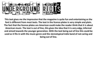
- 1. This text gives me the impression that the magazine is quite fun and entertaining as the font is different from most texts. The text in the licence plates is very simple and plain. The fact that the licence plates are American could make the reader think that it is about American music. The text is out of line, this gives the idea that it is very edgy, informal and aimed towards the younger generation. With the text being out of line this could be used as it fits in with the music genre and the stereotypical indie band of not caring and being out of line.
- 2. This text gives me the impression that the magazine is quite fun and entertaining as the font is different from most texts. However, some of the letters don’t really leave much of a gap. Each letter also comes out of the box that it is in. These things are bad because it will make it quite hard to read. The text is like the font that is used in the Facebook logo. This gives the connotation that the magazine is aimed towards the younger generation as it is mainly younger people that use Facebook. It also suggests that the magazine is informal.
- 3. This text gives me the impression that the magazine is quite fun and entertaining as the font is different from most texts. The text is quite close in line which is different to the other texts. However, the boxes look quite faded and look like it could be used for the logo of an indie band. The font inside the square is also very simple and easy to read.
- 4. This text gives me the impression that the magazine is quite fun and entertaining as the font is different from most texts. This font looks like is has been stamped on to the page as the font is in a circle and the font is very plain and simple. This font is quite interesting and was used by a legendary indie band called Pearl Jam so could be used for an indie themed magazine. This font would make me think that the magazine is about legendary indie bands.
- 5. This text gives me the impression that the magazine is quite fun and entertaining as the font is very arty and different from other texts. The font could give the reader the idea that is aimed at children that watch art programmes on TV stations aimed at them. However, the font could also be seen as being aimed at teenagers and could be used for a indie magazine as the text is out of line which fits in with the music genre and the stereotypical indie band of not caring and being out of line.
- 6. This is the font that I shall be using as it gives me the impression that the magazine is quite fun and entertaining as the font is different from most texts. The text in the licence plates is very simple and plain. The fact that the licence plates are American could make the reader think that it is about American music. The text is out of line, this gives the idea that it is very edgy, informal and aimed towards the younger generation. With the text being out of line this could be used as it fits in with the music genre and the stereotypical indie band of not caring and being out of line.