
Empfohlen
Weitere ähnliche Inhalte
Was ist angesagt?
Was ist angesagt? (20)
Ähnlich wie Front Cover Layout Evolution
Ähnlich wie Front Cover Layout Evolution (20)
Mehr von mickyb96
Mehr von mickyb96 (20)
Front Cover Layout Evolution
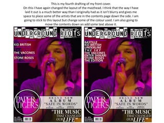
- 1. This is my fourth drafting of my front cover. On this I have again changed the layout of the masthead. I think that the way I have laid it out is a much better way than I originally had as it isn’t blurry and gives me space to place some of the artists that are in the contents page down the side. I am going to stick to this layout but change some of the colour used. I am also going to move the contents down an add some text above it.
- 2. This is my fifth drafting of my front cover. On this I have again kept the layout of the masthead as it makes the magazine stand out and allows me to use extra space for the contents. I felt that after I added the text above the contents that I needed to make it stand out to the reader. I did this by then going on to changing the colour of the text that says “ACTS TO”. I also added a plug under the title as it adds more to the cover instead of being plain down one side.
- 3. Final product This is my final draft of my front cover. I have decided to choose this as my cover for many different reasons. The first reason that I chose this is that the masthead is the most important part to the page and on this cover it stands out. It also allows me to use the other space for things like the plug on the right hand side and the contents on the left side. I said that I would be using a colour scheme that used reds, whites and blacks. I decided to move away from that colour scheme and use colours that are in the main image. I then decided to develop it by then using colours that contrast with these colours. I think that this colour scheme is much better.