
Empfohlen
Weitere ähnliche Inhalte
Was ist angesagt?
Was ist angesagt? (20)
Ähnlich wie Viewing all information with an eye-catching poster
Ähnlich wie Viewing all information with an eye-catching poster (20)
Viewing all information with an eye-catching poster
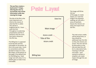
- 1. The eye flow creates a backwards ‘C’ shape, allowing the view to successfully view all the information while also Poster Layout The image will fill the full size viewing the image.. of the page, to create impact, as I want the The title of the film is the Date line image to be attention most important as it seeking, yet still with a informs the viewer of sense of aesthetic what the film is called. beauty the viewers can This will be in enjoy and expect from EnglishScript EG. I have the film. used this font Main image throughout my planning presentation and fits in perfectly with the iconic Actors credit The main actors credits and classic influences will be placed here, as this film has. Title of film they should be addressed near the title The billing box is supposed Actors credit so that, the viewers are to be discreet and less aware. This text will not noticeable on the poster. As be decorative, as the this is the usual case, I stuck title and date line will to conventions and have be in a decorative font, decided to keep it in a box meaning it will look like shape, at the bottom of over done – and I the page in the default font wanted to achieve a for the billing box, ‘steel Billing box simplistic yet create tongs’ and will colour it in a impact through the use darkish grey to make it less of image. noticeable.