
Empfohlen
Weitere ähnliche Inhalte
Was ist angesagt?
Was ist angesagt? (20)
Andere mochten auch
Andere mochten auch (18)
Ähnlich wie Rabbit
Ähnlich wie Rabbit (20)
Kürzlich hochgeladen
Kürzlich hochgeladen (20)
Rabbit
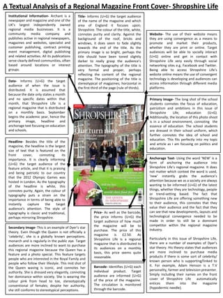
- 1. A Textual Analysis of a Regional Magazine Front Cover- Shropshire Life Institutional Information- Archant is a newspaper and magazine and one of the UK’s largest independently owned regional media businesses. It is a community media company and publishes active in regional newspapers, magazines and websites, specialist and customer publishing, contract printing event management, digital publishing and related activities. All its publications serve clearly defined communities, often based around locations or interest groups. Date- Informs (U+G) the target audience of when the issue is distributed. It is assumed that because the date only states a month and no specific dates within that month, that Shropshire Life is a regional magazine that is distributed on a monthly basis. September begins the academic year, hence the primary image, headline and anchorage text focusing on education and schools. Title- Informs (U+G) the target audience of the name of the magazine and which area of England it focuses upon; Shropshire. The colour of the title, white, connotes purity and clarity. Against the background of the roof, bricks and windows, it does seem to fade slightly towards the end of the title. As the primary image is so bright, perhaps the title should have been toned slightly darker to really grasp the audience’s attention. The typography of the title is very formal and proper, perhaps reflecting the content of the regional magazine. The positioning of the title is stereotypical of magazines; horizontal in the first third of the page (rule of thirds). Headline- Besides the title of the magazine, the headline is the largest size of text that is featured on the front cover, connoting its importance. It is clearly informing (U+G) the target audience of the feature article, and that it is praising and being patriotic to our country that the 2012 Olympic Games was hosted in London. As the typography of the headline is white, this connotes purity. Again, the colour of typography puts a strain on the importance in terms of being able to instantly capture the target audience’s attention. The style of typography is classic and traditional, perhaps mirroring Shropshire. Secondary Image- This is an example of Dyer’s star theory. Even though the Queen is not officially a ‘celebrity’, she is a globally known perceptions. monarch and is regularly in the public eye. Target audiences are more inclined to want to purchase this regional magazine because the Queen has a feature and a photo special. This feature targets people who are interested in the Royal Family and people who follow their lifestyle. This mid shot of the Queen waving is iconic, and connotes her authority. She is dressed very elegantly, connoting her dominance within society. She is wearing the colour pink from head to toe, stereotypically conventional of females; despite her authority, she still conforms to stereotypical perceptions. Website- The use of their website means they are using convergence as a means to promote and market their products, whether they are print or online. Target audiences will be able to socially interact (U+G) online and get in contact with Shropshire Life very easily through social networking sites e.g. Facebook and Twitter. Being able to access Shropshire Life’s website online means the use of convergent technology is developing and audiences can access information through different media platforms. Primary Image- The long shot of the school students connotes the focus of education, patriotism and ambitions in this issue of Shropshire Life; education (U+G). Additionally, the location of this photo shoot is in a school environment, connoting the essence of education. The school students are dressed in their school uniform, which further connotes the idea of school and education. This fits perfectly into my topic and article as I am focusing on politics and education. Price- As well as the barcode, the price informs (U+G) the target audience of how much the magazine will be to purchase. The price of this magazine is £2.50. As Shropshire Life is a regional magazine that is distributed to its audiences on a monthly basis, this price seems quite reasonable. Barcode- Identifies (U+G) each individual product. Target audience are informed (U+G) of the price of the magazine. The circulation is monitored through the barcode. Anchorage Text- Using the word ‘NEW’ is a form of anchoring the audience into Shropshire Life’s regional magazine. It does not matter which context the word is used, ‘new’ instantly grabs the audience’s attention because we as a society are always wanting to be informed (U+G) of the latest things, whether they are technology, people or trend-setting based. The fact that Shropshire Life are offering something new to their audience, this connotes that they value their audience and the fact that they can see that new developments, layouts and technological convergence needed to be made in order to still be a dominant competitor within the regional magazine industry. Particularly in this issue of Shropshire Life, there are a number of examples of Dyer’s star theory. His theory states that audiences are more inclined to purchase media products if there is some sort of celebrity/ known person who is supporting/linked to it. For example, Adam Henson is a T.V personality, farmer and television presenter. Simply including their names on the front cover of Shropshire Life automatically entices them into the magazine (hypodermic needle).
- 2. This is a textual analysis that is based on the Shropshire Life front cover I have annotated. Shropshire Life is a county and is full of rich heritage. Shropshire Life is a regional magazine, distributed through the publishing company called Archant, that focuses on life in Shropshire, and the many new and exciting things it has to offer. Their topics range from food and drink to events and people. Shropshire Life contrasts to city centre regional magazines such as Time Out as Time Out targets London and the city life, while Shropshire Life offers information (uses and gratification) to local people and new audiences on life in Shropshire and what it means to life and experience new surrounding in the county of Shropshire. The title of this regional magazine is called Shropshire Life. This clearly informs (uses and gratification) the target audience where the magazine is based and what area of England it is focusing on; Shropshire. The positioning of the title is stereotypical of magazines; horizontal and in the first third of the shot. The colour of the typography is white, connoting purity and clarity. This could represent the qualities that the county of Shropshire has to offer. Against the primary image of the roof, brick and windows, the title does seem to slightly disappear. Unfortunately, this could distract the target audience’s attention away from the title of the magazine. Additionally the layering of the text of the title on the primary image on the front cover is quite harsh in terms of colour and tone. The typography of the title is very formal and proper, perhaps connoting the content of the regional magazine. Compared with Cornwall Life and Time Out, Shropshire Life seems as though it is targeting a more wealthy audience; middle-class. This is assumed through the style and layout of the school that is featured as the primary image on the front cover; it look like a private school. Stereotypically, the clothing of the school students that attend private schools is blazers and long skirts. The title is an overall feature that ties every element of the front cover together, whilst also allowing the target audience to identify (uses and gratification) which part of England the regional magazine is targeted towards. The way in which the title is represented on the layout of the front cover is intertextual to every issue of Shropshire life. This also emphasises the house style of the magazine, and is consistent throughout every issue. There is also institutional information featured on the front cover. In the left hand corner, the publishing company, Archant, has their logo placed. This instantly informs (uses and gratification) the target audience that there has been synergy between the two different institutions – Shropshire Life and Archant. Archant are a newspaper and magazine publishing company. They publish regional newspapers, magazines and websites, specialist and customer publishing, contract printing, event management, digital publishing and related activities. The synergy between these two institutions allows them to create something that would not have been possible by themselves. Archant need the status of Shropshire Life to succeed, while Shropshire Life need a good publishing company to be able to market and distribute their media products to mass audiences. The logo of the brand Archant is visually appealing. White and red are colours that work well together to make institutional information stand out. Again, this is a feature that is intertextual to Shropshire Life because if features on every single issue. Providing the target audience with an online website link on the front cover of the print edition of Shropshire Life is evidence of convergent technological development. This feature instantly informs (use and gratification) the target audience that Shropshire Life are in touch with technology and are moving along with times. Stereotypically, people often assume that quite, countryside counties such as Shropshire do not have access to new technology and the aspects of media distribution that comes with it. This is a stereotype and does not truly or correctly represent Shropshire. Having a digital edition of the print regional magazine online on Shropshire Life’s website further connotes convergent media has taken place and there has been technological development in the regional magazine industry. The website allows the target audience to access a large amount of data and information through many technological devices e.g. smart phones, laptops, PC’s, tablets, etc. As the internet is easily accessible through almost every form of technological device, Shropshire Life can be consumed and distributed by mass audiences for different purposes. For example, school students might want to identify (uses and gratification) with the school students featured on the front cover in terms of an education/age perspective. Regardless of class/status, every single child is entitled to an education. Another example, the elderly/patriotic people would like to be informed (uses and gratification) of how the Queen’s day was in Shropshire. This would have been a very big deal to the people of Shropshire as she is an iconic figure in British historical heritage, and would most definitely be worthy of featuring on the front cover. The online edition of Shropshire Life simply allows people to access the magazine who do not have the time or money to go to the nearest newsagent or local shop and purchase a print version every month; especially in the economic depression that England still seems to be suffering from and dealing with.
- 3. Besides the title of the magazine, the headline is the most dominant and important text that features on the front cover. The headline for this issue of Shropshire Life reads ‘Our turn now’, accompanied by ‘glory days for county paralympians’. This clearly is a topic that deserves to make the headline. The headline is clearly praising and being patriotic to England and specifically Shropshire, because these are paralympians who are from the county of Shropshire. The fact that Shropshire Life is able to cover this story, simple connotes their passion and promise to the people of Shropshire; they are always going to inform (uses and gratification) their audiences about the latest topics and media coverage in Shropshire. The colour of the typography is white, connoting purity, honesty and clarity. White is a colour that is a part of Shropshire Life’s house style and is intertextual to the regional magazine because it is used in every single issue. The language used in the headline is very proud and patriotic. The phrase ’our turn now’ immediately connotes that they have been waiting for this moment for a very long time. It is as though they have come very far and have been on a very long journey to achieve where they are now. Shropshire Life could be seen as going on the journey with them in the article, asking them about their life experiences and what they have endured on their journeys. This is an excellent headline because it is direct to Shropshire, however mass audiences can also identify (uses and gratification) with the topic because London 2012 Olympics was a global event that saw paralympians from across the world compete. Where the use of anchorage text is considered, Dyer’s star theory can be applied to a vast majority of the language used. Dyer’s star theory states that audiences are more inclined to purchase and consume media products if there is some sort of celebrity/known person who is associated, supporting or linked to the product. For example, Adam Henson is a T.V personality, farmer and television presenter. Simply featuring his name on the front cover and informing (uses and gratification) the target audience that he will be featured in an article instantly captures their attention. Audiences are stereotypically infatuated with celebrities and famous people, and are always wanting to be informed (uses and gratification) on where these celebrities are in their lives. As Adam Henson is a farmer, the target audience could be looking to identify (uses and gratification) with him in a sense that they are also farmers and want to aspire to be like him. Additionally, they will want to be educated (uses and gratification) by himself and his methods of farming good, healthy and efficient produce. Another example of Dyer stars theory is the anchorage text that reads ‘Ex Shrews star Sam Aiston’s Wedding day’. Sam Aiston is an ex-footballer who used to play for Shrewsbury Town Football Club and is now a teacher. Shrewsbury is a town in Shropshire. Target audiences will most definitely be attracted to this feature of Shropshire Life because of the star quality that it focuses on. Ordinary people are stereotypically obsessed with celebrities and their personal lives. For Sam Aiston to allow Shropshire Life to have coverage and provide audiences with an article on his wedding connotes that he himself values his fans and supporters by allowing them to be informed (uses and gratification) and almost take a journey with them through his wedding day through anecdotes and images. Dyer’s star theory can be applied to this feature because target audiences, specifically people who follow Football and live in Shrewsbury, are more inclined to purchase this issue of Shropshire Life for the simple fact that Sam Aiston is one of the focuses of an article. It allow the target audience to not only be informed (uses and gratification) of the events that took place on his wedding day, but for them to reminisce and almost identify (uses and gratification) with him as they may be married too and can relate to his new experiences of married life. Shropshire Life can be consumed as almost a local ‘celebrity ‘ life magazine, however is still represented as classy and relates to the target market. The word ‘new’ is another form of anchorage text in terms of enticing audiences to purchase Shropshire Life. It does not matter what context the word is used in, ‘new’ instantly grabs the audience’s attention because we as a society are constantly wanting to be informed (uses and gratification) of the latest things, whether they are technology, people or trend-setting based. The fact that Shropshire Life are offering something new to their audience connotes that they value them. Shropshire Life needed to make new changes to their layout and content in order to stay a competitor within the regional magazine industry. Moreover, ‘new’ makes it seem as though nobody else has seen the ‘new’ content or layout. The person who picks up Shropshire Life will think that they are the first person to see this, and therefore feel as though Shropshire Life want to specifically inform (uses and gratification)them. The typography of the word ‘new’ is capitalised to connote its importance. It is layered on a shade of pink which allows it to be seen more quickly and therefore audiences are visually more attracted to it.
- 4. Another piece of anchorage text is ‘back to school, heads reveal Olympic ambitions’. This correlates with the headline and connotes that the topics of the Olympics, schools and education are going to be the primary focus of this issue of Shropshire Life. Target audiences will be informed (uses and gratification) of school childrens ambitions to become Olympians, thus inspiring other children to aspire to their own personal goals and achievements. This piece of anchorage text directly correlates with the headline and primary image in the sense that they all focus upon the topics of education, the Olympics and young people aspiring towards their goals and dreams. The typography of ‘BACK TO SCHOOL’ is capitalised, to connote its importance. Additionally, the colour of this piece of anchorage text is a salmon pink, which is proof of Shropshire Life’s house style because this colour is evident in a number of different features of this issue. The phrase ’back to school’ is commonly known to all people in education, from teachers and school children to parents and carers. The use of this phrase will allow audiences to identify (uses and gratification) with the magazine because it is as though the magazine can relate to the trials and tribulations of getting children back into the school routine. The date of September 2012 also correlates with this concept of ‘back to school’ as this is the month when the academic school year begins. The primary image is represented to the target audience through a long shot of school students walking together through their school grounds. The fact that the audience can visually see that the location of this shot is at a school, further connotes the focus of education and young people in this issue of Shropshire Life. Different demographics of target audiences can identify (uses and gratification)with this primary image. Firstly, young students who are around the same age (possibly fifteen-seventeen years old) as the school students can identify (uses and gratification)with them because they are in the same predicament as them in terms of education and lifestyle. It is important for young people to know that there are regional magazines that offer useful and informative insight into the ambitions, daily lives and mindset of young people. The fact that a feature of this issue is that these school students have Olympic ambitions connotes the determination and willpower of young people’s mindset, and that if you strive towards success, it can come true. Parents/carers can also identify (uses and gratification) with the primary image as they could possibly want their children to strive towards similar goals and dreams. The amount of coverage of media regarding education is vitally important to both children and their parents because they all want to be informed (uses and gratification) of what the right way to do things is. This article focusing on student’s Olympic ambitions could possible be the first step for children to realise that they would like to do this too as a possible career. Shropshire Life have informed (uses and gratification) mass audiences through this print article about education and ambitions. This would more than likely lead to the people reading Shropshire Life to tell their friends and family about what they have gained through the experience of reading Shropshire Life. The use of word and mouth allows media communications to develop and expand, thus advertising promoting and distributing media products to further mass audiences (two step flow). Additionally, the facial expressions of these students are happy and excited, connoting they are eager and pleased to be at school to further develop their learning. Stereotypically, regional magazines do not always seem to have targeted topics towards children and education. Shropshire Life will most definitely gain mass audiences because the topic of education is vitally important and will always stay relevant. It is a human right that everyone and anyone should have access to. It does not matter what age people are, they are never to old to go into education, or continue to educate themselves. Education is a topic that is covered through media platforms e.g. print (regional magazines), the internet, etc. The secondary image of Queen Elizabeth is an excellent visual marketing strategy and an example of Dyer’s star theory. Although the Queen is not represented as being a ‘star’ or ‘celebrity’, she is a globally know monarch and is regularly in the public eye through technological media convergence. Target audiences are more inclined to want to purchase this issue of Shropshire Life because the Queen is the focus of a feature article and photo special. This feature targets people who are interested in the Royal Family and people who follow their lifestyle. Stereotypically, audiences who are located in counties such as Shropshire, are more inclined to be more interested in the Royal Family because they are not as close or accessible to them compared to audiences who live in London. Additionally, places such as Shropshire stereotypically have a dominated mass population of people who have an English heritage/background. Generically, these are the people who are most ‘star-struck’ by the Royal Family, thus emphasising Dyer’s star theory. The mid shot of the queen waving connotes her authority. It visually looks as though the Queen is waving at the reader. The reader would then feel as though they can identify (uses and gratification) with the Queen, thus purchasing the regional magazine as a result of this (hypodermic needle). She is dressed very elegantly and conservatively, a quality that is stereotypical of the Royal family. Her outfit is head to toe in the colour pink, a stereotypical colour of females; despite her authority, she still conforms to stereotypes in society.
- 5. Featuring the price on the front cover of Shropshire Life regional magazine informs (uses and gratification) the target audience of how much the magazine will be to purchase. The price of this magazine is £2.50. As Shropshire Life is a regional magazine that is distributed to its audiences on a monthly basis, this price seems quite sensible. The target audience are informed (uses and gratification) of how much the magazine will cost them to purchase, so they are not surprised when they pay for it. The date of this issue of Shropshire Life is September 2013. Just as the primary image and headline correlate with each other, so does that date. In terms of the summer holiday and school seasons, the beginning of September is when the academic school year begins. In addition, the fact that England (London) hosted the 2012 Olympics, this further connotes why the topics of the Olympics, school and education are the primary focus of this issue of Shropshire Life, and why they have decided to distribute it to audiences in the month of September. The summer months of July and August saw the Olympics and Paralympics be the centre of media coverage e.g. T.V, radio broadcasting, magazines, newspapers, the internet, etc. As this global event came to a successful end, it allowed young people to look back on these months and think about what they would want to do, and if they had any ambitions to become involved in the Olympics. The fact that this issue of Shropshire Life praises county Paralympians and offers young people the chance to strive for their sporting ambitions, simply connotes the patriotism and passion that not only Shropshire have, but England as a whole. Dating and distributing this issue of Shropshire Life in the month of September 2012 allows the global event of the Olympics not be forgotten, and for new and young people to hopefully continue the Olympic legacy on.