Call Girls In Firozabad Escorts ☎️8617370543 🔝 💃 Enjoy 24/7 Escort Service En...
Evaluation q6
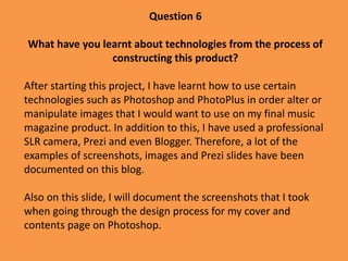
1. Question 6
What have you learnt about technologies from the process of
constructing this product?
After starting this project, I have learnt how to use certain
technologies such as Photoshop and PhotoPlus in order alter or
manipulate images that I would want to use on my final music
magazine product. In addition to this, I have used a professional
SLR camera, Prezi and even Blogger. Therefore, a lot of the
examples of screenshots, images and Prezi slides have been
documented on this blog.
Also on this slide, I will document the screenshots that I took
when going through the design process for my cover and
contents page on Photoshop.
2. The first screenshot on the left shows how I altered the brightness and contrast of the
image which I chose to use as the main image on my magazine front cover. I did this
because when I first edited the image to make it black and white, the image was too dark
and the background was too light. Therefore by altering the brightness I made it appear
lighter and the contrast made it appear more clear. Also, the image on the right shows
how I zoomed in on the image so that I could see a close up shot of the boys face. I then
used the “Spot Healing Brush” which allowed me to click on the areas of skin which I
wanted to blur, therefore I chose to use this on the face so that it looked clear and
professional, but not too airbrushed.
3. After looking again at the image I chose to use, I found that it looked slight
unprofessional as the audience would be able to tell that the young man was wearing
a fake tattoo sleeve. Therefore, by using the Spot Healing Brush, I made the line of
the sleeve more discreet by blurring it, then copy and pasting a section of the sleeve
to “wrap” around the circular shape of the watch. This made the tattoo look more
real and therefore made the image look more professional.
4. These two
screenshots
document what my
final cover looked
like. When designing
this magazine cover
in particular, I tried
to apply the many
recognisable codes
and conventions,
such as a pug, cover
lines and bottom
strip. The image on
the right shows the
strip of Layers that I
used on Photoshop
and how I have
included all the
features which relate
to the RnB genre.
5. This screenshot shows how I began to design my magazine contents page on Page Plus.
By using the colour tab, I used the paint tool and the drop down menu of fonts to get
the exact same style for the word “Contents” as the masthead. This programme did not
allow me to edit the image, so I opened the image in Photoshop and altered the
brightness and contrast, then copied the image back into the Page Plus programme.
Also, I tried to maintain a regular house style throughout my magazine by using the
brown/white/black/red colour scheme. On the list of features on the contents page, I
highlighted the Chris Brown interview in the familiar brown colour, so that the audience
can easily recognise that it is the main story in the magazine.