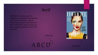
1. Serif font is mostly used for
magazines masthead and sublines
as it most commonly used for
formal writing. Serif font tends to
have “little feet” which is how you
can distinguish between serif and
san serif.
Serif
Serif textA B C D
Little feet
2. San Serif
San serif font is much more bolder
font and is used more as an
informal font. Some magazines do
use san serif for their mast heads as
it looks much bolder and catches
the eye. It can be used in contents
pages. San serif is the font that
doesn’t have the “little feet” or
edges.
A B C D
No edges
3. Mast Head
Typically, the mast head of a magazine will be
serif font and will be easy to read, the colour of
the text will be basic but bold so it attracts the
audiences eye. It will also match the mise en
scene of the model and the magazine
4. Contents
The contents page usually matches the font of the front cover.
The contents title will most likely be serif to match the
masthead. Although for the section headings, the font is san
serif making it stand out and differ from the headings. The
headings are also a different colour to the subheadings so they
attract the reader to the section they want to read. The
headings also tend to be in bold.
5. Websites
Often, the websites text matches the magazine therefore the masthead will match the
font whether that be serif or san serif. However for the navigation bar the font
typically used is serif making it more bold and stand out. The font colour is usually
black or a very dark colour to stand out against the white/ pale background