1. Print Productions Case Study 1: James Blake
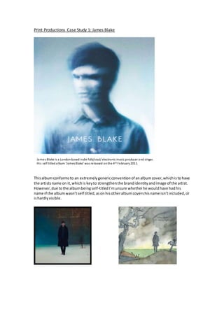
Thisalbumconformsto an extremelygenericconventionof analbumcover,whichistohave
the artistsname on it,whichis keyto strengthenthe brandidentityandimage of the artist.
However,due tothe albumbeingself-titledI’munsure whetherhe wouldhave hadhis
name if the albumwasn’tself titled,asonhisotheralbumcovershisname isn’tincluded,or
ishardlyvisible.
James Blake is a Londonbased indie folk/soul/ electronic music producer and singer.
His self titledalbum ‘JamesBlake’ was released onthe 4th February2011.
2. The use of the self titledalbumname ensuresthathisname ismore recognised,and
perhapscreatesa more directand personal effecttothe audience,implyingthatthe content
of the albumisperhapsa personal bodyof work. Onthe otherhand,the stand alone title is
simplistic,perhapsurgingthe audience tobuythe albumto‘see whatits about’,whichcould
have beena tactical marketingtechnique.
Due to the editingandstyle of the image combinedwith how Blake isturnedawayfromthe
audience createsamore distanteffect.Mostartistsuse directaddressintheiralbumcovers,
lookingintothe camerato create a more personal relationshipwiththe audience,making
themfeel closertothe artist.Blake ischallengingthisconvention,whichmakeshimappear
disconnectedfromthe audience,howeverthiscould be the intention.
It isextremelytypical foran image of the artist to be includedonthe albumcover,as
ultimately,the artistisbeingpromotedaswell asthe album. The style of thatsaidimage isa
keyfactor increatingthe brand image.Popartiststendto have an extremelycommercial
styledimage of themselvesforalbumcovers,withglamorousandboldclothes,hair,make
up and propsand locationsreflectingtheirwealth,forexample.If youignore the editingof
thisimage,youcan see that itwas clearlyaphoto of the artist on a white backdrop,dressed
ina shirt;extremelyminimal.Orthe same setup, withhimturninghisface and multiple
shotstakenat a highspeed,capturingmotionblur.Eitherway,the original image would
have beensimplistic.The colourpaletteof thisimage consistsof multipleshadesof cold
blues,whitesandgreys.
White can connote; light, goodness, purity and cleanliness. It is often used in advertising to
create a ‘cleaner image’, suggesting simplicity. Blue can connote; depth, stability, nature (sky
and sea), calmness and tranquillity. Lighter blues can often be associated with health,
serenity and understanding, whereas darker blues, knowledge, power, strength and
seriousness. These colour connotations are all representative of Blake’s artistimage and the
content of his music, which is all experimental and cathartic, whilst being personal and
intimate. After researching the artist more, he is often minimal and low key in his self-
presentation, and often described as introverted and mysterious. Therefore, by using this
colourpalette inhisalbumcoverhe isaidinghisdesiredbrand/artistidentity.
3. Other elements that add to this mysterious and
disconnected artist identity is the use of motion blur
photography. This technique creates the perception that he
has multiple faces. This implies more depth as ‘different
sides’ of him are shown. Furthermore the psycadelic inspired
style of the image is surrealistic and almost resembling a
hallucination, creating a ‘dream like’illusion. This creates the
idea his music is alternative and far from the mainstream,
rejectingthis.