
![My chosen brief: A promotion package for a new film, to include a teaser trailer together with two of the following three options ,[object Object]](data:image/gif;base64,R0lGODlhAQABAIAAAAAAAP///yH5BAEAAAAALAAAAAABAAEAAAIBRAA7)
Empfohlen
Weitere ähnliche Inhalte
Was ist angesagt?
Was ist angesagt? (18)
Ähnlich wie Advanced portfolio evaluation
Ähnlich wie Advanced portfolio evaluation (20)
Mehr von Alima Ali
Advanced portfolio evaluation
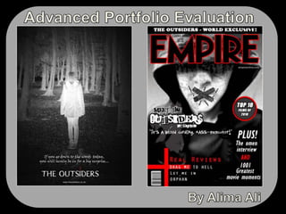
- 1. Advanced Portfolio Evaluation By Alima Ali
- 3. A film magazine front cover, featuring the film
- 4. A poster for the filmI chose to create a magazine font cover featuring the film and a poster for the film.
- 6. The release date that was chosen for the film was 11/11/11 and this was shown mid way through the trailer which is a common convention as it allows the audience to identify the date of which they can go and view the film in cinemas.
- 10. The background used on the poster is woods which indicates to the audience that this is the main location and setting for the film. Like the background on the Blair Witch project, I inverted the image so that the hooded figure stands out against the dark background and this in turn, reflects the films genre.
- 11. I included ‘If you go down to the woods today you will surely be in for a big surprise’ as the films strap line and this also signifies to the audience that the films prime location is the woods and a film strap line is a common convention that is always included on the film poster. This nursery rhyme tagline has a sinister meaning to it and leaves the audience in thought.
- 12. I placed the strap line above the film title, similarly to the Blair Witch Project and also included the films website right at the bottom of the page which provides audiences with more information about the film. This is a common convention that is included on all film posters.
- 13. My film poster makes use of four main colours: black, white, grey and white. These colours are also used on the Blair witch project poster and the colours make a bold statement. The colours that I have used on my poster allows the audience to identify the films genre and creates a sense of mystery and darkness. Codes and Conventions: Film Poster
- 15. Another convention is to clearly display the magazine title on the cover, usually within the top margin. I used the same font that is used for the ‘Empire’ magazine title and added a red outline, red being a consistent colour that i had used throughout the magazine which can be interpreted as representing blood and hence, representing the genre horror. The use of black and grey adds a sense of mystery and darkens and leaves the audience in thought as to who the figure on the cover may be which encourages them to read the magazine to find out more about the film.
- 16. A common convention of Empire magazines is to advertise one film in particular and to display content relating to that film and/or to that films genre on the front cover and this is what i did on my magazine cover. The strap lines that i had used on the cover alongside the films featured for the ‘Real Reviews’ sections are all iconic horror films. For those who are unable to identify that Empire is a film magazine, the strap lines used are able to distinguish this to the audience.
- 17. Other obvious magazine conventions is including the magazine issue number, the price of the magazine, the barcode and the magazine website and I displayed all four elements on my cover. The website is shown so that the target audience know which site to visit to find out more information about both Empire and the film The Outsiders.
- 20. “I liked how you ensured that all the clips used in the trailer were in black and white. I thought this to be quite effective in capturing and holding the viewers attention and it certainly held mine!”
- 21. “I am a great fan of horror films and this is most definitely a film that i would go and watch! I liked how you included white flashes in the trailer as this left me in thought and created suspense. The colours that you used on both the magazine font cover and the film poster followed a consistent house style”
- 22. “I could tell straight away that the three products that you had created were part of a package. If i was to give you any critical feedback, it would be that some of the shots used in the trailer were a bit shaky. Whether this was purposely done in order to create a dramatic effect i do not know. Aside this, you had my attention throughout the trailer and i found the poster and magazine cover to be quite appealing”
- 28. As well as this, i also used a website called ‘SlideShare’ which allowed me to upload my evaluation to my blog which i created using a website called ‘Blogger’. My Media Studies Blog Uploading my evaluation onto Slide share