Make your first MangoMap
•
0 gefällt mir•8,653 views

Create your first interactive GIS webmap with MangoMap

Empfohlen
Empfohlen
Weitere ähnliche Inhalte
Kürzlich hochgeladen
Kürzlich hochgeladen (20)
Empfohlen
Empfohlen (20)
Make your first MangoMap
- 1. Create your first web map with MangoMap
- 2. What is MangoMap? MangoMap is a cloud based web mapping platform that makes it easy to create and share data-driven web maps with powerful GIS analysis tools built in.
- 3. To complete this tutorial, you’ll need a MangoMap account. It’s completely free for 30 days with full, unrestricted access and functionality. Sign up for your free account at mangomap.com We won’t even ask for your credit card, and it just takes a few seconds. We’ll wait here while you sign up. Click here!
- 4. All done? Great! Let’s make your first map.
- 5. Now you’re signed up and logged in, create a new map by clicking on the big green PLUS button.
- 6. Pause to admire your shiny new base map. OK, now click on the layer button on the navigation panel.
- 7. Click “Add Data From Our Sample Library”
- 8. For this tutorial, we’ll use the demo dataset US State Borders. Click the green PLUS button to add the dataset to your account.
- 9. Once the dataset is loaded into your account, the Layer editor will appear. Here you can style your data, add labels and customize attribute popups.
- 10. Set the map type to “Category”, and set the column to “vote_2008”. Category maps assign different colors to the map based on content of the selected column — perfect for a small number of categories. Now click on the Custom Legend button.
- 11. Click on the color choose and set Democrat to blue & Republican to red. Click Done.
- 12. Next, go to the Labels tab and activate layer labels by clicking the toggle switch to ON. Set the label value to “vote_2008”. Style your label text as you wish and click Save.
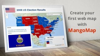
- 13. Now we can see the results of just a few clicks of customization: A cool map of the contiguous USA, with states that voted Democrats or Republican in 2008 are clearly defined by party colors, and labels. But, look at that title... Let’s fix that!
- 14. To give the map a title and add a custom logo, open the map customization panel button, and rename the map to “2008 US Election Results”. Describe the map as “State by State category Map”. Then tap on Save.
- 15. Now navigate to the Brand Settings tab, and enable Custom logo/colors.
- 16. Here we can set the map interface theme. Let’s make a few changes to the design by setting the following: ⚫ Background Color: White ⚫ Title Text Size: Large ⚫ Title Text Color: Blue ⚫ Upload a logo from your PC. For this example, I’ve chosen the Stars and Stripes. When you’re done, click Save. Scroll down for more custom settings.
- 17. Now we can see our custom colors, logo, and our updated map title and description. LOOKING GOOD!
- 18. Wait! Let’s make this interesting. Open a new browser tab, and go to: http://j.mp/USFlags That’s a zip package of US State flags I prepared earlier. Download the file and unzip it to your Dropbox’s Public Folder.
- 19. Once the flags have synced with your Dropbox, grab the public link by right- clicking on one of the flags.
- 20. Let’s tweak the map attribute popup. Navigate to the Layers panel & edit the US State Borders layer by clicking on the pencil icon. Got that Dropbox Public Link? Good work. We’ll use that in just a moment. But first...
- 21. On the layer panel, open the Popup tab. Enable the popup, and enable custom popup layout.
- 22. In our example dataset, there are 3 attributes which appear in the popup: {name} - the state, {population} - its population, and {vote_2008} - and the party that won the 2008 Presidential election. By default, your popup contains all attributes, but has no formatting, so let’s add some -- Click on the embed image button.
- 23. You will be presented with a URL input box. Here, paste the public dropbox URL we copied a few moments ago. Now, modify the URL to include our variable: Replace “Alabama” with {name}, then click Insert.Your Final URL should like like this: https://dl.dropbox...../Flag_of_{name}.png
- 24. In the popup editor, you should now see a placeholder image where the flags will appear. Hmmm. That default attribute data looks a little dull, let’s spice things up!
- 25. Remove the existing attribute variables, and replace with the following line: “In the 2008 US Presidential election, the {vote_2008} party won the popular vote in {name}.” Now click Save. Tip: You can use the green button to insert any variable you want.
- 26. Now let’s click on a state and see what our popup looks like. We have our attribute variables rendered in the text, and automagically, our image of the state’s flag loads for each state. Click on a few more states and see how the text and images change.
- 27. I don’t know about you, but I’m pretty happy with how this is looking, so it’s time to share it with the world! First, you’ll need to Publish your map – click on that big green Publish Map button at the bottom of the map editor, wait for the magic to happen, then copy your short URL!
- 28. Paste your short URL into a new tab and see it in all it’s glory in the wild. Play around with the map, hit the share button, send it to your friends, neighbours, that guy you always see walking his dog at the park. MangoMap is built to share!
- 29. Did you test your map on your mobile? Give it a try — MangoMap works on all devices.
- 30. How easy was that? In just a few minutes, you’ve: ➔ created a map ➔ styled and customized your data ➔ styled and customized your map interface ➔ customized your attribute popups ➔ configured images to load dynamically from data attributes ➔ learned how quick and simple it is to use MangoMap That’s all folks!
- 31. What’s next? Glad you asked! ➔ Check out our blog - blog.mangomap.com - for more tutorials and insights for making amazing interactive data driven web maps. ➔ Sign up for our QGIS video tutorials on Discover Spatial to learn about open source GIS for desktop: http://j.mp/QGIS4Beginners ➔ Make more maps! Your town or local government probably has loads of GIS and census data available for download - why not download some and make some maps about your local community, your rivers, your environment… anything that tells a story about your world, and share them with the world with MangoMap!