
Empfohlen
Weitere ähnliche Inhalte
Was ist angesagt?
Was ist angesagt? (20)
Andere mochten auch
Andere mochten auch (20)
Ähnlich wie MIS 226: Chapter 3
Ähnlich wie MIS 226: Chapter 3 (20)
Kürzlich hochgeladen
Kürzlich hochgeladen (20)
MIS 226: Chapter 3
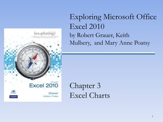
- 1. Exploring Microsoft Office Excel 2010 by Robert Grauer, Keith Mulbery, and Mary Anne Poatsy Chapter 3 Excel Charts 1
- 2. Chart Basics • A chart is a visual representation of numeric data 2
- 3. Chart Basics • Chart components include: – Data Points – Data Series – Category Labels 3
- 4. Column Charts • A column chart displays data vertically, with each data series forming a column 4
- 6. Reversing Categories and Data Series 6
- 8. 100% Stacked Column Chart 8
- 10. Bar Chart 10
- 11. Line Chart 11
- 12. Pie Chart 12
- 13. Area Chart 13
- 14. X Y (Scatter) Chart 14
- 15. Stock Chart 15
- 16. Surface Chart 16
- 18. Bubble Chart 18
- 19. Radar Chart 19
- 20. Creating a Chart • Select the data source • Select the chart type • Position and size the chart 20
- 21. Changing the Chart Type • Using the Chart Tools contextual tab: – Click the Design tab – Click Change Chart Type – Select the desired chart type 21
- 22. Changing the Data Source • To modify the chart data source: – Click the Design tab – Click Select Data under the Data group 22
- 23. Moving a Chart • To move a chart: – Click the Design tab – Click Move Chart under the Location group 23
- 24. Printing a Chart • To print an embedded chart: – Select the chart – Click the File tab – Click Print to display the Backstage view – Use the Print Selected Chart option • To print a chart sheet: – Use the Print Active Sheet option 24
- 25. Creating a Sparkline • A sparkline is a miniature chart displayed in a single cell 25
- 26. Chart Layout • The Layout tab offers many ways to enhance a chart visually 26
- 27. Selecting and Formatting Chart Elements • Formatting a chart element: – Right-click the element and select the Format element command – The element portion will change depending on the selection (ex. Format Data Series) 27
- 29. Chart Titles and Legend • A chart title is the label that describes the entire chart • An axis title is a label that describes either the category or value axis • A legend is used to distinguish data points in a pie chart or data series in a multiple series chart 29
- 30. Data Labels • A data label is the value or name of a data point 30
- 31. Axes and Gridlines • Excel computes starting, ending, and incremental values for display on the value axis • A gridline is a horizontal or vertical line through the plot area 31
- 32. Adding a Trendline • A trendline is a line used to depict trends and forecast future data 32
- 33. Summary • In this chapter, you have learned to create charts such as column, bar, pie and line charts. • You can modify an existing chart by changing the chart type, location or data source. • You can insert, remove, and format chart elements such as titles, labels, and the legend. 33
- 34. Questions 34
Hinweis der Redaktion
- This chapter reviews Excel charts and how to depict data visually.
- Figure 3.2 illustrates a column chart, plotting the number of majors across all colleges in 2012. It plots a single data series, including values for year 2012.The chart area contains the entire chart and all of its elements. The plot area contains the graphical representation of values in the data series. The X-axis (Category axis) is a horizontal line that borders the plot area and often displays category labels. The Y-axis (Value axis) is a vertical line that borders the plot area and contains markers to help display the values in the data series.
- Figure 3.3 illustrates a clustered column chart, plotting the number of majors across colleges for years 2009 through 2012 in a side-by-side fashion.Multiple data series include two or more sets of data. This chart illustrates four data series, one for each year. A legend is included to help the reader distinguish the multiple data series. Each data series is depicted in a different color.
- Figure 3.4 illustrates a clustered column chart, also plotting the number of majors across colleges for years 2009 through 2012.The role of categories and data series is reversed. This chart plots seven data series—one for each college.
- Figure 3.5 illustrates a stacked column chart. This type of chart places stacks of data in segments on top of each other in one column, with each category in the data series represented by a different color.
- Figure 3.7 illustrates a 100% stacked column chart. This type of chart stacks data in one column per category, with each column having the same height of 100%. It shows the percentage that each data point contributes to the total for each category.
- Figure 3.8 illustrates a 3-D column chart. This type of chart adds a third dimension to each data series.
- Figure 3.9 illustrates a clustered bar chart. This type of chart compares values across categories using horizontal bars. Bar charts, like column charts, may plot single or multiple data series, appear clustered or stacked, or add a 3-D effect.
- Figure 3.10 illustrates a line chart. This type of chart uses a line to connect data points in order to show trends over a period of time. The X axis (Category axis) typically displays time units, and the Y axis (Value axis) displays values for each point.
- Figure 3.11 illustrates a pie chart. This type of chart plots a single data series where each point is a sector with area proportional to the total of the series. A legend is used to display the category label for each data point in a different color. Data labels, such as percentages, are often portrayed on the pie wedges. An exploded pie chart separates one or more pie slices from the rest.
- Figure 3.12 illustrates an area chart. This type of chart emphasizes the magnitude of changes over time by filling in the space between lines with a color.
- Figure 3.13 illustrates an X Y (scatter) chart. This type of chart shows a relationship between two variables.
- Figure 3.14 illustrates a stock chart. This type of chart shows the high, low, opening, and closing prices for individual stocks over time.
- Figure 3.15 illustrates a surface chart. This type of chart displays trends using two dimensions on a continuous curve.
- Figure 3.16 illustrates a doughnut chart. This type of chart displays values as percentages of the whole, but may contain more than one data series.
- Figure 3.17 illustrates a bubble chart. This type of chart shows relationships among three values by using bubbles.
- Figure 3.18 illustrates a radar chart. This type of chart compares aggregate values of three or more variables represented on axes starting from the same point.
- The data source includes the data series, category labels and series names. Use the Ctrl key to select noncontiguous ranges. To create a chart, click the Insert tab, click the chart type (such as Column) in the Chart group, and then select a subtype (such as Clustered Column) from the chart gallery. A sizing handle, indicated by faint dots on the outside border of a selected chart, enables you to adjust the size of the chart.
- Once a chart is selected, Excel displays the Chart Tools contextual tab with tabs for Design, Layout, and Format. You can change the chart type by clicking the Change Chart Type button in the Type group on the Design tab.
- The Select Data Source dialog box illustrated in Figure 3.29 can be used to add a new data series, remove an existing one, or edit the range on an existing series.
- By default, a chart is placed in the same worksheet as the data source. You can also choose to move the chart to another location. The Move Chart dialog box, shown in Figure 3.31, offers choices for the chart location to be in a different or new worksheet.
- If a chart is embedded on a worksheet with the data source, you can choose to print the data, the chart or the entire worksheet. To print only the embedded chart, select it first. Click the File tab, click Print, and from the Backstage view, choose the Print Selected Chart option. If the chart is on its own worksheet, use the Print Active Sheet option.
- A sparkline is a small line, column, or win/loss chart contained in a single cell. It presents a condensed visual illustration of data. Unlike regular charts, a sparkline does not include chart layout objects such as a chart title or axes labels. To create a sparkline, click Line, Column, or Win/Loss in the Sparklines group on the Insert tab. Insert the cell references in the Data Range box. Enter the range where you want the sparkline to appear in the Location Range box.
- The Layout tab offers many ways to enhance a chart visually. Care should be taken not to overpower the chart, but rather to enhance its effectiveness in portraying information. As shown in Figure 3.39, the Chart Layout Tools Tab, options include inserting objects, removing objects, customizing axes, formatting the background, and including analysis.
- The easiest method to format a chart element, such as a legend or data series, is to right-click it on the chart and select the Format element command. The element portion will change depending on the selection (for example, Format Data Series or Format Legend).Figure 3.40 illustrates the Format Data Series dialog box with options for Fill, Border Color, and more. Alternatively, you can click the Chart Elements arrow in the Current Selections group, and select the element from the list. Once selected, click Format Selection in the Current Selections group.
- Chart labels, as shown in Figure 3.42, include: Chart title Data labels Value axis title Category axis title Legend Data Table
- The Labels group on the Layout tab contains options to edit the chart title, axis titles, legend, data labels, and data table. Chart title options include None, Centered Overlay Title, and Above Chart. More Title Options offer fill, border, and alignment settings.To display category axis title options, click Axis Titles in the Labels group, and point to Primary Horizontal Axis Title. Options include None, Title Below Axis, and More Primary Horizontal Axis Title Options. To display value axis title options, click Axis Titles in the Labels group, and point to Primary Vertical Axis Title. Options include None, Rotated Title, Vertical Title, Horizontal Title and More Primary Vertical Axis Title Options. Legend options include None and the desired location of the legend.
- Data labels are descriptive labels that show the exact value of the data points on the value axis. Add data labels only when necessary to reduce a cluttered look to the chart.Figure 3.43 illustrates formatting options for data labels.
- By default, Excel will compute markers for the starting, ending, and incremental values on the Y (value) axis. To change settings, click Axes in the Axes group and point to Primary Vertical Axis. Select from options to change units or select More Primary Vertical Axis Options to customize the markers.Gridlines are horizontal or vertical lines that span the chart to help people identify the values plotted by the visual elements. To change settings, click Gridlines in the Axes group, and point to either Primary Horizontal Gridlines or Primary Vertical Gridlines. Select from options to remove gridlines or add Minor Gridlines for more detail on the chart.Figure 3.44 displays two charts—one with the original intervals and the other in millions.
- Charts help reveal trends, patterns, and other tendencies that are difficult to uncover by looking at numerical data in a worksheet. A trendline is a line used to depict trends and forecast future data, commonly used in prediction events. To add a trendline, click Treadline in the Analysis group, and select the type of trendline from Linear Trendline, Exponential Treadline, Linear Forecast Treadline, or Two Period Moving Average.Figure 3.45 illustrates two linear forecast trendlines—one applied to the Business data series and one applied to the Undeclared data series.
- Chapter 3 has studied the creation and formatting of Excel charts. In this chapter, you have learned to create charts such as column, bar, pie and line charts. You can modify an existing chart by changing the chart type, location or data source. You can insert, remove, and format chart elements such as titles, labels, and the legend.
- Are there any questions?