
Empfohlen
Weitere ähnliche Inhalte
Empfohlen
Empfohlen (20)
Blair Witch Analysis
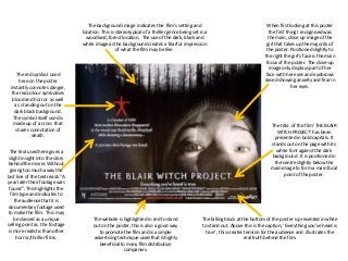
- 1. The background image indicates the film’s setting and location. This is stereotypical of a thriller genre being set in a woodland, forest location. The use of the dark, black and white image as the background creates a fearful impression of what the film may be like. The red symbol used here on the poster instantly connotes danger, the red colour symbolises blood and horror as well as standing out on the dark black background. The symbol itself used is made up of a cross that shares connotation of death. The text used here gives a slight insight into the story behind the movie. Without giving too much away the last line of the text reads “A year later their footage was found”. This highlights the film type and indicates to the audience that it is documentary footage used to make the film. This may be classed as a unique selling point as the footage is more realistic than other horror/thriller films. When first looking at this poster the first thing I recognised was the main, close up image of the girl that takes up the majority of the poster. Positioned slightly to the right the girl's face is the main focus of the poster. The close-up image only displays part of her face with her eyes and eyebrows raised showing anxiety and fear in her eyes. The title of the film ‘THE BLAIR WITCH PROJECT’ has been presented in bold capitals. It stands out on the page with its white font against the dark background . It is positioned in the centre slightly below the main image to form a main focal point of the poster. The website is highlighted in red to stand out on the poster, this is also a good way to promote the film and is a simple advertising technique used that is highly beneficial to many film distribution companies. The billing block at the bottom of the poster is presented in white to stand out. Above this is the caption; ‘Everything you’ve head is true’ , this creates tension for the audience and illustrates the real truth behind the film.
- 2. The review reading “SCARY AS HELL” has been used at the top of the poster as a way to advertise the movie. It makes the audience aware of the thrill and scare them a little without giving away too much. The negative background image used on the poster portrays a scary, spooky setting. The trees work well in white on top of the negative black colouring. The text used here gives a slight insight into the story behind the movie. Without giving too much away the last line of the text reads “A year later their footage was found”. This highlights the film type and indicates to the audience that it is documentary footage used to make the film. This may be classed as a unique selling point as the footage is more realistic than other horror/thriller films. The general layout of this poster is fairly simple. I think this makes it effective by only using a background image with a small amount of text, this way it doesn’t give too much away about the film yet still creates a spooky sense. The billing block is not printed on this poster only the film’s website. This leaves the bottom of the poster particularly empty.