
Empfohlen
Weitere ähnliche Inhalte
Was ist angesagt?
Was ist angesagt? (18)
Andere mochten auch
Andere mochten auch (11)
Ähnlich wie Analysis of music magazines
Ähnlich wie Analysis of music magazines (20)
Kürzlich hochgeladen
Kürzlich hochgeladen (20)
Analysis of music magazines
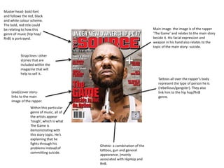
- 1. Master head- bold font and follows the red, black and white colour scheme. The bold, red title could be relating to how this genre of music (hip hop/ RnB) is portrayed. Main image- the image is of the rapper ‘The Game’ and relates to the main story beside it. His facial expression and weapon in his hand also relates to the topic of the main story- suicide. Tattoos all over the rapper’s body represent the type of person he is (rebellious/gangster). They also link him to the hip hop/RnB genre. Strap lines- other stories that are included within the magazine that will help to sell it. Lead/cover story-links to the main image of the rapper. Within this particular genre of music, all of the artists appear ‘tough’, which is what The Game is demonstrating with this story topic. He’s explaining that he fights through his problems instead of committing suicide. Ghetto- a combination of the tattoos, gun and general appearance. (mainly associated with HipHop and RnB.
- 2. The way the main image is partially covering the master head suggests that this magazine is very well-known because people are still able to decipher. Expensive looking ‘bling’ represents the amount of money he has. It also backs up the idea mentioned of him being a “King”. His ethnicity, tattoo and haircut are usually associated with the HipHop/ RnB genre, which suggests that’s the sort of artist he is. The ring he’s wearing on his marriage finger, supports the statement of him being “married with a vengeance”. This word and the font that it’s written in suggests that this magazine is mainly about HipHop and RnB because graffiti is usually associated with this genre.
- 3. The design of the master head supports the rock genre because it’s black and looks like smashed glass (rock stars are known for being reckless). Dark, over-the-top eye makeup demonstrates that this artist belongs to the rock genre. Artists who belong to the rock/ heavy metal genre are usually associated with smoking/use of drugs, which is being shown here. The main image is very large and takes up the majority of the page which is effective because it will attract fans immediately. Free poster with the magazine will attract readers, especially if they’re interested in the band/artist on the poster. The use of Ville Valo’s band’s logo suggest that they’re well known, because the logo is enlarged to grab the attention of their fans.
- 4. Even though the title ‘contents’ isn’t listed anywhere on this page, it’s clear that this is what that is. The subtitle ‘features’ is included and below, a list of the magazine’s contents. A subtle ‘V’ is placed at the start of a barcode look-a-like, which is effective because it represents the name of the magazine ‘Vibe’. It’s also creative and unique. All of the focus is on Usher, because the background is designed to look so simple. He’s standing in a position that makes him look extremely powerful. Usher’s also wearing a very expensive looking jacket, which represents his wealth. The main colour scheme of this contents page is white, black and grey. This allows most of the focus to be on the main image of Usher, whilst making the magazine look sexy and sophisticated. The name of the photographer who took Usher’s picture is listed in small print near the bottom of this page. Another representation of the wealth and power that Usher holds is the expensive brands that he’s wearing.
- 5. Included on the contents page is the title of the magazine, the issue number and the issue date. This is useful for frequent readers or collectors of this magazine to keep them in order. The issue number also demonstrates that this magazine has been successful because this is the 235th one. The colour scheme of this contents page is red, white, black and grey. The red, white and black links nicely to the iconic colour scheme of Q magazine itself. The target audience of this particular issue of Q magazine is made very clear from this contents page. The main image is of Nick Valensi, the guitarist of The Strokes (a band who became popular within the past 15 years). On the left hand side it features artists such as Radiohead and Johnny Cash- also more popular with older people. The pose that Nick Valensi is in appears to be quite intimidating, which could interest a lot of the readers into thinking he has a ‘dark secret’.
- 6. The main colour scheme of this contents page is black and white, so the pop of colour coming from the red heart on the artist’s body makes this page look sophisticated and unique. The heart could also be in bright red because it relates to a love story about KanyeWest featured in this magazine. This large, grey ‘V’ represents the title of the well-known magazine Vibe. More exciting formation of letters to form the title of the contents page. The artist is dressed in a shirt and suit jacket, linking to the sophistication of the layout of this particular contents page, and also the formal colour scheme. Different, but simple fonts are used for different aspects of the text included on the contents page. This variation causes the page to look even more unique and ‘fashionable’. Vibe magazine made this contents page simple, but effective. KanyeWest features in the middle of it which is enough to attract the readers. If the background was brighter or more ‘busy’
- 7. The close up shot of Lady Gaga and the fact that she’s posing naked suggests that the article is extremely personal in a way that it ‘reveals’ her. The image of the artist and the article about her are placed on different pages. A single letter in red representing her name makes the page stand out. Lady Gaga’s name is only placed in the right hand corner of the page, which suggests that most people know who she is just by looking at the picture. The first letter of this paragraph is larger and bolder than the rest of the font, which could mean that it’s an important paragraph, or it’s simply put their to look nice. The size of the majority of the font is fairly small, which makes the article look basic, but more sophisticated. The main colour scheme is black and white, which makes the red letter ‘L’ stand out even more. However, this gives the double page spread a splash of colour, making it look more interesting.
- 8. Wiz Khalifa is well-known for smoking marijuana, and it’s also subtitled in the article (“how high?”) Flat cap and tattoos represent the genre of music he belongs to- HipHop. The same colour scheme of black and yellow run over both pages- this could also be related to Wiz Khalifa’s single “Black and Yellow”. A whole page dedicated to an image of the artist. Close up shot of the artist can suggest that the article is very personal. Separate page for the article.
- 9. The ‘fancy’ font and pink background make the article look very girly, which represents the ‘Barbie’ aspect of Nicki Minaj. This bold font is used to make the artists name stand out within the article, however, it could suggest that the singer/rapper also has a tough side to her as well. The artist’s appearance is sophisticated, but over-the-top/ trashy. Her pose could also link her to the genre of HipHop. Black, pink and white colour scheme runs throughout. The light pinks could suggest that she’s trying to appeal to a younger female fan base. Her makeup matches the colour scheme of the spread and suggests that she’s fun. It could also support her ‘Barbie’ look that she often associates with herself. Highlighted and bold text to make the subheadings stand out. The font is simple so that it’s easy for people to read. Although the colours in her outfit suggest that she’s aiming towards younger females, her outfit is skin-tight which portrays her ‘sexy’ side.