HOW TO DESIGN STRONG BRAND IDENTITIES 3/4
•
2 gefällt mir•811 views

Presentation from Brand Identity Class at IED (istituto europe di Design) of Milan Made by Giuseppe Liuzzo, Founder of Liuzzo's Factory 2013/2014

Empfohlen
Weitere ähnliche Inhalte
Was ist angesagt?
Andere mochten auch
Andere mochten auch (20)
Ähnlich wie HOW TO DESIGN STRONG BRAND IDENTITIES 3/4
Ähnlich wie HOW TO DESIGN STRONG BRAND IDENTITIES 3/4 (20)
Kürzlich hochgeladen
Kürzlich hochgeladen (20)
HOW TO DESIGN STRONG BRAND IDENTITIES 3/4
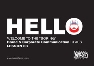
- 1. HELLOWELCOME TO THE "BORING" Brand & Corporate Communication CLASS www.liuzzosfactory.com LESSON 03 HELLO
- 2. www.liuzzosfactory.com I’m BackGIUSEPPE LIUZZO BRAND & GRAPHIC DESIGNER AND ALSO YOUR LOVELY TEACHER FOR TODAY.
- 3. www.liuzzosfactory.com VISUAL IDENTITY IN THIS CLASS LIKE A BOSS ! WE GOING TO TALK ABOUT AND LEARN HOW IT WORKS AND HOW TO DESIGN IT HEM... LIKE A PRO, NOT BOSS, MY FAULT ;-)
- 4. www.liuzzosfactory.com LAST TIME... CHOOSE TWO LOGOS FROM THE STREET AND MAKE AN ANALYSIS BASED ON: WHAT'S THE ORIGIN OF NAMING? IT WORKS IN ONE COLOR? IT'S POSSIBLE TO SIMPLIFY THIS LOGO? HOW? HAVE A CONCEPT BEHIND? IT WORKS? IT WORKS IN SMALL SIZE? WHAT KIND OF LOGO IS IT? WHY? IS THIS LOGO ICONIC? WHY? FROM A BAR, A LAUNDRY, A RESTURANT etc... please: don't choose famous brands, or franchising stores. GROUP PROJECT MAX. 10 SLIDES PRESENTATION
- 5. www.liuzzosfactory.com TODAY WE TALK ABOUT DESIGN PROCESS
- 6. www.liuzzosfactory.com YES, DESIGN HAVE A PROCESS BECAUSE DESIGN ISN'T ART... IT'S A PLAN FOR THE COSTRUCTION OF EVERYTHING It's not important if it looks good or bad... it have to WORKS
- 9. www.liuzzosfactory.comwww.liuzzosfactory.com BRIEFCLIENT REQUEST. YOU NEED SOME INFORMATION BEFORE STARTING A NEW PROJECT. BRIEF
- 10. www.liuzzosfactory.com BRIEFING IN ORDER TO MAKE A GOOD AND USEFULL GRAPHIC DESIGN PROJECT YOU NEED TO KNOW EVERYTHING ABOUT YOUR CLIENTS NEEDS. COMPANY PROFILE COMPANY AIMS a short, honest synopsis of company or product They want to: What company does? How long have been estab- lished and how many staff you employ? What your niche market is? How you fit in to your indus- try sector? Generate sales? Encourage enquiries? Gain newsletter subscribers? Obtain information from your audience? Encourage them to tell a friend?
- 11. www.liuzzosfactory.com BRIEFING IN ORDER TO MAKE A GOOD AND USEFULL GRAPHIC DESIGN PROJECT YOU NEED TO KNOW EVERYTHING ABOUT YOUR CLIENTS NEEDS. WHAT'S THE AUDIENCE BUDGET & DEADLINES These may include: a budget expectation will give you a good idea of the type of solution you will realistically be able to provide. Time scale is also an im- portant consideration in order to know if there is a specific deadline that has to be met. Age Sex Income Occupation Location Important Keywords
- 12. www.liuzzosfactory.com BRIEFING IN ORDER TO MAKE A GOOD AND USEFULL GRAPHIC DESIGN PROJECT YOU NEED TO KNOW EVERYTHING ABOUT YOUR CLIENTS NEEDS. ALWAYS ASK TO CLIENTS FOR A DETAILED BRIEFING... NOW, THIS IS NOT A PERFECT WORLD... SO LEARN ALSO HOW TO MAKE ONE BY YOURSELF. SAMPLES & BENCHMARK ask for design style that your client particularly like or dislike and to explain why in the brief. collect sample of other company for inspirations.
- 13. www.liuzzosfactory.comwww.liuzzosfactory.com RESEARCHDON'T RUN... LOOK AROUND, TAKE INSPIRATION FROM BOOKS AND WEB, DISCOVER WHAT OTHER DESIGNER MADE IN SIMILAR PROJECT.
- 14. www.liuzzosfactory.com A DESIGN EXPLORATION WHAT SIMILAR COMPANY DO? HOW THEY COMMUNICATE? WICH COLOR THEY USE? ... IN THIS STEP YOU GOING TO FIND THE "STORY" THE "CONCEPT" OF YOUR DESIGN
- 15. www.liuzzosfactory.com A DESIGN EXPLORATION EXPLORATION COULD BE MADE ON DIFFERENT MEDIA.
- 16. www.liuzzosfactory.comwww.liuzzosfactory.com SKETCHTHE BEST WAY TO FIND IDEAS AT THE BEGINNING FORGET COMPUTERS... SKETCH YOUR IDEAS, IT'S THE BEST WAY TO CREATE MULTIPLE GRAPHIC SOLUTIONS.
- 17. www.liuzzosfactory.com BECAUSE MEANS: GRAPHIC FREEDOM. COMPUTER CAN CONFUSE YOUR IDEAS, BY DRAWING YOU CAN JUMP FORM ONE IDEA TO AN OTHER IN JUST ONE SECOND... NO "OPEN FILE" OR BULLSHIT LIKE THAT... AND ALSO... YOU CAN DO IT EVERYWHERE...
- 18. www.liuzzosfactory.com IS SIMPLE AND POWERFUL TOOL TO SOLVE PROBLEMS AND EXPLORE POSSIBILITIES THINK ALSO WITH YOUR HANDS...
- 20. www.liuzzosfactory.comwww.liuzzosfactory.com DESIGNTIME TO BE PROFESSIONAL LET'S FINALIZE YOUR IDEAS, CONCEPT STORIES AND SKETCHES IN A TECHNICAL WAY BY USING GRAPHIC RULES... DESIGN
- 21. www.liuzzosfactory.com MAKE IT REAL MAKE YOUR CONCEPT AND SKETCHES USABLE IN A TECHNICAL WAY. DESIGN IT IN A GRID, GIVE RULES.
- 22. www.liuzzosfactory.com BUILD A LOGO GEOMETRICAL CONSTRUCTION OF SHAPES HELPS LOGOS USAGE AND MEMORABILITY.
- 23. www.liuzzosfactory.com CHOOSE COLORS BY USING A STRATEGY, USE YOUR DESIGNER MIND
- 24. www.liuzzosfactory.com SET COLOR PALETTES GIVE RULES TO COLORS, SET BALANCE etc...
- 25. www.liuzzosfactory.com TEST YOUR DESIGN MAKE USAGE TESTS, LOOK HOW AND IF THEM WORKS.
- 26. www.liuzzosfactory.comwww.liuzzosfactory.com REFINEBE READY TO CHANGE YOUR DESIGN NOT ALWAYS EVERYTHING IS GOOD AT THE FIRST TIME... LEARN IT QUICKLY AND DON'T BE MAD IF YOU HAVE TO WORK AGAIN ON YOUR IDEAS OR YOU HAVE TO DESTROY EVERYTHING YOU MADE... REFINE
- 27. www.liuzzosfactory.com SERIOUSLY IT'S NOT EASY I KNOW... DON'T BE IN LOVE WITH YOUR PROJECTS... BE ANALYTICS, BE CRI- TIQUE, BE READY TO CHANGE EVERYTHING IF IT DOESN'T WORKS.
- 28. www.liuzzosfactory.comwww.liuzzosfactory.com PUBLISHDONE! SEND TO CLIENT ;) PUBLISH
- 29. www.liuzzosfactory.com GUIDELINES MAKE YOUR DESIGN USABLE BY OTHER DESIGNERS IN ORDER TO SPEAK ALWAYS THE SAME LANGUAGE.
- 31. www.liuzzosfactory.comwww.liuzzosfactory.com DESIGNERWAY TO SEE THE WORLD DESIGNER
- 32. www.liuzzosfactory.com USE RHYTHM DESIGNER IS A VISUAL MUSICIAN it keeps your eye moving around a space. It provides something for your eye to pick up on, follow and stop. It allows for both unity and variety in a design.
- 33. www.liuzzosfactory.com MOVEMENT creating a sense of movement through a design. It assists in giving the end-user a clear path for their eye to follow. is a way to direct the viewer’s eye to the places you want them to look and even the sequence in which you want them to look. ARE WE TALKING ABOUT VIDEO? NO!
- 34. www.liuzzosfactory.com SCALE&PROPORTIONS scale deals with the measurable size of an object. Proportion, on the other hand, deals with the size of an object relative to those things around it. BIG LIKE THIS OR SMALL LIKE THAT?
- 35. www.liuzzosfactory.com EMPHASIS what stands out or gets noticed first. Every layout needs a focal point to draw the readers eye to the important part of the layout. Too many focal points defeat the purpose. FOCUS POINTS AROUND YOUR LAYOUT
- 36. www.liuzzosfactory.com BALANCE Balance is an equal distribution of weight. Every element has visual weight that is determined by its size, darkness or lightness, and thickness of lines. There are two basic approaches to balance. symmetrical and asymmetrical balance. Also color, value, size, shape, and texture can be used as balancing elements. OF THE UNIVERSE BUT ALSO IN GRAPHIC DESIGN
- 37. www.liuzzosfactory.com CLOSURE Closure is the idea that the brain tends to fill in missing information when it perceives an object is missing some of its pieces. BE ABLE TO FU*K THE BRAINS
- 38. www.liuzzosfactory.com CONTRAST the greater the difference the greater the contrast. The key to working with contrast is to make sure the differences are obvious. Adds interest and provides a means of emphasizing what is important. common methods of creating contrast are by using differences in size, value, color, and type. THE DIFFERENCES BETWEEN DAY AND NIGHT
- 39. www.liuzzosfactory.com THERE ARE MANY AND YOU MUST THEM ALLIN DESIGN RULES TOBREAKTHEM KNOW
- 40. www.liuzzosfactory.comwww.liuzzosfactory.com BASICVISUAL IDENTITY ELEMENTS VISUAL IDENTITY HAVE A D.N.A COMPOSED BY BASIC
- 42. www.liuzzosfactory.com EXECUTIVE FILES LOGOS AND VISUAL IDENTITY ELEMENTS MUST BE MAKE BY VECTOR. NO PHOTOSHOP
- 43. www.liuzzosfactory.com EXECUTIVE FILES COLORS COULD BE DIFFERENT. YOU HAVE TO SET ANY KIND OF VALUES PANTONE SYSTEM RAL SYSTEM HEX The Pantone Color Matching System is largely a standardized color reproduction system. By standardizing the colors, different manufacturers in different locations can all refer to the Pantone system to make sure colors match without direct contact with one another. is a colour matching system used in Europe. Mainly used for varnish and powder coating but nowadays there are reference panels for plastics as well. A hex triplet is a six-digit, three-byte hexa- decimal number used in HTML, CSS, SVG, and other computing applications, to repre- sent colors.
- 45. www.liuzzosfactory.com EXTRAS WATCH THIS VIDEO TIRED OF HELVETICA youtube.com/watch?v=FmnIFqrpOWE GO TO: WWW.HOUSEIND.com A video brand guidelines manual from a brand called ArcelorMittal. Very usefull for understanding rules behind visual identity design A prolific American type foundry, has made a considerable impact on the world of design. Their fonts scream from billboards, wish happy whatever from tens of thousands of greeting cards, serve as the basis for consumer product logos and add elements of style to a wide range of mainstream media.
- 46. www.liuzzosfactory.com FOR NEXT TIME WATCH THIS MOVIE IT'S YOUR BRIEFING youtube.com/watch?v=gBn6093xFaU AND DESIGN A "LOGO" FOR TALK ABOUT THE STORY BY FOLLOW THE DESIGN PROCESS. MAKE A GRAPHIC RESEARCH OF THE MOST ICONIC ELEMENTS AND VALUES OF THE MOVIE, HOW OTHER PEOPLE COMMUNCIATE THEM? 2 SLIDE PRESENTATION SKETCH MULTIPLE SOLUTIONS, TRY TO EXPLORE DIFFERENT WAYS. AT LEAST 5 SKETCHES DESIGN A VISUAL LOGO OF THE MOVIE IT HAVE TO WORKS ON A WIDTH OF 5cm IT IS POSSIBLE TO USE MAX. 3 COLORS WHY YOU CHOOSE THAT COLORS? IT HAVE TO WORKS ALSO IN 1 COLOR MAX. 10 PAGES PRESENTATION PRINTED ON A4 PAPER
- 47. www.liuzzosfactory.com IF YOU NEED HELP SEND ME AN EMAIL BUT ONLY IF YOU REALLY, REALLY NEED* *OR IF YOU WANT TO INVITE ME TO AN AMAZING PARTY hello@liuzzosfactory.com
- 48. www.liuzzosfactory.com MANY FRESH THINGS www.liuzzosfactory.com SEE YA' NEXT WEEK FELLAS...