Beginners Guide to TikTok for Search - Rachel Pearson - We are Tilt __ Bright...
Newspaper poster research
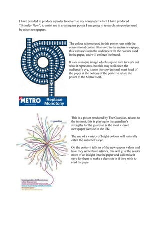
1. -142875443865000089535000I have decided to produce a poster to advertise my newspaper which I have produced “Bromley Now”, to assist me in creating my poster I am going to research into posters used by other newspapers. <br />The colour scheme used in this poster runs with the conventional colour Blue used in the metro newspaper, this will accustom the audience with the colours used in the paper, and will enforce the brand.<br />It uses a unique image which is quite hard to work out what it represents, but this may well catch the audience’s eye, it uses the conventional mast head of the paper at the bottom of the poster to relate the poster to the Metro itself.<br />This is a poster produced by The Guardian, relates to the internet, this is playing to the guardian’s strengths for the guardian is the most viewed newspaper website in the UK.<br />The use of a variety of bright colours will naturally catch the audience’s eye.<br />On the poster it tells us of the newspapers values and how they write there articles, this will give the reader more of an insight into the paper and will make it easy for them to make a decision in if they wish to read the paper.<br />123825-22860000The independent is a more sophisticated paper, and is aimed at the more educated audience, this is shown by the font, and the classy imagery used.<br />The mast head is exactly the same to the newspaper, so that the audience know what to look out for and is easily recognisable; this is also why the logo is shown in the poster also. <br />The colour scheme of Red is not a conventional colour to use and is not always associated with the Independent so this could confuse audience if not familiar with the paper.<br />-1905017145000<br />The Sun is a tabloid newspaper and this means that they aim to the more working class society. This is shown by the lack of vocabulary and words used.<br />The masthead is also used bottom right and this links back the newspaper.<br />The font used is big and bold, and colour scheme used is Red and this is the main colour associated with the newspaper, this catches the audience’s eye for it is easy to read, the working class will be more likely to read it, for there is less to read and is clear, and use of colours are already familiar to them.<br />They use a celebrity in the poster to attract the audience for they lack in content to attract the audience, the sun are playing on their strengths for they know that their type of audience will be more likely to read because of a famous face appears. <br />