Responsive 120214112319-phpapp01
•
0 gefällt mir•215 views

O design responsivo trata-se da adaptação do design de um website a todos os dispositivos móveis nos quais ele pode ser divulgado.

Empfohlen
Weitere ähnliche Inhalte
Was ist angesagt?
Was ist angesagt? (18)
Andere mochten auch
Ähnlich wie Responsive 120214112319-phpapp01
Ähnlich wie Responsive 120214112319-phpapp01 (20)
Kürzlich hochgeladen
Kürzlich hochgeladen (20)
Responsive 120214112319-phpapp01
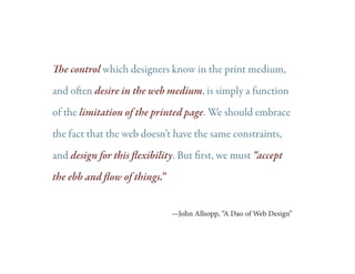
- 1. The control which designers know in the print medium, and often desire in the web medium, is simply a function of the limitation of the printed page. We should embrace the fact that the web doesn’t have the same constraints, and design for this flexibility. But first, we must “accept the ebb and flow of things.” —John Allsopp, “A Dao of Web Design”
- 2. The Ghost of Web Design Past • Fixed width sites • Desktop only browsing • esign for the fold D • 56k—Bee-boop...screetch! The Ghost of Web Design Present • Multiple formats and screen sizes • rowse anywhere: Home, office, B mobile • igher overall bandwidths H • ser responsiveness and U participation
- 4. or better yet, Fluid Web Design
- 5. The Basics of Responsive Web Design • Adapting the layout to suit different screen sizes, from widescreen desktops to tiny phones • Resizing images to suit the screen resolution • Serving up lower-bandwidth images to mobile devices • Simplifying page elements for mobile use • Hiding non-essential elements on smaller screens • roviding larger, finger-friendly links and buttons for P mobile users • etecting and responding to mobile features such as D geolocation and device orientation.
- 6. foodsense.is Desktop iPad • Side navigation items shift to top for iPad • Tabbed items under photo reduce in size • ecent tweet and other left side elements R are removed
- 7. foodsense.is Desktop iPhone/Mobile • Orients to a single column • Navigation reverts to text only • buckets stack each other 4
- 8. cacaotour.com Desktop iPad • arge image is removed to accommodate L more important elements • Navigation shifts • Other home page elements reordered
- 9. cacaotour.com Desktop iPhone/Mobile • Orients to a single column • avigation stacks and is center on N the home screen
- 10. bostonglobe.com Desktop iPad • columns down to 2, columns more even width 3 • Navigation shifts • Ads and other support elements moved
- 11. bostonglobe.com Desktop iPad • columns down to 2, columns more even width 3 • Navigation shifts • Ads and other support elements moved
- 12. bostonglobe.com Desktop iPhone/Mobile • Orients to a single column • avigation changed N • Search feature reduced • Center column becomes main
- 13. bostonglobe.com Desktop iPhone/Mobile • on’t forget the orientation D flip!
- 14. work in GRIDS • tart from wireframing stage S • elps to keep elements aligned and H sized correctly for transition into other formats • hink proportion and hierarchy: What T elements should always be larger/bolder/ more attention then others • elps the developers, speeds up H development time through CSS