1. Banner
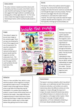
Colour scheme
The banner, informs the audience what the page is
The colour scheme is based around the colours pink
showing. The contrast of the white text and pink
and yellow, but there are quite a lot of other colours
background makes the banner stand out considerably,
used, therefore portraying a fun type of magazine. It
even though the page is very busy anyway. The fact
also suggests the target audience is probably young
the text is also bigger than the rest on the page
teenage girls, or those aged about 10 – 13. The many
emphasizes it, and makes the reader notice it
colours makes the magazine appear very busy and
instantly. The word ‘mag’ could also make the target
interesting to look at, which could persuade people to
audience identify with the magazine, as it is a word
buy it.
that typically a teenage girl would probably use.
Features
Images
Text boxes have been
There doesn’t appear to used to separate
be one main image on different sections of
this contents page. There the magazine, and it
are two; one showing the means it doesn’t have
front of the magazine and huge blocks of
one of a pop band. The information for the
way that a pop band is reader to have to sift
shown could also through to find what
represent what type of they are trying to read
person would read this about. The top of each
magazine; one that text box has a
enjoys pop music. The subheading to show
pictures are scattered all what the pages in the
over the page and this box are about, and the
could symbolise the laid subheadings are larger
back style of this so they stand out to
magazine. the reader. The text
boxes mean that the
page has some
organisation.
Selling line
General layout
There is a ‘wins and offers’ box, which is a way
that the producer of the magazine is trying to The layout is very busy and girlie, which may attract
persuade the reader to buy it. It intrigues the the reader, as it is definitely not dull! There are lots
reader to skip to that page and win amazing of pictures and colour, and numbers are used to
prizes or get offers for things they may be clearly show where the different articles are in the
interested in. It is another way of selling the magazine. It means although the layout isn’t
product, as even if some of the articles aren’t of simple, the reader should still clearly know where
interest to the reader , they might still buy the each different feature is in relation to the rest of
magazine because it means they have a chance the magazine, as the page number is given. I think
of winning free things. It might also make them the layout is very age and target audience
believe that it is better value, as they might appropriate, as if it was really plain and boring, a
believe they getting more for their money. 10-13 year old girl probably wouldn’t buy it.
2. Main image
The main image of Kanye West is central to
the contents page, and suggest o the
reader that he may be featured in the
magazine. The red heart being held in front
of Kanye’s adds some warmth to the
otherwise quite cold looking page. It could General Layout
suggest that the magazine’s theme could
be love. The shot uses a direct mode of The general layout of this magazine
address, therefore making the audience is quite simple and this makes it
connect with it, as Kanye is staring straight easy for the reader to see what is
at the reader. included in the magazine. All of the
text is down the right hand side,
which adds a clear and sophisticated
edge to the style of this magazine
contents page.
Colour scheme
The main colours used in this
contents page are black and grey,
and these are both effective as
they blend with the light grey
background, to produce a very Subheadings
classy and subtle look to the
magazine. This could therefore The subheadings used in the
make the reader associate the contents page are in a different font
classy look with the actual theme and are bigger than the majority of
of the magazine, and make them the text. This makes them stand out,
want to read on. and it means the audience
understand exactly where they need
to look to see what is in the
magazine and where the fashion
pages are in the magazine.
Background
The background uses two different tones of
grey, to coincide with the main colour
scheme. It consists of a large grey ‘V’. The Title
contrast of the two grey’s almost create s a
The title of the contents page is laid out in in a very
brand identity, as it is instantly recognisable
different way to most magazine contents pages. The
to the normal readers of the magazine, and
word is split into three different lines, which draws the
this therefore promotes the magazine in its
reader’s attention to it, and makes them wonder why it
own way. It is different to most magazine
is. It fits into the style of the contents page as it makes
content’s pages, as it only has the title
the writing all on the right hand side, and the writing is a
‘Contents’ and it doesn’t have a specific one
lot bigger than the rest of the text, to emphasize to the
relevant to a certain article in the magazine.
reader that it is important, and shows what the page is
about.
3. Banner Main image
The banner along the top of the page, The main image is placed towards the right-hand side of the page, and
allows the reader to clearly see that this shows one of the bands featured. It is large which suggests it could be one
page is showing what is featured in the of the main articles in the magazine, and this could intrigue the reader to
magazine. The black background allows skip to this page and see what is so important about this article. The
both the ‘Contents’ text and the ‘Q’ to picture used is a long shot of four people, whom are all looking directly at
stand out to the reader. The date is also the reader, apart from one, and this is to try and connect with the
shown on the right hand-side as it is less audience. The men in the image are stood on a hillside which suggests
important and therefore is in smaller they are rural, and the way they are casually dressed means the audience
text. may be able to identify with them.
Colour scheme
Sidebar
The colour scheme used is
The sidebar consists of clear mainly red, black and
features of the magazine in an white. The main image
easy way for the audience to used uses a slight variation
read. It also uses clear of this, but mainly the page
numbers, so the reader can consists of those three
skip to any page that takes colours. The colour scheme
their interest. There is also a keeps the page looking
box used to emphasize the simple, and means that the
‘Oasis special’ and this makes text stands out, as the
the audience aware of the background for writing is
special articles in the magazine generally white, apart from
focused on Oasis. The sidebar the subheadings and
is all down the left-hand side of banner, which makes that
the page to leave room for the those stand out more.
big picture to the right. It is set
out in a very simple way, but is
very effective.
Subheadings Sub-article
These are in a white font with a red This uses a sub-heading of ‘review’ and this shows
background. This creates a contrast of exactly what it’s about to the reader. It also uses a
colour and makes them stand out. The smaller image to create interest from the reader,
colour red has many connotations, such and uses the selling line, ‘The biggest and best music
as danger and passion, but in this case I guide’ which creates the magazine article with a
think it just points out the key features unique selling point. Most importantly though, it
and emphasizes the importance of them makes the reader think that no other magazine will
to the reader in the magazine. have an article about this, that is better than this
one, which may make them want to read this article,
and judge if they think it is the best one they’ve read
or not.
4. Main Coverline Main image Colour scheme
This is made to stand out via the The main image is quite busy, and The colour scheme of this double
blue background and bold black this is to interest the reader and page spread is blue, black and white.
writing which contrasts this. I think make them want to read the article. I think this works well, as the
the colour blue has been chosen as The way the boys are positioned in headings and key features are
the main picture in the article is of the image is in a way that tries to generally consistent in being blue,
three boys, and the colour blue is connect with the audience, as it is a which therefore means the reader
often associated with males. I think relatively relaxed scenario, and the can clearly see which bits are key
the way it states ‘The Teenagers’ way they are staring directly at the information to read. The way that
could also be showing what the reader, could also help connect with all the colours can be layered with
target audience is for the magazine, them. It takes up a full A4 page, each other and still stand out, shows
as well as showing which band the which could help the article stand that the colour choice was a good
article is about. It will intrigue out as when flicking through the one, for example; there is both black
teenagers to read it, to see what is magazine, the image would writing layered on blue and white
being said about them. probably be more obvious than writing layered on black. Both stand
other, smaller, images. out considerably well.
Button Subheading Sidebar
The button, ‘NME loves’, The subheading doesn’t actually The sidebar uses a different
emphasizes the importance of the sound particularly appealing to the coloured background, to symbolise
article to the reader, and reader, as it calls the target to the reader how the information
encourages them to read on. The audience – teenagers, ‘dumb’. on the sidebar isn’t actually related
way it is in a different shaped text However this could actually entice to the band in the main article. The
box to anything else on the page, the reader to connect with the smaller images on the sidebar
also makes it look like it is magazine as it uses language that is create interest for the reader, as if it
something the reader should take associated with teenagers, therefore was all text, it may look a bit boring,
interest in. could make it more relatable and and plain.
personal for them.