

Empfohlen
Weitere ähnliche Inhalte
Andere mochten auch
Ähnlich wie Hall leni mobile_presentation
Ähnlich wie Hall leni mobile_presentation (20)
Hall leni mobile_presentation
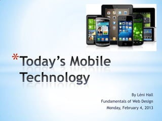
- 1. * By Léni Hall Fundamentals of Web Design Monday, February 4, 2013
- 2. *
- 4. * • More people are on-the-go than ever before. • Lower-priced tablets in late 2011 drove the market. • A larger variety of available smartphones now available - 1.2 billion smartphones will enter the market over the next 5 years.
- 5. * • New devices & formats have created a new "multi-platform” consumer. • Growing evidence shows mobile devices are adding to how people get information, including news
- 6. Hmmm… Mobile devices have changed the way that developers must think and design.
- 7. * • Content Prioritization • Vertical Navigation • Simplified Text, Graphics, Navigation • Minimal Footer • Integration of Phone Functions
- 8. *
- 10. * Text Graphics Navigation
- 11. *
- 12. *
- 13. *
- 15. *
- 16. *
- 17. *
- 18. *
- 19. * Anderson, E. (2012, March). The 5 Worst Mobile Websites. imediaconnection.com. Retrieved on February 4, 2013 from http://www.imediaconnection.com/article_full.aspx?id=31232 Cassavoy, L. (2012, March). Top 20 Mobile Sites and Services. Pcworld.com. Retrieved on February 4, 2013 from http://www.pcworld.com/article/252665/top_20_mobile_web_sites_and_services.html Ma, S. (2011, March). 10 Ways Mobile Sites Are Different from Desktop Web Sites. Uxmatters.com. Retrieved on February 4, 2013 from http://www.uxmatters.com/mt/archives/2011/03/10-ways-mobile-sites-are-different-from- desktop-web-sites.php Mitchell, A., et al (2012, October). Future of Mobile News. Journalism.org. Retrieved on February 4, 2013 from http://www.journalism.org/analysis_report/future_mobile_news Savits, E. (2013, January). HTML5 vs. Native Mobile Apps: Myths and Misconceptions. Forbes.com. Retrieved on February 4, 2013 from http://www.forbes.com/sites/ciocentral/2013/01/23/html5-vs-native-mobile-apps-myths- and-misconceptions/
Hinweis der Redaktion
- Mobile Internet use is expected to outpace desktop Internet use. Creating meaningful experiences for those who visit your mobile site is imperative!
- Based on research by the Pew Research CenterAs of 2012, nearly a quarter of U.S. adults, 22%, now own a tablet device-double the number from a year earlier. Even more U.S. adults (44%) have smartphones
- The advent of the new lower-priced tablets in late 2011 brought in a new crop of tablet owners. A larger variety of available smartphones now available (1.2 billion smartphones will enter the market over the next 5 years)
- Rather than replacing old technology, the introduction of new devices and formats is creating a new kind of "multi-platform" news consumer.There is growing evidence that mobile devices are adding to how much news people get
- There are several very important principles of design that must be used when designing for mobile devices.
- Screens are small so you must prioritize your information. What is necessary? What are the most important buttons and actions that the mobile operator needs/wants?Too much information can be overwhelming. Mobile users are looking for specific answers, not browsing.
- Vertical navigation is necessary to fit the screen of a mobile device. Little-to-no scrolling is necessary and most of it should fit on the screen (above the fold). This makes it easier to find what you are looking for and take action.
- KISS. Keep It Simple Stupid. One of the most basic and important marketing fundamentals. Mobile users don’t want to have to search for things and are more drawn to screens that are neat and organized. White space is a good thing!
- Footers should be minimal in comparison to typical websites. Only the basics are necessary to quick navigation. Using symbols is common to keep it even simpler.
- The ability to search for someone or something and then call them with the touch of a button is ideal and practical. This should be utilized as much as possible. Most mobile devices ARE phones after all! We should still be able to use it as such.
- HTML5 is taking the mobile site development industry by storm. Why is it better than the ‘native app’? It can produce feature-rich web-based apps that can be updated instantaneously. It bridges the gaps between websites and mobile apps.
- In the world of mobile sites, there are good ones, bad ones and just plain ugly ones. Let’s take a look at a few from each category…
- The Good! I love it when companies I love get it right. Here are couple the have a mobile site done right:The Food Network mobile site is great because it allows you to plan meals and follow recipes with ease. It’s also still attractive while functional. With so many bad airline mobile sites out there, it’s great to know that you can go to one that will give you the answers you need. Is my flight on time? Flight Stats can tell you.
- Oh… the Bad. These guys are especially bad because they should know better! First of all, let’s hope that Jeep can engineering their vehicles better than their mobile site. The template used for their site was not made to fit the screen of a mobile device, which means that words are cut off. “Name My R” is supposed to read “Name My Ride”. The inability to deliver the message = bad marketing. Dell is on the naughty list because it is playing games like a ‘used car salesman’. Interruptive ads spring across the screen during simple navigation which is annoying and unnecessary for users. This is more likely to deter users than to attract them.
- And then there’s the ugly… for obvious reasons these were picked. However, here’s a closer look: Johns Hopkins is known as one of the top hospitals in the US. However, their mobile site is less than desirable. Trying to find or access the information you need on this site is about as easy as wandering up and down each hall of the hospital. Then there’s Hardees. Chances are that if you are looking at Hardees’ mobile site, you are looking for a nearby restaurant, right? So then why haven’t the creators of this site implemented a location gps system into the site? Why should I have to enter my zip code? Typically, when you’re traveling, you don’t know the zip code…
- The Adult Literacy League needs to create a mobile site to attract donors, allow students/teachers/volunteers to interact, and promote events. Simple symbols and icons should be used as much as possible for ease of navigation to those who are illiterate. An ecommerce plug-in should be implemented to allow for instant donations. An accessible mobile site is a must for any business or non-profit that wants to be taken seriously.