
Empfohlen
Weitere ähnliche Inhalte
Was ist angesagt?
Was ist angesagt? (19)
Ähnlich wie POLTERGEIST Poster Analysis
Ähnlich wie POLTERGEIST Poster Analysis (20)
Kürzlich hochgeladen
Kürzlich hochgeladen (20)
POLTERGEIST Poster Analysis
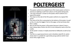
- 1. • This poster conforms to a typical horror film movie poster as there is chiaroscuro lighting as well main colours on the poster being quite. • The main character is shown on the poster, which conforms to a typical film poster. • The clown on the side of the film poster conforms to a typical film poster. • The name of the film is presented on the bottom of the poster. As well as this, it is also the biggest font on the page, so that we know what film is called. • We can tell that the poster is film poster because it doesn’t have a clear release date of when the film is to be released as well as the film credits. • As the poster is teaser, it maybe presented on billboards as well as bus stops. • The film is a supernatural horror and is therefore rated PG 13, which shows that it is suitable for a generally young audience which most horror films might not do.
- 2. • The layout design of the poster is dark and sticks to a maximum of 2 colours on the poster itself. This shows that this film is a horror film. • The font of the poster is quite bold therefore is would make the reader able to see it clearly as well as appealing to them. • Also the title is quite bold and big, which makes it appealing to the reader. • It is a teaser poster as it doesn’t give anything of the film away such as the when the film is to be released. • The campaign of the poster would more or less be on bus stops as it would make people aware of the film and that it would be released soon. • The lighting of the film is quite low lighting, showing that it is taken in the night.