SlideShare ist ein Scribd-Unternehmen logo
1 von 13
Unit 65                                                                               Leeanne Hibbert


            Assignment 2 Task 1

            For this particular assignment I will be analysing different websites and looking closely at their house
            styles and other things. This is because I will in time be creating my own website for OZ backpackers,
            so it will basically be all about the country Australia. The reason for looking at other websites is to
            get ideas for my own website.


            Analysing Websites

            The first website I am looking at is named http://www3.yha.com.au/and this stands for ‘Australian
            Backpacker & Youth Hostel accommodation’.


Shows where
the hostels are                                                                                                Easy Booking


            This screenshot above is what the website looks like. Already I have noticed that the headings and
            fonts are all the same throughout the website plus it’s all the same colour scheme, so it is not
            confusing and very easy to read. Now although this website was not made in flash but does have
            interactive elements that would have been made in flash. The navigation bar at the top of the page
            is also once rolled over is a ‘drop down menu’ meaning a list of different pages will be shown to you,
            this means it makes your search a lot quicker and less stressful as you will find the page you are
            looking for straight away as once you click on the certain page option on the drop down menu it will
            direct you straight to that page on this website.

            Another advantage of this website is how it actually has a map of Australia placed on the home page
            and gives you the option to type either a city or hostel and it will show you where it is and also how
            to book it straight away with no fuss, you can even choose how many nights you would want to be
Unit 65                                                                                 Leeanne Hibbert


            spending at this certain hostel in the particular city in Australia. There is also a ‘my bookings’ part on
            the homepage which is located on the top right hand page and this is basically been made even
            more easier for the public as if say you have already booked a hostel in a city then you can simply
            type in your booking number and email then press search and it will take you to the page showing
            your booking and the hostel of your choice plus different information. I also like the colour scheme
            as to me the colours seem to show like the outback of Australia, such as the colours green, orange
            and brown seems to represent to me the wildlife.


            The other website I am looking at is named http://www.australianbackpackers.net/ this straight
            away to me looks like quite a funky and entertaining type of website.


Colours
blue and
orange
represent
the ocean                                                                                                                Search and
                                                                                                                         book
                                                                                                                         button
                                                                                                                         made easy
                                                                                                                         to book in
                                                                                                                         less time


            As soon as I look at this website the colour scheme seems to represent to me the beach life of
            Australia as the colours are like a sandy orange and an ocean blue. The font all looks the same
            throughout so there is no reason for anyone to get confused. Again on the right hand side of the
            page you have a ‘search & Book’ button making it easier for you as all you would have to do is click
            that button then search for the city and place of accommodation and within at least ten minutes you
            may of even booked it without any fuss.
Unit 65                                                                                Leeanne Hibbert


The navigation of this website at the top of the page again is a ‘drop down menu’ meaning its easier
for you to find the page you are looking for, so you will get there quicker as your search is sectioned
down for you. I really like this website it seems pretty cool. The headings seem s a really cool font
making it look ‘graffiti like ‘ so I would say this is aimed at younger adolescents such as 18 years and
onwards.


Another website I have looked at is http://www.australianbackpackers.com.au/ and this website
seems more of a formal and serious website.
                                                                                                             Picture
                                                                                                             image as
                                                                                                             background


                                                                                                              Slideshow
                                                                                                              of images


This screenshot is of the homepage of this certain website straight away you notice that the
background is an image of a sunset sky making it look warm. The font colour does seem pretty plain
as it is only black but it is all the same font and easy to read so it will please people as there will be
no confusion, plus it is also the same font and colour throughout so it is professional. There is also on
the bottom right side of the page a slideshow box; this once you click your mouse on the image
shows you different images of parts of Australia.

The navigation at the top of the page isn’t a drop down menu but this to me is simply because of the
fact that the website does seem quite small and therefor the buttons which are on the navigation
are the only pages on the site, so this is simple for the target audience. There is a ‘book now’ button
which is the first one placed on the navigation bar and once you click this you can then start booking
your chosen accommodation. The only thing with this website is that it is just for the city ‘Sydney’ so
Unit 65                                                                              Leeanne Hibbert


you could only book for accommodation in the city of Sydney, so you would only use this website if
you want to be in the city of Sydney.


The Proposal

For this particular assignment I have been asked to create a fully interactive website by a client
which is to be aimed at Australian backpackers preferably between the ages of 18 to 25 years of age,
as this is because backpackers are usually students or past students. This website has to be created
and finished by the 26th November 2012.

To get myself some ideasI have been looking at different websites that are similar to the one that I
will be creating and with the same target audience as mine. I have been looking closely at the house
style of each of the three websites that I have been viewing and making my own opinions of them as
I go. Although I haven’t started to create my own website yet I am starting to think of the types of
colour brands I want to use. For instance one website that I looked at earlier had matching colours of
what I would say the Australian wild life; it had colours such as greens, browns and blues. Then
another website I looked at had colours that symbolised an Australian beach with sandy and ocean
type colours, I like the idea of this for my own website as it seems more professional and people do
notice the colour scheme. So for my website I am thinking of using a mixture of blues and greens and
a sandy yellow colour. Or all of the colours that represent the Australian flag which seems a really
good idea because the public will notice this and straight away know they are the colours of the
Australian flag. I think this will work well together as people will notice why I have chosen these
colours and they are quite relaxing colours not to ‘in your face’.

As I have previously said the target audience of my own website will be for Australian backpackers
between the ages of 18 and 25 again this is as most backpackers are usually past students or
students taking some time out of education. As the age range is quite young adolescents I don’t
want to make the website to dull and boring for them with lots of columns of writing, or plain
colours such as standard black and white, but on the other hand I don’t want to make the website to
overcrowded and full of different colours as this would make the pages very unprofessional and
would make people straight away want to just close the site off. So I am going to make sure my
website is fit for purpose and professional towards my chosen age range making it that they leave
the website happy with what they originally planned to do being achieved, instead of leaving the
website annoyed and confused in a rage of anger.

The layout of my website I want to be simple and not confusing towards the target audience. So my
navigation bar will be located at the top of my homepage. My idea of the buttons on the navigation
bar will be at least 6-8 different buttons and one will be named ‘Hostels’ and this will once clicked
locate you to a page of all of the most popular hostels in Australia and there will be an image of each
of these plus information on them and the price range. I will also have another button named ‘book
now’ this will be the page which will have a form that you can fill in which is how people will book
for a hostel. I will have another button named ‘Contact us’ and this page will be of the email address,
phone number and main office address of the company. Those are the two main buttons that I will
Unit 65                                                                                   Leeanne Hibbert


definitely have on the navigation bar, the other buttons I am not too sure what I will call yet. I will
also be using headers, and the font will all be the same throughout my website, as will the colour of
the font. Plus all the writing will be the same size except for headers which will be a little bit larger. I
will also add about 2 images on my homepage. These will be on the right hand side. I may create a
web banner which will be inserted on the homepage somewhere on the left hand side. This is for
now the only way I can describe what my layout will look like as I have not started to create this yet
and many ideas will come to my head once in the process of this.

Now obviously I will be adding images to my website but I need to think in great deal about the
images that I am going to use. I am going to make sure firstly that all of my images are relevant to
the purpose of the website so that I will not upset anyone. Most of my images will be Australian
symbolised such as the Australian flag, different countries of Australia and plus past images of
Australian backpackers, so that when it comes to people viewing my website if they are new to the
backpacking life then they will see exactly what it is like to be a backpacker in Australia.

When it comes creating a website I also have to think about both legal and ethnic considerations, so
straight away I want to reassure the client now that all of the creations on my website is 100%
originally created by me when it comes to copyright issues.This means all the work is original and
not copied from other websites. The same would apply to my own work as If I was to come across a
website that had my original ideas and exact layout as my website does then this would annoy me
deeply. I also have to think about the representation of race meaning that I want my website to be
made for all types of cultures; race and gender. So all of my images will be of both genders male and
female, plus different culture types will be shown. Also my images will be equal to race and I will
have images of both the black and white race, this is so my website does not upset anyone and
makes them feel comfortable whilst in the process of viewing. Also once my client has the details of
my website I would like it to be kept very private and confidential meaning I want nothing to be
revealed about my website until it is official published towards the public.
Unit 65                                                                      Leeanne Hibbert


Storyboards of my website

These are just screenshots of all of the pages that areincluded in my website. I have added
brief information underneath each of the screenshots just giving a small description of that
certain page and what will be included.


The Homepage


This screenshot is the homepage of my website.As you can see my navigation bar is located
right at the top of the page and has six buttons included with it. The navigation bar is
included on every single page of my website. This is the homepage so I will add around two
images and just a brief introduction to the website and some information.
Unit 65                                                                          Leeanne Hibbert


About Australia page


This is a screenshot of the page named ‘About Australia’. This will have one image and will
just be information all about the country Australia and the different cities in there. But it will
be mostly information about what events and hostels etc. will be for backpackers.
Unit 65                                                                               Leeanne Hibbert


Hostels page


This is a screenshot of the page ‘Hostels’. This page will have images of most of the hostels around
Australia. After each image of the hostels there will also be information on the right hand side of it
just giving a brief description of that certain one.
Unit 65                                                                                Leeanne Hibbert


Book Now page


This is a screenshot of the ‘book now’ page. This page is where people will be able to book for a
hostel of their choice. On this page there will be a booking form so that it enables people to fill in
and then properly book without any fuss.
Unit 65                                                                                 Leeanne Hibbert


The Gallery page


This is a screenshot of the ‘gallery’ page. This will be images of all of the places and events that will
interest backpackers.
Unit 65                                                                                Leeanne Hibbert


This is a screenshot of the ‘planning your travel’ page. This will be a page that just has information
on travelling for the backpackers.
Unit 65                                                                               Leeanne Hibbert


This is a screenshot of the ‘Contact us’ page. This page will have all of the important contact details
of this website just in case people really need to get in touch with the people behind the website or
something to do with it.
Unit 65                                                                               Leeanne Hibbert


Folder of my Website images


This is inside of my Unit 65 folder. The folder that is circled which is named ‘website images’ is where
the images that will be inserted on my website are. I will now show a print screen of this folder
open.


This screenshot is of the’ website images’ folder. As you can see I have gathered images.

Weitere ähnliche Inhalte

Mehr von leeanne123

World wide web
World wide webWorld wide web
World wide webleeanne123
 
Final evaluation of promotional video
Final evaluation of promotional videoFinal evaluation of promotional video
Final evaluation of promotional videoleeanne123
 
Premiere elements
Premiere elementsPremiere elements
Premiere elementsleeanne123
 
Questionare about final promotional video
Questionare about final promotional videoQuestionare about final promotional video
Questionare about final promotional videoleeanne123
 
Agenda promotional video
Agenda  promotional videoAgenda  promotional video
Agenda promotional videoleeanne123
 
Minutes promotional video
Minutes   promotional videoMinutes   promotional video
Minutes promotional videoleeanne123
 
Client pitch agenda
Client pitch   agendaClient pitch   agenda
Client pitch agendaleeanne123
 
Technical considerations
Technical considerationsTechnical considerations
Technical considerationsleeanne123
 
Shot video assets
Shot video assetsShot video assets
Shot video assetsleeanne123
 
Short report of our pitch presentation meeting
Short report of our pitch presentation meetingShort report of our pitch presentation meeting
Short report of our pitch presentation meetingleeanne123
 
Raster and vector
Raster and vectorRaster and vector
Raster and vectorleeanne123
 
Raster and vector
Raster and vectorRaster and vector
Raster and vectorleeanne123
 

Mehr von leeanne123 (20)

The pitch
The pitchThe pitch
The pitch
 
World wide web
World wide webWorld wide web
World wide web
 
Final evaluation of promotional video
Final evaluation of promotional videoFinal evaluation of promotional video
Final evaluation of promotional video
 
Premiere elements
Premiere elementsPremiere elements
Premiere elements
 
Questionare about final promotional video
Questionare about final promotional videoQuestionare about final promotional video
Questionare about final promotional video
 
The shot log
The shot logThe shot log
The shot log
 
Agenda promotional video
Agenda  promotional videoAgenda  promotional video
Agenda promotional video
 
Minutes promotional video
Minutes   promotional videoMinutes   promotional video
Minutes promotional video
 
Client pitch agenda
Client pitch   agendaClient pitch   agenda
Client pitch agenda
 
Shot log
Shot logShot log
Shot log
 
Shot log
Shot logShot log
Shot log
 
Technical considerations
Technical considerationsTechnical considerations
Technical considerations
 
Story board1
Story board1Story board1
Story board1
 
Template 1
Template 1Template 1
Template 1
 
Shot video assets
Shot video assetsShot video assets
Shot video assets
 
Short report of our pitch presentation meeting
Short report of our pitch presentation meetingShort report of our pitch presentation meeting
Short report of our pitch presentation meeting
 
Raster and vector
Raster and vectorRaster and vector
Raster and vector
 
Raster and vector
Raster and vectorRaster and vector
Raster and vector
 
Moodboard
MoodboardMoodboard
Moodboard
 
Moodboard
MoodboardMoodboard
Moodboard
 

Unit 65 assignment 2 task 1

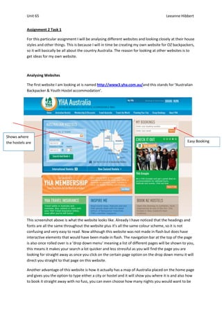
  • 1. Unit 65 Leeanne Hibbert Assignment 2 Task 1 For this particular assignment I will be analysing different websites and looking closely at their house styles and other things. This is because I will in time be creating my own website for OZ backpackers, so it will basically be all about the country Australia. The reason for looking at other websites is to get ideas for my own website. Analysing Websites The first website I am looking at is named http://www3.yha.com.au/and this stands for ‘Australian Backpacker & Youth Hostel accommodation’. Shows where the hostels are Easy Booking This screenshot above is what the website looks like. Already I have noticed that the headings and fonts are all the same throughout the website plus it’s all the same colour scheme, so it is not confusing and very easy to read. Now although this website was not made in flash but does have interactive elements that would have been made in flash. The navigation bar at the top of the page is also once rolled over is a ‘drop down menu’ meaning a list of different pages will be shown to you, this means it makes your search a lot quicker and less stressful as you will find the page you are looking for straight away as once you click on the certain page option on the drop down menu it will direct you straight to that page on this website. Another advantage of this website is how it actually has a map of Australia placed on the home page and gives you the option to type either a city or hostel and it will show you where it is and also how to book it straight away with no fuss, you can even choose how many nights you would want to be
  • 2. Unit 65 Leeanne Hibbert spending at this certain hostel in the particular city in Australia. There is also a ‘my bookings’ part on the homepage which is located on the top right hand page and this is basically been made even more easier for the public as if say you have already booked a hostel in a city then you can simply type in your booking number and email then press search and it will take you to the page showing your booking and the hostel of your choice plus different information. I also like the colour scheme as to me the colours seem to show like the outback of Australia, such as the colours green, orange and brown seems to represent to me the wildlife. The other website I am looking at is named http://www.australianbackpackers.net/ this straight away to me looks like quite a funky and entertaining type of website. Colours blue and orange represent the ocean Search and book button made easy to book in less time As soon as I look at this website the colour scheme seems to represent to me the beach life of Australia as the colours are like a sandy orange and an ocean blue. The font all looks the same throughout so there is no reason for anyone to get confused. Again on the right hand side of the page you have a ‘search & Book’ button making it easier for you as all you would have to do is click that button then search for the city and place of accommodation and within at least ten minutes you may of even booked it without any fuss.
  • 3. Unit 65 Leeanne Hibbert The navigation of this website at the top of the page again is a ‘drop down menu’ meaning its easier for you to find the page you are looking for, so you will get there quicker as your search is sectioned down for you. I really like this website it seems pretty cool. The headings seem s a really cool font making it look ‘graffiti like ‘ so I would say this is aimed at younger adolescents such as 18 years and onwards. Another website I have looked at is http://www.australianbackpackers.com.au/ and this website seems more of a formal and serious website. Picture image as background Slideshow of images This screenshot is of the homepage of this certain website straight away you notice that the background is an image of a sunset sky making it look warm. The font colour does seem pretty plain as it is only black but it is all the same font and easy to read so it will please people as there will be no confusion, plus it is also the same font and colour throughout so it is professional. There is also on the bottom right side of the page a slideshow box; this once you click your mouse on the image shows you different images of parts of Australia. The navigation at the top of the page isn’t a drop down menu but this to me is simply because of the fact that the website does seem quite small and therefor the buttons which are on the navigation are the only pages on the site, so this is simple for the target audience. There is a ‘book now’ button which is the first one placed on the navigation bar and once you click this you can then start booking your chosen accommodation. The only thing with this website is that it is just for the city ‘Sydney’ so
  • 4. Unit 65 Leeanne Hibbert you could only book for accommodation in the city of Sydney, so you would only use this website if you want to be in the city of Sydney. The Proposal For this particular assignment I have been asked to create a fully interactive website by a client which is to be aimed at Australian backpackers preferably between the ages of 18 to 25 years of age, as this is because backpackers are usually students or past students. This website has to be created and finished by the 26th November 2012. To get myself some ideasI have been looking at different websites that are similar to the one that I will be creating and with the same target audience as mine. I have been looking closely at the house style of each of the three websites that I have been viewing and making my own opinions of them as I go. Although I haven’t started to create my own website yet I am starting to think of the types of colour brands I want to use. For instance one website that I looked at earlier had matching colours of what I would say the Australian wild life; it had colours such as greens, browns and blues. Then another website I looked at had colours that symbolised an Australian beach with sandy and ocean type colours, I like the idea of this for my own website as it seems more professional and people do notice the colour scheme. So for my website I am thinking of using a mixture of blues and greens and a sandy yellow colour. Or all of the colours that represent the Australian flag which seems a really good idea because the public will notice this and straight away know they are the colours of the Australian flag. I think this will work well together as people will notice why I have chosen these colours and they are quite relaxing colours not to ‘in your face’. As I have previously said the target audience of my own website will be for Australian backpackers between the ages of 18 and 25 again this is as most backpackers are usually past students or students taking some time out of education. As the age range is quite young adolescents I don’t want to make the website to dull and boring for them with lots of columns of writing, or plain colours such as standard black and white, but on the other hand I don’t want to make the website to overcrowded and full of different colours as this would make the pages very unprofessional and would make people straight away want to just close the site off. So I am going to make sure my website is fit for purpose and professional towards my chosen age range making it that they leave the website happy with what they originally planned to do being achieved, instead of leaving the website annoyed and confused in a rage of anger. The layout of my website I want to be simple and not confusing towards the target audience. So my navigation bar will be located at the top of my homepage. My idea of the buttons on the navigation bar will be at least 6-8 different buttons and one will be named ‘Hostels’ and this will once clicked locate you to a page of all of the most popular hostels in Australia and there will be an image of each of these plus information on them and the price range. I will also have another button named ‘book now’ this will be the page which will have a form that you can fill in which is how people will book for a hostel. I will have another button named ‘Contact us’ and this page will be of the email address, phone number and main office address of the company. Those are the two main buttons that I will
  • 5. Unit 65 Leeanne Hibbert definitely have on the navigation bar, the other buttons I am not too sure what I will call yet. I will also be using headers, and the font will all be the same throughout my website, as will the colour of the font. Plus all the writing will be the same size except for headers which will be a little bit larger. I will also add about 2 images on my homepage. These will be on the right hand side. I may create a web banner which will be inserted on the homepage somewhere on the left hand side. This is for now the only way I can describe what my layout will look like as I have not started to create this yet and many ideas will come to my head once in the process of this. Now obviously I will be adding images to my website but I need to think in great deal about the images that I am going to use. I am going to make sure firstly that all of my images are relevant to the purpose of the website so that I will not upset anyone. Most of my images will be Australian symbolised such as the Australian flag, different countries of Australia and plus past images of Australian backpackers, so that when it comes to people viewing my website if they are new to the backpacking life then they will see exactly what it is like to be a backpacker in Australia. When it comes creating a website I also have to think about both legal and ethnic considerations, so straight away I want to reassure the client now that all of the creations on my website is 100% originally created by me when it comes to copyright issues.This means all the work is original and not copied from other websites. The same would apply to my own work as If I was to come across a website that had my original ideas and exact layout as my website does then this would annoy me deeply. I also have to think about the representation of race meaning that I want my website to be made for all types of cultures; race and gender. So all of my images will be of both genders male and female, plus different culture types will be shown. Also my images will be equal to race and I will have images of both the black and white race, this is so my website does not upset anyone and makes them feel comfortable whilst in the process of viewing. Also once my client has the details of my website I would like it to be kept very private and confidential meaning I want nothing to be revealed about my website until it is official published towards the public.
  • 6. Unit 65 Leeanne Hibbert Storyboards of my website These are just screenshots of all of the pages that areincluded in my website. I have added brief information underneath each of the screenshots just giving a small description of that certain page and what will be included. The Homepage This screenshot is the homepage of my website.As you can see my navigation bar is located right at the top of the page and has six buttons included with it. The navigation bar is included on every single page of my website. This is the homepage so I will add around two images and just a brief introduction to the website and some information.
  • 7. Unit 65 Leeanne Hibbert About Australia page This is a screenshot of the page named ‘About Australia’. This will have one image and will just be information all about the country Australia and the different cities in there. But it will be mostly information about what events and hostels etc. will be for backpackers.
  • 8. Unit 65 Leeanne Hibbert Hostels page This is a screenshot of the page ‘Hostels’. This page will have images of most of the hostels around Australia. After each image of the hostels there will also be information on the right hand side of it just giving a brief description of that certain one.
  • 9. Unit 65 Leeanne Hibbert Book Now page This is a screenshot of the ‘book now’ page. This page is where people will be able to book for a hostel of their choice. On this page there will be a booking form so that it enables people to fill in and then properly book without any fuss.
  • 10. Unit 65 Leeanne Hibbert The Gallery page This is a screenshot of the ‘gallery’ page. This will be images of all of the places and events that will interest backpackers.
  • 11. Unit 65 Leeanne Hibbert This is a screenshot of the ‘planning your travel’ page. This will be a page that just has information on travelling for the backpackers.
  • 12. Unit 65 Leeanne Hibbert This is a screenshot of the ‘Contact us’ page. This page will have all of the important contact details of this website just in case people really need to get in touch with the people behind the website or something to do with it.
  • 13. Unit 65 Leeanne Hibbert Folder of my Website images This is inside of my Unit 65 folder. The folder that is circled which is named ‘website images’ is where the images that will be inserted on my website are. I will now show a print screen of this folder open. This screenshot is of the’ website images’ folder. As you can see I have gathered images.