Connecting essay 5

The document summarizes an image taken by Monika for her online origami exhibition. It shows origami birds emerging from a book and scattered about in different formations. The photographer used selective coloring to make the birds stand out against the gray background. While each bird is the same shape, the angles and composition make them appear slightly different as if flying in different patterns. The author appreciates how Monika photographed origami, which is not real, in a natural scene. They like the bold colors emphasizing the fantasy idea and vivid origami against the green background. Shapes in the blurred background also make the image appealing. Monika included hands in the photo to contrast real life with the fantasy of the origami birds.

Empfohlen
Weitere ähnliche Inhalte
Was ist angesagt?
Andere mochten auch
Ähnlich wie Connecting essay 5
Ähnlich wie Connecting essay 5 (20)
Mehr von Lauren Barrett
Mehr von Lauren Barrett (20)
Connecting essay 5
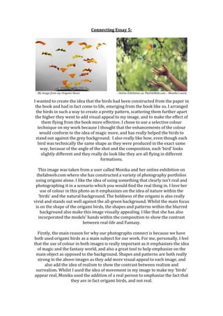
- 1. Connecting Essay 5: - My image from my Origami Shoot. - Online Exhibition on TheFabWeb.com – Monika’s work. I wanted to create the idea that the birds had been constructed from the paper in the book and had in fact come to life, emerging from the book like so. I arranged the birds in such a way to create a pretty pattern, scattering them further apart the higher they went to add visual appeal to my image, and to make the effect of them flying from the book more effective. I chose to use a selective colour technique on my work because I thought that the enhancements of the colour would conform to the idea of magic more, and has really helped the birds to stand out against the grey background. I also really like how, even though each bird was technically the same shape as they were produced in the exact same way, because of the angle of the shot and the composition, each ‘bird’ looks slightly different and they really do look like they are all flying in different formations. This image was taken from a user called Monika and her online exhibition on thefabweb.com where she has constructed a variety of photography portfolios using origami alone. I like the idea of using something that clearly isn’t real and photographing it in a scenario which you would find the real thing in. I love her use of colour in this photo as it emphasizes on the idea of nature within the ‘birds’ and the natural background. The boldness of the origami is also really vivid and stands out well against the all-green background. Whilst the main focus is on the shape of the origami birds, the shapes and patterns within the blurred background also make this image visually appealing. I like that she has also incorporated the models’ hands within the composition to show the contrast between real-life and Fantasy. Firstly, the main reason for why our photographs connect is because we have both used origami birds as a main subject for our work. For me, personally, I feel that the use of colour in both images is really important as it emphasizes the idea of magic and the fantasy world, and also a great tool to help emphasize on the main object as opposed to the background. Shapes and patterns are both really strong in the above images as they add more visual appeal to each image, and also add the idea of realism to show the contrast between realism and surrealism. Whilst I used the idea of movement in my image to make my ‘birds’ appear real, Monika used the addition of a real person to emphasize the fact that they are in fact origami birds, and not real.