2. Wire Frame Ideas
Wire Frame final
simplistic with flair -
from my point of view chairs are designed with this idea in mind so i
wanted to show case this in my website. I wanted to keep simple with
the use of color but show some flair in the design and layout of the div’s
in the website.
From this information i have choosen this wire frame to base my two
webpages off.
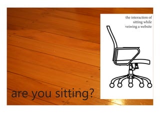
i have chosen to go with a
horozontial webpage as i
think it best suits my view
and represents the interac-
tion of sitting best
this is the first mock up/
itteration of my wire
frame, i like the look and
the way it is coming along
, it needs more work but
i think it highlights the
information very well in
its set out.
itteration - i like the direc-
tion this is going in, the
header is to crowded so i
will be looking to simplify
that also i am not liking all
the gray, i am thinking of a
material background, the
same material that computer
chairs are made from
3. note these have been zoomed out to show full content
these are my two final webpages - I think that the layout, features and colours allow the
content and interaction to be the foucs of the website and add to the content rather than take
away. I chnaged the top ‘are you sitting?’ to the hyperlink blue to indicate a link as it was not
obvious to the user to click to be taken to the next page. I have chossen a twill background
image with a a dark overlay so the effect is still there but not a distraction. My idea for this
website came from the laser cut chair outside the design office, so i wanted to use this in my
site, I have made it my header as i think it communicates the words that were previously
there without stating the obvious. I think my final design is effective in communicating my
interaction of the user sitting while viewing the website.