SlideShare ist ein Scribd-Unternehmen logo
1 von 18
single-candlestick-patterns-part-1
8.1 – The Engulfing Pattern
In a single candlestick pattern, the trader needed just one candlestick to identify a
trading opportunity. However when analyzing multiple candlestick patterns, the trader
needs 2 or sometimes 3 candlesticks to identify a trading opportunity. This means the
trading opportunity evolves over a minimum of 2 trading sessions.
The engulfing pattern is the first multiple candlestick pattern that we need to look into.
The engulfing pattern needs 2 trading sessions to evolve. In a typical engulfing pattern,
you will find a small candle on day 1 and a relatively long candle on day 2 which appears
as if it engulfs the candle on day 1. If the engulfing pattern appears at the bottom of the
trend, it is called the “Bullish Engulfing” pattern. If the engulfing pattern appears at the
top end of the trend, it is called the “Bearish Engulfing” pattern.
8.2 – The Bullish Engulfing Pattern
The bullish engulfing pattern is a two candlestick pattern which appears at the bottom of
the down trend. As the name suggests, this is a bullish pattern which prompts the trader
to go long. The two day bullish engulfing pattern is encircled in the chart below. The
prerequisites for the pattern are as follows:
1. The prior trend should be a downtrend
2. The first day of the pattern (P1) should be a red candle reconfirming the bearishness in
the market
3. The candle on the 2nd
day of pattern (P2) should be a blue candle, long enough to engulf
the red candle
The thought process behind the bullish engulfing pattern is as follows:
1. The market is in down trend with prices steadily moving down
2. On the first day of the pattern (P1), the market opens low and makes a new low. This
forms a red candle in the process
3. On the second day of the pattern (P2), the stock opens near the closing prices of P1,
and attempts to make a new low. However, at this low point of the day there is a sudden
buying interest, which drives the prices to close higher than the previous day’s open.
This price action forms a blue candle
4. The price action on P2 also suggests that bulls made a very sudden and strong attempt
to break the bearish trend and they did so quite successfully. This is evident by the long
blue candle on P2
5. The bears would not have expected the bull’s sudden action on P2 and hence the bull’s
action kind of rattles the bears causing them some amount of nervousness
6. The bullishness is expected to continue over the next few successive trading sessions,
driving the prices higher and hence the trader should look for buying opportunities
The trade set up for the bullish engulfing pattern is as follows:
1. The bullish engulfing pattern evolves over two days
2. The suggested buy price is around the close price of blue candle i.e on P2
o Risk taker initiates the trade on P2 itself after ensuring P2 is engulfing P1
o The risk averse initiates the trade on the next day i.e the day after P2 around the closing price, after
confirming the day is forming a blue candle
o If the day after P2 is a red candle day, the risk averse trader will ignore the trade, owing to rule 1 of
candlesticks (Buy strength and Sell weakness)
o On a personal note, in multiple candlestick patterns where the trade evolves over 2 or more days it is
worth to be a risk taker as opposed to a risk averse trader
3. The stop loss for the trade would be at the lowest low between P1, and P2
Needless to say, once the trade has been initiated you will have to wait until the target
has been hit or the stoploss has been breached. Of course, one can always trail the stop
loss to lock in profits.
Have a look at DLF’s chart below; the bullish engulfing pattern is encircled.
The OHLC on P1 – Open = 163, High = 168, Low = 158.5, Close = 160. On P2 the
OHLC details are – Open = 159.5, High = 170.2, Low = 159, Close = 169.
The trade set up for the bullish engulfing pattern is as follows:
1. The risk taker would go long on P2 at 169. He can do this by validating P2 as an
engulfing pattern. To validate P2 as an engulfing patterns there are 2 conditions:
o One, the current market price at 3:20PM on P2 should be higher than P1’s open.
o Second, the open on P2 should be equal to or lower than P1’s close
2. The risk averse will initiate the trade, the day after P2 only after ensuring that the day is
a blue candle day. So if the P1 falls on a Monday, the risk averse would be initiating the
trade on Wednesday, around 3:20 PM. However, as I had mentioned earlier, while
trading based on multiple candlestick pattern, it may be worth initiating the trade on
pattern completion day itself i.e P2
3. The stop loss on this trade will be the lowest low between P1 and P2. In this example,
lowest low falls on P1 at 158.5
In this example, both the risk averse and the risk taker would have been profitable.
Here is an example of a perfect bullish engulfing pattern formed on Cipla Ltd, the risk
averse trader would have completely missed out a great trading opportunity.
There is often a lot of confusion on whether the candle should engulf just the real body
or the whole candle, including the lower and upper shadows. In my personal experience,
as long as the real bodies are engulfed, I would be happy to classify the candle as a
bullish engulfing pattern. Of course, candlestick sticklers would object to this but what
really matters is how well you hone your skills in trading with a particular candlestick
pattern.
So going by that thought, I’d be happy to classify the following pattern as a bullish
engulfing pattern, even though the shadows are not engulfed.
8.3 – The bearish engulfing pattern
The bearish engulfing pattern is a two candlestick pattern which appears at the top end
of the trend, thus making it a bearish pattern. The thought process remains very similar
to the bullish engulfing pattern, except one has to think about it from a shorting
perspective.
Take a look at the chart below, the two candles that make up the bearish engulfing
pattern is encircled. You will notice:
1. To begin with the bulls are in absolute control pushing the prices higher
2. On P1, as expected the market moves up and makes a new high, reconfirming a bullish
trend in the market
3. On P2, as expected the market opens higher and attempts to make a new high.
However at this high point selling pressure starts. This selling comes unexpected and
hence tends to displace the bulls
4. The sellers push the prices lower, so much so that the stock closes below the previous
day’s (P1) open. This creates nervousness amongst the bulls
5. The strong sell on P2 indicates that the bears may have successfully broken down the
bull’s stronghold and the market may continue to witness selling pressure over the next
few days
6. The idea is to short the index or the stock in order to capitalize on the expected
downward slide in prices
The trade set up would be as follows:
1. The bearish engulfing pattern suggests a short trade
2. The risk taker initiates the trade on the same day after validating two conditions
o The open on P2 is higher than P1’s close
o The current market price at 3:20 PM on P2 is lower than P1’s open price. If the two conditions are
satisfied, then it would be logical to conclude that it is a bearish engulfing pattern
3. The risk averse will initiate the trade on the day after P2 only after ensuring that the day
is a red candle day
4. Since the bearish engulfing pattern is a 2 day pattern, it makes sense to be a risk taker.
However this purely depends on the individual’s risk appetite
Take a look at the chart below of Ambuja Cements. There are two bearish engulfing
patterns formed. The first pattern on the chart (encircled, starting from left) did not work
in favor of a risk taker. However the risk averse would have completely avoided taking
the trade. The second bearish engulfing pattern would have been profitable for both the
risk taker and the risk averse.
The OHLC data for the bearing engulfing pattern (encircled at the top end of the chart) is
as below:
P1: Open – 214, High – 220, Low – 213.3, Close – 218.75
P2: Open – 220, High – 221, Low – 207.3, Close – 209.4
The trade setup for the short trade, based on the bearish engulfing pattern is as follows:
1. On P2 by 3:20 PM the risk taker would initiate the short trade at 209 after ensuring P1,
and P2 together form a bearish engulfing pattern
2. The risk averse will initiate the trade, the day after P2 only after ensuring that the day is
a red candle day
3. The stoploss in both the cases will the highest high of P1 and P2, which in this case is at
221.
Both the risk averse and the risk taker would have been profitable in this particular case.
8.4 – The presence of a doji
Now here is a very interesting chart. From my own personal experience I can tell you,
charts like the one shown below are highly profitable. One should not miss such trading
opportunities
Take a look at the chart, what are the things that catch your attention?
1. An obvious uptrend as highlighted
2. A bearish engulfing pattern right at the top end of the upward rally
3. A doji formation on the day following P2
What implication would a doji have in this chart?
Let us inspect this chart event by event:
1. A prolonged uptrend in the chart confirms the bulls are in absolute control
2. On P1 a blue candle is formed, reconfirming the bull’s dominance in the markets
3. On P2 markets open higher and make a new high comforting the bulls. However at the
high point a strong surge to sell builds up, to an extent that the prices closes below P1’s
opening prices
4. This trading action on P2 sets in a bit of panic to bulls, but they are not shaken yet
5. On day 3, let us call it as P3, though the opening is weak it is not much lower compared
to P2’s close. This is not too comforting for the bulls, as they expect the markets to be
stronger.
6. During P3 the market attempts to move higher (Doji’s upper shadow) however the high
is not sustained. Even the low is not sustained and eventually the day closes flat forming
a Doji. As you may recall, Dojis indicate indecision in the market
7. On P2 bulls panicked and on P3 bulls were uncertain
8. Panic with uncertainty is the perfect recipe for a catastrophe. Which explains the long
red candle following the Doji
From my own personal trading experience I can tell you that whenever a doji follows a
recognizable candlestick pattern, the opportunity created is bigger. Besides illustrating
this point, I also want to draw your attention to chart analysis methodology. Notice in this
particular chart, we did not just look at what was happening on P1 or P2 but we went
beyond that and actually combined two different patterns to develop a comprehensive
view on the market.
8.5 – The Piercing Pattern
The piercing pattern is very similar to the bullish engulfing pattern with a very minor
variation. In a bullish engulfing pattern the P2’s blue candle engulfs P1’s red candle
completely. However in a piercing pattern P2’s blue candle partially engulfs P1’s red
candle, however the engulfing should be between 50% and less than 100%. You can
validate this visually or calculate the same. For example if P1’s range (Open – Close) is
12 , P2’s range should be at least 6 or higher but below 12.
As long as this condition is satisfied, everything else is similar to the bullish engulfing
including the trade set up. Here a risk taker would initiate the trade on P2 around the
close. The risk averse would initiate the trade, the day after P2 only after ensuring a blue
candle is formed. The stoploss would be the low of the pattern.
Have a look at the following chart:
Here P2’s blue candle engulfs just under 50% of P1’s red candle. For this reason we do
not consider this as a piercing pattern.
8.6 – The Dark Cloud Cover
The dark cloud cover is very similar to the bearish engulfing pattern with a minor
variation. In a bearish engulfing pattern the red candle on P2 engulfs P1’s blue candle
completely. However in a dark cloud cover, the red candle on P2 engulfs about 50 to
100% of P1’s blue candle. The trade set up is exactly the same as the bearish engulfing
pattern. Think about the dark cloud cover as the inverse of a piercing pattern.
8.7 – A perspective on selecting a trade
Hence the two stocks may form 2 different (but somewhat similar) candlestick patterns
such as a bearish engulfing and dark cloud cover at the same time.
Both these are recognisable candlestick patterns but if I were to choose between the two
patterns to set up a trade. I would put my money on the bearish engulfing pattern as
opposed to a dark cloud cover. This is because the bearishness in a bearish engulfing
pattern is more pronounced (due to the fact that it engulfs the previous day’s entire
candle). On the same lines I would choose a bullish engulfing pattern over a piercing
pattern.
However there is an exception to this selection criterion. Later in this module I will
introduce a 6 point trading checklist. A trade should satisfy at least 3 to 4 points on this
checklist for it to be considered as a qualified trade. Keeping this point in perspective,
assume there is a situation where the ICICI Bank stock forms a piercing pattern and the
HDFC Bank stock forms a bullish engulfing pattern. Naturally one would be tempted to
trade the bullish engulfing pattern, however if the HDFC Bank stock satisfies 3 checklist
points, and ICICI Bank stock satisfies 4 checklist points, I would go ahead with the ICICI
Bank stock even though it forms a less convincing candlestick pattern.
On the other hand, if both the stocks satisfy 4 checklist points I will go ahead with the
HDFC Bank trade.
Key takeaways from this chapter
1. Multiple candlestick patterns evolve over two or more trading days
2. The bullish engulfing pattern evolves over two trading days. It appears at the bottom end
of downtrend. Day one is called P1 and day 2 is called P2
3. In a bullish engulfing pattern, P1 is a red candle, and P2 is a blue candle. P2’s blue
candle completely engulfs P1;s red candle
4. A risk taker initiates a long trade at the close of P2 after ensuring P1 and P2 together
form a bullish engulfing pattern. A risk averse trader will initiate the trade the day after
P2, near the close of the day
5. The stoploss for the bullish engulfing pattern is the lowest low between P1 and P2
6. The bearish engulfing pattern appears at the top end of an uptrend. P1’s blue candle is
completely engulfed by P2’s red candle
7. A risk taker initiates a short trade at the close of P2 after ensuring P1 and P2 together
form a bearish engulfing pattern. The risk averse trader will initiate the trade the day
after P2, after confirming the day forms a red candle
8. The highest high of P1 and P2 forms the stoploss for a bearish engulfing pattern
9. The presence of a doji after an engulfing pattern tends to catalyze the pattern’s
evolution.
10. The piercing pattern works very similar to bullish engulfing pattern, except that P2’s blue
candle engulfs at least 50% and below 100% of P1’s red candle
11. The dark cloud cover works similar to the bearish engulfing pattern, except that P2’s red
candle engulfs at least 50% and below 100% of P1’s blue candle.
11.1 – The Resistance
As the name suggests, resistance is something which stops the price from rising further.
The resistance level is a price point on the chart where traders expect maximum supply
(in terms of selling) for the stock/index. The resistance level is always above the
current market price.
The likely hood of the price rising up to the resistance level, consolidating, absorbing all
the supply, and then declining is high. The resistance is one of the critical technical
analysis tool which market participants look at in a rising market. The resistance often
acts as a trigger to sell.
I have deliberately compressed the chart to include more data points, the reasons for
which I will shortly explain. But before that there are two things that you need to pay
attention to while looking at the above chart:
1. The resistance level, indicated by a horizontal line, is higher than the current market
price.
2. While the resistance level is at 215, the current candle is at 206.75. The current candle
and its corresponding price level are encircled for your reference
For a moment let us imagine Ambuja cements at Rs.206 forming a bullish marubuzo
with a low of 202. We know this is a signal to initiate a long trade, and we also know that
the stoploss for this trade is at 202. With the new found knowledge on resistance, we
now know that we can set 215 as a possible target for this trade!
Why 215 you may wonder? The reasons are simple:-
1. Resistance of 215 implies there is a likelihood of excess supply
2. Excess supply builds selling pressure
3. Selling pressure tends to drag the prices lower
Hence for reasons stated above, when a trader is long he can look at resistance points
to set targets and to set exit points for the trade.
Also, with the identification of the resistance the long trade can now be completely
designed as follows:
Entry – 206, Stoploss – 202, and Target – 215.
The next obvious question is how do we identify the resistance level? Identifying price
points as either a support or resistance is extremely simple. The identification process is
the same for both support and resistance. If the current market price is below the
identified point, it is called a resistance point; else it is called a support point.
Since the process is the same, let us proceed to understand ‘support’, and we will follow
it up with the procedure to identify S&R.
11.2 – The Support
Having learnt about resistance, understanding the support level should be quite simple
and intuitive. As the name suggests, the support is something that prevents the price
from falling further. The support level is a price point on the chart where the trader
expects maximum demand (in terms of buying) coming into the stock/index. Whenever
the price falls to the support line, it is likely to bounce back. The support level is always
below the current market price.
There is a maximum likely hood that the price could fall till the support, consolidate,
absorb all the demand, and then start to move upwards. The support is one of the critical
technical level market participants look for in a falling market. The support often acts as
a trigger to buy.
Here is the chart of Cipla Limited. The horizontal line coinciding at 435 on chart marks
the support level for Cipla.
Few things that you need to notice on the chart above:
1. The support level, indicated by the horizontal line is below the current market price
2. While the support level is at 435, the current candle is at 442.5. The current candle and
its corresponding price level are encircled for your reference
Like we did while understanding resistance, let us imagine a bearish pattern formation –
perhaps a shooting star at 442 with a high of 446. Clearly with a shooting star, the call is
to short Cipla at 442, with 446 as the stoploss. Since we know 435 the immediate
support, we can set the target at 435.
So what makes Rs.435 target worthy? The following reasons back the decision:
1. Support at 435 implies there is a maximum likely hood of excess demand to emerge
2. Excess demand builds buying pressure
3. Buying pressure tends to drag the price higher
Hence for the reasons stated above, when a trader is short, he can look at support
points to set targets and to set exit points for the trade.
Also, with the identification of the support, the short trade is now completely designed.
Entry – 442, stoploss – 446, and target – 435.
11.3 – Construction/Drawing of the Support and
Resistance level
Here is a 4 step guide to help you understand how to identify and construct the support
and the resistance line.
Step 1) Load data points – If the objective is to identify short term S&R load at least 3-6
months of data points. If you want to identify long term S&R, load at least 12 – 18
months of data points. When you load many data points, the chart looks compressed.
This also explains why the above two charts looks squeezed.
1. Long term S&R – is useful for swing trading
2. Short term S&R – is useful intraday and BTST trades
Here is a chart where I have loaded 12 months of data points
Step 2) Identify at least 3 price action zones – A price action zone can be described
as ‘sticky points’ on chart where the price has displayed at least one of the behaviors:
1. Hesitated to move up further after a brief up move
2. Hesitated to move down further after a brief down move
3. Sharp reversals at particular price point
Here are a series of charts that identifies the above 3 points in the same order:
In the chart below, the encircled points indicate the price hesitating to move up further
after a brief up move:
In the chart below, the encircled points indicate the price hesitating to move down further
after a brief down move:
In the chart below, the encircled points indicate sharp price reversals:
Step 3) Align the price action zones – When you look at a 12 month chart, it is
common to spot many price action zones. But the trick is to identify at least 3 price
action zones that are at the same price level.
For example here is a chart where two price action zones are identified but they are not
at the same price point.
Look at the following chart, I have encircled 3 price action zones that are around the
same price points:
A very important point to note while identifying these price action zones is to make sure
these price zone are well spaced in time. Meaning, if the 1st
price action zone is identified
on 2nd
week on May, then it will be meaningful to identify the 2nd
price action zone at any
point after 4th
week of May (well spaced in time). The more distance between two price
action zones, the more powerful is the S&R identification.
Step 4) Fit a horizontal line – Connect the three price action zones with a horizontal
line. Based on where this line fits in with respect to the current market price, it either
becomes a support or resistance.
Have a look at this chart
Starting from left:
1. The 1st circle highlights a price action zone where there is a sharp reversal of price
2. The 2nd circle highlights a price action zone where price is sticky
3. The 3rd
circle highlights a price action zone where there is a sharp reversal of price
4. The 4th
circle highlights a price action zone where price is sticky
5. The 5th
circle highlights the current market price of Cipla – 442.5
In the above chart all the 4 price action zones are around the same price points i.e at
429. Clearly, the horizontal line is below the current market price of 442.5, thus making
429 as an immediate support price for Cipla.
Please note, whenever you run a visual exercise in Technical Analysis such as
identifying S&R, you run the risk of approximation. Hence always give room for error.
The price level is usually depicted in a range and not at a single price point. It is actually
a zone or an area that acts as support or resistance.
So going by the above logic, I would be happy to consider a price range around 426 to
432 as a support region for Cipla. There is no specific rule for this range, I just
subtracted and added 3 points to 429 to get my price range for support!
Here is another chart, where both S&R have been identified for Ambuja Cements
Limited.
The current price of Ambuja is 204.1, the support is identified at 201 (below current
market price), and the resistance at 214 (above current market price). So if one were to
short Ambuja at 204, the target, based on support can be at 201. Probably this would be
a good intraday trade. For a trader going long at 204, 214 can be a reasonable target
expectation based on resistance.
Notice in both the support and the resistance level, there at least 3 price action zone
identified at the price level, all of which are well spaced in time
11.4 – Reliability of S&R
The support and resistance lines are only indicative of a possible reversal of prices.
They by no means should be taken for as certain. Like anything else in technical
analysis, one should weigh the possibility of an event occurring (based on patterns) in
terms of probability.
For example, based on the chart of Ambuja Cements –
Current Market Price = 204
Resistance = 214
The expectation here is that if at all Ambuja cements starts to move up it is likely to face
a resistance at 214. Meaning, at 214 sellers could emerge who can potentially drag the
prices lower. What is the guarantee that the sellers would come in at 214? In other
words, what is dependence of the resistance line? Honestly, your guess is as good as
mine.
However, historically it can be seen that whenever Ambuja reached 214, it reacted in a
peculiar way leading to the formation of a price action zone. The comforting factor here
is that the price action zone is well spaced in time. This mean 214 stands as a time
tested price action zone. Therefore keeping the very first rule of technical analysis in
perspective i.e “History tends to repeat itself” we go with the belief that support and
resistance levels will be reasonably honored.
Purely from my personal trading experience well constructed S&R points are usually well
respected.
11.4 – Optimization and checklist
Perhaps, we are now at the most important juncture in this module. We will start
discovering few optimization techniques which will help us identify high quality trades.
Remember, when you seek quality, quantity is always compromised, but this is a
compromise that is worth making. The idea is to identify quality trading signals as
opposed to identifying plenty, but worthless trades.
Optimization in general is a technique wherein you fine tune a process for best possible
results. The process in this context is about identifying trades.
Let us go back to candlesticks patterns, maybe to the very first we learnt – bullish
marubuzo. A bullish marubuzo suggests a long trade near the close of the marubuzo,
with the low of the marubuzo acting as the stoploss.
Assume the following credentials for the bullish marubuzo:
Open = 432, High = 449, Low = 430, Close = 448
Hence the entry for the long trade is approximately at 448, with 430 as the stoploss.
Now what if the low of the marubuzo also coincides with a good time tested support? Do
you see a remarkable confluence of two technical theories here?
We have a double confirmation to go long. Think about it on following terms:
1. A recognized candlestick pattern (bullish marubuzo) suggests the trader to initiate a long
trade
2. A support near the stoploss price suggests the trader the presence of significant buying
interest around the low
While dealing with a fairly random environment such as the markets, what a trader really
needs is a well crafted trade setup. The occurrence of the above two conditions
(marubuzo + support near the low) suggests the same action i.e to initiate a long trade in
this case.
This leads us to an important idea. What if we had a checklist (call it a framework if you
like) for every trade that we consider? The checklist would act as a guiding principle
before initiating a trade. The trade should comply to the conditions specified in the
checklist. If it does, we take the trade; else we just drop it and look for another trade
opportunity that complies with the checklist.
Discipline, they say makes up for the 80% of the trader’s success. The checklist in my
opinion forces you to be disciplined; it helps you avoid taking abrupt and reckless trading
decision.
In fact to begin with we have the first two very important factors of the checklist:
1. The stock should form a recognizable candlestick pattern
1. Note: We have learnt some of the popular patterns in this module. To begin with you can use just
these patterns to comply with checklist
2. S&R should confirm to the trade. The stoploss price should be around S&R
1. For a long trade, the low of the pattern should be around the support
2. For a short trade, the high of the pattern should be around the resistance
Going forward in this module, as and when we learn new TA concepts, we will build this
checklist. But just to quench your curiosity, the final checklist will have 6 checklist points.
In fact when we have the grand 6 checklist points, we will weigh down each one of them.
For example, checklist point number 4 may not be as important as point number 1, but
nevertheless it is more important than 100 other factors that distract the trader.
Key takeaways from this chapter
1. S&R are price points on the chart
2. Support is a price point below the current market price that indicate buying interest
3. Resistance is a price point above the current market price that indicate selling interest
4. To identify S&R, place a horizontal line in such a way that it connects at least 3 price
action zones, well spaced in time. The more number of price action zones (well spaced
in time) the horizontal line connects, the stronger is S&R
5. S&R can be used to identify targets for the trade. For a long trade, look for the
immediate resistance level as target. For a short trade, look for the immediate support
level as target.
6. Lastly, comply with the checklist for optimal trading results

Weitere ähnliche Inhalte

Ähnlich wie Multiple candles pattern

Multiple candlesticks.pptx
Multiple candlesticks.pptxMultiple candlesticks.pptx
Multiple candlesticks.pptxPadmanavRout
 
Gap up Bounce Day - Wedge (scalp) - 29-12-22.pptx
Gap up Bounce Day - Wedge (scalp) - 29-12-22.pptxGap up Bounce Day - Wedge (scalp) - 29-12-22.pptx
Gap up Bounce Day - Wedge (scalp) - 29-12-22.pptxMaartenvanBemmel3
 
Technical analysis vmt
Technical analysis vmtTechnical analysis vmt
Technical analysis vmtVishal Tidake
 
Linda Bradford Raschke - The Taylor Trading Technique.ppt
Linda Bradford Raschke - The Taylor Trading Technique.pptLinda Bradford Raschke - The Taylor Trading Technique.ppt
Linda Bradford Raschke - The Taylor Trading Technique.pptKennethAnderson58
 
Classical Methods - CH 24 - Pattern Recognition | CMT Level 3 | Chartered Mar...
Classical Methods - CH 24 - Pattern Recognition | CMT Level 3 | Chartered Mar...Classical Methods - CH 24 - Pattern Recognition | CMT Level 3 | Chartered Mar...
Classical Methods - CH 24 - Pattern Recognition | CMT Level 3 | Chartered Mar...Professional Training Academy
 
TECHNICAL ANALYSIS PART II.pdf
TECHNICAL ANALYSIS PART II.pdfTECHNICAL ANALYSIS PART II.pdf
TECHNICAL ANALYSIS PART II.pdfRealTrader2
 
Stopped Out Swing Trade Is OK
Stopped Out Swing Trade Is OKStopped Out Swing Trade Is OK
Stopped Out Swing Trade Is OKNetpicksTrading
 
Trend Trend day - Trend PB - TSLA - 3-1-23.pptx
Trend Trend day - Trend PB - TSLA - 3-1-23.pptxTrend Trend day - Trend PB - TSLA - 3-1-23.pptx
Trend Trend day - Trend PB - TSLA - 3-1-23.pptxMaartenvanBemmel3
 
Best 30 Candlestick Pattern You Should Have To Know
Best 30 Candlestick Pattern You Should Have To KnowBest 30 Candlestick Pattern You Should Have To Know
Best 30 Candlestick Pattern You Should Have To KnowStockia
 
Playblook trade - D1 Gap Up Low Float - QNGY.pptx
Playblook trade - D1 Gap Up Low Float - QNGY.pptxPlayblook trade - D1 Gap Up Low Float - QNGY.pptx
Playblook trade - D1 Gap Up Low Float - QNGY.pptxMaartenvanBemmel3
 
May 6 I Session 1 I GBIH
May 6 I Session 1 I GBIHMay 6 I Session 1 I GBIH
May 6 I Session 1 I GBIHGBIHSupport
 
Teoria dos candlesticks
Teoria dos candlesticksTeoria dos candlesticks
Teoria dos candlesticksGrupo Shield
 
Chart patterns final handout
Chart patterns   final handoutChart patterns   final handout
Chart patterns final handoutwijitha gayan
 
How To Get Great Trade Entries - Euro Futures example
How To Get Great Trade Entries - Euro Futures exampleHow To Get Great Trade Entries - Euro Futures example
How To Get Great Trade Entries - Euro Futures exampleNetpicksTrading
 
Mindfluential Trading (Session 1)....pdf
Mindfluential Trading (Session 1)....pdfMindfluential Trading (Session 1)....pdf
Mindfluential Trading (Session 1)....pdfKanifDukarePatil
 
Engulfing candlestick trading strategy
Engulfing candlestick trading strategyEngulfing candlestick trading strategy
Engulfing candlestick trading strategypipsumo traderfx
 
Profit From Pullback Trading
Profit From Pullback TradingProfit From Pullback Trading
Profit From Pullback TradingNetpicksTrading
 

Ähnlich wie Multiple candles pattern (20)

Multiple candlesticks.pptx
Multiple candlesticks.pptxMultiple candlesticks.pptx
Multiple candlesticks.pptx
 
Gap up Bounce Day - Wedge (scalp) - 29-12-22.pptx
Gap up Bounce Day - Wedge (scalp) - 29-12-22.pptxGap up Bounce Day - Wedge (scalp) - 29-12-22.pptx
Gap up Bounce Day - Wedge (scalp) - 29-12-22.pptx
 
Bars
BarsBars
Bars
 
Technical analysis vmt
Technical analysis vmtTechnical analysis vmt
Technical analysis vmt
 
Linda Bradford Raschke - The Taylor Trading Technique.ppt
Linda Bradford Raschke - The Taylor Trading Technique.pptLinda Bradford Raschke - The Taylor Trading Technique.ppt
Linda Bradford Raschke - The Taylor Trading Technique.ppt
 
Classical Methods - CH 24 - Pattern Recognition | CMT Level 3 | Chartered Mar...
Classical Methods - CH 24 - Pattern Recognition | CMT Level 3 | Chartered Mar...Classical Methods - CH 24 - Pattern Recognition | CMT Level 3 | Chartered Mar...
Classical Methods - CH 24 - Pattern Recognition | CMT Level 3 | Chartered Mar...
 
TECHNICAL ANALYSIS PART II.pdf
TECHNICAL ANALYSIS PART II.pdfTECHNICAL ANALYSIS PART II.pdf
TECHNICAL ANALYSIS PART II.pdf
 
Stopped Out Swing Trade Is OK
Stopped Out Swing Trade Is OKStopped Out Swing Trade Is OK
Stopped Out Swing Trade Is OK
 
Trend Trend day - Trend PB - TSLA - 3-1-23.pptx
Trend Trend day - Trend PB - TSLA - 3-1-23.pptxTrend Trend day - Trend PB - TSLA - 3-1-23.pptx
Trend Trend day - Trend PB - TSLA - 3-1-23.pptx
 
Best 30 Candlestick Pattern You Should Have To Know
Best 30 Candlestick Pattern You Should Have To KnowBest 30 Candlestick Pattern You Should Have To Know
Best 30 Candlestick Pattern You Should Have To Know
 
Playblook trade - D1 Gap Up Low Float - QNGY.pptx
Playblook trade - D1 Gap Up Low Float - QNGY.pptxPlayblook trade - D1 Gap Up Low Float - QNGY.pptx
Playblook trade - D1 Gap Up Low Float - QNGY.pptx
 
Core Master Trading Strategies
Core Master Trading StrategiesCore Master Trading Strategies
Core Master Trading Strategies
 
May 6 I Session 1 I GBIH
May 6 I Session 1 I GBIHMay 6 I Session 1 I GBIH
May 6 I Session 1 I GBIH
 
Teoria dos candlesticks
Teoria dos candlesticksTeoria dos candlesticks
Teoria dos candlesticks
 
Powerband
PowerbandPowerband
Powerband
 
Chart patterns final handout
Chart patterns   final handoutChart patterns   final handout
Chart patterns final handout
 
How To Get Great Trade Entries - Euro Futures example
How To Get Great Trade Entries - Euro Futures exampleHow To Get Great Trade Entries - Euro Futures example
How To Get Great Trade Entries - Euro Futures example
 
Mindfluential Trading (Session 1)....pdf
Mindfluential Trading (Session 1)....pdfMindfluential Trading (Session 1)....pdf
Mindfluential Trading (Session 1)....pdf
 
Engulfing candlestick trading strategy
Engulfing candlestick trading strategyEngulfing candlestick trading strategy
Engulfing candlestick trading strategy
 
Profit From Pullback Trading
Profit From Pullback TradingProfit From Pullback Trading
Profit From Pullback Trading
 

Kürzlich hochgeladen

Student login on Anyboli platform.helpin
Student login on Anyboli platform.helpinStudent login on Anyboli platform.helpin
Student login on Anyboli platform.helpinRaunakKeshri1
 
Holdier Curriculum Vitae (April 2024).pdf
Holdier Curriculum Vitae (April 2024).pdfHoldier Curriculum Vitae (April 2024).pdf
Holdier Curriculum Vitae (April 2024).pdfagholdier
 
Q4-W6-Restating Informational Text Grade 3
Q4-W6-Restating Informational Text Grade 3Q4-W6-Restating Informational Text Grade 3
Q4-W6-Restating Informational Text Grade 3JemimahLaneBuaron
 
Grant Readiness 101 TechSoup and Remy Consulting
Grant Readiness 101 TechSoup and Remy ConsultingGrant Readiness 101 TechSoup and Remy Consulting
Grant Readiness 101 TechSoup and Remy ConsultingTechSoup
 
Software Engineering Methodologies (overview)
Software Engineering Methodologies (overview)Software Engineering Methodologies (overview)
Software Engineering Methodologies (overview)eniolaolutunde
 
9548086042 for call girls in Indira Nagar with room service
9548086042  for call girls in Indira Nagar  with room service9548086042  for call girls in Indira Nagar  with room service
9548086042 for call girls in Indira Nagar with room servicediscovermytutordmt
 
BAG TECHNIQUE Bag technique-a tool making use of public health bag through wh...
BAG TECHNIQUE Bag technique-a tool making use of public health bag through wh...BAG TECHNIQUE Bag technique-a tool making use of public health bag through wh...
BAG TECHNIQUE Bag technique-a tool making use of public health bag through wh...Sapna Thakur
 
Interactive Powerpoint_How to Master effective communication
Interactive Powerpoint_How to Master effective communicationInteractive Powerpoint_How to Master effective communication
Interactive Powerpoint_How to Master effective communicationnomboosow
 
microwave assisted reaction. General introduction
microwave assisted reaction. General introductionmicrowave assisted reaction. General introduction
microwave assisted reaction. General introductionMaksud Ahmed
 
Class 11th Physics NEET formula sheet pdf
Class 11th Physics NEET formula sheet pdfClass 11th Physics NEET formula sheet pdf
Class 11th Physics NEET formula sheet pdfAyushMahapatra5
 
Paris 2024 Olympic Geographies - an activity
Paris 2024 Olympic Geographies - an activityParis 2024 Olympic Geographies - an activity
Paris 2024 Olympic Geographies - an activityGeoBlogs
 
APM Welcome, APM North West Network Conference, Synergies Across Sectors
APM Welcome, APM North West Network Conference, Synergies Across SectorsAPM Welcome, APM North West Network Conference, Synergies Across Sectors
APM Welcome, APM North West Network Conference, Synergies Across SectorsAssociation for Project Management
 
The Most Excellent Way | 1 Corinthians 13
The Most Excellent Way | 1 Corinthians 13The Most Excellent Way | 1 Corinthians 13
The Most Excellent Way | 1 Corinthians 13Steve Thomason
 
Nutritional Needs Presentation - HLTH 104
Nutritional Needs Presentation - HLTH 104Nutritional Needs Presentation - HLTH 104
Nutritional Needs Presentation - HLTH 104misteraugie
 
Ecosystem Interactions Class Discussion Presentation in Blue Green Lined Styl...
Ecosystem Interactions Class Discussion Presentation in Blue Green Lined Styl...Ecosystem Interactions Class Discussion Presentation in Blue Green Lined Styl...
Ecosystem Interactions Class Discussion Presentation in Blue Green Lined Styl...fonyou31
 
Activity 01 - Artificial Culture (1).pdf
Activity 01 - Artificial Culture (1).pdfActivity 01 - Artificial Culture (1).pdf
Activity 01 - Artificial Culture (1).pdfciinovamais
 
Unit-IV- Pharma. Marketing Channels.pptx
Unit-IV- Pharma. Marketing Channels.pptxUnit-IV- Pharma. Marketing Channels.pptx
Unit-IV- Pharma. Marketing Channels.pptxVishalSingh1417
 
Sports & Fitness Value Added Course FY..
Sports & Fitness Value Added Course FY..Sports & Fitness Value Added Course FY..
Sports & Fitness Value Added Course FY..Disha Kariya
 
Arihant handbook biology for class 11 .pdf
Arihant handbook biology for class 11 .pdfArihant handbook biology for class 11 .pdf
Arihant handbook biology for class 11 .pdfchloefrazer622
 

Kürzlich hochgeladen (20)

Student login on Anyboli platform.helpin
Student login on Anyboli platform.helpinStudent login on Anyboli platform.helpin
Student login on Anyboli platform.helpin
 
Holdier Curriculum Vitae (April 2024).pdf
Holdier Curriculum Vitae (April 2024).pdfHoldier Curriculum Vitae (April 2024).pdf
Holdier Curriculum Vitae (April 2024).pdf
 
Q4-W6-Restating Informational Text Grade 3
Q4-W6-Restating Informational Text Grade 3Q4-W6-Restating Informational Text Grade 3
Q4-W6-Restating Informational Text Grade 3
 
Grant Readiness 101 TechSoup and Remy Consulting
Grant Readiness 101 TechSoup and Remy ConsultingGrant Readiness 101 TechSoup and Remy Consulting
Grant Readiness 101 TechSoup and Remy Consulting
 
INDIA QUIZ 2024 RLAC DELHI UNIVERSITY.pptx
INDIA QUIZ 2024 RLAC DELHI UNIVERSITY.pptxINDIA QUIZ 2024 RLAC DELHI UNIVERSITY.pptx
INDIA QUIZ 2024 RLAC DELHI UNIVERSITY.pptx
 
Software Engineering Methodologies (overview)
Software Engineering Methodologies (overview)Software Engineering Methodologies (overview)
Software Engineering Methodologies (overview)
 
9548086042 for call girls in Indira Nagar with room service
9548086042  for call girls in Indira Nagar  with room service9548086042  for call girls in Indira Nagar  with room service
9548086042 for call girls in Indira Nagar with room service
 
BAG TECHNIQUE Bag technique-a tool making use of public health bag through wh...
BAG TECHNIQUE Bag technique-a tool making use of public health bag through wh...BAG TECHNIQUE Bag technique-a tool making use of public health bag through wh...
BAG TECHNIQUE Bag technique-a tool making use of public health bag through wh...
 
Interactive Powerpoint_How to Master effective communication
Interactive Powerpoint_How to Master effective communicationInteractive Powerpoint_How to Master effective communication
Interactive Powerpoint_How to Master effective communication
 
microwave assisted reaction. General introduction
microwave assisted reaction. General introductionmicrowave assisted reaction. General introduction
microwave assisted reaction. General introduction
 
Class 11th Physics NEET formula sheet pdf
Class 11th Physics NEET formula sheet pdfClass 11th Physics NEET formula sheet pdf
Class 11th Physics NEET formula sheet pdf
 
Paris 2024 Olympic Geographies - an activity
Paris 2024 Olympic Geographies - an activityParis 2024 Olympic Geographies - an activity
Paris 2024 Olympic Geographies - an activity
 
APM Welcome, APM North West Network Conference, Synergies Across Sectors
APM Welcome, APM North West Network Conference, Synergies Across SectorsAPM Welcome, APM North West Network Conference, Synergies Across Sectors
APM Welcome, APM North West Network Conference, Synergies Across Sectors
 
The Most Excellent Way | 1 Corinthians 13
The Most Excellent Way | 1 Corinthians 13The Most Excellent Way | 1 Corinthians 13
The Most Excellent Way | 1 Corinthians 13
 
Nutritional Needs Presentation - HLTH 104
Nutritional Needs Presentation - HLTH 104Nutritional Needs Presentation - HLTH 104
Nutritional Needs Presentation - HLTH 104
 
Ecosystem Interactions Class Discussion Presentation in Blue Green Lined Styl...
Ecosystem Interactions Class Discussion Presentation in Blue Green Lined Styl...Ecosystem Interactions Class Discussion Presentation in Blue Green Lined Styl...
Ecosystem Interactions Class Discussion Presentation in Blue Green Lined Styl...
 
Activity 01 - Artificial Culture (1).pdf
Activity 01 - Artificial Culture (1).pdfActivity 01 - Artificial Culture (1).pdf
Activity 01 - Artificial Culture (1).pdf
 
Unit-IV- Pharma. Marketing Channels.pptx
Unit-IV- Pharma. Marketing Channels.pptxUnit-IV- Pharma. Marketing Channels.pptx
Unit-IV- Pharma. Marketing Channels.pptx
 
Sports & Fitness Value Added Course FY..
Sports & Fitness Value Added Course FY..Sports & Fitness Value Added Course FY..
Sports & Fitness Value Added Course FY..
 
Arihant handbook biology for class 11 .pdf
Arihant handbook biology for class 11 .pdfArihant handbook biology for class 11 .pdf
Arihant handbook biology for class 11 .pdf
 

Multiple candles pattern

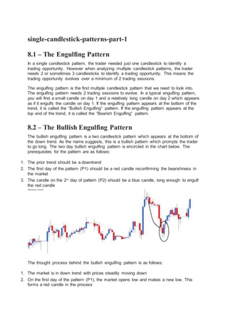
  • 1. single-candlestick-patterns-part-1 8.1 – The Engulfing Pattern In a single candlestick pattern, the trader needed just one candlestick to identify a trading opportunity. However when analyzing multiple candlestick patterns, the trader needs 2 or sometimes 3 candlesticks to identify a trading opportunity. This means the trading opportunity evolves over a minimum of 2 trading sessions. The engulfing pattern is the first multiple candlestick pattern that we need to look into. The engulfing pattern needs 2 trading sessions to evolve. In a typical engulfing pattern, you will find a small candle on day 1 and a relatively long candle on day 2 which appears as if it engulfs the candle on day 1. If the engulfing pattern appears at the bottom of the trend, it is called the “Bullish Engulfing” pattern. If the engulfing pattern appears at the top end of the trend, it is called the “Bearish Engulfing” pattern. 8.2 – The Bullish Engulfing Pattern The bullish engulfing pattern is a two candlestick pattern which appears at the bottom of the down trend. As the name suggests, this is a bullish pattern which prompts the trader to go long. The two day bullish engulfing pattern is encircled in the chart below. The prerequisites for the pattern are as follows: 1. The prior trend should be a downtrend 2. The first day of the pattern (P1) should be a red candle reconfirming the bearishness in the market 3. The candle on the 2nd day of pattern (P2) should be a blue candle, long enough to engulf the red candle The thought process behind the bullish engulfing pattern is as follows: 1. The market is in down trend with prices steadily moving down 2. On the first day of the pattern (P1), the market opens low and makes a new low. This forms a red candle in the process
  • 2. 3. On the second day of the pattern (P2), the stock opens near the closing prices of P1, and attempts to make a new low. However, at this low point of the day there is a sudden buying interest, which drives the prices to close higher than the previous day’s open. This price action forms a blue candle 4. The price action on P2 also suggests that bulls made a very sudden and strong attempt to break the bearish trend and they did so quite successfully. This is evident by the long blue candle on P2 5. The bears would not have expected the bull’s sudden action on P2 and hence the bull’s action kind of rattles the bears causing them some amount of nervousness 6. The bullishness is expected to continue over the next few successive trading sessions, driving the prices higher and hence the trader should look for buying opportunities The trade set up for the bullish engulfing pattern is as follows: 1. The bullish engulfing pattern evolves over two days 2. The suggested buy price is around the close price of blue candle i.e on P2 o Risk taker initiates the trade on P2 itself after ensuring P2 is engulfing P1 o The risk averse initiates the trade on the next day i.e the day after P2 around the closing price, after confirming the day is forming a blue candle o If the day after P2 is a red candle day, the risk averse trader will ignore the trade, owing to rule 1 of candlesticks (Buy strength and Sell weakness) o On a personal note, in multiple candlestick patterns where the trade evolves over 2 or more days it is worth to be a risk taker as opposed to a risk averse trader 3. The stop loss for the trade would be at the lowest low between P1, and P2 Needless to say, once the trade has been initiated you will have to wait until the target has been hit or the stoploss has been breached. Of course, one can always trail the stop loss to lock in profits. Have a look at DLF’s chart below; the bullish engulfing pattern is encircled. The OHLC on P1 – Open = 163, High = 168, Low = 158.5, Close = 160. On P2 the OHLC details are – Open = 159.5, High = 170.2, Low = 159, Close = 169.
  • 3. The trade set up for the bullish engulfing pattern is as follows: 1. The risk taker would go long on P2 at 169. He can do this by validating P2 as an engulfing pattern. To validate P2 as an engulfing patterns there are 2 conditions: o One, the current market price at 3:20PM on P2 should be higher than P1’s open. o Second, the open on P2 should be equal to or lower than P1’s close 2. The risk averse will initiate the trade, the day after P2 only after ensuring that the day is a blue candle day. So if the P1 falls on a Monday, the risk averse would be initiating the trade on Wednesday, around 3:20 PM. However, as I had mentioned earlier, while trading based on multiple candlestick pattern, it may be worth initiating the trade on pattern completion day itself i.e P2 3. The stop loss on this trade will be the lowest low between P1 and P2. In this example, lowest low falls on P1 at 158.5 In this example, both the risk averse and the risk taker would have been profitable. Here is an example of a perfect bullish engulfing pattern formed on Cipla Ltd, the risk averse trader would have completely missed out a great trading opportunity. There is often a lot of confusion on whether the candle should engulf just the real body or the whole candle, including the lower and upper shadows. In my personal experience, as long as the real bodies are engulfed, I would be happy to classify the candle as a bullish engulfing pattern. Of course, candlestick sticklers would object to this but what really matters is how well you hone your skills in trading with a particular candlestick pattern. So going by that thought, I’d be happy to classify the following pattern as a bullish engulfing pattern, even though the shadows are not engulfed.
  • 4. 8.3 – The bearish engulfing pattern The bearish engulfing pattern is a two candlestick pattern which appears at the top end of the trend, thus making it a bearish pattern. The thought process remains very similar to the bullish engulfing pattern, except one has to think about it from a shorting perspective. Take a look at the chart below, the two candles that make up the bearish engulfing pattern is encircled. You will notice: 1. To begin with the bulls are in absolute control pushing the prices higher 2. On P1, as expected the market moves up and makes a new high, reconfirming a bullish trend in the market 3. On P2, as expected the market opens higher and attempts to make a new high. However at this high point selling pressure starts. This selling comes unexpected and hence tends to displace the bulls 4. The sellers push the prices lower, so much so that the stock closes below the previous day’s (P1) open. This creates nervousness amongst the bulls
  • 5. 5. The strong sell on P2 indicates that the bears may have successfully broken down the bull’s stronghold and the market may continue to witness selling pressure over the next few days 6. The idea is to short the index or the stock in order to capitalize on the expected downward slide in prices The trade set up would be as follows: 1. The bearish engulfing pattern suggests a short trade 2. The risk taker initiates the trade on the same day after validating two conditions o The open on P2 is higher than P1’s close o The current market price at 3:20 PM on P2 is lower than P1’s open price. If the two conditions are satisfied, then it would be logical to conclude that it is a bearish engulfing pattern 3. The risk averse will initiate the trade on the day after P2 only after ensuring that the day is a red candle day 4. Since the bearish engulfing pattern is a 2 day pattern, it makes sense to be a risk taker. However this purely depends on the individual’s risk appetite Take a look at the chart below of Ambuja Cements. There are two bearish engulfing patterns formed. The first pattern on the chart (encircled, starting from left) did not work in favor of a risk taker. However the risk averse would have completely avoided taking the trade. The second bearish engulfing pattern would have been profitable for both the risk taker and the risk averse. The OHLC data for the bearing engulfing pattern (encircled at the top end of the chart) is as below: P1: Open – 214, High – 220, Low – 213.3, Close – 218.75 P2: Open – 220, High – 221, Low – 207.3, Close – 209.4 The trade setup for the short trade, based on the bearish engulfing pattern is as follows: 1. On P2 by 3:20 PM the risk taker would initiate the short trade at 209 after ensuring P1, and P2 together form a bearish engulfing pattern 2. The risk averse will initiate the trade, the day after P2 only after ensuring that the day is a red candle day 3. The stoploss in both the cases will the highest high of P1 and P2, which in this case is at 221. Both the risk averse and the risk taker would have been profitable in this particular case.
  • 6. 8.4 – The presence of a doji Now here is a very interesting chart. From my own personal experience I can tell you, charts like the one shown below are highly profitable. One should not miss such trading opportunities Take a look at the chart, what are the things that catch your attention? 1. An obvious uptrend as highlighted 2. A bearish engulfing pattern right at the top end of the upward rally 3. A doji formation on the day following P2 What implication would a doji have in this chart? Let us inspect this chart event by event: 1. A prolonged uptrend in the chart confirms the bulls are in absolute control 2. On P1 a blue candle is formed, reconfirming the bull’s dominance in the markets 3. On P2 markets open higher and make a new high comforting the bulls. However at the high point a strong surge to sell builds up, to an extent that the prices closes below P1’s opening prices 4. This trading action on P2 sets in a bit of panic to bulls, but they are not shaken yet 5. On day 3, let us call it as P3, though the opening is weak it is not much lower compared to P2’s close. This is not too comforting for the bulls, as they expect the markets to be stronger. 6. During P3 the market attempts to move higher (Doji’s upper shadow) however the high is not sustained. Even the low is not sustained and eventually the day closes flat forming a Doji. As you may recall, Dojis indicate indecision in the market 7. On P2 bulls panicked and on P3 bulls were uncertain 8. Panic with uncertainty is the perfect recipe for a catastrophe. Which explains the long red candle following the Doji From my own personal trading experience I can tell you that whenever a doji follows a recognizable candlestick pattern, the opportunity created is bigger. Besides illustrating this point, I also want to draw your attention to chart analysis methodology. Notice in this particular chart, we did not just look at what was happening on P1 or P2 but we went
  • 7. beyond that and actually combined two different patterns to develop a comprehensive view on the market. 8.5 – The Piercing Pattern The piercing pattern is very similar to the bullish engulfing pattern with a very minor variation. In a bullish engulfing pattern the P2’s blue candle engulfs P1’s red candle completely. However in a piercing pattern P2’s blue candle partially engulfs P1’s red candle, however the engulfing should be between 50% and less than 100%. You can validate this visually or calculate the same. For example if P1’s range (Open – Close) is 12 , P2’s range should be at least 6 or higher but below 12. As long as this condition is satisfied, everything else is similar to the bullish engulfing including the trade set up. Here a risk taker would initiate the trade on P2 around the close. The risk averse would initiate the trade, the day after P2 only after ensuring a blue candle is formed. The stoploss would be the low of the pattern. Have a look at the following chart: Here P2’s blue candle engulfs just under 50% of P1’s red candle. For this reason we do not consider this as a piercing pattern.
  • 8. 8.6 – The Dark Cloud Cover The dark cloud cover is very similar to the bearish engulfing pattern with a minor variation. In a bearish engulfing pattern the red candle on P2 engulfs P1’s blue candle completely. However in a dark cloud cover, the red candle on P2 engulfs about 50 to 100% of P1’s blue candle. The trade set up is exactly the same as the bearish engulfing pattern. Think about the dark cloud cover as the inverse of a piercing pattern. 8.7 – A perspective on selecting a trade Hence the two stocks may form 2 different (but somewhat similar) candlestick patterns such as a bearish engulfing and dark cloud cover at the same time. Both these are recognisable candlestick patterns but if I were to choose between the two patterns to set up a trade. I would put my money on the bearish engulfing pattern as
  • 9. opposed to a dark cloud cover. This is because the bearishness in a bearish engulfing pattern is more pronounced (due to the fact that it engulfs the previous day’s entire candle). On the same lines I would choose a bullish engulfing pattern over a piercing pattern. However there is an exception to this selection criterion. Later in this module I will introduce a 6 point trading checklist. A trade should satisfy at least 3 to 4 points on this checklist for it to be considered as a qualified trade. Keeping this point in perspective, assume there is a situation where the ICICI Bank stock forms a piercing pattern and the HDFC Bank stock forms a bullish engulfing pattern. Naturally one would be tempted to trade the bullish engulfing pattern, however if the HDFC Bank stock satisfies 3 checklist points, and ICICI Bank stock satisfies 4 checklist points, I would go ahead with the ICICI Bank stock even though it forms a less convincing candlestick pattern. On the other hand, if both the stocks satisfy 4 checklist points I will go ahead with the HDFC Bank trade. Key takeaways from this chapter 1. Multiple candlestick patterns evolve over two or more trading days 2. The bullish engulfing pattern evolves over two trading days. It appears at the bottom end of downtrend. Day one is called P1 and day 2 is called P2 3. In a bullish engulfing pattern, P1 is a red candle, and P2 is a blue candle. P2’s blue candle completely engulfs P1;s red candle 4. A risk taker initiates a long trade at the close of P2 after ensuring P1 and P2 together form a bullish engulfing pattern. A risk averse trader will initiate the trade the day after P2, near the close of the day 5. The stoploss for the bullish engulfing pattern is the lowest low between P1 and P2 6. The bearish engulfing pattern appears at the top end of an uptrend. P1’s blue candle is completely engulfed by P2’s red candle 7. A risk taker initiates a short trade at the close of P2 after ensuring P1 and P2 together form a bearish engulfing pattern. The risk averse trader will initiate the trade the day after P2, after confirming the day forms a red candle 8. The highest high of P1 and P2 forms the stoploss for a bearish engulfing pattern 9. The presence of a doji after an engulfing pattern tends to catalyze the pattern’s evolution. 10. The piercing pattern works very similar to bullish engulfing pattern, except that P2’s blue candle engulfs at least 50% and below 100% of P1’s red candle 11. The dark cloud cover works similar to the bearish engulfing pattern, except that P2’s red candle engulfs at least 50% and below 100% of P1’s blue candle. 11.1 – The Resistance As the name suggests, resistance is something which stops the price from rising further. The resistance level is a price point on the chart where traders expect maximum supply (in terms of selling) for the stock/index. The resistance level is always above the current market price.
  • 10. The likely hood of the price rising up to the resistance level, consolidating, absorbing all the supply, and then declining is high. The resistance is one of the critical technical analysis tool which market participants look at in a rising market. The resistance often acts as a trigger to sell. I have deliberately compressed the chart to include more data points, the reasons for which I will shortly explain. But before that there are two things that you need to pay attention to while looking at the above chart: 1. The resistance level, indicated by a horizontal line, is higher than the current market price. 2. While the resistance level is at 215, the current candle is at 206.75. The current candle and its corresponding price level are encircled for your reference For a moment let us imagine Ambuja cements at Rs.206 forming a bullish marubuzo with a low of 202. We know this is a signal to initiate a long trade, and we also know that the stoploss for this trade is at 202. With the new found knowledge on resistance, we now know that we can set 215 as a possible target for this trade! Why 215 you may wonder? The reasons are simple:- 1. Resistance of 215 implies there is a likelihood of excess supply 2. Excess supply builds selling pressure 3. Selling pressure tends to drag the prices lower Hence for reasons stated above, when a trader is long he can look at resistance points to set targets and to set exit points for the trade. Also, with the identification of the resistance the long trade can now be completely designed as follows: Entry – 206, Stoploss – 202, and Target – 215.
  • 11. The next obvious question is how do we identify the resistance level? Identifying price points as either a support or resistance is extremely simple. The identification process is the same for both support and resistance. If the current market price is below the identified point, it is called a resistance point; else it is called a support point. Since the process is the same, let us proceed to understand ‘support’, and we will follow it up with the procedure to identify S&R. 11.2 – The Support Having learnt about resistance, understanding the support level should be quite simple and intuitive. As the name suggests, the support is something that prevents the price from falling further. The support level is a price point on the chart where the trader expects maximum demand (in terms of buying) coming into the stock/index. Whenever the price falls to the support line, it is likely to bounce back. The support level is always below the current market price. There is a maximum likely hood that the price could fall till the support, consolidate, absorb all the demand, and then start to move upwards. The support is one of the critical technical level market participants look for in a falling market. The support often acts as a trigger to buy. Here is the chart of Cipla Limited. The horizontal line coinciding at 435 on chart marks the support level for Cipla. Few things that you need to notice on the chart above: 1. The support level, indicated by the horizontal line is below the current market price 2. While the support level is at 435, the current candle is at 442.5. The current candle and its corresponding price level are encircled for your reference Like we did while understanding resistance, let us imagine a bearish pattern formation – perhaps a shooting star at 442 with a high of 446. Clearly with a shooting star, the call is to short Cipla at 442, with 446 as the stoploss. Since we know 435 the immediate support, we can set the target at 435.
  • 12. So what makes Rs.435 target worthy? The following reasons back the decision: 1. Support at 435 implies there is a maximum likely hood of excess demand to emerge 2. Excess demand builds buying pressure 3. Buying pressure tends to drag the price higher Hence for the reasons stated above, when a trader is short, he can look at support points to set targets and to set exit points for the trade. Also, with the identification of the support, the short trade is now completely designed. Entry – 442, stoploss – 446, and target – 435. 11.3 – Construction/Drawing of the Support and Resistance level Here is a 4 step guide to help you understand how to identify and construct the support and the resistance line. Step 1) Load data points – If the objective is to identify short term S&R load at least 3-6 months of data points. If you want to identify long term S&R, load at least 12 – 18 months of data points. When you load many data points, the chart looks compressed. This also explains why the above two charts looks squeezed. 1. Long term S&R – is useful for swing trading 2. Short term S&R – is useful intraday and BTST trades Here is a chart where I have loaded 12 months of data points Step 2) Identify at least 3 price action zones – A price action zone can be described as ‘sticky points’ on chart where the price has displayed at least one of the behaviors: 1. Hesitated to move up further after a brief up move 2. Hesitated to move down further after a brief down move 3. Sharp reversals at particular price point Here are a series of charts that identifies the above 3 points in the same order:
  • 13. In the chart below, the encircled points indicate the price hesitating to move up further after a brief up move: In the chart below, the encircled points indicate the price hesitating to move down further after a brief down move: In the chart below, the encircled points indicate sharp price reversals: Step 3) Align the price action zones – When you look at a 12 month chart, it is common to spot many price action zones. But the trick is to identify at least 3 price action zones that are at the same price level.
  • 14. For example here is a chart where two price action zones are identified but they are not at the same price point. Look at the following chart, I have encircled 3 price action zones that are around the same price points: A very important point to note while identifying these price action zones is to make sure these price zone are well spaced in time. Meaning, if the 1st price action zone is identified on 2nd week on May, then it will be meaningful to identify the 2nd price action zone at any point after 4th week of May (well spaced in time). The more distance between two price action zones, the more powerful is the S&R identification. Step 4) Fit a horizontal line – Connect the three price action zones with a horizontal line. Based on where this line fits in with respect to the current market price, it either becomes a support or resistance. Have a look at this chart
  • 15. Starting from left: 1. The 1st circle highlights a price action zone where there is a sharp reversal of price 2. The 2nd circle highlights a price action zone where price is sticky 3. The 3rd circle highlights a price action zone where there is a sharp reversal of price 4. The 4th circle highlights a price action zone where price is sticky 5. The 5th circle highlights the current market price of Cipla – 442.5 In the above chart all the 4 price action zones are around the same price points i.e at 429. Clearly, the horizontal line is below the current market price of 442.5, thus making 429 as an immediate support price for Cipla. Please note, whenever you run a visual exercise in Technical Analysis such as identifying S&R, you run the risk of approximation. Hence always give room for error. The price level is usually depicted in a range and not at a single price point. It is actually a zone or an area that acts as support or resistance. So going by the above logic, I would be happy to consider a price range around 426 to 432 as a support region for Cipla. There is no specific rule for this range, I just subtracted and added 3 points to 429 to get my price range for support! Here is another chart, where both S&R have been identified for Ambuja Cements Limited. The current price of Ambuja is 204.1, the support is identified at 201 (below current market price), and the resistance at 214 (above current market price). So if one were to
  • 16. short Ambuja at 204, the target, based on support can be at 201. Probably this would be a good intraday trade. For a trader going long at 204, 214 can be a reasonable target expectation based on resistance. Notice in both the support and the resistance level, there at least 3 price action zone identified at the price level, all of which are well spaced in time 11.4 – Reliability of S&R The support and resistance lines are only indicative of a possible reversal of prices. They by no means should be taken for as certain. Like anything else in technical analysis, one should weigh the possibility of an event occurring (based on patterns) in terms of probability. For example, based on the chart of Ambuja Cements – Current Market Price = 204 Resistance = 214 The expectation here is that if at all Ambuja cements starts to move up it is likely to face a resistance at 214. Meaning, at 214 sellers could emerge who can potentially drag the prices lower. What is the guarantee that the sellers would come in at 214? In other words, what is dependence of the resistance line? Honestly, your guess is as good as mine. However, historically it can be seen that whenever Ambuja reached 214, it reacted in a peculiar way leading to the formation of a price action zone. The comforting factor here is that the price action zone is well spaced in time. This mean 214 stands as a time tested price action zone. Therefore keeping the very first rule of technical analysis in perspective i.e “History tends to repeat itself” we go with the belief that support and resistance levels will be reasonably honored. Purely from my personal trading experience well constructed S&R points are usually well respected. 11.4 – Optimization and checklist Perhaps, we are now at the most important juncture in this module. We will start discovering few optimization techniques which will help us identify high quality trades. Remember, when you seek quality, quantity is always compromised, but this is a compromise that is worth making. The idea is to identify quality trading signals as opposed to identifying plenty, but worthless trades. Optimization in general is a technique wherein you fine tune a process for best possible results. The process in this context is about identifying trades. Let us go back to candlesticks patterns, maybe to the very first we learnt – bullish marubuzo. A bullish marubuzo suggests a long trade near the close of the marubuzo, with the low of the marubuzo acting as the stoploss. Assume the following credentials for the bullish marubuzo: Open = 432, High = 449, Low = 430, Close = 448
  • 17. Hence the entry for the long trade is approximately at 448, with 430 as the stoploss. Now what if the low of the marubuzo also coincides with a good time tested support? Do you see a remarkable confluence of two technical theories here? We have a double confirmation to go long. Think about it on following terms: 1. A recognized candlestick pattern (bullish marubuzo) suggests the trader to initiate a long trade 2. A support near the stoploss price suggests the trader the presence of significant buying interest around the low While dealing with a fairly random environment such as the markets, what a trader really needs is a well crafted trade setup. The occurrence of the above two conditions (marubuzo + support near the low) suggests the same action i.e to initiate a long trade in this case. This leads us to an important idea. What if we had a checklist (call it a framework if you like) for every trade that we consider? The checklist would act as a guiding principle before initiating a trade. The trade should comply to the conditions specified in the checklist. If it does, we take the trade; else we just drop it and look for another trade opportunity that complies with the checklist. Discipline, they say makes up for the 80% of the trader’s success. The checklist in my opinion forces you to be disciplined; it helps you avoid taking abrupt and reckless trading decision. In fact to begin with we have the first two very important factors of the checklist: 1. The stock should form a recognizable candlestick pattern 1. Note: We have learnt some of the popular patterns in this module. To begin with you can use just these patterns to comply with checklist 2. S&R should confirm to the trade. The stoploss price should be around S&R 1. For a long trade, the low of the pattern should be around the support 2. For a short trade, the high of the pattern should be around the resistance Going forward in this module, as and when we learn new TA concepts, we will build this checklist. But just to quench your curiosity, the final checklist will have 6 checklist points. In fact when we have the grand 6 checklist points, we will weigh down each one of them. For example, checklist point number 4 may not be as important as point number 1, but nevertheless it is more important than 100 other factors that distract the trader. Key takeaways from this chapter 1. S&R are price points on the chart 2. Support is a price point below the current market price that indicate buying interest 3. Resistance is a price point above the current market price that indicate selling interest 4. To identify S&R, place a horizontal line in such a way that it connects at least 3 price action zones, well spaced in time. The more number of price action zones (well spaced in time) the horizontal line connects, the stronger is S&R
  • 18. 5. S&R can be used to identify targets for the trade. For a long trade, look for the immediate resistance level as target. For a short trade, look for the immediate support level as target. 6. Lastly, comply with the checklist for optimal trading results