2. Before&After®
2 of 12
X
i
BAmagazine.com U
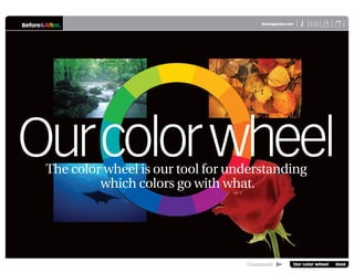
Our color wheel 0646
Our color wheel
Part science, part art, the color wheel is our tool for understanding
which colors go with what.
Infinity, simplified
White light contains all visible colors, which form an infinite
spectrum that always appears in the violet-to-red sequence
you see in a rainbow (right, top). To make it practical, the color wheel represents
this infinity with 12 basic hues pretty much like those in your first box of crayons.
Wherever there is light, there
is color. While we think of
colors as independent—this
blue, that red—a color is
never seen alone but always
in the context of other colors. Like a musical
note, no one color is “good” or “bad.” Rather,
it’s one part of a composition that as a whole
is pleasing or not. The color wheel is our tool
for understanding how colors relate to one
another. Here’s how it works.
Visible light
Ultraviolet Infra-red
The color wheel is the range of visible light made into a circle.
3. Before&After® Our color wheel 3 of 12 X
i
BAmagazine.com U
3 of 12 Our color wheel 0646
What are the colors?
The wheel has 12 basic hues. First are the three primary colors of blue, yellow and red.
Primary colors combine to make secondary colors, which combine to make tertiary colors.
Primary colors are the wheel’s “parent”
colors; they are the only colors not made from
other colors. The primary colors are positioned
around the wheel in thirds.
Secondary colors are halfway
between the primary colors. Each
is made from equal amounts of
the nearest primaries.
Tertiary colors fill the remaining
gaps. They are made from equal
amounts of the adjacent primary
and secondary colors.
4. Before&After® Our color wheel 4 of 12 X
i
BAmagazine.com U
4 of 12 Our color wheel 0646
Colors in common
As you can tell, every color is part of the color next to it, which is part of the next and the
next, all the way around the wheel. Colors in common are the basis of color relationships.
Blue is common to all seven colors, which get
less blue as they fan out. Green and violet are
the secondaries that contain blue.
Yellow is common to all seven colors, which
get less yellow as they fan out. Green and
orange are the secondaries that contain yellow.
Red is common to all seven colors, which get
less red as they fan out. Orange and violet are
the secondaries that contain red.
5. Before&After® Our color wheel 5 of 12 X
i
BAmagazine.com U
5 of 12 Our color wheel 0646
Shades
hue+black
Color value
Color also has darkness and lightness, or value. To show value, the color wheel has
more rings; two big rings for the dark shades and two small rings for the light tints.
Tints
hue+white
Hue
Shade
Hue
Tint
Tint
Shade
The color wheel has five
concentric rings from dark to light—
shades are the big rings, tints are
the small, and hues are the middle.
Tints and shades
(Left) A shade is the hue plus
black, and a tint is the hue plus
white.
Infinite gradient
(Below) Five steps represent
what is actually a continuous
gradient from white to black. A
tint or shade can fall anywhere
on the continuum.
6. Before&After® Our color wheel 6 of 12 X
i
BAmagazine.com U
6 of 12 Our color wheel 0646
Color relationships
The following pages illustrate the six basic color relationships. Each can yield an
endless number of color palettes.
Monochromatic
First are the dark, medium and light values of a single
color. This is a monochromatic palette. It has no color
depth, but it provides the contrast of dark, medium and
light that’s so important to good design.
Analogous
Adjacent colors are called analogous. Analogous colors
share strong undertones (here, yellow and red), which
create pleasing, low-contrast harmony. Analogous
palettes are rich and always easy to work with.
7. Before&After® Our color wheel 7 of 12 X
i
BAmagazine.com U
7 of 12 Our color wheel 0646
Any palette can include shades and tints along with the hue. The result can be
all dark, all light, or any combination.
Complement
Direct opposites on the color wheel are complements—in this
case, blue and orange. What the complement brings is contrast.
A color and its complement convey energy, vigor and excite-
ment. Typically, the complement is used in a smaller amount
as an accent; a spot of orange on a blue field, for example.
Split complement
One step either way are the complement’s own analogous
colors. This palette is called a split complement. Its strength is
in the low-contrast beauty of analogous colors, plus the added
punctuation of an opposite color. In this case the red, because
it’s most different, would likely be used as the accent.
8. Before&After® Our color wheel 8 of 12 X
i
BAmagazine.com U
8 of 12 Our color wheel 0646
The amount of color matters. Palettes can be made warmer/cooler, darker/lighter,
stronger/quieter and so on by using more or less of some colors.
Primary
The primary colors are rarely seen as a trio except in children’s
products. Red and yellow, however, are popular in American
culture for everything from fast food to gasoline. Red and blue
are common but attractive only if separated by open space.
Secondary
Secondary colors have a lot in common—two share blue,
two share yellow, and two share red—so harmonize easily.
As a trio they are soft, inviting and rich, and have pleasing
depth and dimension that are hard to get in other ways.
Rare Popular Clash Separated
9. Before&After® Our color wheel 9 of 12 X
i
BAmagazine.com U
9 of 12 Our color wheel 0646
Now for a quiz
Train your eye: Each cover uses one of the basic color relationships. Can you name them?
Hint: Look at the big colors, not the small ones; ignore black & white. Answers on page 11.
COUNTRY
Garden Greens
Great Gourds
A Perfect Porch
Simple Gifts
StovetopTreats
Plush Pullover
And more!
Comfort COUNTRY
Comfort
Garden Greens
Great Gourds
A Perfect Porch
Simple Scarves
Stovetop Treats
Plush Pullover
And more!
Monochromatic
Analogous
Complement
Split complement
Primary
Secondary
Monochromatic
Analogous
Complement
Split complement
Primary
Secondary
Monochromatic
Analogous
Complement
Split complement
Primary
Secondary
Monochromatic
Analogous
Complement
Split complement
Primary
Secondary
COUNTRY
Garden Greens
Great Gourds
A Perfect Porch
Simple Gifts
StovetopTreats
Plush Pullover
And more!
Comfort COUNTRY
Comfort
Garden Greens
Great Gourds
A Perfect Porch
Simple Gifts
StovetopTreats
Plush Pullover
And more!
10. Before&After® X
i
BAmagazine.com U
10 of 12 Our color wheel 0646
Our color wheel 10 of 12
Download: Before & After color wheel
Our color wheel | 748kb
www.bamagazine.com/ColorWheel/
This color wheel is exactly the one we use in
Before & After magazine. It is a reference tool, not
an interactive product. Its purpose is to help you
understand how colors are related. Its 12 hues
and 48 tints represent the full spectrum of color
but are only a tiny fraction of the infinity of colors
actually in nature.
The format is Adobe PDF. For everything you want
to know about working with PDF, please contact
Adobe’s Reader support Web site at
www.adobe.com/support/products/acrreader.html
Before&After®
11. Before&After® X
i
BAmagazine.com U
11 of 12 Our color wheel 0646
Our color wheel 11 of 12
18
16
17
COUNTRY
Comfort
Garden Greens
Great Gourds
A Perfect Porch
Simple Gifts
StovetopTreats
Plush Pullover
And more!
COUNTRY
Comfort
Garden Greens
Great Gourds
A Perfect Porch
Simple Gifts
Stovetop Treats
Plush Pullover
And more!
COUNTRY
Garden Greens
Great Gourds
A Perfect Porch
Simple Gifts
StovetopTreats
Plush Pullover
And more!
Comfort
COUNTRY
Comfort
Garden Greens
Great Gourds
A Perfect Porch
Simple Gifts
StovetopTreats
Plush Pullover
And more!
COUNTRY
Comfort
Garden Greens
Great Gourds
A Perfect Porch
Simple Gifts
Stovetop Treats
Plush Pullover
And more!
Typefaces
1 Giza Nine Three
2 Sloop ScriptOne
3 ITC Goudy Sans Bold Italic
Images
4 (a–d) iStockphoto.com | a b c d
Quiz answers
Article resources
Colors
C65 M35 Y75 K65
C50 M0 Y76 K0
C30 M0 Y64 K0
C26 M0 Y47 K0
C60 M25 Y0 K0
C50 M15 Y0 K0
C15 M5 Y0 K0
C0 M55 Y20 K0
C30 M85 Y75 K55
C20 M80 Y35 K5
C60 M28 Y90 K30
C0 M75 Y95 K0
C25 M75 Y100 K20
C0 M30 Y97 K0
C5 M48 Y96 K0
9
10
1
4a
2
11
12
10
14
13
12
11
4d
4c
4b
3
15
16
14
22
23
21
5 6
7 8
9
20
15
16
17
18
19
20
21
22
5 Monochromatic
6 Complementary
7 Primary
8 Analogous
13
19
23
13. Back | Paper-saver format
X
i
BAmagazine.com U
®
Before&After
For paper-saver format
Print: (Specify pages 14–19)
Before & After is made to fit your binder
Before & After articles are intended for permanent reference. All are titled and numbered.
For the current table of contents, click here. To save time and paper, a paper-saver format of this article,
suitable for one- or two-sided printing, is provided on the following pages.
Print
Format: Landscape
Page Size: Fit to Page
Save
Presentation format or
Paper-saver format
For presentation format
Print: (Specify pages 1–12)