Designing Graphics for Effective Use in a Videoconference
•Als DOC, PDF herunterladen•
0 gefällt mir•473 views
![Online Video Publishing [dot] com](https://cdn.slidesharecdn.com/profile-photo-klessblog-48x48.jpg?cb=1522782825)
I created this graphic tips guide with a few simple rules to help presenters design better Powerpoint slide shows for video productions and videoconferences.

Empfohlen
Empfohlen
Weitere ähnliche Inhalte
Kürzlich hochgeladen
Kürzlich hochgeladen (14)
Empfohlen
Empfohlen (20)
Designing Graphics for Effective Use in a Videoconference
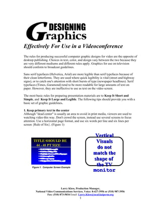
- 1. Effectively For Use in a Videoconference The rules for producing successful computer graphic designs for video are the opposite of desktop publishing. Choices in text, color, and design vary between the two because they are very different mediums and different rules apply. Graphics for use on television should conform to broadcast guidelines. Sans serif typefaces (Helvetica, Arial) are more legible than serif typefaces because of their clean letterforms. They are used where quick legibility is vital (street and highway signs), or to catch one's attention with short bursts of type (newspaper headlines). Serif typefaces (Times, Garamond) tend to be more readable for large amounts of text on paper. However, they are ineffective to use as text on the video screen. The most basic rules for preparing presentation materials are to Keep It Short and Simple, and Keep It Large and Legible. The following tips should provide you with a basic set of graphic guidelines. 1. Keep primary text in the center Although "dead center" is usually an area to avoid in print media, viewers are used to watching video this way. Don't crowd the screen, instead use several screens to focus attention. Use a horizontal page format, and use six words per line and six lines per screen {Rule of Six}. (Figure 1) Vertical TITLE SHOULD BE Visuals 44 - 48 PT SIZE • l0d Bt y o bx d ot 3p te do not •n t f Srp ai e s ye s e a f c •gt d c n Lxa k d it o bo h n au t e r g • or 6 sn w l re di p k r e match the •is a 6 pe lnp e g e She g twfi r •a i a i A ynT r i Sl t t n e a shape of Figure 1: Computer Screen Example the TV monitor Larry Kless, Production Manager, National Video Communications Services, Voice: 8-427-3956 or (510) 987-3956 Fax: (510) 873-5034 Email: Larry.Kless@ncal.kaiperm.org 1
- 2. 2. Work within the STA (Safe Titling Area) The STA is the cut off area for all screen images. The screen size between computers and TV monitors is not equal, and things can be cut off if they get to close to the edges. Leave at least a one inch border of empty space around each side of the page to be safe. (Figure 2) 11” TITLE CAN Text outside of the • BE ALL CAPS S ame rule s as abo ve (Fig ure 1) STA can be cut off • • Blac k Te xt + White Bac kg ro und No le s s than 30 Pt. body te xt 81/2 ” when going from the Computer to • DON'T US E ALL CAPS • Le ave an inc h bo rde r at edg e s • Us e Lands c ape Orie ntation the TV monitor Figure 2: Hard Copy “Overheads” Example Prepared in Landscape format 3. Avoid thin horizontal lines, single dots, busy patterns and finely detailed grids Always use 2 Pt. lines or larger, thin lines just don't cut it. Lines need to be thick and bold or they will flicker. Like thin lines, fine grids, patterns and dots cause flickering and picture distortion also. Avoid shading on printed hard copy because it creates buzzing patterns on camera. Supply details verbally, making charts and graphs simple (Figure 3) . Also, use clip art and flow charts sparingly, remember less is more. Make Charts and Call Ce nter Graphs Simple Symptomatic ~ Rx Refill ~ Appt Request Member Departments Call-in Results ~ Results Inquiry 100 Message types: Member of Ca reteam 80 Careteam fulfills 60 message tasks KP On-line Advice RN 40 20 Member Access to Lab clinical info Radiology and demographics 0 Transcript ion Rx Refill 1st Qtr 2nd Qtr 3rd Qtr 4th Qtr Message Ext ernal S ystem becomes part of chart Chart Figure 3: Graphic Example Figure 3: Graphic Example RIGHT WRONG 4. Avoid highly saturated colors Chroma crawl can be seen when two neighboring colors (text and background) bleed into each other. . The more saturated your colors are the more chroma crawl is added to the image. Don't overdo your use of color. AVOID USING RED or GREEN FOR TEXT Larry Kless, Production Manager, National Video Communications Services, Voice: 8-427-3956 or (510) 987-3956 Fax: (510) 873-5034 Email: Larry.Kless@ncal.kaiperm.org 2
- 3. 5. Make text large and legible • Use 32 Pt. for body text, and 40 - 48 Pt. for titles. • Use no more than two typefaces per presentation • Use drop shadows to add depth to text, drop shadows help separate text from the background (Figure 1) • DON'T USE ALL CAPS FOR BODY TEXT, IT'S TOO HARD TO READ!! (see examples below and Text Tips section) Bold, sans serif High contrast with characters are white text on a easier to read dark background from a distance works best DON’T USE ALL CAPS FOR YOUR TEXT, IT’S TOO HARD TO READ Light, Serif And Italic Be Word Wise TYPEFACES ARE MORE • Be concise Difficult To Read • Use key phrases • Make a single point • Less is more Larry Kless, Production Manager, National Video Communications Services, Voice: 8-427-3956 or (510) 987-3956 Fax: (510) 873-5034 Email: Larry.Kless@ncal.kaiperm.org 3
- 4. Do's • Keep text large and legible by using 32 pt for body text, 30 - 45 pt for subtitles and 40 - 48 pt for titles 48 pt serif title: Times Bold 32 pt sans serif-body text: Helvetica Bold • Use sans serif typeface for body text and serif typeface for titles (the opposite of desktop publishing) • Use no more than two fonts and only one background per presentation • Use white text on a dark blue to black background, this works the best readability from across the room • Use drop shadows to add depth to text, drop shadows help separate text from the background • Use fonts like Zapf Dingbats or Monotype Sorts (example below) as bullets, they are more expressive than Option-8 (•) 6wxd`vpq' 41S(¥gXX ÅÊv£¤W Dont's • Don't use Script fonts, they are too fancy for presentations • DON'T USE ALL CAPS IT'S TOO HARD TO READ!! All caps works only for TITLES Larry Kless, Production Manager, National Video Communications Services, Voice: 8-427-3956 or (510) 987-3956 Fax: (510) 873-5034 Email: Larry.Kless@ncal.kaiperm.org 4