
Empfohlen
Weitere ähnliche Inhalte
Was ist angesagt?
Was ist angesagt? (17)
Ähnlich wie Opening titles
Ähnlich wie Opening titles (20)
Mehr von kiera sage
Kürzlich hochgeladen
Kürzlich hochgeladen (20)
Opening titles
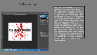
- 1. We used Photoshop to put together our production logo. We used the website ‘da font’ to pick out our titling and then transferred it over to Photoshop to change the colours. Each layer was made separately then was put together. We an image of splattered paint and deleted the background so that the titling could be put on top. The splattered paint was initially blue however we decided that red would be a more suitable as we trying to enforce our thriller genre. Production Logo
- 2. Initial movie title Developedmovietitling We initially started with this design however we felt that it was too plain so we developed it further. We felt that black and red were good colours as they represent death and darkness which is what our brand is about. We used photo shop to edit the titling and will then add it premiere in the editing process of the movie.
- 3. Initial design Developed design We initially started with this design. We felt as though the image of the moon represented our name well. We created the titling on ‘da font’ and then transferred it over to Photoshop and edited and changed the colours. We had created two versions and felt that the second fitted the name better. This is because the titling is clearer and the image is actually of a half moon. This first image was designed by ‘ Samantha’ and the second image w3as designed by ‘Luke’ Similarly to the first image we compiled it on Photoshop because we felt it was easier to edit change the colours of the images if we had too. In contrast to the first image the titling was created on ‘font space’ and then copied over to Photoshop.