
Empfohlen
Weitere ähnliche Inhalte
Was ist angesagt?
Was ist angesagt? (19)
Andere mochten auch
Andere mochten auch (20)
Ähnlich wie Contents pages
Ähnlich wie Contents pages (20)
Mehr von kendro98
Kürzlich hochgeladen
Kürzlich hochgeladen (20)
Contents pages
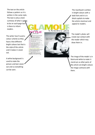
- 1. A white background is used to make the picture and text stand out and so everything can be seen. The masthead is written in bright colours with a bold font and it is in block capitals to make the article stand out and appeal to readers. The model’s photo will create eye contact with the reader which may draw them in. The writer hasn't used a colour scheme as they have a few different bright colours but that is the style of the article and it makes it stand out. The image of the model is in black and white to make it stand out as other parts of the article are bright colours the image contrasts with them. The text on the article follows a pattern as it is written in the same style. The text is only a short summary of what is going to be on each page but it is there to inform readers.
- 2. Vogue means a prevailing fashion style at a particular time. The head mast literally tells you what the magazine is about in the contents. That’s why it is also the biggest text on the page because it’s the main priority. The font is black to stand out against the white background. The main image on the contents page shows a woman wearing a very peculiar, yet fashionable dress. This is how you know the target audience is women because a woman is wearing the dress, and it’s women’s clothing. The text in the article is black throughout. Again that matches the colour scheme. It’s also really small because there is a lot of text to fit on the page. The models facial expression is very serious, and her body posture is very confident and exaggerated which makes the clothing she is wearing look more attractive to wear, making the audience want to buy the clothes which is the main point of the magazine. The selling line of the contents page is very small in comparison to the other main text on the page because it isn't the main priority, and is only a small amount of information. The sub-headings of the text are in bold red to stand out to the main text so you know it’s a sub-heading. Also, the red matches the colour scheme of the contents page with the red dress etc.
- 3. The sections are separated by different fonts and large number to make it easy for the reader to find the page for the most interesting story. The editor keeps the same theme throughout as it makes it simpler and easier on the eyes. The subtitles in bold are followed by a small paragraph that is used to describe the story and draw the reader in to want to read more. The use of red draws the audience towards the main contents on the page. One picture is used for the background to keep it simple, the image is also used to promote a main story in the subtitles.
- 4. There is a picture of the magazine in the top right corner which shows the reader what issue the magazine is. The page is organised into sections and is clearly laid out which may mean the magazine is an efficiently run magazine with an audience of organised people. The picture of the magazine in the contents page makes the magazine look more professional and gives the reader an insight to what people are going to be in the magazine. Having features and reviews separated in an organised fashion gives the impression of a professional look The colour scheme could be a connotation of Britain as it is a British magazine.