Whoa To Wow Final
•Als PPTX, PDF herunterladen•
1 gefällt mir•387 views

A power point with some pratical ideas for providers of senior living facilities to add that WOW factor.

Empfohlen
Weitere ähnliche Inhalte
Was ist angesagt?
Was ist angesagt? (20)
Ähnlich wie Whoa To Wow Final
Ähnlich wie Whoa To Wow Final (20)
Whoa To Wow Final
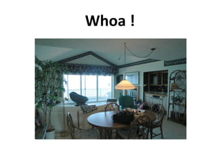
- 1. Whoa !
- 2. Wow !
- 3. Compare
- 5. Whoa…to Wow!
- 6. Sometimes all you need is paint.
- 7. Take a photo of the space. The trace the Space. Make several copies of the uncolored traced paper. Color it in in a few different ways. Decide on your favorite and get started.
- 8. Why Color Matters Color is a language. Color is one of the most fulfilling elements in our lives. Color can attract your attention or change your mood. It speaks to who you are, how you feel and where you're going. At Sherwin-Williams, we can help you put together the perfect colors for your life. Color is one of the first things you notice when you walk into a room. Is it any wonder that color, and how you use it, is one of the most important decorating decisions you'll make in your home? Inside your home, the latest colors and the way they're applied give voice to your personality and décor. Color sets a mood. From floor to ceiling, paint color reflects your style and makes a personal statement of what home means to you. Color unites one-of-a-kind accent pieces with manufactured items throughout your home. Electrifying hues, inspired by technology, bring a touch of whimsy to spaces that also feature natural carved wood, woven textiles and wrought iron. Bright colors are further enhanced when paired with large areas of negative color for contrast.
- 9. Color Theory HUE-Hue identifies the general family of a color, such as red, yellow, blue or green. The traditional color wheel is made up of twelve color families: red, red-orange, orange, yellow-orange, yellow, yellow-green, green, blue-green, blue-red-violet, violet and blue-violet. Color Wheel Colors on the opposite side of the wheel from each other are called complementary colors. In combination, these create striking contrasts. For less contrast, choose colors next to each other on the color wheel, which are called analogous colors. Choosing colors of different tints within one color family creates a monochromatic color scheme. Warm or Cool? Different colors in the same family may be described as being "warm" or "cool." Colors with yellow undertones will seem warmer, while the same color with blue or red undertones will appear cool. Cool colors - blue, green, violet - invite relaxation and thought. Warm colors - red, orange, yellow - encourage conversation and play. Sherwin-Williams color experts suggest using both warm and cool colors in rooms where you desire balance and variety. Value Value describes how light or dark a specific color may be. On Sherwin-Williams color strips, lighter values are at the top, mid-tone values are in the middle and darker values are at the bottom. When you combine colors from a single color strip, you're creating a monochromatic color scheme - perfect for creating a sophisticated, spacious look in a single room.
- 10. Color schemes
- 11. The right tone with the right depth and hue can make all the difference. Cool hue –pale density Warm hue- medium density
- 12. When an environment that is too cool it is uninviting…paint can warm it up.
- 13. Nice layout …nice composition, No WOW. To much neutral on wall and fireplace Colors to gray Lack of contrast Flooring and ceiling do not add to design Accents uninteresting
- 14. Now that’s WOW!
- 15. Dark rooms need lighter, brighter accents to enliven them.
- 16. Light rooms need dark accents to ground them.
- 17. Accent walls can enliven an area without overwhelming.
- 18. The right mix of mid tones with some contrast makes a pleasing palette.
- 19. Look for color around you to inspire schemes.
- 20. Nature can provide great inspiration.
- 21. Theme as well as color can be collected from everyday surroundings. Use color and innovative accents to transport residents to wonderful places.
- 22. The balancing actwarm against cool-light against dark The white against the black provide a sharp contrast. Play off light against Darks and use accents for punch. The sky ceiling opens up the room and adds a unique touch.
- 23. A broad color scheme can add diversity and continuity to a facility
- 25. Use one light color here we used white
- 27. here we used coral and green
- 30. White for our light
- 31. Red and medium blue for our mediums
- 33. Can replace small area’s easily
- 34. Lots of design options without paying more for bordering
- 36. Tips
- 37. Buy extra to avoid dye lot mismatch on replacement pieces
- 39. Homelike
- 40. Lots of warmth
- 41. Comfortable to walk on
- 43. More slippery than carpet Tips Use medium tones with light textures
- 45. Costs about the same as wallpaper
- 46. Hides flaws, dirt and blemishesClassic and subtle Tips: Do not vary your hues and keep your shades within a couple of tones. If you are thinking about doing it yourself practice and get a book on it - check out pricing for professional, it takes skill.
- 48. Great for implementing themes
- 49. Good selection of murals available on the internetTips Avoid over duplicated scenes look for unique murals. Avoid murals that distract from design, look for ones that compliment.
- 50. Decorative painting Lots of WOW! Can be pricey. Tips- hire a pro do it right, bad decorative painting is worse than no decorative painting.
- 51. The finishing touches are your best value for adding WOW to a space.