
Empfohlen
Weitere ähnliche Inhalte
Was ist angesagt?
Was ist angesagt? (19)
Andere mochten auch
Ähnlich wie Rihrih
Ähnlich wie Rihrih (20)
Mehr von kalkidanbrook
Rihrih
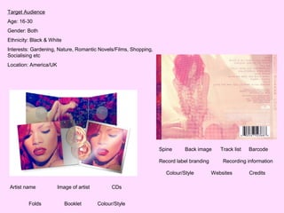
- 1. Target Audience Age: 16-30 Gender: Both Ethnicity: Black & White Interests: Gardening, Nature, Romantic Novels/Films, Shopping, Socialising etc Location: America/UK Spine Back image Record label branding Colour/Style Artist name Folds Image of artist Booklet CDs Colour/Style Track list Barcode Recording information Websites Credits
- 2. The CDs are creatively decorated with light pink followers. They give off a feminine feel as they connote love, passion and beauty, all of which is the artists brand. The theme of flowers is yet another element that continues across all texts, they are most evident in the music video for Only Girl. The album is entitled LOUD. This is contrasts the main image as she connoted as being peaceful and innocent. The typography is simple with big gaps between each letter, which emphasises the bold and vibrant red colours. It connotes her attitude towards music and its effective in grabbing the audiences attention. This image spans across three folds within the inside of the digipak - this is unconventional as you would expect to see three different images however in this case it is very effective as it holds emotion and deep meaning. The artist lays across a bed of vibrant red roses and wears a white dress. The colour saturation has been manipulated so that the red in both the roses and the artists hair stands out because its a theme that has been carried out through all of her media texts from all her music videos to her pictures (also the bold colours enhance the genre of pop). This was done because red connotes all things associated with love but also danger and blood. So, the colour helps highlight the themes and also helps establish the songs content. She lays limply on a bed of roses connoting that the idea of love and the beauty of nature comforts her. This is further connoted as she has her eyes closed, this highlights how she can feel the music and this is shown through her expression of passion. This gives the audience an impression that the music will be very emotional and raw. There is a close up shot of the artist looking down (possibly eyes closed) and her lips are parted. She looks away from the audience which is unconventional because artists normally make direct eye contact in order to invite the audience in. Rihanna still achieves this because the image connotes her as being attractively vulnerable and by looking down and away it connotes her mysterious side, this therefore draws the audience in as we want to know what she's hiding. The close up focuses on her face and her body is not shown off. This shot type connotes the artists personal and enclosed pose. This intrigues and grabs the audience attention as we want to know what has caused her to shy away and be protective of herself. Her gentle pose is contrasted by the bold red hair and lipstick. This connotes her sexual appeal as it emphasises her femininity and simplistic beauty, that the audience will notice and appreciate.
- 3. The artist sits in a bundle on the floor. Again she wears a white lacy dress which connotes her innocence and vulnerability. Also, it emphasises her sex appeal as her dress is partially see through and her legs are revealed. She wears an usually large bead necklace.This fashion statement could be related to religion as prayer beads are used to meditate and find peace. Therefore, this album could be about coming into terms with a subject matter since she holds the beads tightly as if in a contemplative prayer. In addition, she sits hunched over as if trying to avoid something. This is further connoted through her facial expression since she looks away. The colour palette is soft and gentle and with the combination of her body language it makes her seem angelic. The spine have the artists name and album name on it. The colours are very bright and eye catching, making it stand out on the selves. This is a barcode which is very conventional of an album. There is a clear narrative being portrayed in each of the images. I guess its about relationships and how she is distressed about them because when looking at all songs on the track list, it seems that love and lust seem to be the key themes the music is about, as their are songs entitled love the way you lie, which could be about cheating and mistrust. This then explains the reoccurring theme of red and pinks. The audience can relate to her emotions as they may have also gone through the same situations, therefore they can connect with artist as they will feel she understands them.
- 4. • Who is the artist? Overview This artist is called Rihanna. • How are they branded? The artist is branded as being gentle, feminine, sexy, simple, attractive and innocent. This brand is strongly portrayed through the use of the colour red and also her expression - the closed eyes. • How does it synergise with other representations of the brand? The artists star persona has been built around her bold coloured red hair. She has pushed boundaries and it is something that has gained massive attention across the world. She has set a trend and now people crave to get Rihannas red look. The institution used this to their advantage to then create a continuous theme through her different texts which the global audience will instantly recognise as its bold and inviting. • How is the digipak constructed? It consists of 8 panels, CDs and a booklet. They have chosen to do this in order to get the artists brand across to the audience and also clearly connote what her music is like through the narrative based images. • What message does the cover give to the audience? As a whole the cover gives off this very powerful and emotional vibe. The use of red across all texts creates the expectation that her music and music videos will establish the theme of love/heartbreak/death. The colours used are bright and vibrant so it tells the audience that the music will be upbeat and LOUD just like her album title said. • What will you use or not use and why? When it comes to making my digipak i want to make sure i have a distinctive theme that runs through all three mediums that me and my partner are creating, so that its instantly recognisable and portrays the artists brand effectively. However, unlike Rihanna inside cover i will use three separate images instead of one whole image that goes across all three folds because i want to establish the artists personality and the music's themes.