
Empfohlen
Weitere ähnliche Inhalte
Andere mochten auch
Andere mochten auch (15)
Mehr von jrt004
Mehr von jrt004 (20)
Kürzlich hochgeladen
Kürzlich hochgeladen (20)
Sample Graph Temperature Vs Latitude
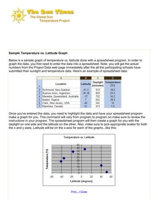
- 1. Sample Temperature vs. Latitude Graph Below is a sample graph of temperature vs. latitude done with a spreadsheet program. In order to graph the data, you first need to enter the data into a spreadsheet. Note: you will get the actual numbers from the Project Data web page immediately after the all the participating schools have submitted their sunlight and temperature data. Here's an example of spreadsheet data. Once you've entered the data, you need to highlight the data and have your spreadsheet program make a graph for you. This command will vary from program to program so make sure to review the instructions in your program. The spreadsheet program will then create a graph for you with the daylight on one side and the latitude on the other. Also, make sure to pick appropriate scales for both the x and y axes. Latitude will be on the x-axis for each of the graphs...like this: Print... | Close