
Empfohlen
Weitere ähnliche Inhalte
Mehr von jphibbert
Mehr von jphibbert (20)
Kürzlich hochgeladen
Kürzlich hochgeladen (20)
Gemma colours
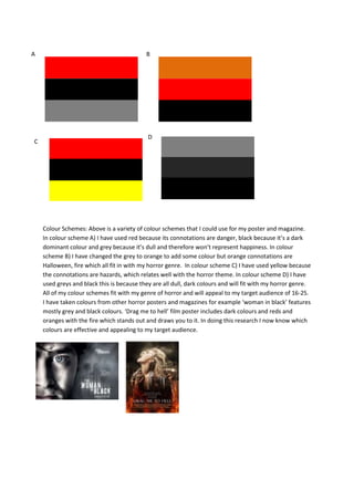
- 1. A B D C Colour Schemes: Above is a variety of colour schemes that I could use for my poster and magazine. In colour scheme A) I have used red because its connotations are danger, black because it’s a dark dominant colour and grey because it’s dull and therefore won’t represent happiness. In colour scheme B) I have changed the grey to orange to add some colour but orange connotations are Halloween, fire which all fit in with my horror genre. In colour scheme C) I have used yellow because the connotations are hazards, which relates well with the horror theme. In colour scheme D) I have used greys and black this is because they are all dull, dark colours and will fit with my horror genre. All of my colour schemes fit with my genre of horror and will appeal to my target audience of 16-25. I have taken colours from other horror posters and magazines for example ‘woman in black’ features mostly grey and black colours. ‘Drag me to hell’ film poster includes dark colours and reds and oranges with the fire which stands out and draws you to it. In doing this research I now know which colours are effective and appealing to my target audience.