
Empfohlen
Weitere ähnliche Inhalte
Was ist angesagt?
Was ist angesagt? (20)
Andere mochten auch
Andere mochten auch (18)
Ähnlich wie Eval 2
Ähnlich wie Eval 2 (20)
Mehr von Jodie Turini
Mehr von Jodie Turini (10)
Kürzlich hochgeladen
Kürzlich hochgeladen (20)
Eval 2
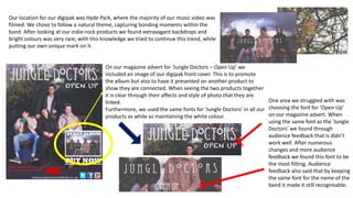
- 1. On our magazine advert for ‘Jungle Doctors – Open Up’ we included an image of our digipak front cover. This is to promote the album but also to have it presented on another product to show they are connected. When seeing the two products together it is clear through their affects and style of photo that they are linked. Furthermore, we used the same fonts for ‘Jungle Doctors’ in all our products as while as maintaining the white colour. One area we struggled with was choosing the font for ‘Open Up’ on our magazine advert. When using the same font as the ‘Jungle Doctors’ we found through audience feedback that is didn’t work well. After numerous changes and more audience feedback we found this font to be the most fitting. Audience feedback also said that by keeping the same font for the name of the band it made it still recognisable. Our location for our digipak was Hyde Park, where the majority of our music video was filmed. We chose to follow a natural theme, capturing bonding moments within the band. After looking at our indie-rock products we found extravagant backdrops and bright colours was very rare; with this knowledge we tried to continue this trend, while putting our own unique mark on it.
- 2. The placement of the digipak front cover upon a magazine poster is in my opinion an ideal form of synergy and one that is often under looked. I chose to use this form of synergy because it allows a connection to be formed directly between the two products. During our research we found this in a common trend on magazine adverts across all genres.
- 3. Another feature we included social media logos. Social media is one of, if not the biggest platform for advertising. By including these links it directs the band audience to their personal online pages, where they will regularly post about up and coming music and tours etc. As well as this the Youtube logo suggests they have visual content such as the music video we created for their audience to watch. On our magazine we included a quote from NME; we felt this would attract our target audience, as it shows that the band have respected reviews from established companies. Also, we found this a key feature on digipaks during our research. We included their webpage as we found this an effective way of self promotion, leading customers to more of their music and products. USE OF LOGOS ON OUR MAGAZINE ADVERT.
- 4. Our area that we felt vital for adding synergy to our products was through the same of the same font and colour. The only difference is the font title, but we felt their text was the most effective for the magazine and it clearly showed it was the name of the album and not a continuation of the band name. The title of the band ‘Jungle Doctors’ is in the same distinctive font, with degree sign in replacement on the ‘o’, giving it a unique and edgy look. It was important to keep the same font style for the name of the band to make it recognisable and create another synergistic element. We took influence from the Conduit’s album, similarly to our album and advert they kept the name of the band the same and only slightly used the sizing of the album name. Also, Marina & The Diamonds used the same font in both the album cover and magazine advert and only changes the colouring on the pictures, similar to ours.