

Empfohlen
Weitere ähnliche Inhalte
Was ist angesagt?
Was ist angesagt? (20)
Ähnlich wie principles of design
Ähnlich wie principles of design (20)
Kürzlich hochgeladen
Kürzlich hochgeladen (20)
principles of design
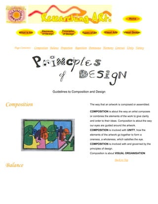
- 1. Page Contents: Composition Balance Proportion Repetition Dominance Harmony Contrast Unity Variety Guidelines to Composition and Design Composition The way that an artwork is composed or assembled. COMPOSITION is about the way an artist composes or combines the elements of the work to give clarity and order to their ideas. Composition is about the way our eyes are guided around the artwork. COMPOSITION is involved with UNITY, how the elements of the artwork go together to form a oneness, a wholeness, which satisfies the eye. COMPOSITION is involved with and governed by the principles of design. Composition is about VISUAL ORGANISATION Back to Top Balance
- 2. BALANCE involves the distribution of elements in a work of art. BALANCE is the control of the elements in attracting attention. This attention must be evenly or unevenly spread over the area to make sure interest in kept up, all the way through the art work, without being static or chaotic. BALANCE can be symmetrical or asymmetrical BALANCE can create movement, tension or calmness. BALANCE of the pictorial elements can act like a seesaw or lever. The elements can be balanced around a VERTICAL, HORIZONTAL or DIAGONAL AXIS with enough variety so that the artwork has rhythm and energy. Back to Top Proportion PROPORTION involves the relationship between sizes - scale. PROPORTION is about realistic relationship or ratio. As an illustration, the ideal human proportion is eight heads high and the shoulders are two heads wide so artists can change these relationships or proportions for dramatic or comic effect or to emphasise a feature or quality. In cartoons the head and hands are emphasised by enlarging then beyond realistic scale. PROPORTION is familiar to us all so artists can use the warping or normal proportions to suggest emotions or affect the status of a subject. Back to Top Repetition
- 3. REPETITION is the use of similar or connected pictorial elements. For example, similar shapes, colours or lines that are used more than once REPETITION can be regular or irregular and even or uneven. REPETITION can be in the form of RADIATION where the repeated elements spread out from a central point. REPETITION may be in the form of GRADATION where the repeated elements slowly become smaller or larger. RHYTHM is about the rate the eye moves throughout the work of art. This is usually because the eye moves, jumps or slides from one similar element to another in a way similar to music. Back to Top Dominance DOMINANCE is about the focus given to a part of a work of art. DOMINANCE helps to create UNITY as the eye is attracted to a key point then led around the image by pictorial elements. DOMINANCE can be created by contrasting pictorial elements such as line, shape, tone, texture, direction, size or colour. DOMINANCE and BALANCE work together to bring outUNITY. Back to Top Harmony HARMONY means pictorial elements of the same type that “go” together. HARMONY can be made where the eye is used to seeing objects together, so they form a group eg. flower pot and plants.
- 4. HARMONY can create feelings, similar elements can seem calm and pleasing eg. Blues and greens, rectangles and squares or groups of organic shapes, while contrasting elements create energy, vitality, tension or anger eg. triangles with circles and squares Back to Top Contrast CONTRAST means pictorial elements that stand out because they are not alike eg. squares and circles and triangles. Red, yellow and blue contrast as they are so dissimilar. CONTRAST can be made by putting objects together that do not normally “go” together and therefore make each other stand out more, than they would separately. CONTRAST gives variety and makes the elements more lively. Back to Top Unity UNITY is the sense of ONENESS, of things belonging together and making up a coherent whole. Artists do this by repeating elements, overlapping shapes and directing the eye of the viewer around the work from one similar element to the next or along a line or shape The eye is directed by the principles of design and composition so that the artwork has UNITY. The main function or job of the principles is to organise the elements into a unified artwork. Back to Top
- 5. Variety VARIETY gives an artwork interest and vitality, as the elements are repeated with enough change or difference to enhance each other. VARIETY, contrast and harmony work together to give unity. Too much VARIETY leads to confusion and disunity. Too little leads to boredom. Back to Top Principles of Design The Principles are concepts used to organize or arrange the structural elements of design. Again, the way in which these principles are applied affects the expressive content, or the message of the work. The principles are: Balance Proportion Rhythm Emphasis Unity Balance
- 6. Balance is the concept of visual equilibrium, and relates to our physical sense of balance. It is a reconciliation of opposing forces in a composition that results in visual stability. Most successful compositions achieve balance in one of two ways: symmetrically or asymmetrically. Balance in a three dimensional object is easy to understand; if balance isn't achieved, the object tips over. To understand balance in a two dimensional composition, we must use our imaginations to carry this three dimensional analogy forward to the flat surface. Symmetrical balance can be described as having equal "weight" on equal sides of a centrally placed fulcrum. It may also be referred to as formal balance. When the elements are arranged equally on either side of a central axis, the result is Bilateral symmetry. This axis may be horizontal or vertical. It is also possible to build formal balance by arranging elements equally around a central point , resulting in radial symmetry. There is a variant of symmetrical balance called approximate symmetry in which equivalent but not identical forms are arranged around the fulcrum line. Asymmetrical balance, also called informal balance, is more complex and difficult to envisage. It involves placement of objects in a way that will allow objects of varying visual weight to balance one another around a fulcrum point. This can be best imagined by envisioning a literal balance scale that can represent the visual "weights" that can be imagined in a two dimensional composition. For example, it is possible to balance a heavy weight with a cluster of lighter weights on equal sides of a fulcrum; in a picture, this might be a cluster of small objects balanced by a large object. It is also possible to imagine objects of equal weight but different mass (such as a large mass of feathers versus a small mass of stones) on equal sides of a fulcrum. Unequal weights can even be balanced by shifting the fulcrum point on our imaginary scale.
- 7. Whether the solution is simple or complex, some form of balance can be identified in most successful compositions. For a further discussion of balance in design see these sites: Symmetrical balance Asymmetrical balance Proportion Proportion refers to the relative size and scale of the various elements in a design. The issue is the relationship between objects, or parts, of a whole. This means that it is necessary to discuss proportion in terms of the context or standard used to determine proportions. Our most universal standard of measurement is the human body; that is, our experience of living in our own bodies. We judge the appropriateness of size of objects by that measure. For example, a sofa in the form of a hand is startling because of the distortion of expected proportion, and becomes the center of attention in the room. Architectural spaces intended to impress are usually scaled to a size that dwarfs the human viewer. This is a device often used in public spaces, such as churches or centers of government. The same principle is often applied to corporate spaces through which the enterprise wishes to impress customers with its power and invincibility. In contrast, the proportions of a private home are usually more in scale with human measure, and as a result it appears more friendly, comfortable, less intimidating. Use of appropriate scale in surface design is also important. For
- 8. example, an overly large textile design can overwhelm the form of a garment or a piece of furniture. A surprising aspect of proportion is the way ideal proportions can vary for the human body itself. Styles change in bodies as they do in clothing. Prior to the 16th century, for example, the female body ideally had large hips and belly. Only later was a small waistline stressed. In the 17th century and many other periods, the ideal body was much heavier than we would accept today. Of course, in the last 35 years the ideal personified by the fashion model has fostered a standard which idealizes exceptionally slender body proportions for women. In this century, sports have provided models for ideal male body proportions. Beginning with the rise of televised football in the 1960's, and the subsequent fitness boom, an increasingly
- 9. exaggerated muscular silhouette, corresponding to that of the uniformed and padded football player, was presented as the ultimate male form. Only in this period could Arnold Schwartzenegger have represented the heroic ideal body image. This trend reached its most extreme form in the late 1970s and early 1980s. Since that time the emergence of basketball as the predominant American sport has led to a more naturally proportioned fit body ideal for men. In addition, artists frequently take liberties with the natural proportions of the human body to achieve their expressive goals. A well known classic example is Michaelangelo's David, in which distortions of proportion are used by the artist to depict both the youthfulness of the boy David, together with the power of the hero about to conquer the giant Goliath. The surrealist painter Magritte often used distortions of proportions to create striking effects. This web site Copyright © 1995 by Charlotte Jirousek Questions or comments? Let us know at caj7@cornell.edu.