
Empfohlen
Weitere ähnliche Inhalte
Was ist angesagt?
Was ist angesagt? (20)
Andere mochten auch
Andere mochten auch (11)
Ähnlich wie Analysis of Similar Artists
Ähnlich wie Analysis of Similar Artists (20)
Kürzlich hochgeladen
Kürzlich hochgeladen (20)
Analysis of Similar Artists
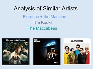
- 1. Analysis of Similar Artists Florence + the Machine The Kooks The Maccabees
- 2. Florence + the Machine Because of the style that Florence has she attracts the free spirited younger generation, the target audience will be between 14-20 years old because that is the age when you are becoming aware of the world, for example Florence has a very earthy, natural look which for her fans is important. The look is very eco friendly which for younger people is an encouragement to help ‘save the world’ by recycling, Florence is setting an example, her style and clothing does the same thing. She wears vintage clothes, this is a form of recycling too. Florence also often wears very floral patterns and neutral colour which then relates back to the earthy natural look. Her music also relates to her style because many of her song titles are related to nature, for example: ‘Rabbit Heart’, ‘Dog Days are Over’ and ‘Hurricane Drunk’.
- 3. Florence + the Machine With this album cover we see Florence leaning against a tree with flowers on it, this attracts the target audience because it is very natural so it relates to the earthy appeal and looks very picturesque. Another part of the cover is the main link between the title ‘Lungs’ and the red lungs that are hung around Florence’s neck. This is a strong connection and a good advertiser. Because of the lungs shown on the album cover when you enter the website it is also a main connection as there is a pair of the same lungs shown and there is the sound of inhaling and exhaling, which is the function of the lungs. http://florenceandthemachine.net/ On the website there are lots of things that connect with the natural, earthy and vintage recycling that the band is related with. For example the information boxes look like old paper that has curled or bent in time, the photographs also have the worn look to them. There is also a butterfly and a flower that moves as well to add to the natural theme.
- 4. Florence + the Machine These are images I have taken from the music videos that have been released and you can see that the theme of nature it throughout. Two of the videos are filmed in some form of forest or woodland area which is the direct link with nature. And the 3rd has elements of nature in it as she repeatedly walks through tree branches coated in leaves. There is also the costume to consider which relates to her image. In the first image the video that it is in has very colourful playful clothes and props which are some what childlike, this connects to the target audience because they have just gone through that age and the video revisits that. Also the clothing has a slight vintage style to it. The second image contains lots of vintage clothing and old fashioned behaviour. The way the dance is more old fashioned and flowing, it is very classic, I think there is a strong connection between classic and vintage. The last video is more modern and shows less of the simplistic side of Florence’s image. We are shown Florence walking through the leaves on more than one occasion but she is also shown with lots of different bulbs flashing above her which is nothing like her previous videos, does this mean her image is starting to change? Dog Days Are Over Rabbit Heart Cosmic Love
- 5. The Kooks The Kooks have a very relaxed attitude to their style as they are either photographed in black jackets and white tops, or in casual hoodies and t-shirts. This fashion is also reflected in the artwork on the homepage of their website, the band members are plain and not coloured in but around them is a big splash of colour. It attracts an age group of about 15-20 year olds as it is the time when you can be relaxed but focused. The music that they create is also very easy to listen to and reflects their style to for example the first album was titled ‘Inside In/Inside Out’, this is care free showing it does really matter whether something is the right way round or not. Also the titles of some of the tracks: ‘Sofa Song’, ‘Ooh La’, ‘She Moves In Her Own Way’.
- 6. The Kooks With both of The Kooks album covers they have a lot of negative, blank space. The band is made to stand out through the colour, for example in ‘Inside In/Inside Out’ they stand out because they are black and grey on a white background, and in ‘Konk’ they are colour on a black background. The album title and band name stand out in the same way. http://www.thekooks.com/ The Kooks website is similar in the fact there is lots of space, nothing is cluttered, it is relaxed and organised. Those factors relate to the band image of being relaxed. The band name is also made to stand out like it does on the album cover, you can see it straight away. Also on the homepage it shows the band members in flashes of colour and they are in black and white, it is similar to the covers for the fact that they stand out from the background except that you see the colour first then the band members.
- 7. The Kooks Performance is the main theme for nearly all of The Kooks music videos they are never at a gig or venue but playing casually to themselves and friends or randomly on the beach but alone. They are also never dressed up, they play in ordinary clothes, the same as when it comes to promotional advertising they wear ordinary clothes then too. They also never have the use of bright colours, if there are elements of colour there is some sort of filter used to quieten them down. All of these elements are why there image is laid back and free, they never have much colour which is reflected in every video and with the album covers too. This attracts their target audience because the recognise the style to be relaxed, care free and just about the music. I also think that because they never show themselves performing in front of anybody that the music is the only important thing, that it is the main focus to chill out and play music. Always Where I Need To Be She Moves In Her Own Way Eddie’s Gun
- 8. The Maccabees The Maccabees are a very creative band as most of there videos or photographs involve lots of colour or pattern. Their style is very casual but colourful they are often in bright coloured tops or jumpers. Because of this I think their audience is 13-20 year olds because they project a fun atmosphere within their work, some of the elements in their videos can be playful and childlike which is also show in the titles of the songs. Because of their style and attitude they are able to link it together extremely well, Many of the videos have a lot of colour and a lot of movement, they really combine lots of different elements. This is reflected in their album and song titles, for example the first album is called ‘Colour It In’ colouring is normally related to children's activities. I think that they are able to attract the 13-20 years olds because they are still growing up and can relate the band to memories they have for example the song titles are, ‘First Love’, ‘Lego’ and ‘Dinosaurs’.
- 9. The Maccabees For The Maccabees album covers the are certainly full of colour, that is the theme for their image, both have a range of colours shown, especially ‘Wall Of Arms’ as it contains the three primary colours and green too. The album ‘Colour It In’ has many variations, the album changes colour if there are bonus tracks or other features. This defiantly attracts the target audience because the covers are bright how they would expect them to be. The first album ‘Colour It In’ relates to the childlike aspect with the hand drawn people and the title of the band and album are done in the way a child writes when they learn to join the letters together. The second album ‘Wall Of Arms’ relates to the childlike theme because the band members look like plastic dolls which younger children would play with. The fact that they relate so heavily to childhood elements shows that they have a lot of fun creating music and that they have creative minds in order to come up with these fun ideas. The Maccabees website is not the same though. It is very simple very straight forward. The homepage is a live performance of the band which is all surrounded by a black background. As you search the website the colours shown in their videos and clothing and album covers does not appear which shows that when it comes down to it they really focus on what music they have created.
- 10. The Maccabees The Maccabees have two main themes for their music videos, One they are full of colour, or,Two they have lots of people involved. In ‘Latchmere’ they have used both, the stop picture animation that they are using is the first clue to the creative side of the band and then the colours arrive and the large amount to people, this combination is the key to their appearance and how they attract their audience. The second video has only the colour involved. Throughout the video the centre of attention is the pattern in-between the band members. As it changes shape it evolves into different computer games such and pacman, space invaders and snake. These elements connect to the childlike activities, as the pattern that reminds you of the game snake changes it creates superhero masks over the lead singers face, that is also a connection with their childlike image. The last video has a lot of references to colour and childlike behaviour. We see them drawing with chalk on the road making a pattern which they later colour in, the chalk drawing is something you do when you are young to avoid permanent mess, and colouring in is again something you do when your young. Then the same pattern is made out of drawing pins and we see lots of different colours of them. And we also see black paint covering a white canvas making lots of mess. That part of the video shows how you can grow up and still be young. Everything that I have mentioned shows how they attract their target audience with the use of colour and childlike behaviour. Latchmere No Kinds Words X-Ray