
Empfohlen
Empfohlen
Weitere ähnliche Inhalte
Kürzlich hochgeladen
Kürzlich hochgeladen (6)
Empfohlen
Empfohlen (20)
Industry Standard Mobile Design Tips
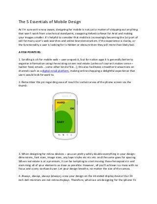
- 1. The 5 Essentials of Mobile Design As I’m sure we’re now aware, designing for mobile is not just a matter of stripping out anything that won’t work from a technical standpoint, swapping Helvetica Neue for Arial and making your images smaller. It’s helpful to consider that mobile is increasingly becoming the 1st port of call for many user’s web searches and online brand encounters. If the experience is clunky, or the functionality a user is looking for is hidden or obscure then they will more than likely bail. A FEW POINTERS: 1. Scrolling is ok for mobile web – users expect it, but for native apps it is generally better to organise information using the existing screen real estate (unless of course it makes sense – twitter feed, emails… some other kind of list…); this also facilitates smoother transactions on channels such as a digital retail platform, making online shopping a delightful experience that users would look forward to. 2. Remember this pic regarding ease of reach for certain areas of the phone screen via the thumb: 3. When designing for retina devices – you can pretty safely double everything in your design: dimensions, font sizes, image sizes, any layer styles etc etc etc. and the same goes for spacing. When real estate is at a premium, it can be tempting to start moving those fenceposts in and cramming all of your elements as close as possible. However, all you’ll achieve is a mess with no focus and a very confused user. Let your design breathe, no matter the size of the canvas. 4. Always, always, always (always), view your design on the intended display device! Our 24 inch dell monitors are not retina displays. Therefore, when we are designing for the iphone 5′s
- 2. 640px by 1136px retina display in photoshop, on said 24 inch monitor, the photoshop document will look massive and over-sized (in this case twice the size it should be). Why is this the case? Well essentially you can think of retina displays containing “high definition” pixels which are smaller than regular “standard definition” pixels (see Fig 2). Resolution values (dimensions) however, stay the same. So if we were to build a current retina iPad with a resolution of 1536 x 2048 pixels using a non-retina display, it would be roughly the size of a 32 inch lcd tv! (Plus you would be the bane of all others on public transport… Fig 1.). Fig 1. No-one wants to be that guy!
- 3. Fig 2. A picture speaks 1000 words (or 2000 retina words??) http://www.newfangled.com/optimize_your_site_for_retina_displays Unfortunately, there is nothing that you can do about this design inconvenience until all our monitors also come equipped with little tiny retina display pixels. Until that glorious day, remember that what you see on your monitor is very different to what you will see on a retina device. All your fonts and buttons etc etc etc will look massive and “wrong” and you WILL be tempted to make things smaller. Restrain yourself dear designer!! Doing this will more than likely make the elements too small when your design makes it to the retina screen. However there is hope! If you are on a mac (im sure there is a pc equivalent but you can find it yourself) like me you can use this app to mirror what you are working on in Photoshop on your iDevice and hence can ALWAYS check how your design is looking in it’s intended habitat: http://bjango.com/mac/skalapreview/ It’s universal so you can happily sync up with either iPhone or iPad depending on the project. 5. As a postscript to the above point, here are some general sizing guidelines: 44px (88px retina) – this is the golden touch size for an average user according to Apple’s UI guidelines. Any smaller than this and you start to head into MC Hammer territory (can’t touch this…). Apple says that if you are really at a pinch for screen real estate you can go as far as 30px (60px retina) – but definitely don’t make this your default user experience. As a general rule dont go smaller than 24px for type. I find text the hardest thing to get used to when designing for retina as it just looks so big, but I’ve found if you drop below 24px you really run the risk of having your type being illegible. Of course there will be
- 4. exceptions – ie labels for your tab bar buttons – but let them be exceptions and use them wisely. If you have to attempt to convince yourself that something isn’t too small, then it’s probably too small. I find it super helpful to keep attribute values (ie. stroke widths, font sizes etc.) to even values. That way any style you create can be easily divided by two and still look nice and crisp when resized for non-retina (peasant) devices. Source: http://mobileden.com.au/