IxDA Chicago Mobile Site by Svetlin Denkov
•Als PPTX, PDF herunterladen•
0 gefällt mir•780 views


Empfohlen
Empfohlen
Weitere ähnliche Inhalte
Ähnlich wie IxDA Chicago Mobile Site by Svetlin Denkov
Ähnlich wie IxDA Chicago Mobile Site by Svetlin Denkov (20)
Mehr von IxDA Chicago
Mehr von IxDA Chicago (20)
Kürzlich hochgeladen
Kürzlich hochgeladen (20)
IxDA Chicago Mobile Site by Svetlin Denkov
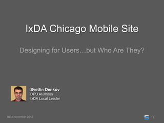
- 1. IxDA Chicago Mobile Site Designing for Users…but Who Are They? Svetlin Denkov DPU Alumnus IxDA Local Leader IxDA November 2012 1
- 2. AGENDA • The Background • The Research • The Redesign • The Next Level • The Surprise • The Lessons Learned IxDA November 2012 2
- 3. The BACKROUND Where did it all begin? IxDA November 2012 3
- 4. The BACKGROUND Context The Organization • Global network dedicated to Interaction Design • Hosting monthly events as discussion forums • Chicago is 3rd largest chapter in the world • Active online community at ixdachicago.org Core Issues • Mobile site came as freebie in 2007 site transition • At the time, Ning (company behind the CMS), had no mobile specific roadmap • Platform was significantly outdated • Missing key required functionality IxDA November 2012 4
- 5. The BACKGROUND Motivation The Personal View • Student seeking an interesting problem • Vested interest as a Local Leader • Dissatisfaction with the existing solution Image Source: http://bit.ly/UUdOID The Bigger Picture • In 02/2012, smartphones surpassed the 50% mark • The chapter members are multitaskers on the go • Members want to attend events, but they fill quickly • No mobile update coming from Ning Image Source: http://bit.ly/HjaVbb IxDA November 2012 5
- 6. The BACKGROUND Process Goals • Increase site engagement by improving satisfaction • Provide a platform-agnostic, extensible solution • Validate that the redesign meets user needs UCD Approach • 2-phase project over 8 weeks for creating a solution • In the 1st phase, I conducted user research • In the 2nd phase, the research findings informed a system redesign which was then tested Image Source: http://bit.ly/cDUOmm IxDA November 2012 6
- 7. The RESEARCH What did I uncover? IxDA November 2012 7
- 8. The RESEARCH Overview I wanted to identify who the existing and prospective users are and how they interact with the website. This would help me determine pain points and create a list of needs. Activities Analytics Interviews Looked at 1 and 6-month statistics to learn Held discussion with existing users to answer about the site’s audience questions about preference, impressions, etc. Surveys Heuristic Review Pinged expert and novice users to establish Analyzed key areas of the existing experience usage metrics including tasks and frequency to discover critical usability issues IxDA November 2012 8
- 9. The RESEARCH Analytics What I did • Tracked mobile devices only • Focused on 11/2011 – 04/2012 period • Analyzed 8 data dimensions What I found • On average 90 visits/month • 40 visits had proper redirect • Not all are unique visits • Equivalent to 3% of membership • Small percentage visited Home IxDA November 2012 9
- 10. The RESEARCH Surveys What I did • 1 with experts (usage >= 6 months) and 1 with novices (usage < 1 month) • Recruitment was done via social media, email, and in person solicitation • Both surveys ran for 2 consecutive weeks • Participation overall was low with only 8 respondents. Suggests lack of familiarity. What I found • Site used infrequently with limited task completion • Used for event lookup and adding members • Navigation, visual design and layout rated low • Purpose and messaging are somewhat unclear • Member search and event registration requested IxDA November 2012 10
- 11. The RESEARCH Interviews What I did • 4 1-on-1 semi-structured interviews • 2 conducted in person, 2 via Skype • Interviewees were existing mobile users • Recruited at IxDA events from eligible participants • UX professionals with at least 2 years experience What I found • Participants used the site for over 6 months • Tasks related to current events were discussed • Resorted to “hacks” for event viewing • Networking first, communication second • Site was seen as “half-baked”, but can be fixed Image Source: http://bit.ly/YngUt4 IxDA November 2012 11
- 12. The RESEARCH Heuristic Review What I did • Followed Nielsen usability guidelines • Analyzed main areas of experience 1 • Evaluated via a 3-level grading system • Logged critical issues and good observations • Recommended fixes to the problems 2 What I found 3 • No uniform style guide/poor visual presentation • Non-existing copy standards (iPhone references) • Inconsistent brand communication • Unintuitive IA and limited IxD model • Lack of information hierarchy of UX components IxDA November 2012 12
- 13. The RESEARCH Heuristic Review - Example 1 1 2 2 3 4 4 3 IxDA November 2012 13
- 14. The REDESIGN How did I solve the problem? IxDA November 2012 14
- 15. The REDESIGN Overview During the Design and Test phase, I wanted to restructure the underlying IA, introduce missing functionality prioritized based on needs, and test the end product with users. Activities Personas Designs Captured the audience segmentations via 3 Created a sitemap and process flows for the personas which listed their tasks, most important tasks users asked in the frustrations, and expectations Research phase Research and Ideation Prototype and Testing Conducted 2 individual and 1 joint Using a paper prototype I tested the usability brainstorm sessions for surfacing concepts of the design with 4 in-class novice users IxDA November 2012 15
- 16. The REDESIGN Personas What I did • Identified usage patterns in surveys and interviews • The research identified user characteristics • 3 groups: Recruiters, Students, Professionals • Professors may be the 4th segmentation • Each persona has a detailed description What I found • Students want to network and learn about events • Professionals hold discussions and browse jobs • Recruiters post job openings for candidates IxDA November 2012 16
- 17. The REDESIGN Personas - Examples Include Background Data: Include Contextual Data: • Name and Role • Mobile Use • Demographic Information • Frustrations and Motivations • Quote and Story • Attempted Tasks IxDA November 2012 17
- 18. The REDESIGN Research and Ideation What I did • Investigated various mobile examples • Conducted 3 iterations of brainstorming • Sketched concepts and flows in different fidelities What I found • Common patterns for social experiences exist • Initial scope was too optimistic and was readjusted • Task importance drove feature prioritization • There are never bad ideas IxDA November 2012 18
- 19. The REDESIGN Research and Ideation – Example Tasks Flows Designs IxDA November 2012 19
- 20. The REDESIGN Designs What I did • Blended site map and process flows • Created designs for the following: - Registration and Sign In - Home and Global Navigation - Event Registration/Info - Members Search/Browse What I found • Your audience dictates the fidelity • Every wireframing tool has limitations • Careful planning eliminates rework • Iterating over designs will happen IxDA November 2012 20
- 21. The REDESIGN Designs – Original Experience Sign In Screen Sign Up Screen Home Screen IxDA November 2012 21
- 22. The REDESIGN Designs – Redesign Examples IxDA November 2012 22
- 23. The REDESIGN Designs – Original Experience (cont.) Own Member Profile Members Screen Events Screen ? IxDA November 2012 23
- 24. The REDESIGN Designs – Redesign Examples (cont.) IxDA November 2012 24
- 25. The REDESIGN Prototype and Testing What I did • Used a detailed paper prototype • Tested with 4 in-class novice participants • Each asked to complete 3 tasks in 30 min: - Log in to view own profile - Register for the April event - Add Micki Katz as a friend • Captured observations via audio and notes • Created list of design recommendations What I found • The tangibility did not impact performance • Time to completion was identical across users • Registration feedback was missed due to fidelity • Member searching/filtering needed clarification • The menu icon was mostly unfamiliar IxDA November 2012 25
- 26. The REDESIGN Prototype and Testing - Examples IxDA November 2012 26
- 27. The NEXT LEVEL Where is this project going? IxDA November 2012 27
- 28. The NEXT LEVEL Plan for Post Capstone Work Short Term Goals • Incorporate feedback into 2nd round of design • Build Axure prototype of solution • Present project work to Chapter leadership • Reach consensus on next steps Image Source: http://bit.ly/115LeaE Long Term Goals • Engage IxDA Chicago’s membership for: - Commentary on proposed redesign - Surface additional requirements and ideas • Agree on UX strategy and finalize the design • Analyze tools/platforms for site deployment • Create roadmap for site management Image Source: http://bit.ly/Sr8Baw IxDA November 2012 28
- 29. The SURPRISE How did Ning beat me to the punch? IxDA November 2012 29
- 30. The SURPRISE Ning’s Big Reveal on July 16th What was changed? • Website developed in HTML5 • Updated look and feel and interaction model • Consistent and flexible design • Options such as My Page, Events, Discussions, etc. • Works on multiple mobile platforms Tour of the Mobile Interface: http://bit.ly/Tny4E3 Administrative Customization: http://bit.ly/Tny9YB What were the similarities? • Simplified Sign In and Registration • Persistent global navigation menu • Dedicated Events and Event Info pages • Contextual searching/filtering of Events and Members IxDA November 2012 30
- 31. The SURPRISE Ning’s Big Reveal on July 16th – Examples 1 Sign In Screen Sign Up Screen Home Screen IxDA November 2012 31
- 32. The SURPRISE Ning’s Big Reveal on July 16th – Examples 2 Own Member Profile Members Screen Events Screen IxDA November 2012 32
- 33. The LESSONS LEARNED What wisdom was revealed to me? IxDA November 2012 33
- 34. The LESSONS LEARNED • Have no preconceptions going into a project. • Plan and plan again. Did I forget to mention, PLAN? • Optimism is good, but realism is much better. • Be ready to adapt on the fly. Problems will arise! • 2 heads ALWAYS think better than 1, right? • Toolkit mastery ≠ predictability. Learning never stops. IxDA November 2012 34
- 35. Thank You for Listening! @svetlindenkov http://linkd.in/JbZDre http://bit.ly/Jo93RJ IxDA November 2012 35
Hinweis der Redaktion
- NOTES:UCD ApproachThe project was to cover Research, Design and Testing of an alternative solution.1st phase = elaborate on user needs, pain points, and to determine behavior and expectations for the product2nd phase = findings were leveraged to create a robust information architecture, complete main process flows, and to establish validation procedures of the re-design
- NOTES:What I DidAsked for participation based on mobile site usage. Reached out to 20-30 people at consecutive IxDA events in February, March, and April.Of 10 candidates that showed interest, only 4 followed through.What I FoundEvents = opportunities to exchange knowledge, give back to community, networking with like-minded individualsHacks = link redirecting to full site, email link, or Google search for ixdachicago.org/eventsNetworking = “want to make connections with others”Communication = “no search functionality and browsing was cumbersome”Messaging = unclear but not seen as a communication platform. One person each for Discussions and Job BoardRequested Fixes = sort members alphabetically, better sign in/registration processPerception = “boring and dull”, “like a prototype”, sparse functionality, does not solve user needsVisual Presentation = split on opinions. “It is fine” vs. “Navigation is bad”, “look and feel a bit dated”
- NOTES:What I DidFollowed 10 or so Nielsen usability guidelines.Analyzed both the Signed In/Signed Out experiences, as well screen variations due to different user roles in system (Friend, Not a Friend, etc.)Issues criticality categorized as High, Medium, Low, or Positive Finding. 32 issues and 9 positive findings.What I found